Get ready to throw your wallet at Seth Rogen’s rebranded cannabis brand Houseplant, which stacks like lego
With Ikea-like packaging illustrations based on product shapes, Pràctica and Ma-Ma rebrand Houseplant by evoking modernist product design.
Share
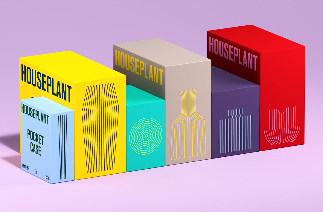
Is there such a thing as a universal dream client? If there were, it would probably be Seth Rogen, and the project would definitely be for his cannabis line, Houseplant. Pràctica and Ma-Ma are the design studios that have scored the work, delivering a pleasingly packaging-based rebrand. Combining stackable, collectable products with a punchy custom typeface and modernist product design visuals, the revamp serves to help Houseplant stand out in a saturated US market – and empty the pockets of stoners across North America and Canada.
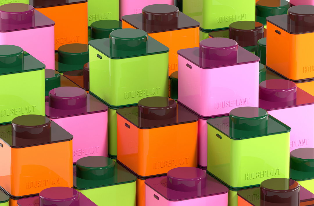
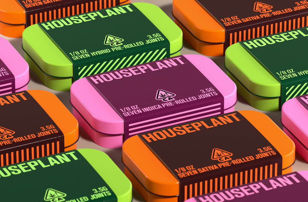
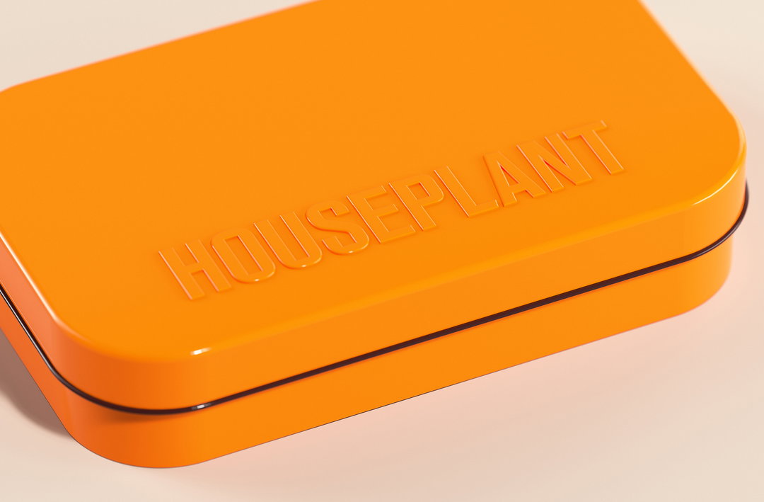
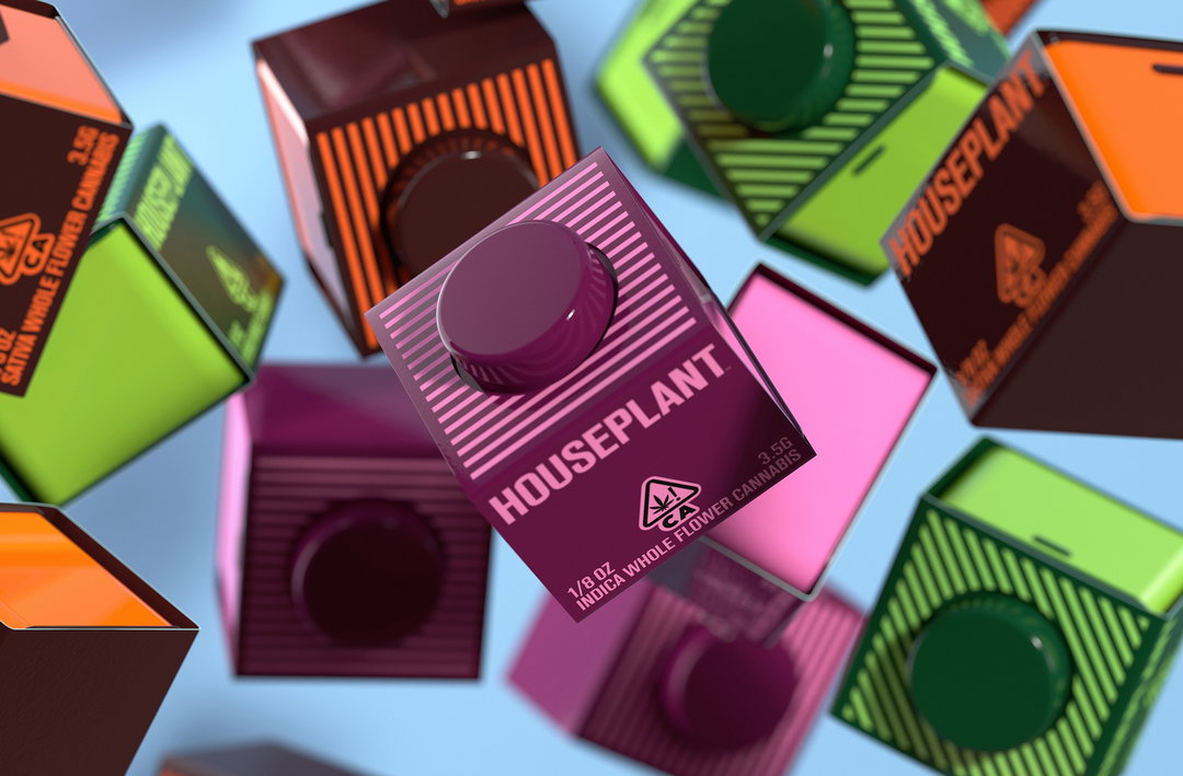
Creating containers that buyers would want to hold onto was crucial for Pràctica and Ma-Ma. Javier Arizu, co-founder at Pràctica, tells It’s Nice That: “We wanted to leverage Houseplant’s playful identity and design as something that could be collected and reused over time. The stackable nature of the jar was conceptualised with this in mind.” Simulating a “gotta catch ’em all” sort of ethos, the studios ran with the concept that buyers could try all of the strains and keep the recyclable tin jars as a keepsake.
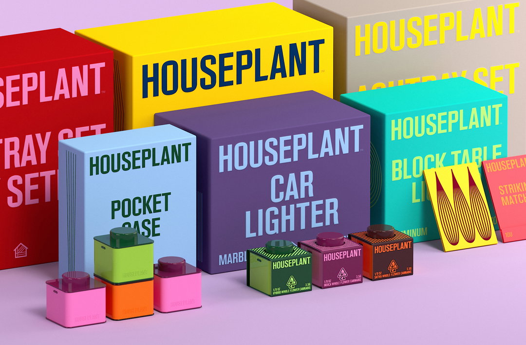
Pràctica and MA-MA: Houseplant (Copyright © MA-MA and Pràctica, 2022)
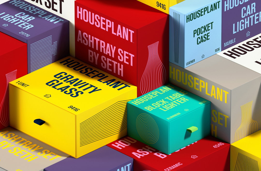
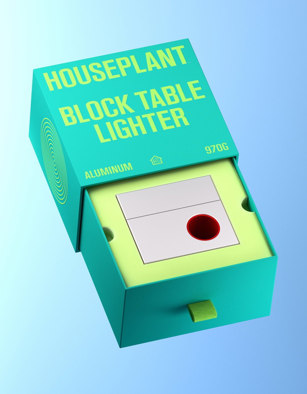
Excellent design was obviously crucial to turning something disposable into a collectable product. For the packaging, the structure design remains simple; a drawer system has been implemented alongside a selection of bold block colours. A complimenting colour then features within the typography, line illustration, pull tab and eco-foam within. In efforts to keep the packaging as sustainable as the jars, Pràctica and Ma-Ma designed a simple label wrap for the tins made out of cardstock paper with printed graphics.
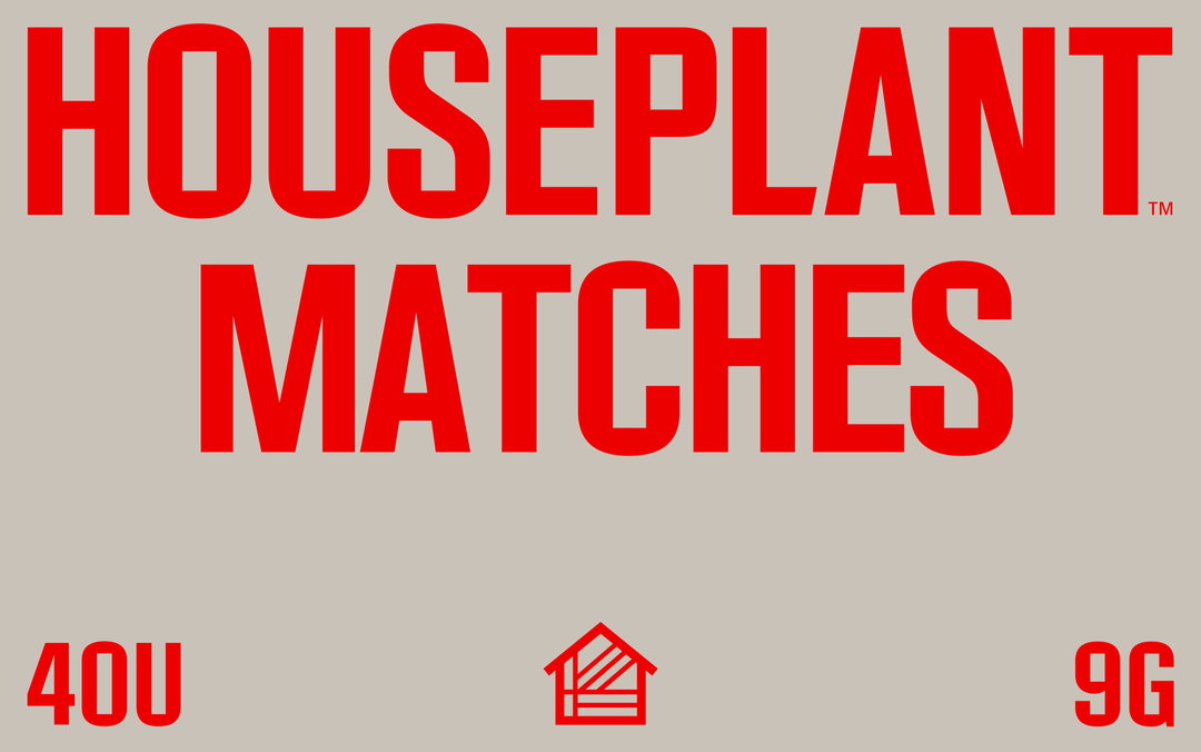
Typographically, the redesign sees the introduction of a custom typeface based on Houseplant’s existing logotype, featuring rectangular counter-forms together with a condensed style. This new type dictated a tight, justified layout approach. “On the other hand, these refreshed compositions achieve an almost vernacular construct, which is reminiscent of a past time, something which Houseplant has always been attracted to,” says Javier. The line illustrations, based on the shape of each product, tie in with this nostalgic idea, referencing classic modernist product design packaging.
“As for the colours,” Javier adds, “the move was to brighten them up, departing from the more vintage-inspired colour palette [Houseplant] originally had. This way, we further reinforced Houseplant’s vibrant personality.” Javier concludes that from the brighter colour palette to the line illustrations: “All choices were made with the intention to communicate and connect the family of products within Houseplant”, with the form of each product feeding back into the identity. Plus, it’s Seth Rogen, c’mon.
GalleryPràctica and MA-MA: Houseplant (Copyright © MA-MA and Pràctica, 2022)

Hero Header
Pràctica and MA-MA: Houseplant (Copyright © MA-MA and Pràctica, 2022)
Share Article
Further Info
About the Author
—
Liz (she/they) is the senior editor at Insights, a research-driven department within It’s Nice That. They previously ran the news section of the website. Get in contact with them for potential Insights collaborations or to discuss Insights’ public-facing reports.