Richard Turley designs 2019's D&AD Annual inspired by “doubt and vulnerability”
Richard Turley: The 57th D&AD annual
Wieden + Kennedy’s global creative director Richard Turley has designed the 57th D&AD annual, aiming to make the publication feel “feel warm and human.”
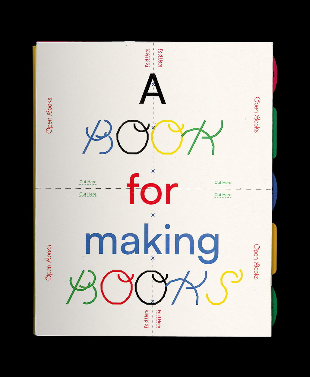
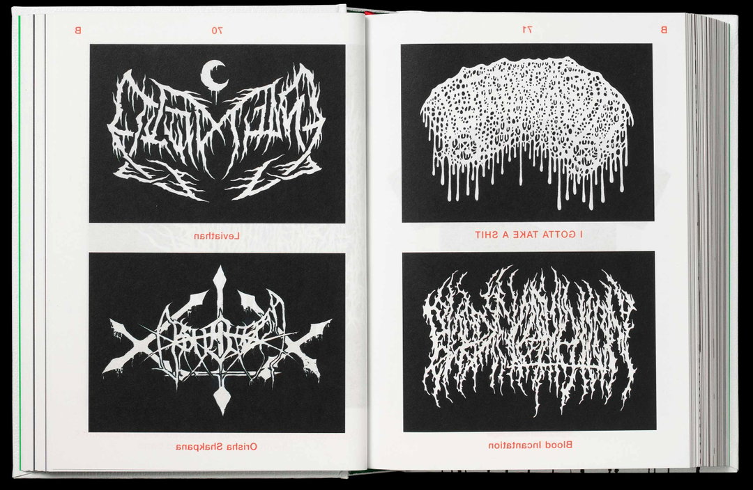
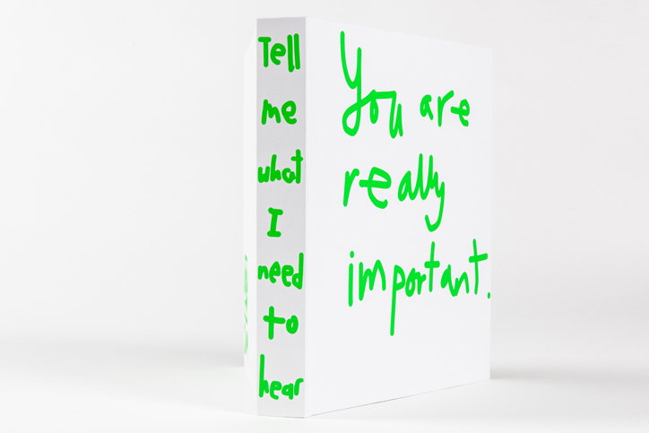
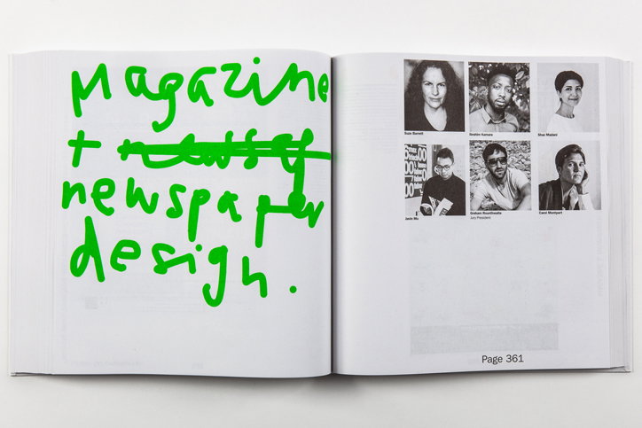
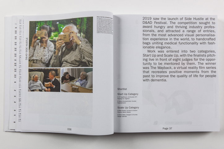
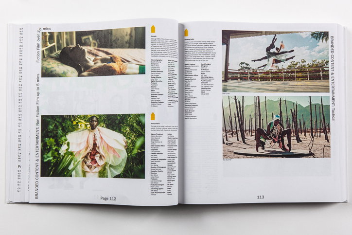
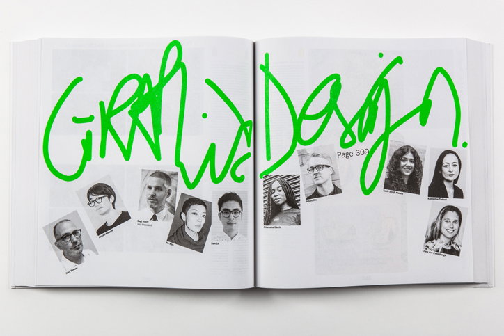
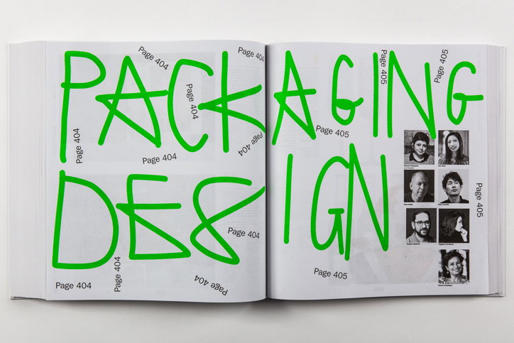
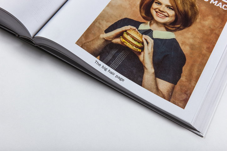
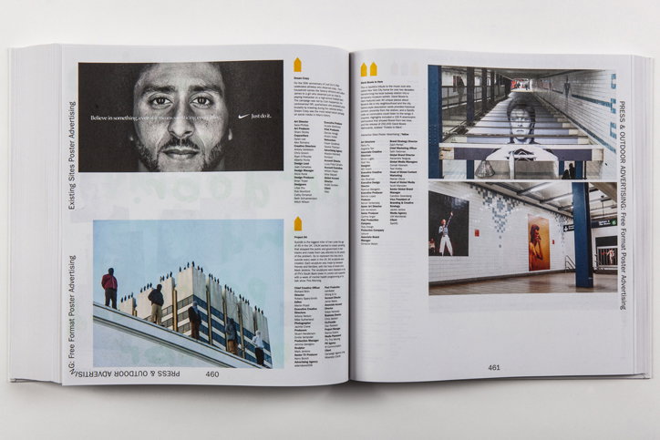
The annual, which collects together work by the D&AD Pencil winners, features handwritten lime green scrawl throughout, with a tongue-in-cheek cover that reads “You are really important.” Elsewhere category names sit vertically on the edges of the pages, playfully slinking round corners, and page numbers have been given equally mischievous treatment. Page 292, for example, has been replaced with “292.999999r”, and others read “Another page” or “[Page Number Goes Here]”.
Turley, who is best known for his rejuvenation of Bloomberg Businessweek, relaunching Interview magazine and his clever idents while head of storytelling at MTV, was commissioned by current D&AD president Harriet Devoy to develop a design that would stand out from past annuals. While previous iterations of the publication have “excelled in graphic design as precision engineering,” Turley said in a statement about the project, he instead wanted to create a look at feel that was “vulnerable maybe. And a bit dumb.”
The concept behind the book stemmed from a conversation between Turley and Devoy where the pair discussed their work, the industry and awards culture in general. Turley said, “I don’t remember all that much about that talk other than bonding over a few of the themes that I guess we developed in the book. The neediness. The doubt and vulnerability associated not just with the awards but with working within the creative industries as a whole. The craving for reassurance and validation all the time. The need for likes on your Instagram post. For views on your video. For a website to write about your work.”
This approval culture, Turley explains, can push designers into a daily existential crisis and periods of self-doubt. “A lot of that bubbled around,” he says. “That and the paradox of a lot of socially-minded left of centre creatives providing the (often rather successful) communications for multi-national corporations whose motives they are entirely at odds with.”
Although Turley doesn’t suggest that all of this thinking exists in the design, it was the underlying spirit that drove its direction. He says, “Without sounding too pretentious… the scrawl is trying to find an equivalence for that – the ghost in the corporate marketing machine. Digitized, stupefied. Compliant. Powerless. A bit frantic. With a sense of humour. Will be in at work at 9.30 just like I promised. Deck looks great btw. Here are 15 ideas for that banner ad. Do you like them? Do I even like them? What am I doing? Ice age coming. Ice age coming.”
The 57th D&AD Annual designed by Richard Turley is published today (3 October).
Richard Turley: The 57th D&AD annual
Richard Turley: The 57th D&AD annual
Richard Turley: The 57th D&AD annual
Richard Turley: The 57th D&AD annual
Richard Turley: The 57th D&AD annual
Richard Turley: The 57th D&AD annual
Richard Turley: The 57th D&AD annual
Share Article
Further Info
About the Author
—
Laura is a London-based arts journalist who has been working for It’s Nice That on a freelance basis since 2016.