Try not to drool: Studio Yukiko’s new magazine for DoorDash is yummy to the core
Nutritious colour palettes and road-side restaurant architecture; the design of DoorDash’s surprising new print title is food-informed through and through.
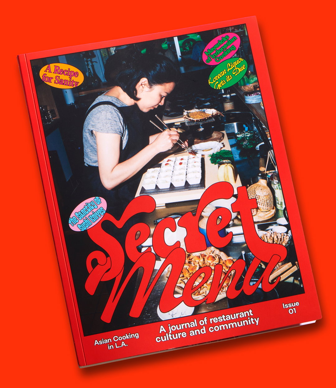
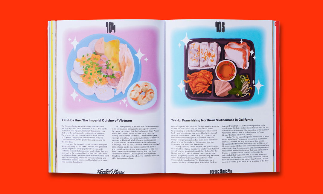
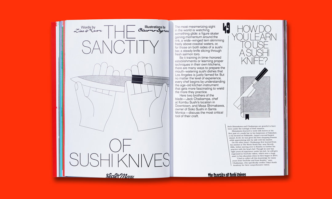
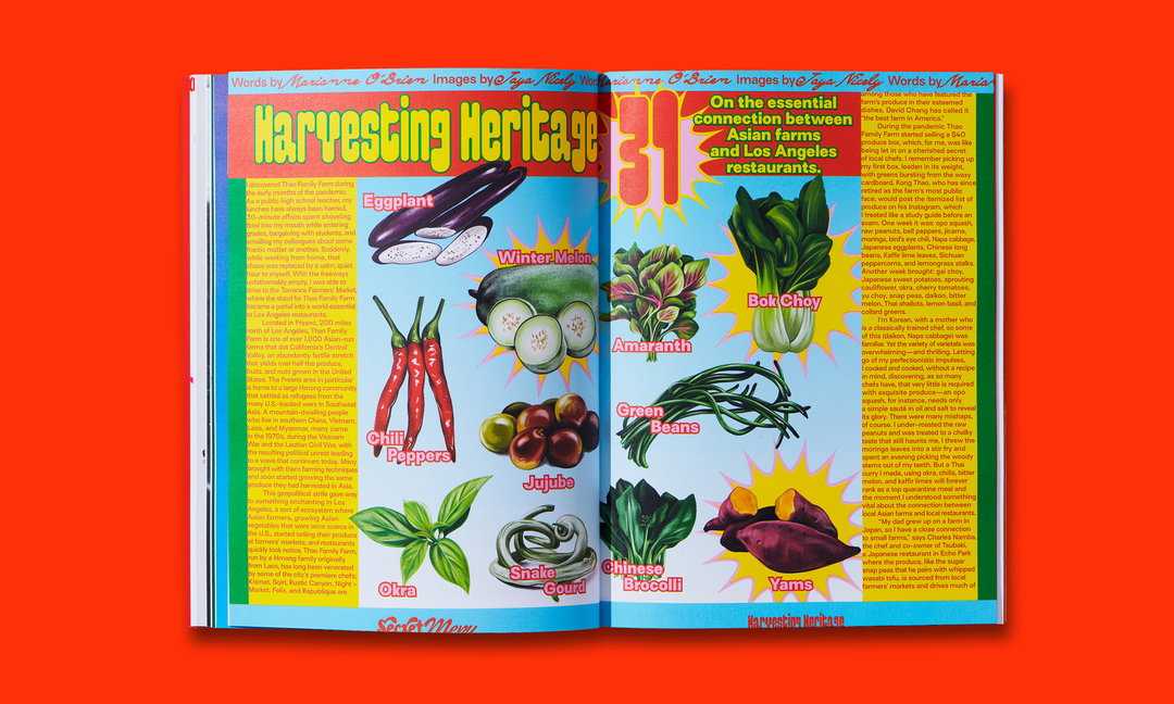
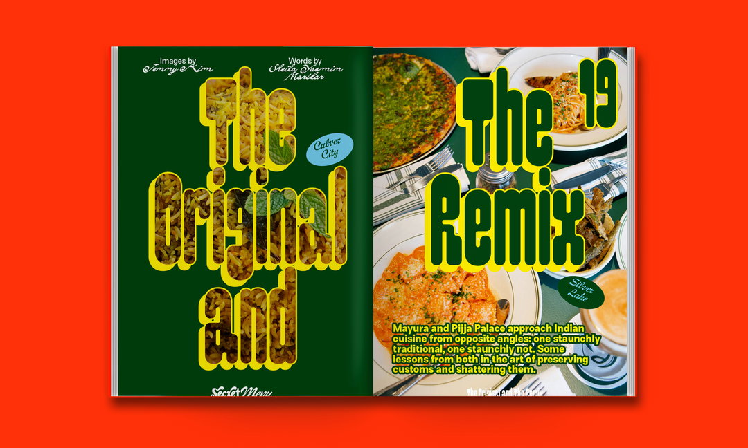
Before you sink your teeth into the first bite of a meal out, what’s the first thing that gets your mouth watering? It has to be the menu or, if you’re a Virgo, the PDF version downloaded to your phone days before. We are of the opinion that a menu is always better with pictures. Though salivating over pictures of food isn’t always conducive to hard work, as Studio Yukiko found out when working on its newest project for food ordering platform DoorDash. The design team was tasked by the company to produce Secret Menu, a new print title that takes a “behind-the-scenes-look into local food culture, starting with Asian food in Los Angeles”, Yukiko wrote recently on Instagram. “Honestly we were constantly hungry,” says Yukiko founder Michelle Phillips, who worked on the art direction.
As the publication is for such a well-established brand, Yukiko has been given an unusual amount of creative freedom. “DoorDash was very gracious to let the creative team really flex their expertise here. Shout out to Adriel Nunes who believed in our design work and let us get away with a lot of juicy design stuff you don’t always get to do with such big brands,” Michelle Phillips says. The first issue of Secret Menu is embedded within the culture of LA food. Sébastien Millot, design director and Yukiko founder, explains: “It was important for us to aim at taking the reader on a personal and immersive culinary journey through the neighbourhoods, serving up delicious stories and generous design that reflects both LA and its creative food scene.”
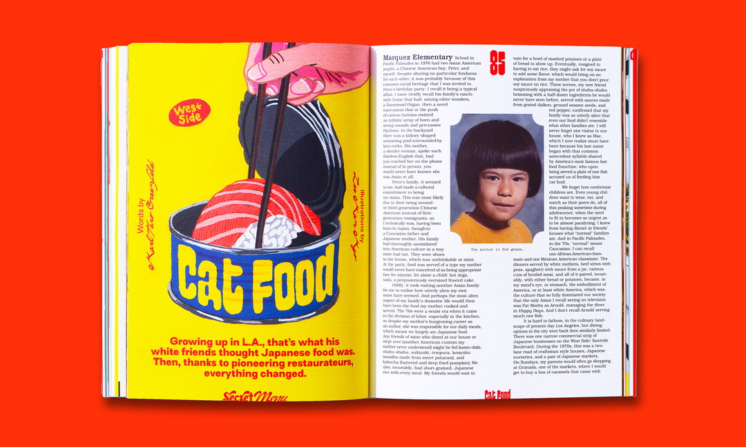
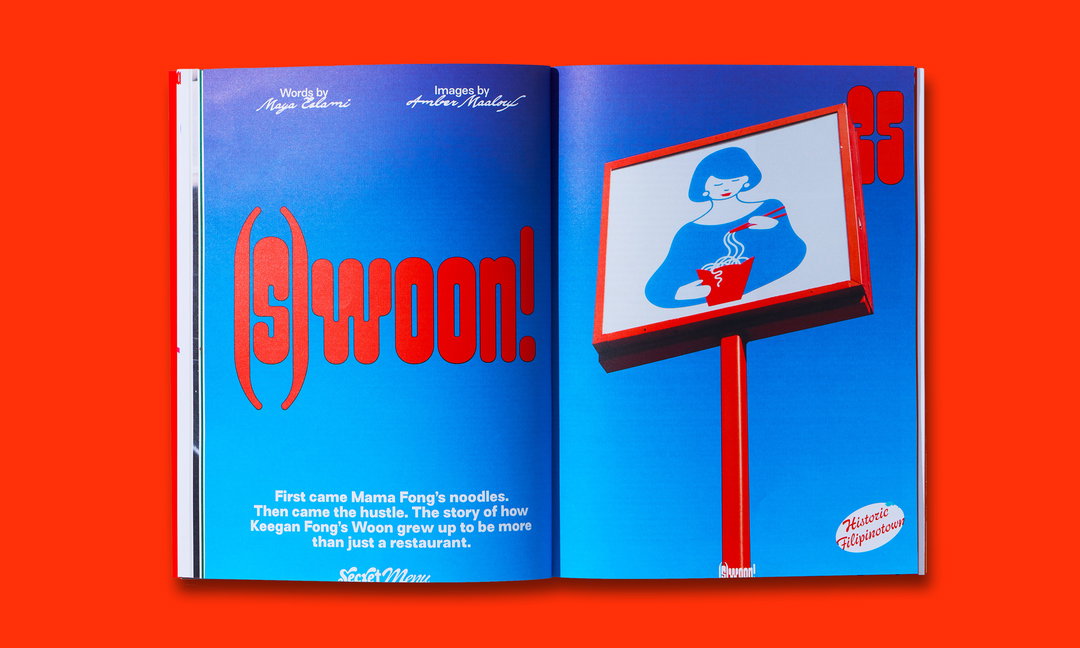
Yukiko began by looking into iconic Californian design posters. LA signage from strip malls and indoor food markets also played a role. One of the main sources of inspiration, in fact, came from “almost no-longer existing roadside vernacular restaurant architecture” from LA – “literally food shaped eateries”, says Sebastien.
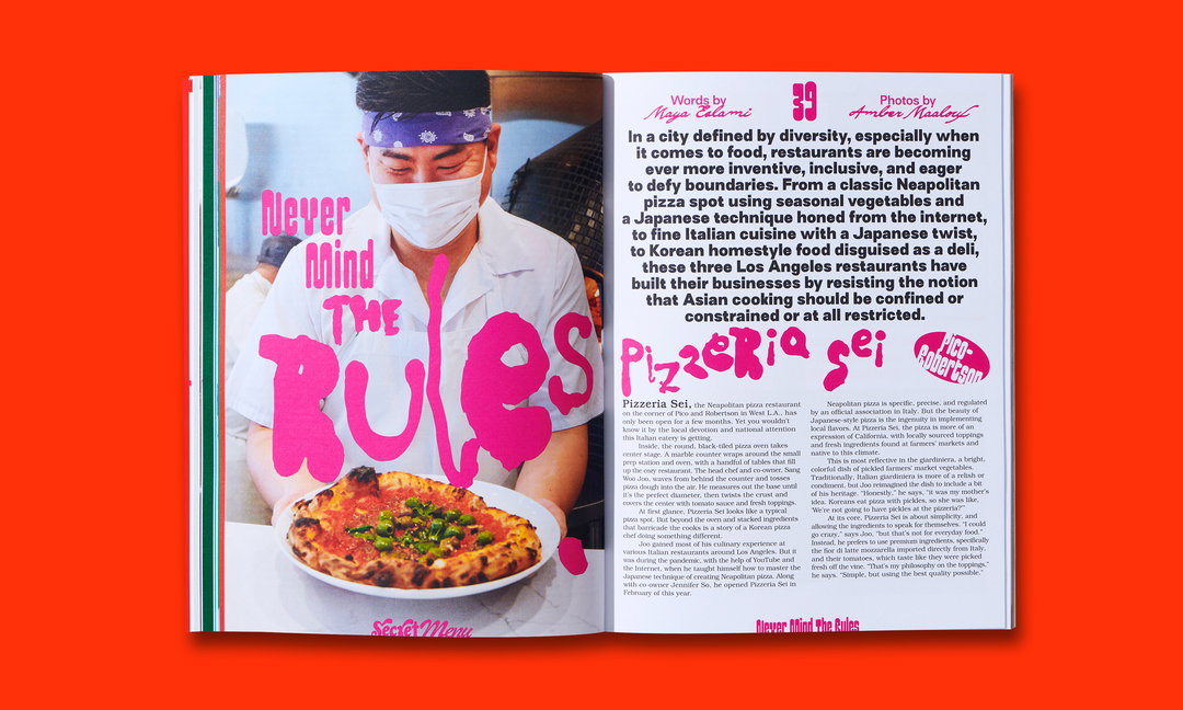
Studio Yukiko: DoorDash, Secret Menu (Copyright © DoorDash, 2022)
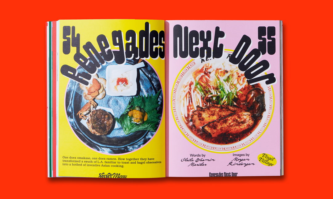
The result is a print title combining bright sunset colours with “juicy typefaces”, with Yukiko approaching the title pages as if they are restaurant street signs. The logo, for example, is a mix of calligraphic hand-painted street sign styles; the headline font from Benoît Bodhuin, named Pimpit, “was a natural choice with its variable aspect and funky curves", says Sebastien.
On the process behind the work, Michelle recounts: “The whole project from start to finish was fun, and the team was so enjoyable and inspirational to work with – that is reflected in the magazine too. At our weekly meetings, [Secret Menu makers] Erin Ruffin and David Amsden would describe all the local stories they were unearthing in such mouthwatering detail and with such awe about how all the family-run restaurants were getting creative with food and business. We just wanted to pack all that energy, inspiration and creativity into the design.”
Taking a deep dive into the neighbourhoods, communities and culture that make up the American food industry, issue one of Secret Menu is available to read in full on the DoorDash site, where you can also sign up for notifications about future issues.
GalleryStudio Yukiko: DoorDash, Secret Menu (Copyright © DoorDash, 2022)
Hero Header
Studio Yukiko: DoorDash, Secret Menu (Copyright © DoorDash, 2022)
Share Article
About the Author
—
Liz (she/they) is the senior editor at Insights, a research-driven department within It’s Nice That. They previously ran the news section of the website. Get in contact with them for potential Insights collaborations or to discuss Insights’ public-facing reports.