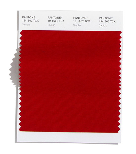
This year’s forecasted runway colour palette has been revealed by The Pantone Color Institute
We are expected to see an increase in functional and more timeless tones, alongside some colours that are predicted to “stand out.”
The Pantone Color Institute has released its annual insight into the palette we can expect to see on this season’s runways in New York.
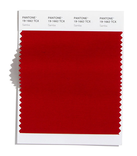
The Fashion Color Trend Report includes fourteen colours, four of which are classic neutrals with the other ten “a palette of fresh colour classics.” Each mirrors attitudes held in society, and is centred around a move towards practicality, with exuberance making way for more understated tones.
"Offering a rich narrative, the colour palette for Autumn/Winter 2020/2021 highlights our desire for versatile, timeless colour. Reflecting a ‘less is more’ mindset that is becoming increasingly important to consumers prioritising value and functionality, our colour palette is stripped of excess," said Leatrice Eiseman, executive director of the Pantone Color Institute. “Imbued with strength and personality, colours for Autumn/Winter 2020/2021 encourage our ongoing desire for unique self-expression through creative and unusual visual statements that stand out.”
The classic colours that lay the foundations for this season include an off-white shade called Almond Oil as well as Blue Depths, Sleet and Military Olive.
The forecasted colours set to feature heavily on the runways have been chosen to reflect changing societal attitudes, which means an embrace of timeless colours as opposed to shades that do not stand the test of time.
This is not to say that there are no impactful colours, with Pantone emphasising the opportunities for shades to make statements and stand out alongside the other more versatile options.
The more understated colours in the palette include Fired Brick, Classic Blue, Ultramarine Green and Magenta Purple. On the other end of the spectrum, the colours more likely to turn heads this season are Peach Nougat, Rose Tan, Green Sheen and Amberglow.
GalleryPantone: Fashion Color Trend Report
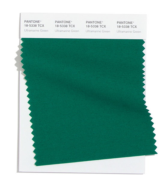
Ultramarine Green
Slate
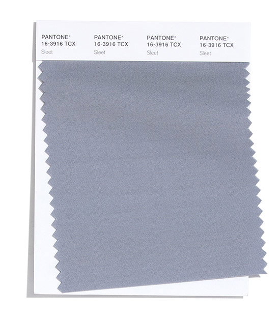
Slate
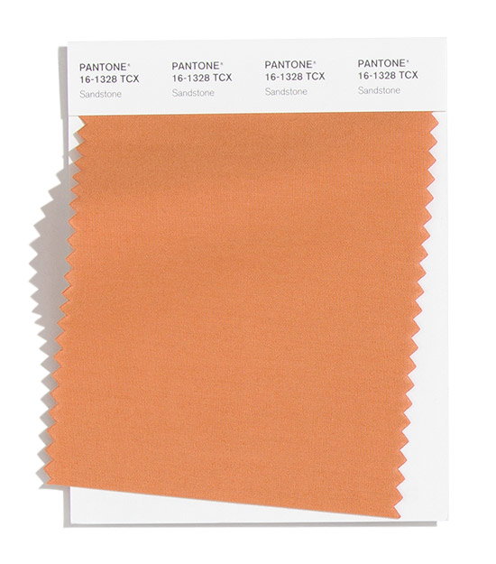
Sandstone
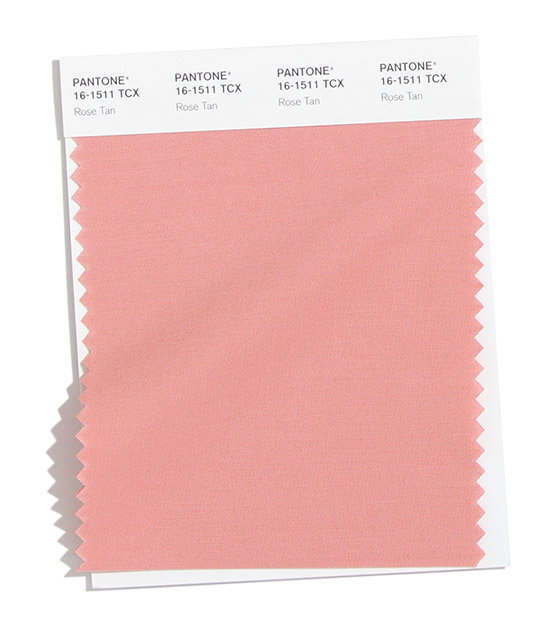
Rose Tan
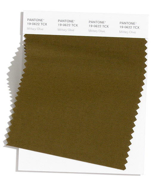
Marine Green
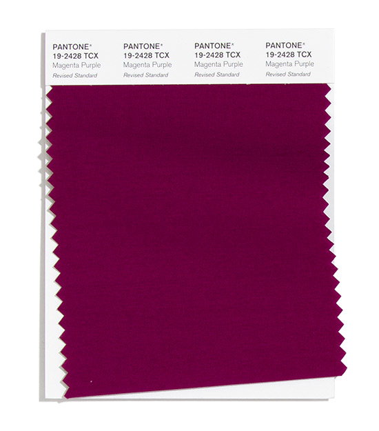
Magenta Purple
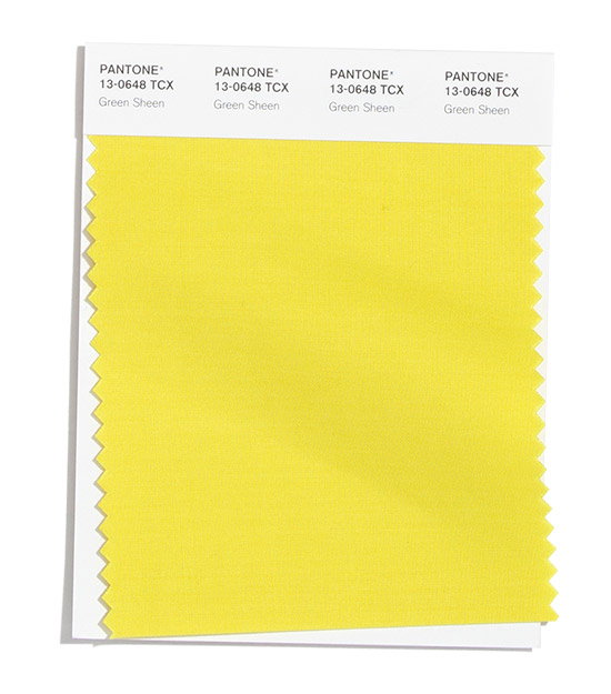
Green Sheen
Classic Blue
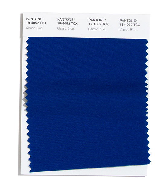
Classic Blue
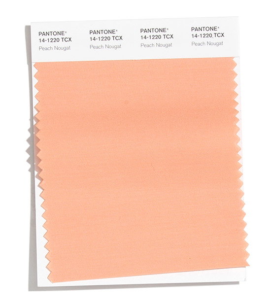
Peach Nougat
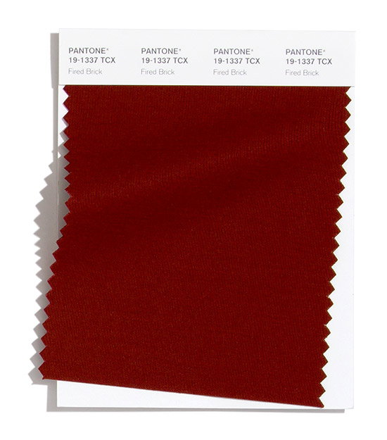
Fired Brick
Blue Depths
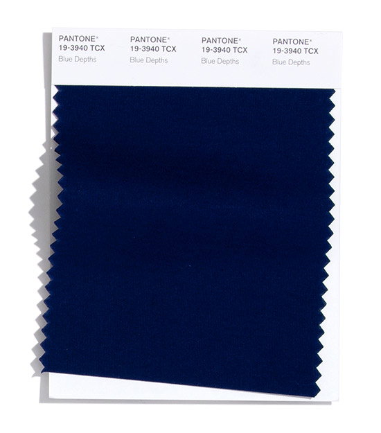
Blue Depths
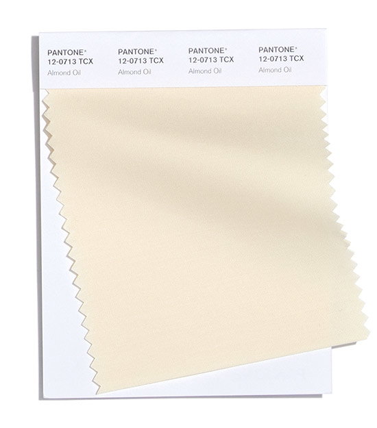
Almond Oil
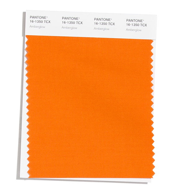
Amberglow
Hero Header
Pantone: Fashion Color Trend Report
Share Article
Further Info
About the Author
—
Charlie joined It’s Nice That as an editorial assistant in December 2019. He has previously worked at Monocle 24, and The Times following an MA in International Journalism at City University. If you have any ideas for stories and work to be featured then get in touch.