Grey London rebrands as Valenstein & Fatt to celebrate its Jewish origins and launches diversity plan
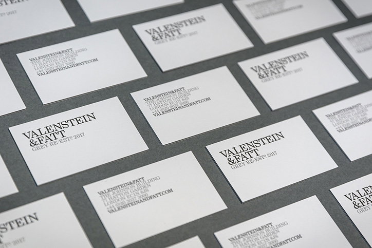
Grey London has rebranded as Valenstein & Fatt and created a new identity that acknowledges the Jewish founders of the company. Grey was founded in New York in 1917 by Lawrence Valenstein and Arthur Fatt, who named the company after the colour of the wallpaper in their office, rather than reveal their Jewish heritage amid rife anti-semitism. The rebrand of the London office will last for 100 days and marks the start of a commitment to diversity with the publication of a five-point strategy that asks “Is diversity adland’s least effective campaign?”
“Recent events, from rising instances of hate crime and terror attacks in London to the triggering of Article 50, have sent shivers through our society and businesses,” says Leo Rayman CEO of Valenstein & Fatt. “But it should also inspire a collective and determined attitude that our country and our companies will not change for the worse.”
“In the week that the British government triggers Article 50 and begins the process of disconnecting the UK from the European Union, Grey London is showing its commitment to diversity and openness by re-establishing itself under the name of its original Jewish founders,” says the company.
The Valenstein & Fatt logotype will replace the Grey san serif version and is set in Century Schoolbook, a typeface designed in 1917 by a foundry just a few streets from Lawrence and Arthur’s office. “The modern but familiar design uses a black and white colour palette to reference the founders’ time in 1910s New York and emphasises the fact that diversity isn’t just black and white,” says the company. “The installation of a beautifully crafted Valenstein & Fatt logo set in solid concrete at the agency’s Hatton Garden offices symbolises the solid foundation and building blocks of Lawrence and Arthur’s actions.”
The five-point strategy comprises a commitment to publishing the diversity data of the company; launching a cross-industry task force to identify the barriers to recruitment and retention of talent among ethnic minorities; to launch a Valenstein & Fatt Bursary to pay a year’s rent for up to two young people from ethnic minority and disadvantaged backgrounds; to inspire the next generation, by working with 100 primary and secondary schools to introduce students to a career in the creative industries; and a commitment to develop diverse talent.
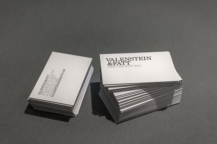
Valenstein & Fatt: Identity
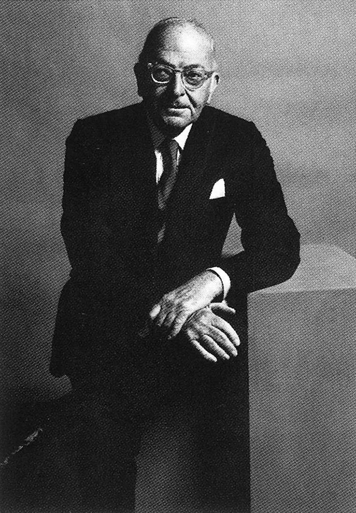
Larry Valenstein
Arthur Fatt
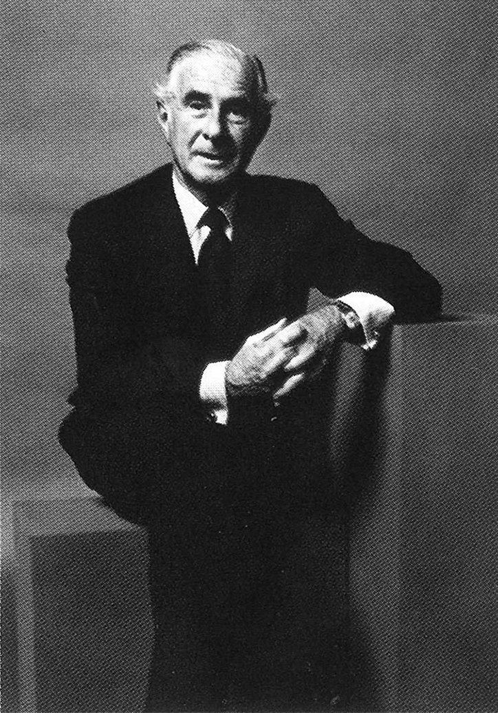
Arthur Fatt
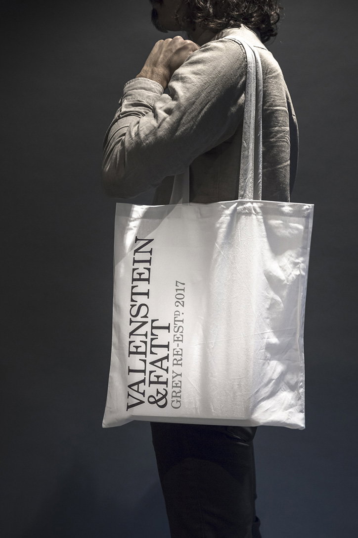
Valenstein & Fatt: Identity
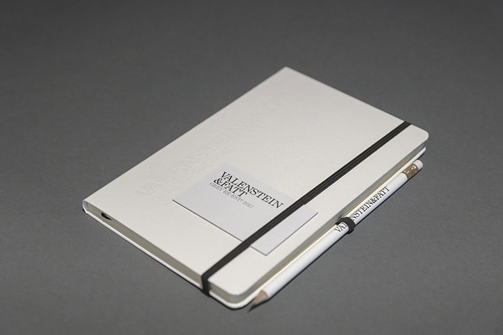
Valenstein & Fatt: Identity
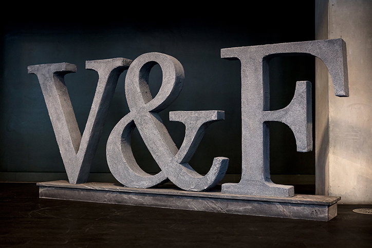
Valenstein & Fatt: Identity
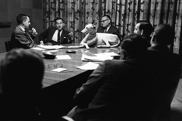
Valenstein & Fatt: Meeting
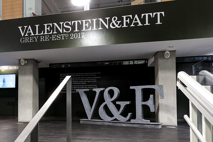
Valenstein & Fatt: Identity (All photography Dan Weil)
Share Article
Further Info
“www.valensteinandfatt.com”http://valensteinandfatt.com
About the Author
—
Owen joined It’s Nice That as Editor in November of 2015 leading and overseeing all editorial content across online, print and the events programme, before leaving in early 2018.