




Exclusive: Wired UK's magazine redesign, with custom type by Sawdust

Wired UK has redesigned its print magazine, with a new set of type idents by Sawdust studio. In an exclusive interview, we chat to creative director Andrew Diprose about the graphic overhaul.
So, first off, why the redesign?
It has been three years since we redesigned and in that time our attitude to managing space and the pace of the magazine have changed. Personally it’s like a breath of fresh air! We also have a new editor, Greg Williams, who has made some changes to the architecture of the magazine. And we reconsidered the word counts for pieces, bearing in mind how they’ll run on other platforms – it’s no good having a 65-word review in print that looks ridiculously short online. We wanted to build in that flexibility.
What are the big changes and the ideas behind them?
I always like to get back to basics with the grid when redesigning – there’s nothing worse than a glossy, surface redesign. We’re now on a nose-bleeding 15-column grid, the idea being we have the flexibility of our previous 14-column grid, but with a slightly wider triple column for running extended captions (as in our Gear section) where the previous narrow “floating” column gave us too short a line length.
We’re also playing with a six-column vertical grid. I’m not sure how that will play out, but it’s interesting having a vertical grid running through sections. Also, everything is locking to the baseline grid now. That sounds kind of obvious, but I love the detail of having everything from captions, body copy and rules hitting the grid.
It’s so important for Wired to adapt and evolve, both in how we tell stories with text and with the imagery. I want to call our aesthetic “tech-chic”… but, quite rightly, no one is taking me seriously! Joking aside, the look is cleaner, the stories are running longer, and our imagery is slightly more sparing and generous.

Wired UK redesign
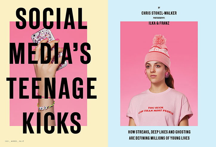
Wired UK redesign
Photo: Ilka & Franz
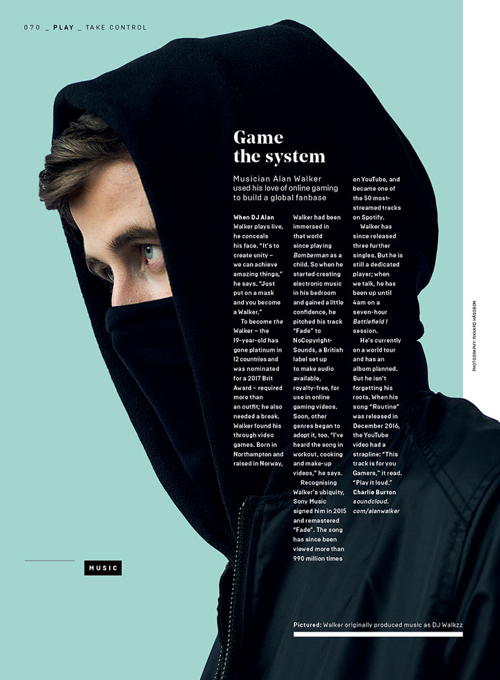
Wired UK redesign
Wired UK redesign
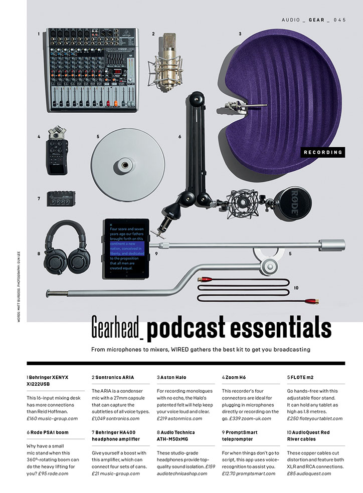
Wired UK redesign
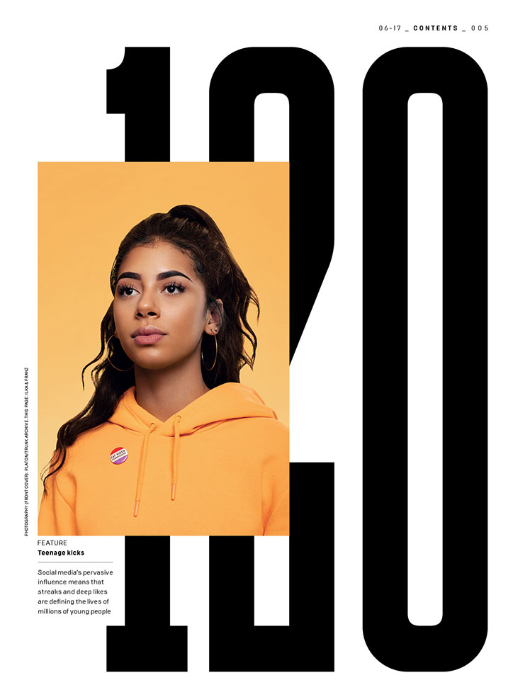
Wired UK redesign
Photo: Ilka & Franz
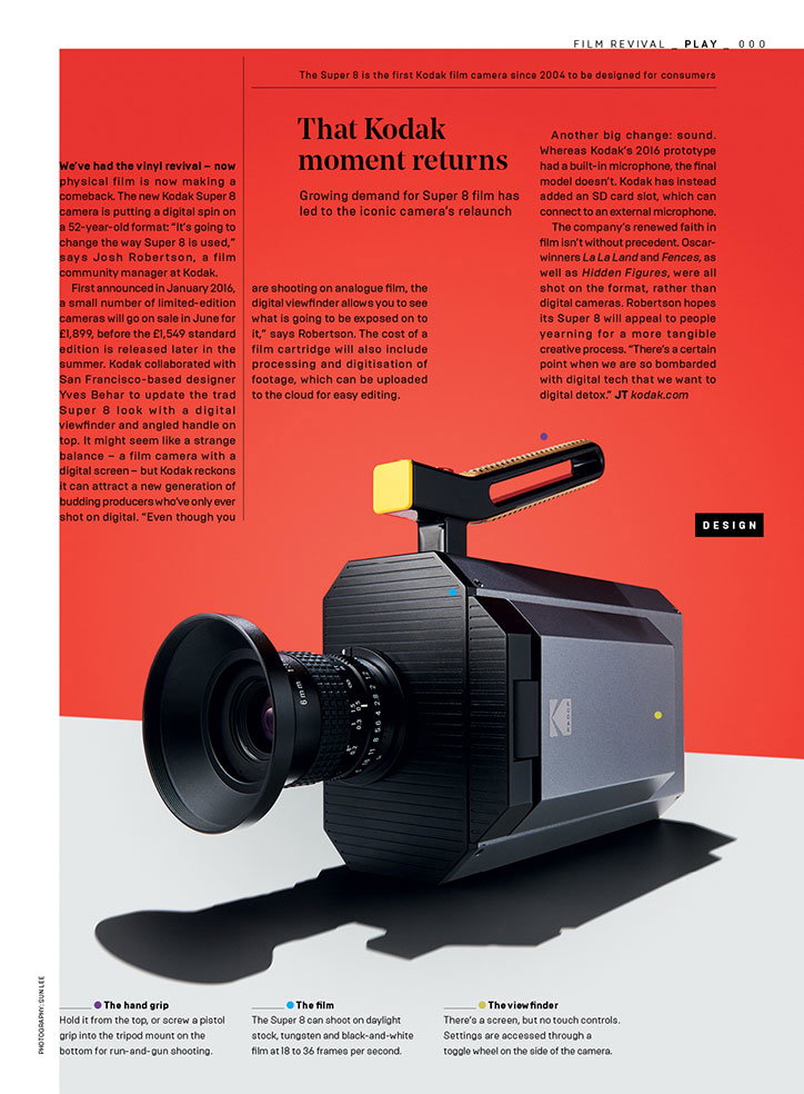
Wired UK redesign
What’s different in terms of the approach to spreads, and the balance of imagery and text?
There’s always a dance we have with the editors regarding space and copy lengths. I detest magazines that are claustrophobic, it doesn’t make me want to settle in and involve myself with the pieces. That said, readers know when we’re not giving them value for money on the page, hopefully we’ve found that balance with this iteration.
There’s so much thought these days about what it means to buy a magazine in print and to read stories on paper rather than online. I’m keen to make Wired even more luxurious in print, with higher production values, great paper stock and finishes, something valuable in the hand, something to savour – everything that’s great about print.
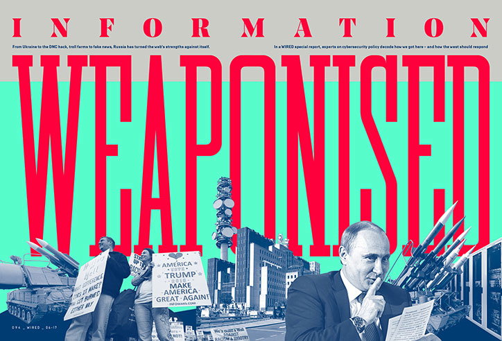
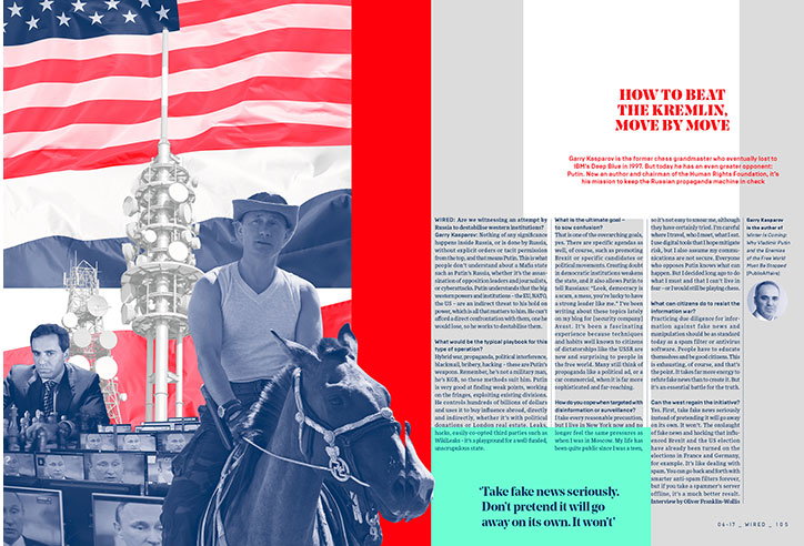
A good example is the fun we had with the Russian Hacking package this issue too. It’s an in-depth, important read that I hope we made easier to digest visually with our treatment: 16 pages of uncoated stock featuring only special colours (PMS 805 flouro red, PMS 877 silver, PMS 3375 Mint and PMS 541 Navy). It’s the first time we’ve had to completely empty the CMYK ink units at the printers! And at a time when average photography is everywhere online, having something of quality, where imagery is valued, is so important. If we can lure the best talent in illustration and photography I’ll do my damndest to do it justice.
How has the type changed?
We’ve retained the typefaces we brought on to our digital platforms since our last full redesign, like the New Grotesque family from A2 type, so Wired in print, online and digital now shares a suite of core typefaces. We’ve also added some of our favourites including: Shick Toikka’s Noe Display and the narrow slab of Matt Willey’s Blakey. We didn’t want to throw the baby out with the bathwater though – we’ve kept our hard-working body copy typefaces, just tweaked the settings under the hood. I’m keen to have a versatile, tight set of display typefaces, from the narrow, punchy New Grotesque and Blakey that we can potentially run huge, to the wide, crisp and angular Noe, to the geometric, modern and, er, brutal-looking Brutal, by the Russian Brownfox foundry.
And the bespoke type – what’s this used for, and how was it made?
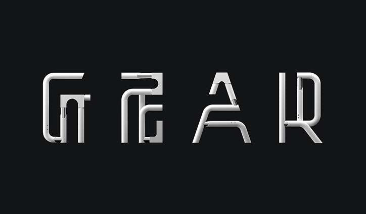
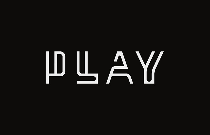
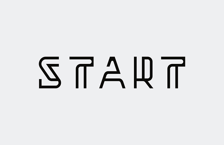
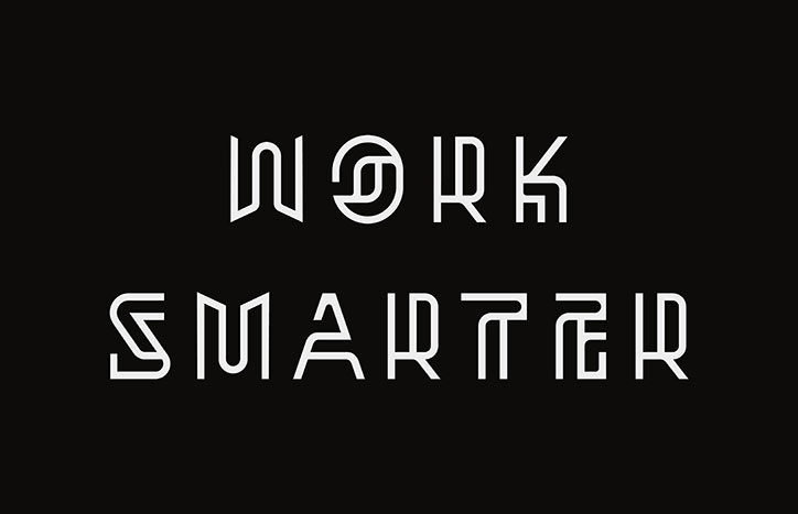
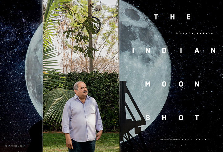
We were keen we freshen up our section headers, commissioning a typeface for single and DPS openers and to use as special display drop-caps and numbers. We’ve now got something we can place more playfully around a page on an image as well as locked up in a more traditional manner on a whiteout box. We’re stricter with page design in the front of book, very black and white, a little more restrained… With this typeface we’ve added a little fun and personality. Goodness, we don’t want to take it too seriously, do we?!
The June 2017 issue of Wired is available 4 May.
Wired UK redesign
Wired UK redesign
Wired UK redesign

Wired UK redesign
Wired UK redesign
Wired UK redesign
Wired UK redesign
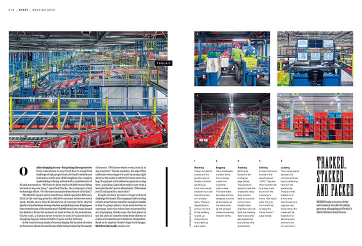
Wired UK redesign
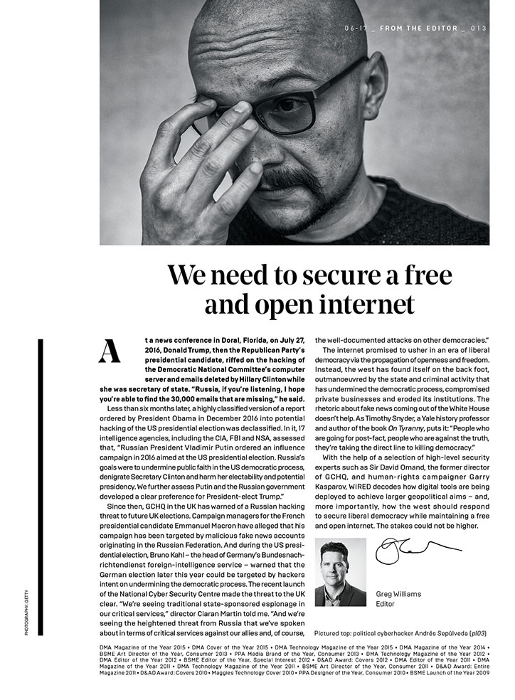
Wired UK redesign
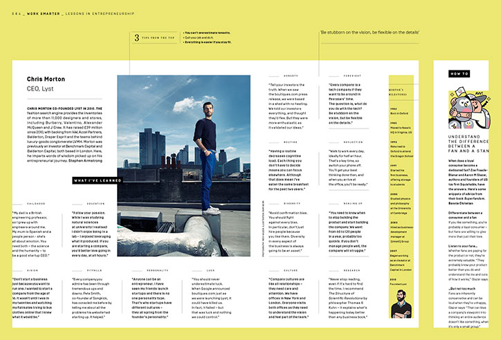
Wired UK redesign
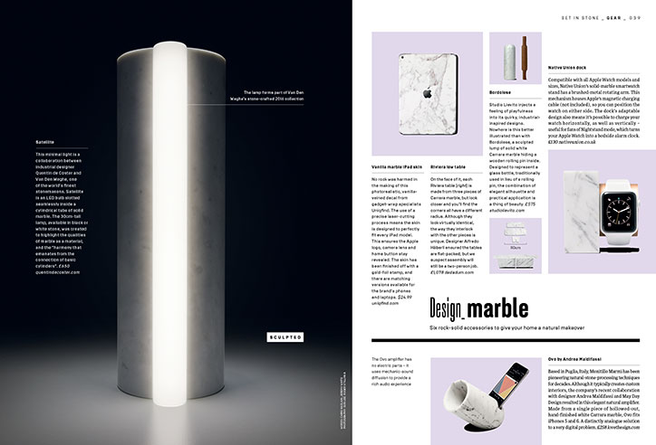
Wired UK redesign
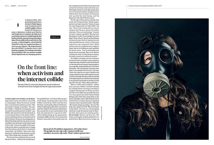
Wired UK redesign
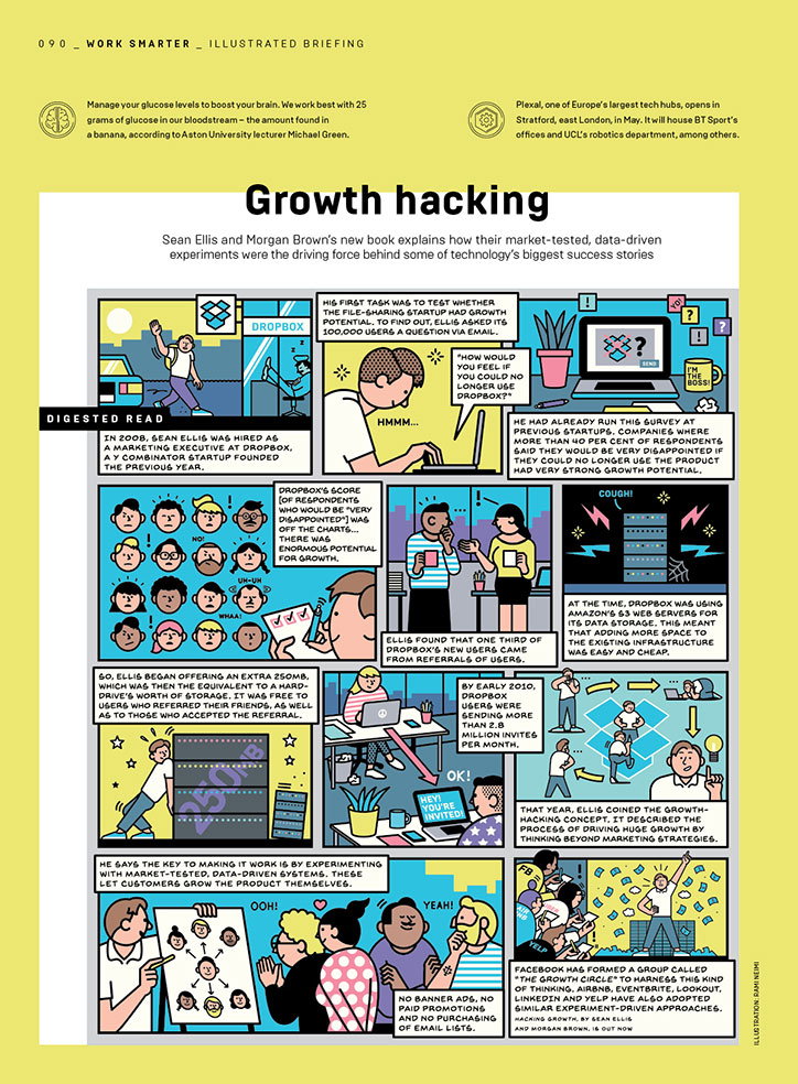
Wired UK redesign
Share Article
Further Info
About the Author
—
Jenny oversees editorial output across It’s Nice That. Get in touch with writing pitches for features or opinion pieces, big creative story tips, or questions about all things editorial. [email protected]
To submit your work to be featured on the site, please see our Submissions Guide.