Launch Recite Me assistive technology
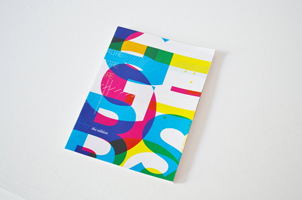
A colourful brochure featuring bold, overlapping typographic shapes in blue, red, yellow and green. Small text in the lower left reads “the edition”.

Graphic Design: But not as we know it – a bitingly satirical project from Amy West

—
Date
9 September 2013

Though it saddens us to say it, there’s not really a whole lot of satire going on in the world of graphic design. The design community tend to take themselves reasonably seriously, which means we don’t often get to have a good old laugh due to a designer’s witty observations or humorously-minded project.

Amy West has just changed all that though with an acerbic piece of work based on the internet’s obsession with trends and style over substance. Grafik BS was a fake studio set up by Amy with the intention of catching out those with a superficial understanding of design and pointing the finger for a big old laugh. “A fake Behance page for the studio received hundreds of appreciations, positive comments on the style of the posters and even a job application for a position in the studio. The experiment proved that there is an online community practising design with the understanding that the entire process consists solely of applying style to anything,” said Amy.

Lucky for us we never posted any of Grafik BS’ work until now. Though come to think of it, I DO like the style of those posters…
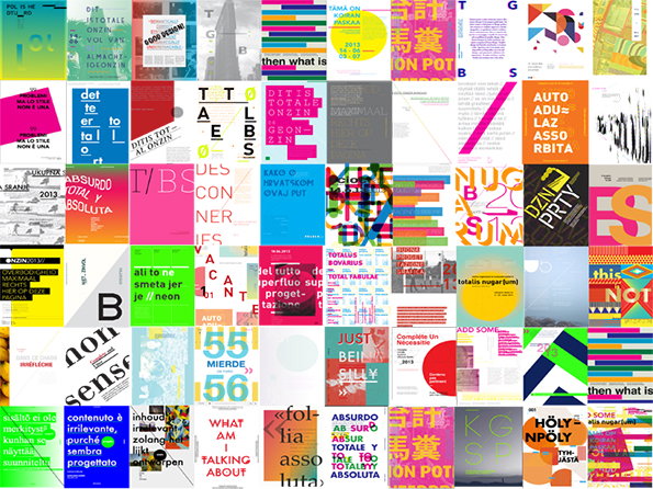
A grid of 50 diverse graphic design pieces, featuring a mix of bold typography, abstract shapes and vibrant colours. Many of the works include fragmented text in various languages and experimental layouts.
Above

Amy West: Grafik BS

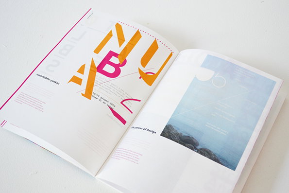
An open magazine shows a bold, typographic spread. One page features large, overlapping orange and pink letters, while the opposite page shows a pale blue image of a coastline.
Above

Amy West: Grafik BS

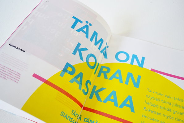
An open magazine features a bold typographic layout in blue and yellow. Large blue text reads “TÄMÄ ON KOIRAN PASKAA”, with a smaller heading on the left that reads “koiran paskaa”.
Above

Amy West: Grafik BS

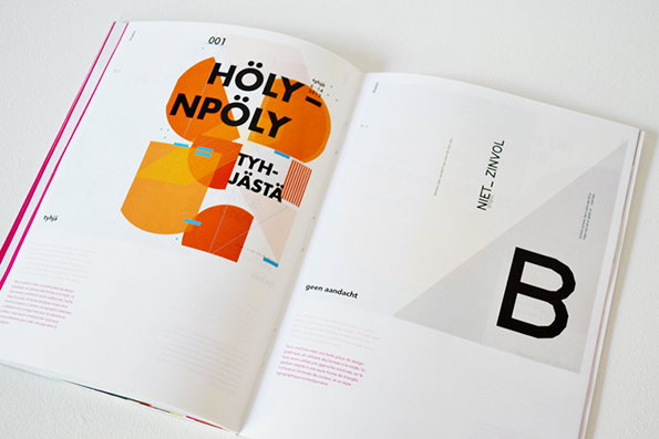
An open book shows a graphic design layout. The left page features bold, orange geometric shapes and the text “HÖLYN-NPÖLY” and “TYH-JÄSTÄ”. The right page is mostly white with a large, black letter “B” and the words “NIET_ ZINVOL”.
Above

Amy West: Grafik BS

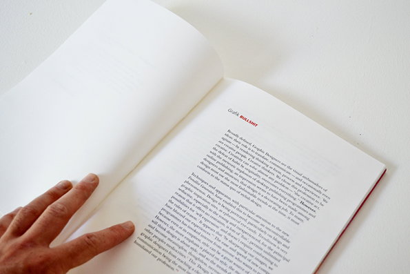
An open book lies flat on a white surface. The right-hand page features a heading that reads “Grafik BULLSHIT” above several paragraphs of justified text.
Above

Amy West: Grafik BS

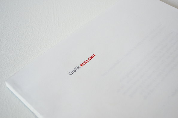
A close-up of a white book cover with the words “Grafik BULLSHIT” printed in the centre. The first word is in black and the second is in red.
Above

Amy West: Grafik BS

Share Article

Further Info

About the Author

James Cartwright

—

James started out as an intern in 2011 and came back in summer of 2012 to work online and latterly as Print Editor, before leaving in May 2015.
It's Nice That Newsletters

Fancy a bit of It's Nice That in your inbox? Sign up to our newsletters and we'll keep you in the loop with everything good going on in the creative world.