Launch Recite Me assistive technology
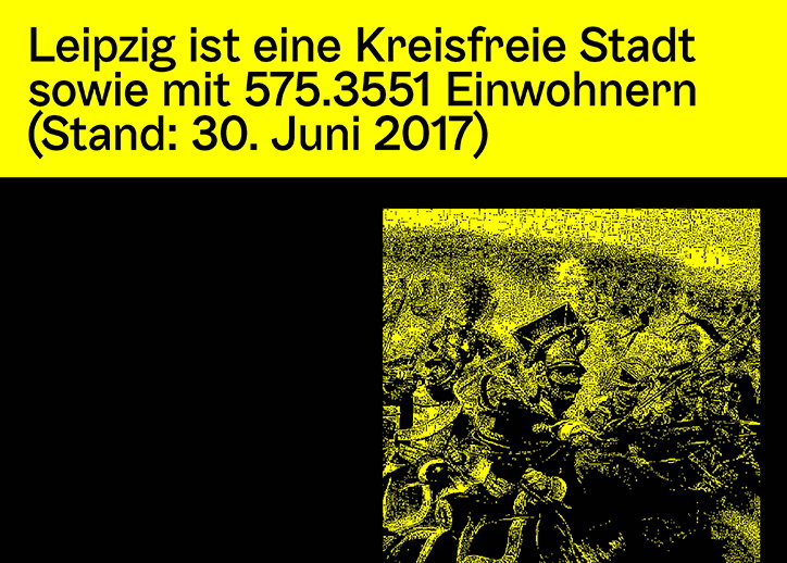
A yellow banner at the top contains German text stating that Leipzig is a district-free city with 575,355 inhabitants as of 30 June 2017. Below, a high-contrast yellow and black image shows a crowd of people.

Designer Anatole Couteau's technical approach lets him communicate simply and precisely

—
Date
20 April 2018

For Anatole Couteau, communication always manifests itself in the simplest and most precise forms. With a portfolio spanning graphic and type design, his work is satisfyingly direct, combining monochrome elements with a variety of custom typefaces in a precise and astute manner.

Originally from Paris, Anatole is currently working for Monotype in Berlin while also undertaking a DSAA in typographic design at École Estienne. Although clearly placing a precedence on typography within his practice, he explains how he tries to “practice type design as much as graphic design and coding.”

Whether working editorially or digitally, Anatole has developed a technically thorough approach that sees him fully immersed in every aspect of his work. “I try to go as far as I can in every project,” he tells It’s Nice That, “that means, for the [type] design part, I create full glyph-sets, well-designed forms etc and for the technical part, I try to produce and develop the typeface as much as I can by coding the OpenType, optimising the spacing and the kerning, hinting, checking the tables – lots of boring type stuff… sometimes I really sound like a type-nerd,” he jokes.

This technical approach forms the basis of the designer’s process, providing Anatole with a blueprint by which to create work. “For the graphic design, I try to always stick to particularly grid and simple forms and effects,” Anatole adds, “that’s kind of the ‘plan’ I try to follow in every project that I make.”

When designing his typeface Liszt, which is still a work in progress, Anatole took what started as a small project and allowed his technical brain to turn it into something much bigger. “Liszt is sort of inspired by the stone engraving found around [Franz] Lizst’s grave,” he explains. After developing a text version as a complete as possible, Anatole decided to expand the typeface to one “usable in every version,” but extended beyond the usual light to bold we are accustomed to.

“I’ve created an italic version of it and most recently the display roman version, I’m currently working on the Italic display and a monospaced version, but I’ll try to extend it as much as I can, maybe with a lining version or even a pixel or emoji version, who knows were it can lead to! And with all the new technologies that are emerging right now, why not create a variable-font version of it,” he concludes.
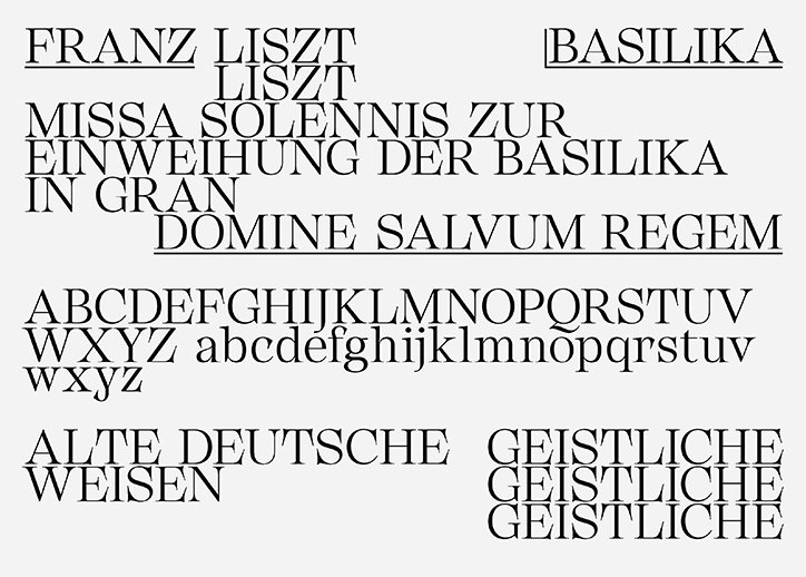
A specimen of a serif typeface featuring various arrangements of uppercase and lowercase letters. The text includes phrases such as “Franz Liszt”, “Basilika” and “Domine Salvum Regem”.
Above

Anatole Couteau

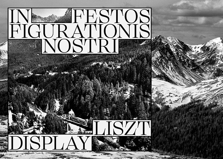
A black and white image of a snowy mountain range and a dense pine forest. Bold serif text is laid over the scene, reading “IN FESTOS FIGURATIONIS NOSTRI” at the top and “LISZT DISPLAY” at the bottom.
Above

Anatole Couteau

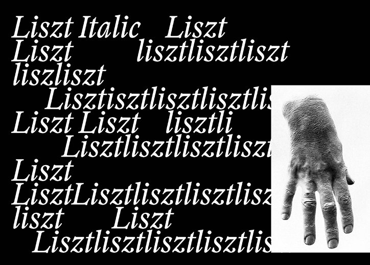
A black and white collage featuring a grayscale image of a hand on the right. To the left, the word “Liszt” is repeated multiple times in various sizes and italicised fonts against a black background.
Above

Anatole Couteau

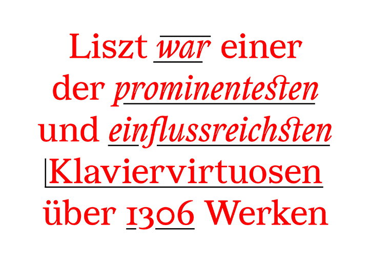
Red text on a white background reads “Liszt war einer der prominentesten und einflussreichsten Klaviervirtuosen über 1306 Werken”. Several words are underlined with double lines.
Above

Anatole Couteau

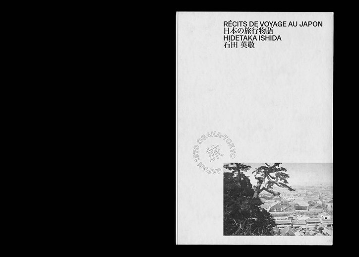
The cover of a book titled “Récits de voyage au Japon” by Hidetaka Ishida. A black and white photograph in the bottom right corner shows a pine tree overlooking a town.
Above

Anatole Couteau

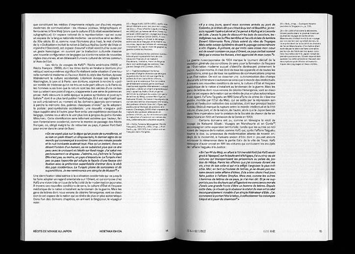
An open book showing two pages of dense French text. The bottom of the left page reads “Récits de voyage au Japon” and “Hidetaka Ishida”.
Above

Anatole Couteau

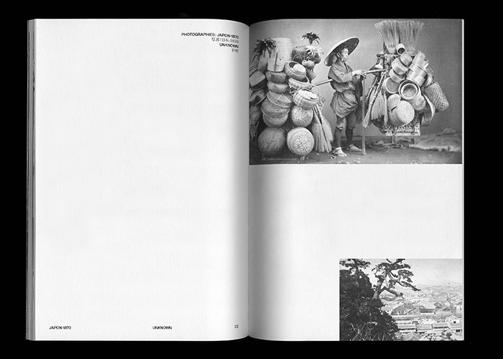
An open book shows two black and white photographs from Japan. The top image features a person wearing a conical hat, carrying a large load of baskets and pots on a shoulder pole.
Above

Anatole Couteau

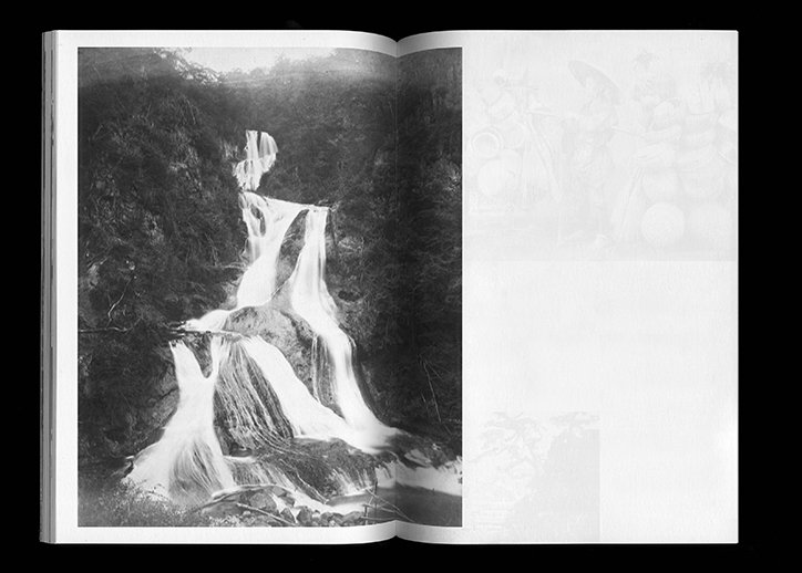
An open book shows a black and white photograph of a tiered waterfall cascading through a dark, wooded valley. The opposite page is mostly blank, with a faint, ghostly image visible at the top.
Above

Anatole Couteau

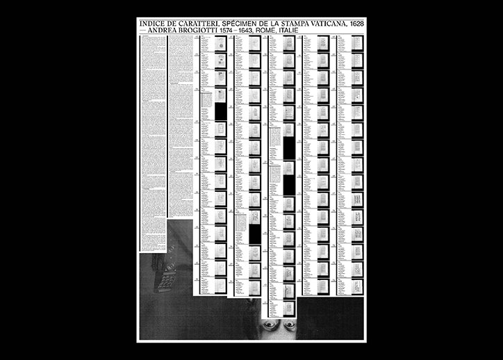
A black and white specimen sheet of typography. A header reads “INDICE DE CARATTERI, SPÉCIMEN DE LA STAMPA VATICANA, 1628 – ANDREA BROGIOTTI 1574 – 1643, ROME, ITALIE”. Below, columns of various typefaces and character sets are arranged in a grid, accompanied by a block of descriptive text.
Above

Anatole Couteau

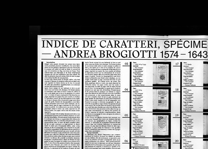
A black and white photograph of a printed page titled “INDICE DE CARATTERI, SPÉCIME – ANDREA BROGIOTTI 1574 – 1643”. The page features columns of French text and a numbered list of typeface specimens.
Above

Anatole Couteau

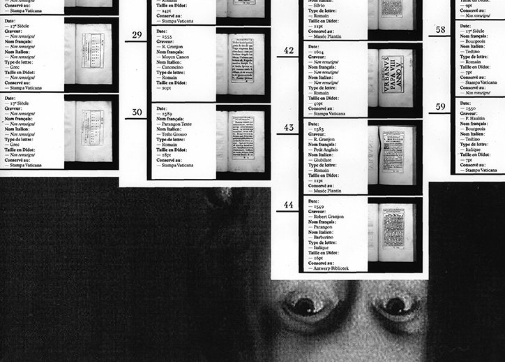
A black and white collage featuring a grid of typographic specimens and archival text. A pair of wide, staring eyes is cropped into the bottom right corner.
Above

Anatole Couteau

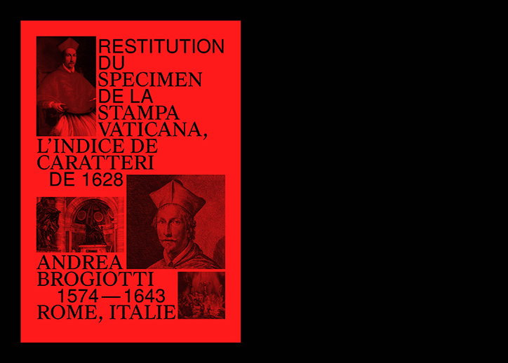
A red and black poster featuring two portraits of a person in clerical dress. Bold text reads “Restitution du specimen de la stampa vaticana, l’indice de caratteri de 1628” and “Andrea Brogiotti 1574 – 1643 Rome, Italie”.
Above

Anatole Couteau

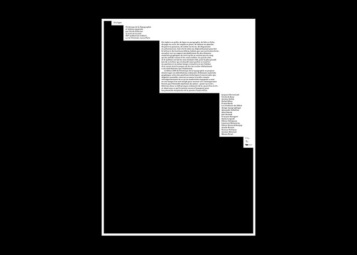
A minimalist page layout with black text on a white background. Small blocks of French text are arranged in the top right and middle right, leaving a large area of empty space below.
Above

Anatole Couteau

Share Article

Further Info

About the Author

Ruby Boddington

—

Ruby is Senior Creative at It's Nice That, overseeing our visual output across platforms and projects. Before that, she was associate editor on the editorial team, after joining in September 2017 following graduation from Central Saint Martins.

It's Nice That Newsletters

Fancy a bit of It's Nice That in your inbox? Sign up to our newsletters and we'll keep you in the loop with everything good going on in the creative world.