Andrej & Andrej gives Pohoda Festival an identity refresh, complete with 3D babies and a futuristic typeface
Pohoda Festival in Slovakia is like “a second Christmas” – but how many Christmases can you think of where you were overshadowed by two giant babies while listening to electronic music? Design duo Andrej & Andrej share how they helped the festival feel new after three decades.
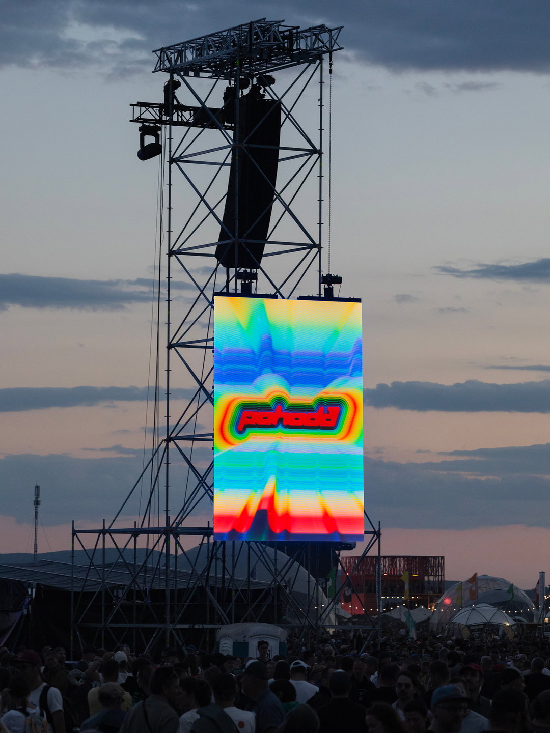
Pohoda Festival is Slovakia’s largest annual open-air music and arts festival – and it’s 30 years old! Founded in 1997, the festival is led by its namesake ‘pohoda’ which translates to ‘ease’ and ‘well-being’ in Slovak and Czech. The festival has no VIP areas so all ticket holders can enjoy equal access – artists across all genres share the stage and attendance is capped to preserved an uncrowded experience. For its big birthday, Andrej & Andrej, a graphic design studio based in Bratislava, Slovakia and founded by Andrej Barčák and Andrej Čanecký were tasked with giving the festival’s identity its third major iteration, with a new logo, typeface and colour palette.
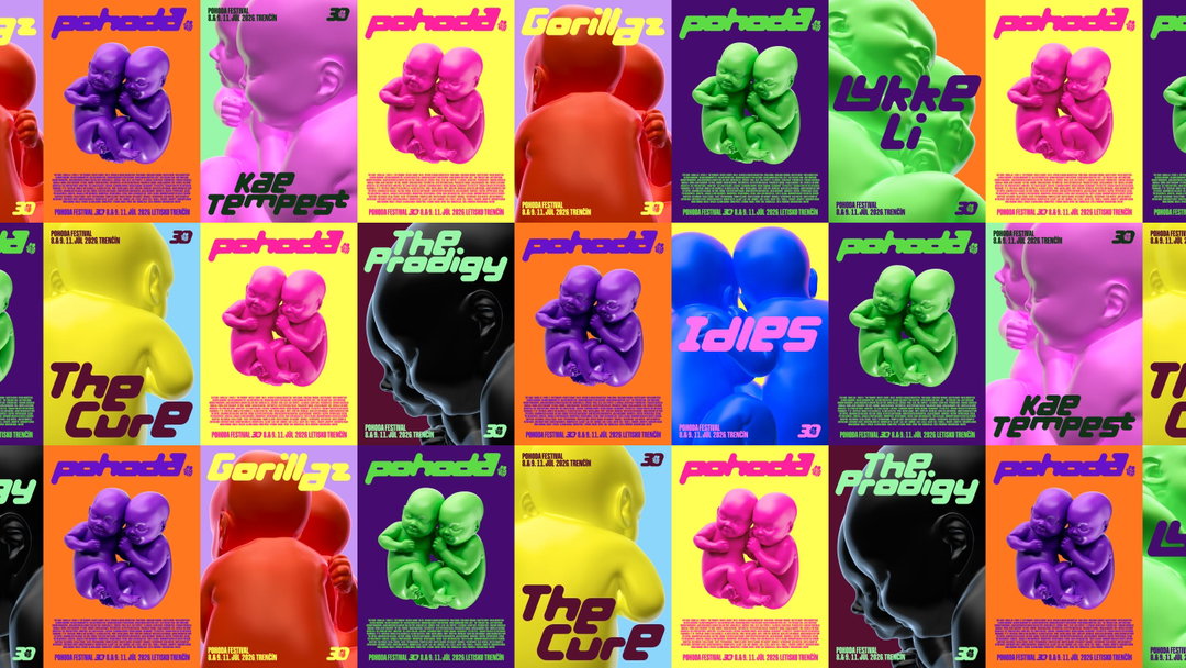
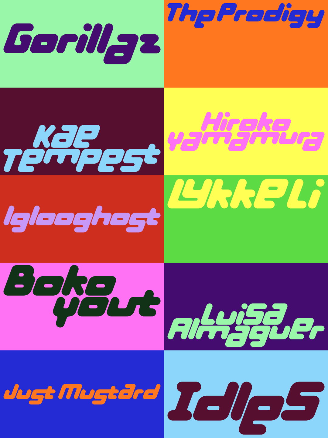
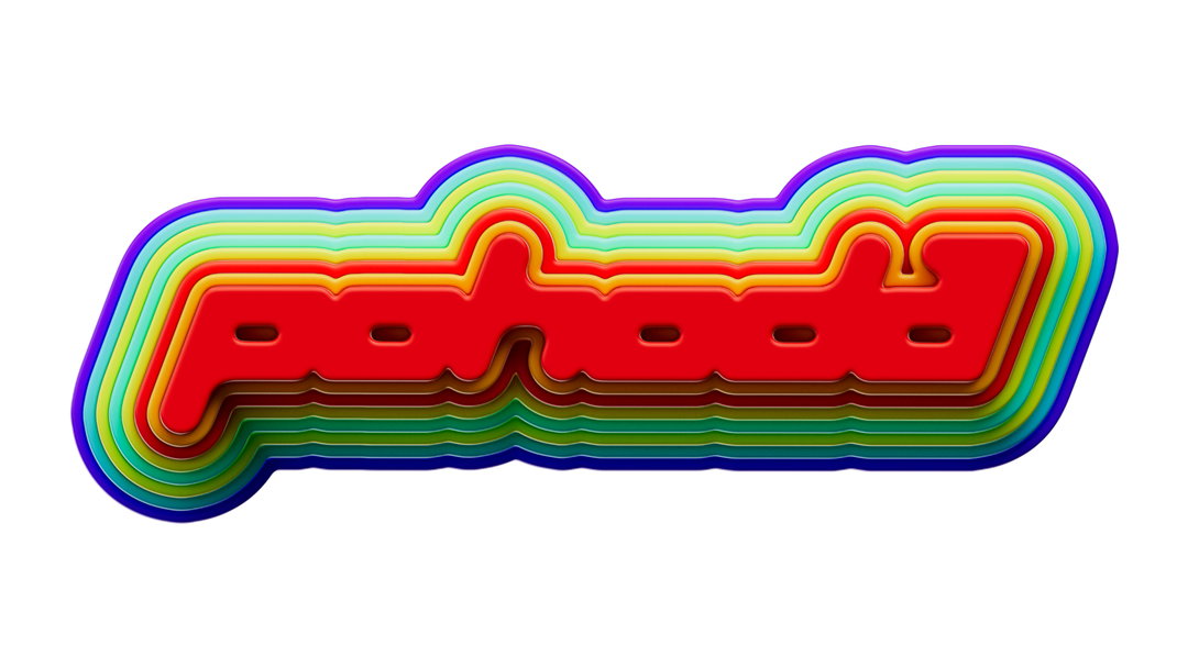
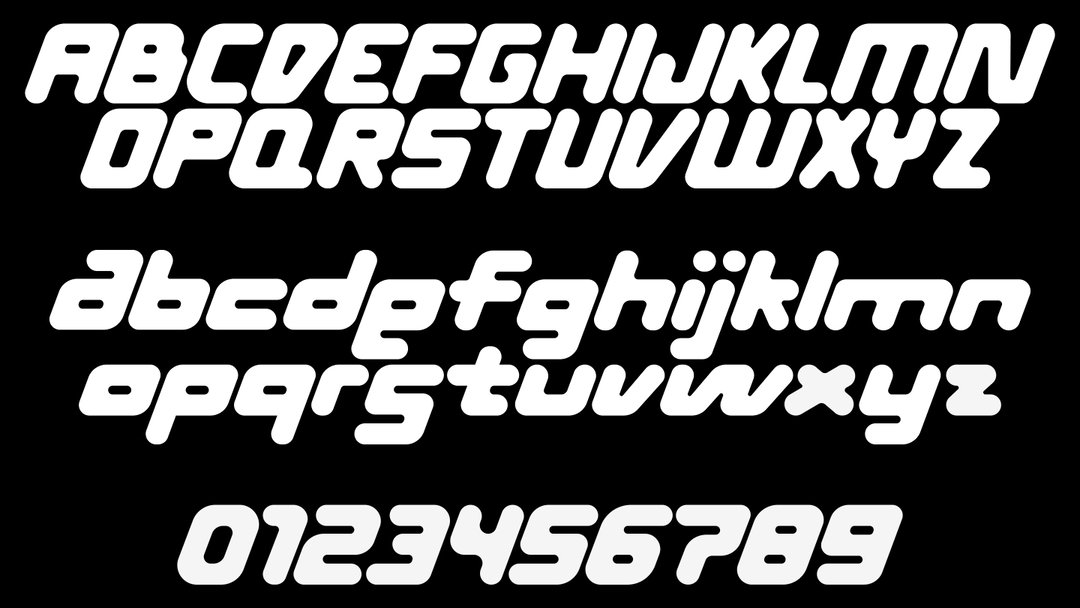
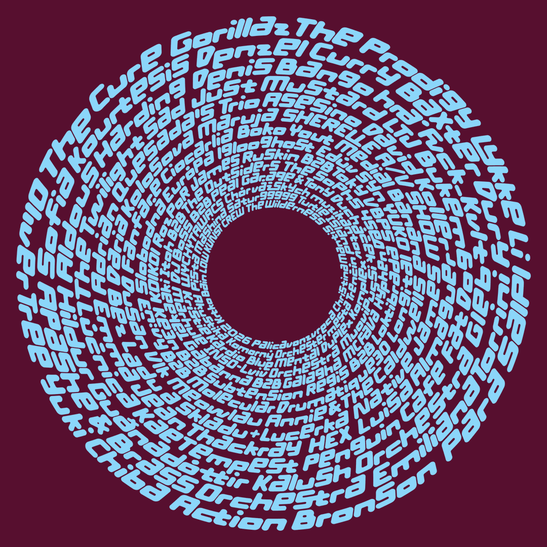
“Another special thing about Pohoda is that it brings together different generations. It’s a beautiful cross-generational melting pot – Gen Z newcomers, indie millennials, 90s ravers proving that they still have it, grandparents taking care of their grandchildren while mum and dad are reliving their puberty,” says Andrej B. “It really feels like a second Christmas cause everyone celebrates it.” The new identity for Pohoda definitely brings together that melting pot, mirroring the hot, saturated colours of 90s dance music videos with a futuristic, rounded typeface that looks ripped from old club posters. But its origin is actually found in the festival’s communications in pre-2010. “We reinterpreted this original lettering as a display typeface with geometric construction and rounded forms [...] one of the typeface’s defining principles is the treatment of the lowercase a, e and s. They share the height of the capitals and can align to either the upper or lower edge of the line,” says Andrej Č. Therefore, the billed artist’s names become more than simply typeset words – each can function as an individual piece of lettering, with its own composition and rhythm.
Andrej & Andrej: Pohoda Festival (Copyright © Andrej & Andrej, 2026)
Looking back at the festival’s history, the two Andrejs’ wanted to carry forward its personality, changing its materials, colours, textures, levels of abstractions, veering into the sculptural and glossy and sometimes the simplistic. “Freedom is one of Pohoda’s core values, so we created a colourful gradient version of the logo to represent it. Another version uses bright, candy-like colours, reflecting the fact that Pohoda has always been a very colourful festival, with bold colours playing an important role in its visual identity,” says Andrej Č. “Stripes were closely associated with Pohoda during a particular period of its history. At one point, it almost felt as though the typical Pohoda visitor always wore a striped, navy-like T-shirt. We liked the idea of bringing that visual memory back.” As well as that, the merchandising was of great importance, which Andrej and Andrej developed in collaboration with Linda Straková – drawing on different layers of the identity with production taking place in Portugal at a GOTS-certified factory, with an emphasis on material quality and craftsmanship.
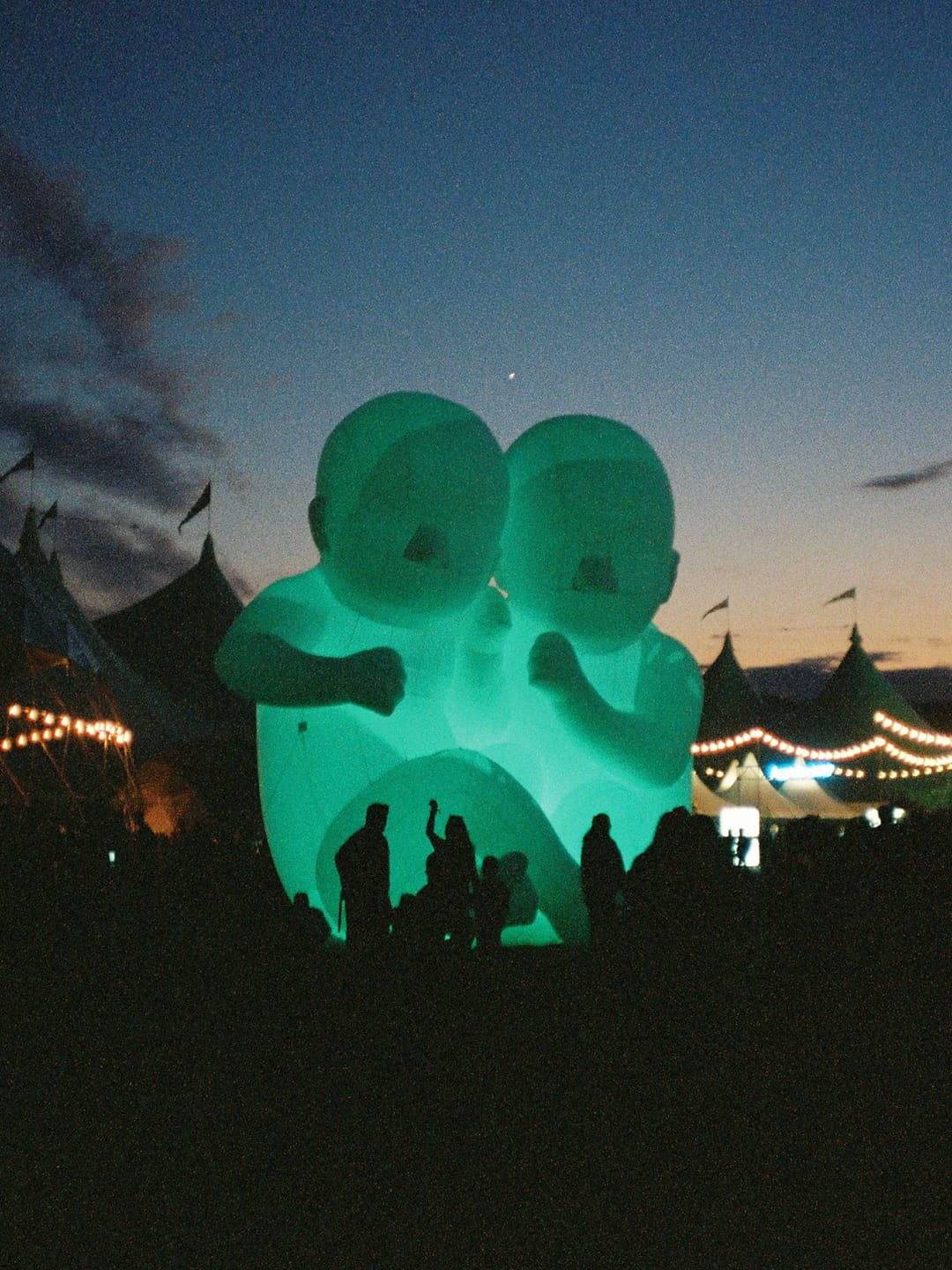
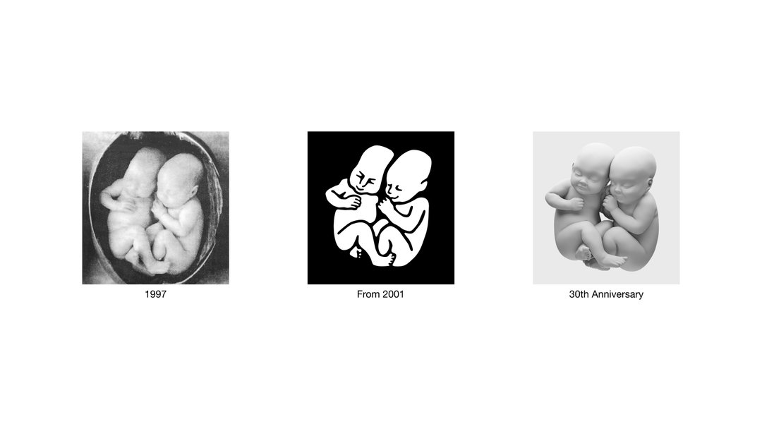
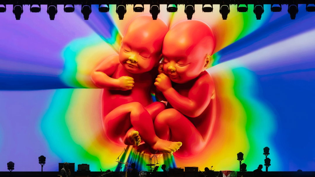
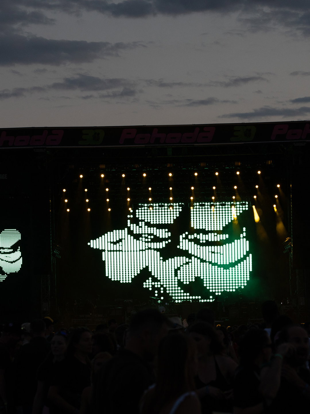
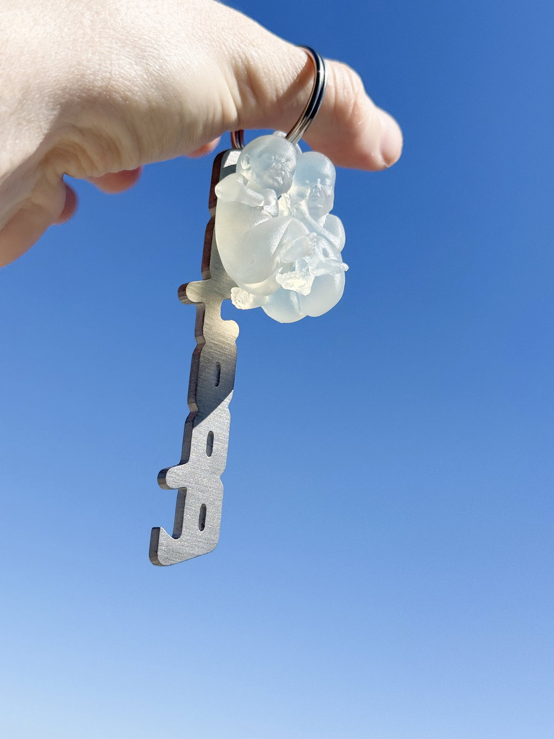
Central to the festivals’ new design is the aforementioned twin baby logo (fitting to be redesigned by two Andrejs’!). Created in collaboration with 3D artist Matej Martinec, the new logo shows how far the festival has come; in 1997, the babies originally appeared as a photograph, then in 2001, a graphic rendition was created. Reversing that process, Andrej and Andrej brought the babies back to the third dimension, developing a digital model of the iconic pair. This opened the floodgates for what was possible across the festival’s design, such as being turned into an enormous inflatable twin sculpture, looming over festival-goers like the famous space baby from 2001: A Space Odyssey – and there’s even a neat transparent keyring of the babies. “It reflects the meaning of the Slovak word pohoda: a feeling of ease, closeness and togetherness. Over the years, these two babies have become one of the most recognisable visual symbols in Slovakia,” says Andrej B.
GalleryAndrej & Andrej: Pohoda Festival (Copyright © Andrej & Andrej, 2026)
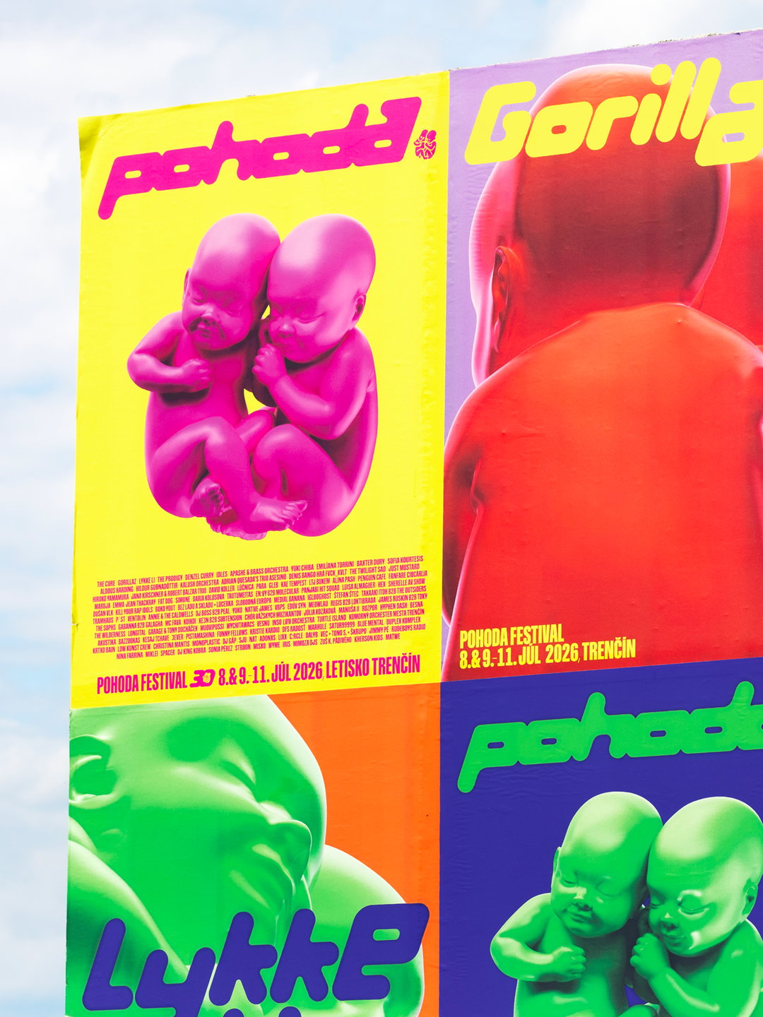
Hero Header
Andrej & Andrej: Pohoda Festival (Copyright © Andrej & Andrej, 2026)
Share Article
Further Info
About the Author
—
Paul M (He/Him) is a Junior Writer at It’s Nice That since May 2025. He has a strong interest in graphic design, digital kitsch, multimedia painting, collage, nostalgia, analogue technology and all matters of strange stuff. pcm@itsnicethat.com
To submit your work to be featured on the site, see our Submissions Guide.