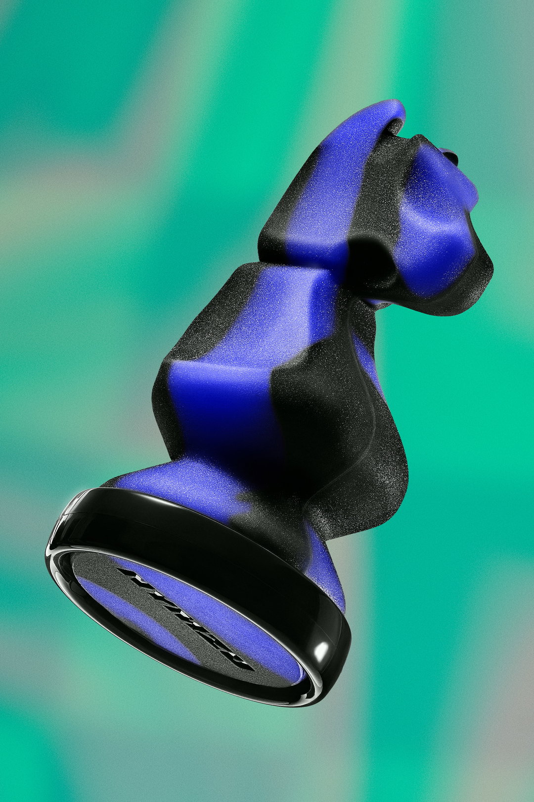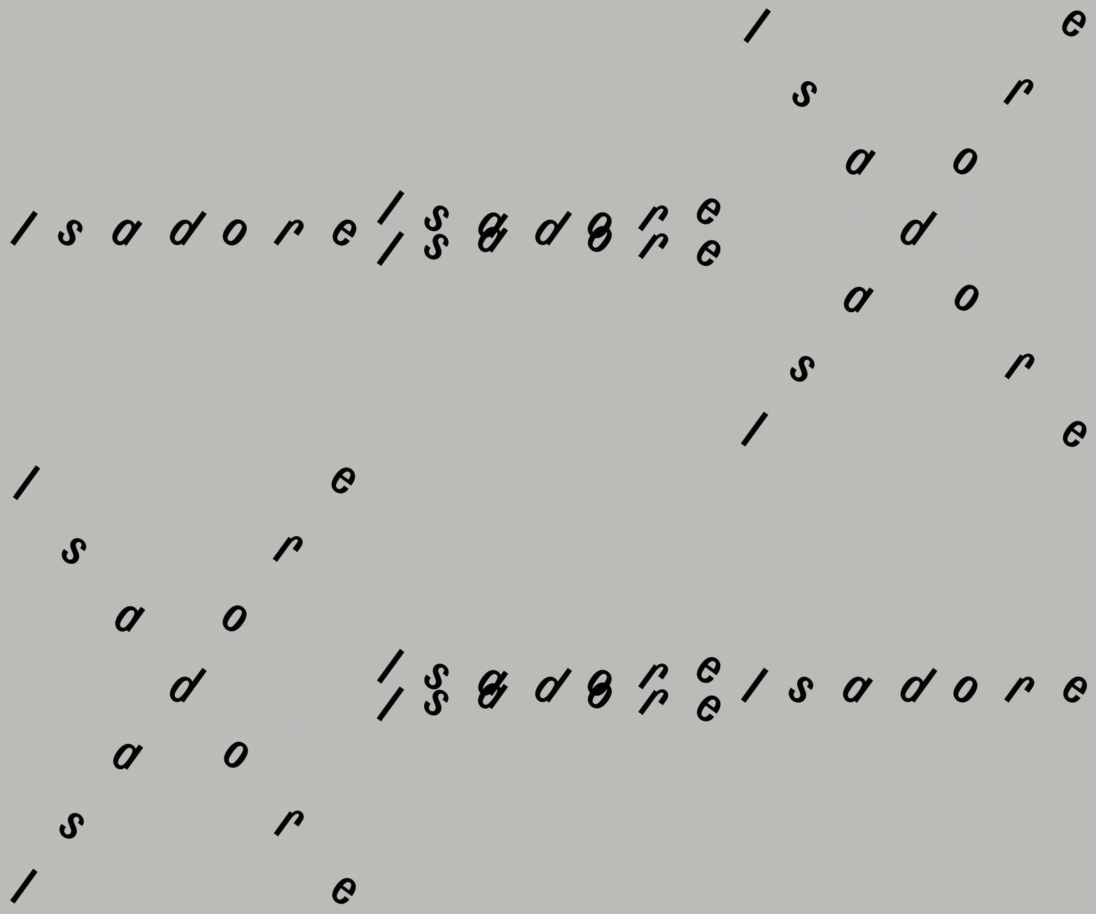
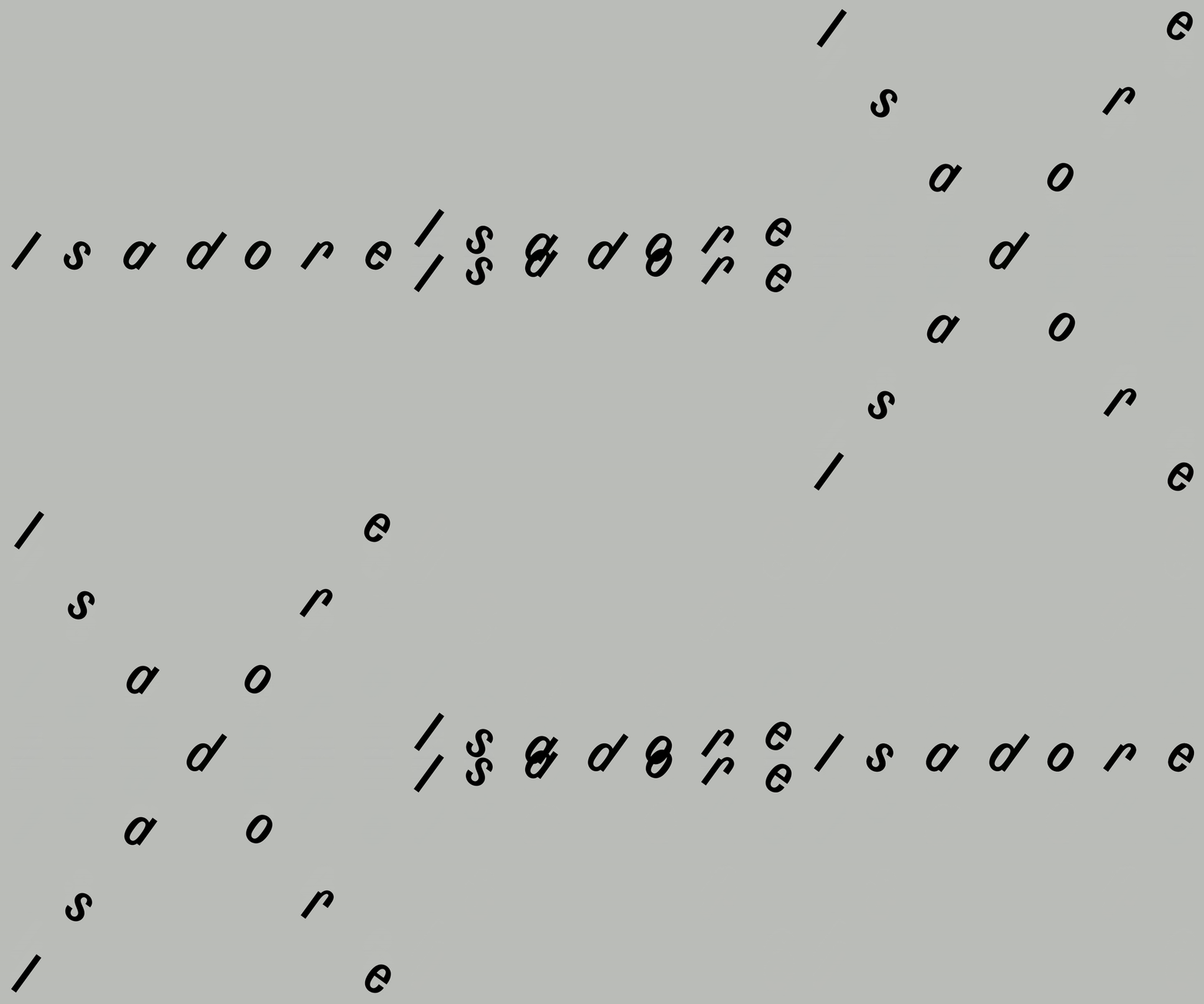
Andrej & Andrej’s identity for Isadore mimics the speed and rhythm of cyclists in a peloton
Typography takes centre stage in the design duo’s flexible visual system for the sportswear brand, spelling out clever design solutions across applications.
As a brand established by two pro cyclists, Isadore’s apparel and approach has always been centred on simplicity and minimalism, leaving room to focus on the joys of cycling not the fuss or frills of what you might wear on the bike. Founded by brothers Martin and Peter Velits in 2018, Isadore is built on a shared vision to make the clothes the pair always wanted for themselves, whilst caring for nature and the people behind the sport. Recently in search of a brand identity that better encapsulated its sustainable, utilitarian roots, Martin and Peter turned to Andrej & Andrej, Slovakian design studio and experts in bespoke visual systems that have been cropping up across all corners of the cultural sector over the last few years.
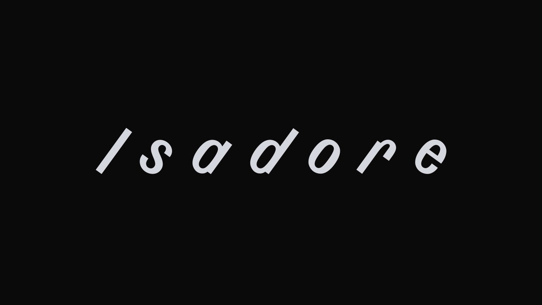
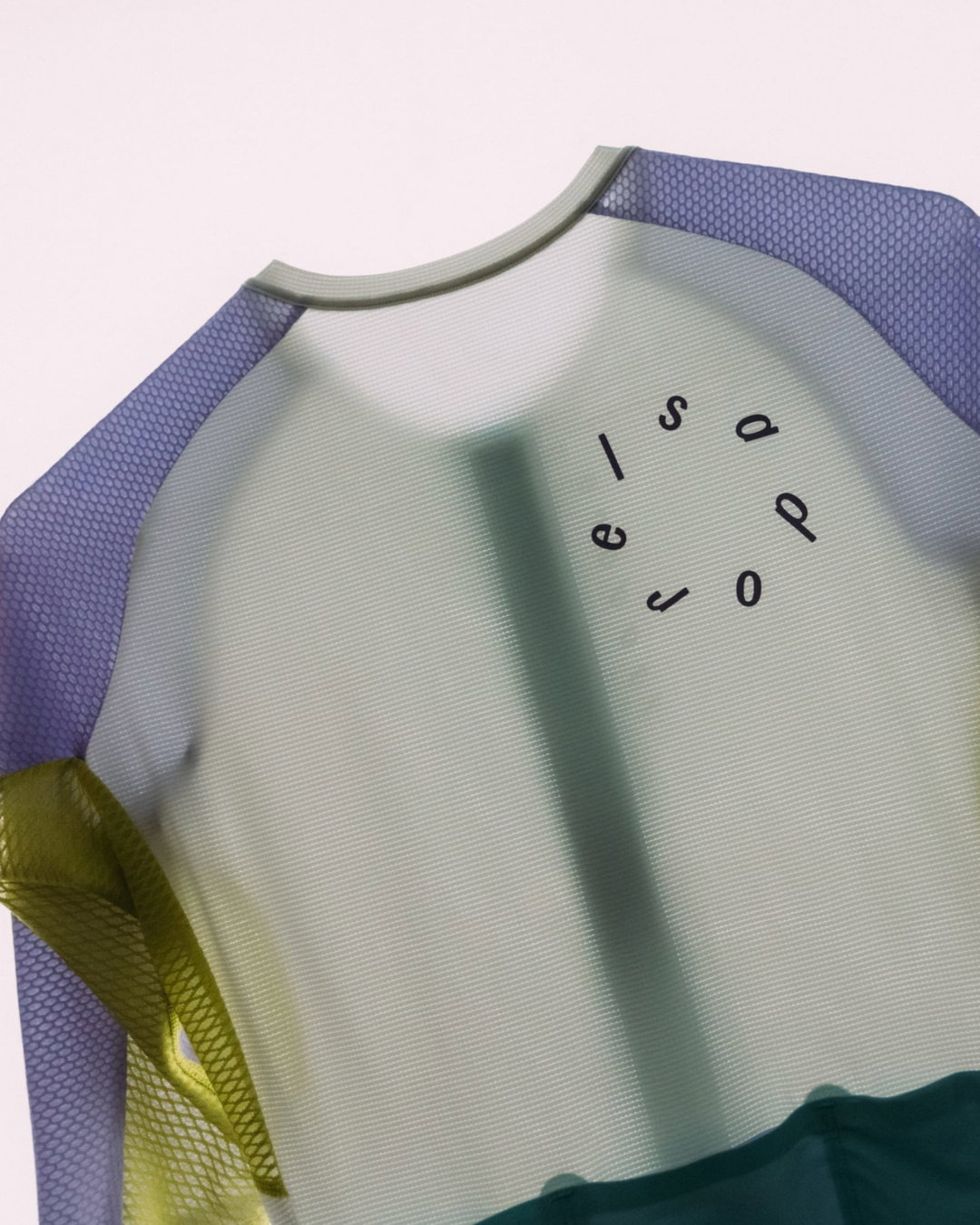
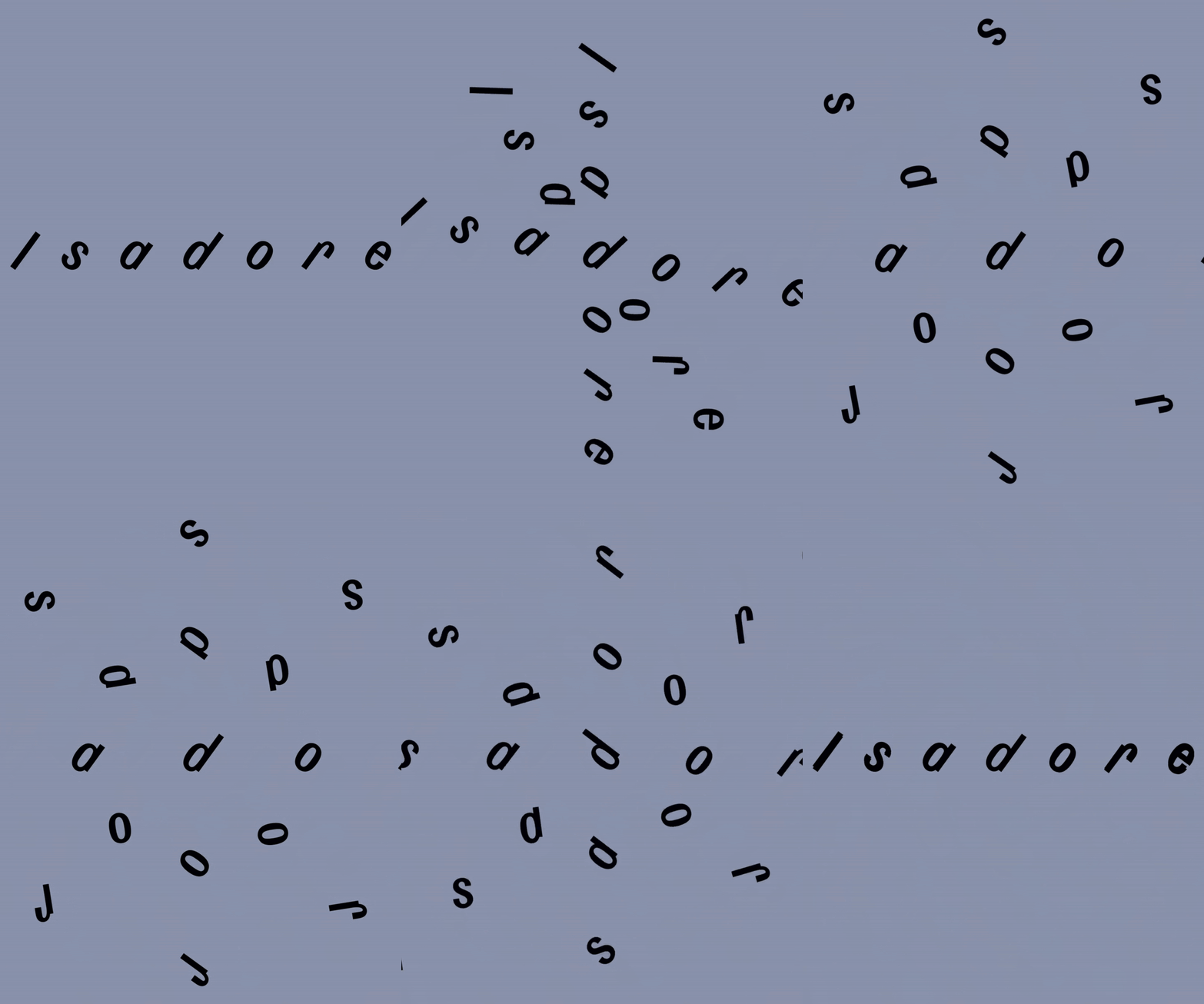
“When we met with Isadore, we resonated deeply with the brand’s philosophy of balance – both in their design needs and their connection to the cycling community”, says studio co-founder Andrej Barcak. Extending this simple concept into a rehashing the brand’s logo, Andrej & Andrej used the slanted look of Isadore’s existing brand mark as a starting point for a cleverly orchestrated identity that sets type into motion to mimic cycling manoeuvres.
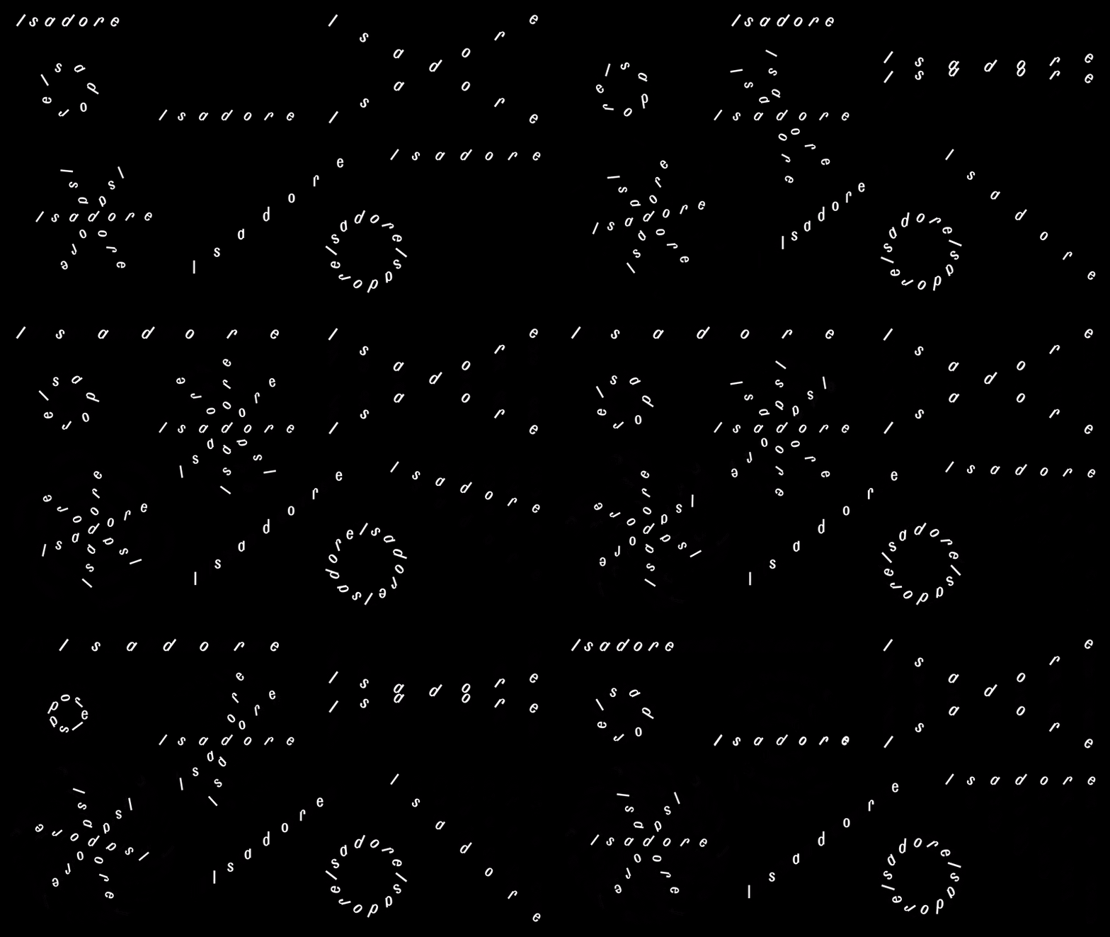
Andrej & Andrej: Isadore (Copyright © Andrej & Andrej, 2024)
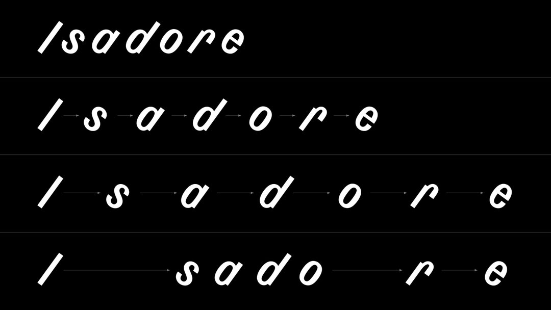
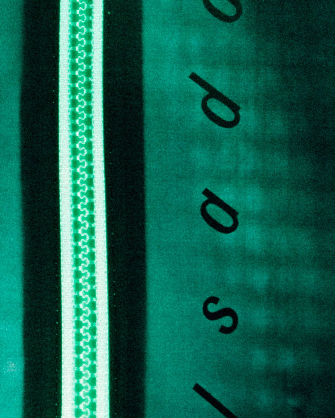
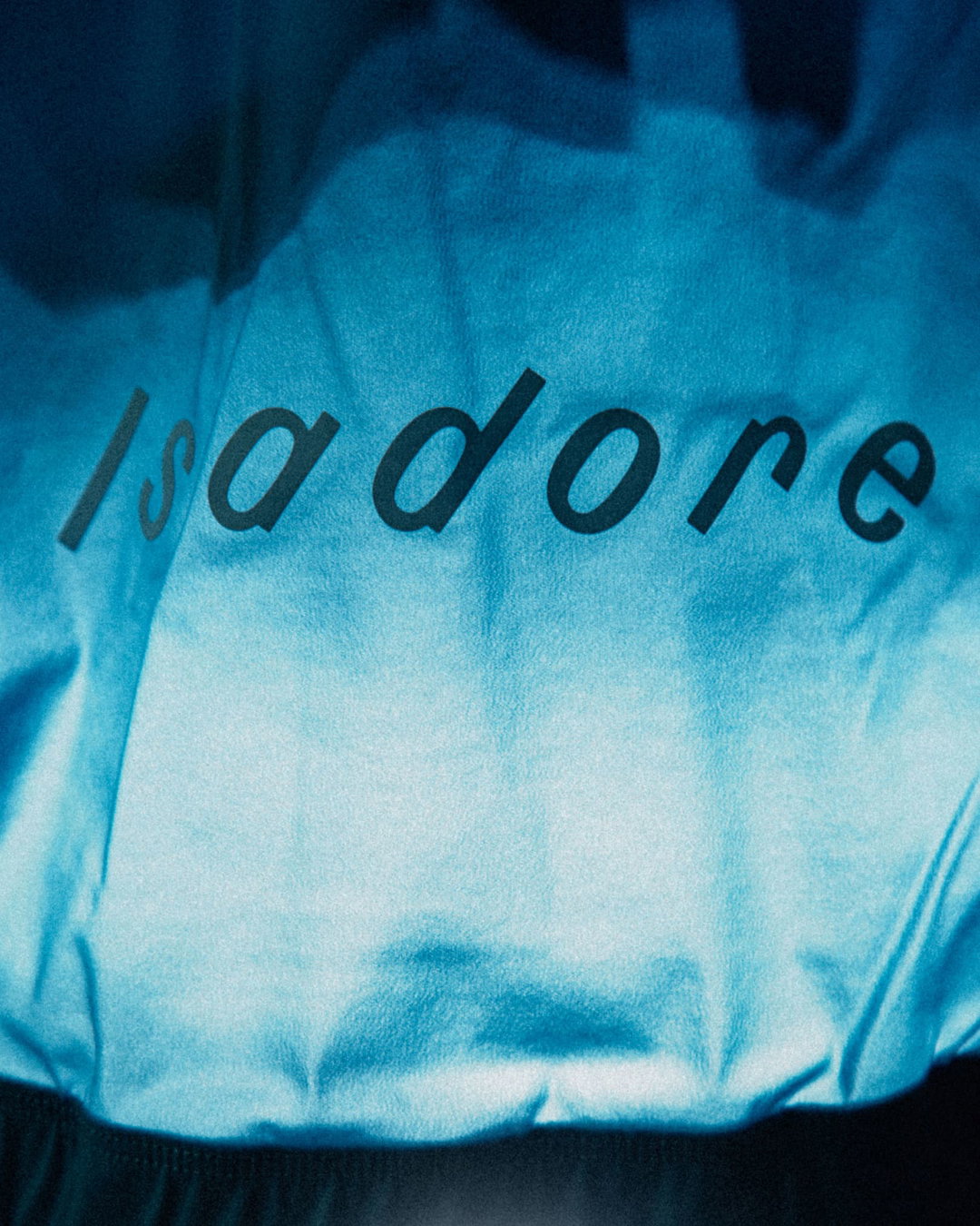
“Upon the existing logo a new idea was applied, inspired by the cycling peloton,” says Andrej. As a way of conserving energy, cyclists in pelotons use ‘drafting’, by which they keep pace with each other by mimic one another’s ride and keeping the same spacing. Translating this typographically, Andrej & Andrej let letterforms merge into singular channels and slant outwards at speed, using motion as a way to capture the fluidity of these cycling formations and nod to the wonderfully collaborative nature of the sport. “This principle of equal energy, pace and space distribution was applied as a metaphor to the whole visual identity, whether it comes to the custom characters or the headline typeface.”
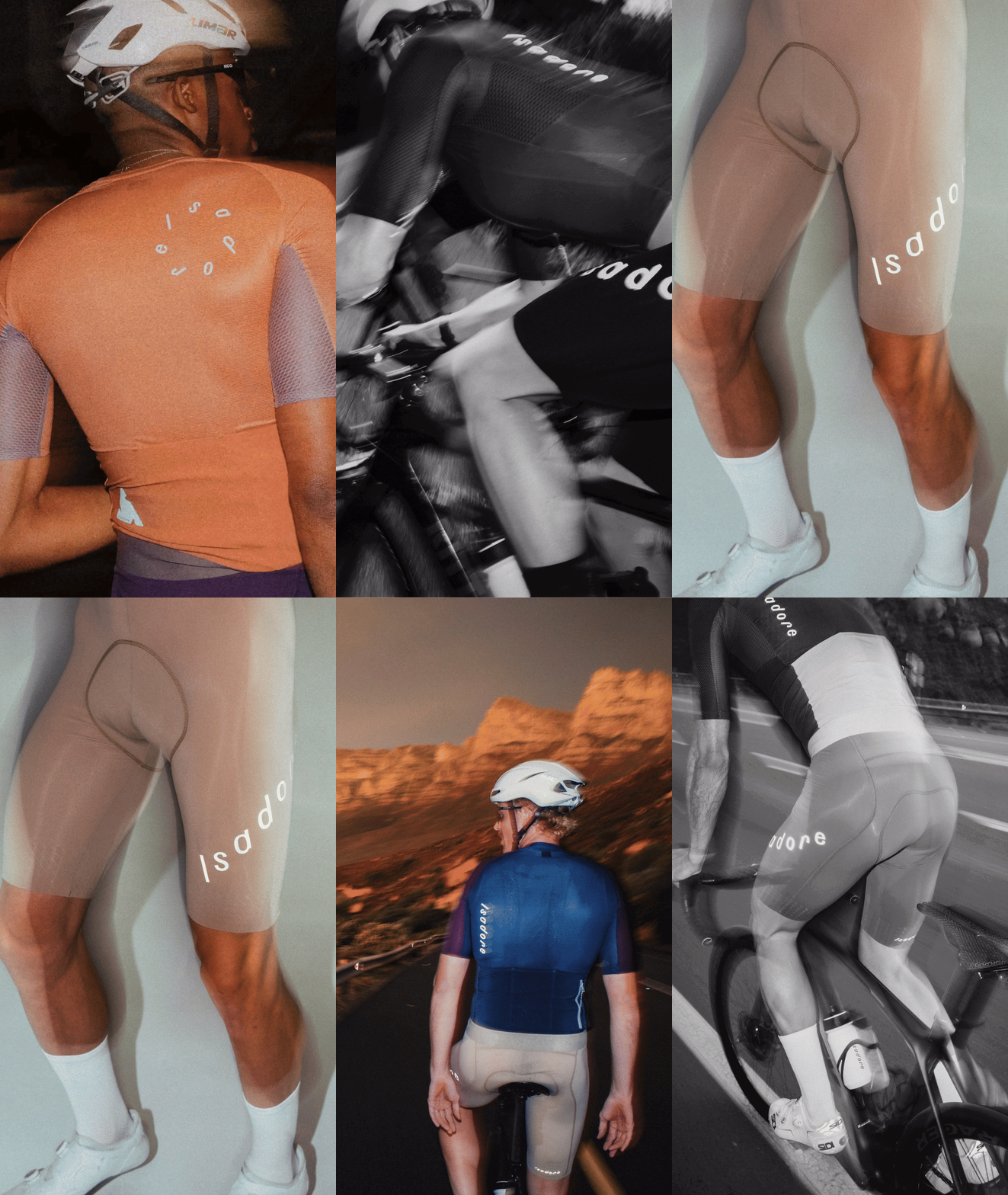
Unlike the previous logo with a “brush-like slightly handcrafted character”, says Adrej, “the new logo features custom type, with individually set letters.” This allowed the studio to make use of its layout to adapt to different applications in the design system. Its flexible letterforms are able to accommodate everything from the stretch of elastic fabrics used in Isadore’s collection of clothing, to static brand outputs like printed labels and store signs. The logotype was also designed to be legible from a greater distance when on the move, its variable nature allowing it to be placed on multiple touch points on the brands gear.
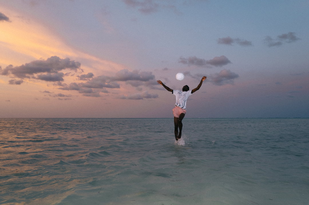
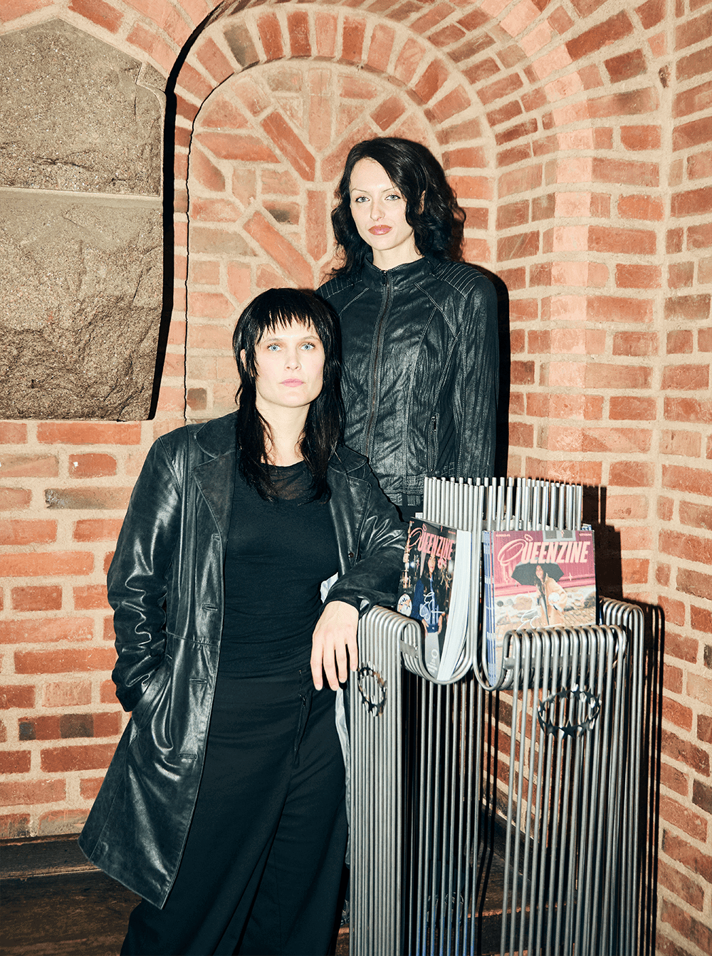
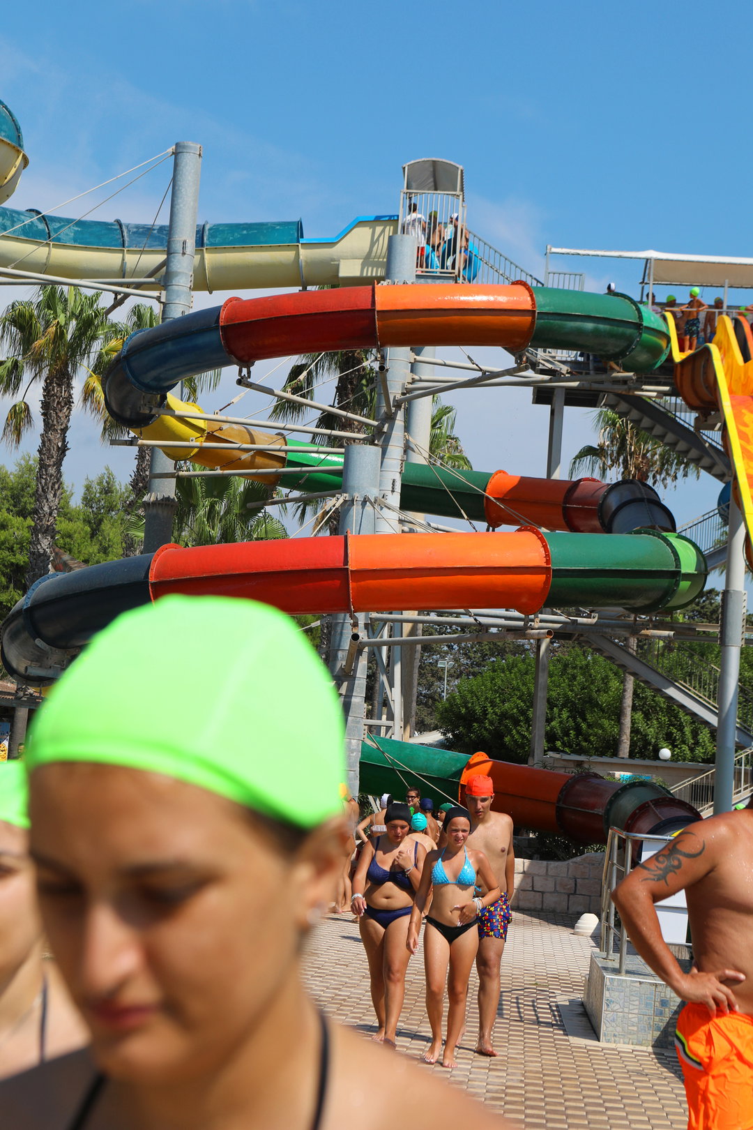
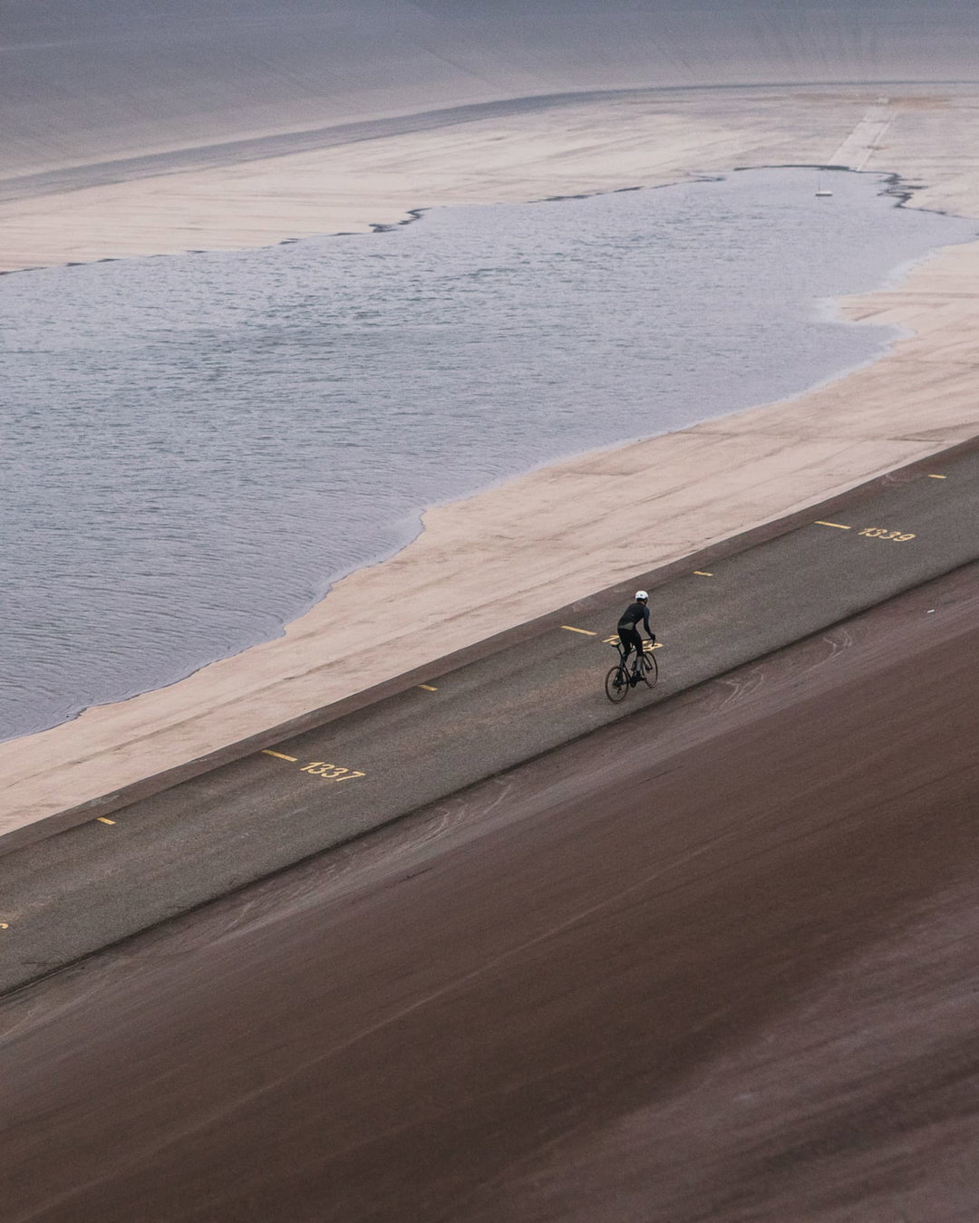
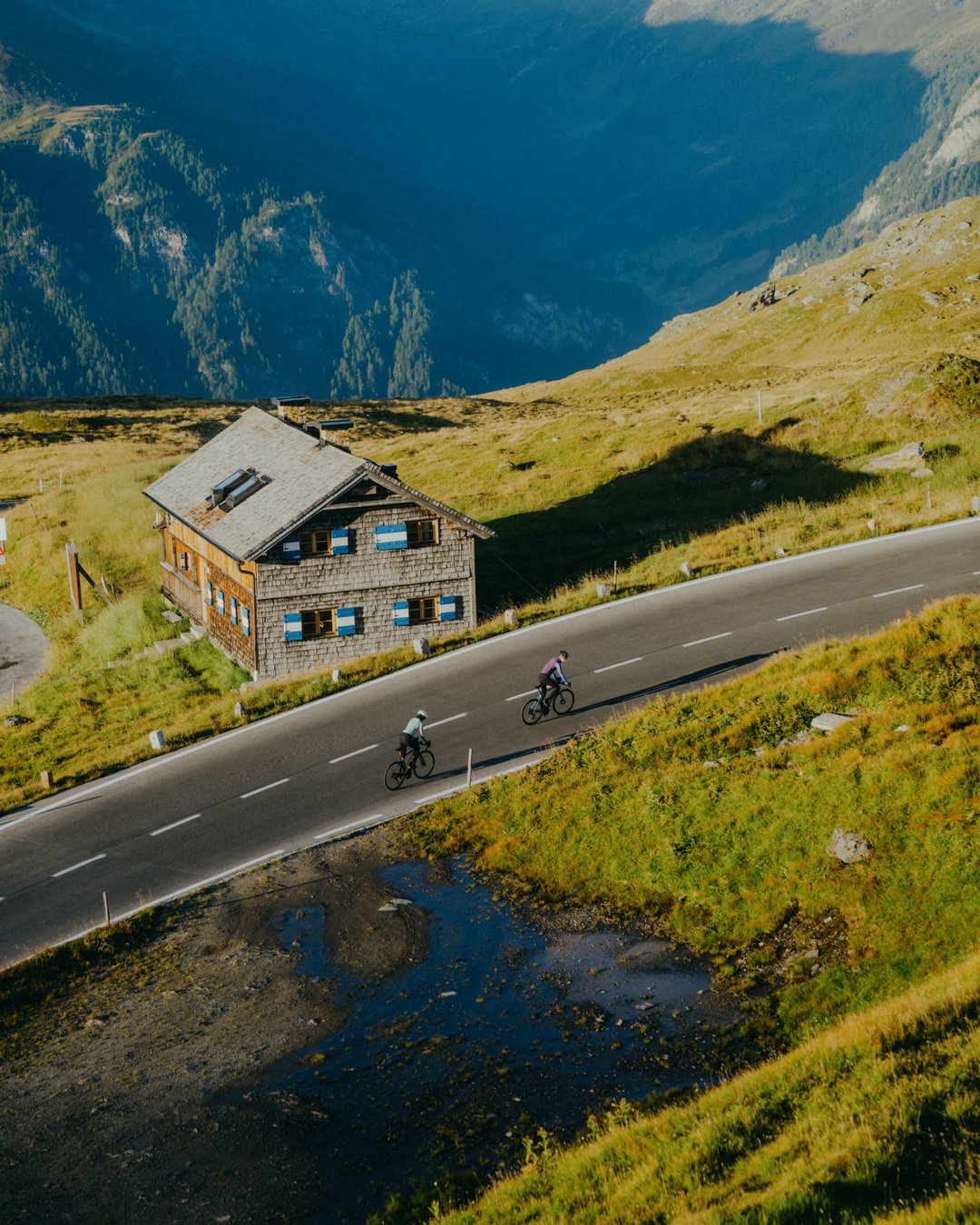
Whilst type certainly takes centre stage in the new identity, Andrej & Andrej’s colour palette, photography and styling were carefully chosen to further nod to the brand’s minimalist spirit as well as its connection to nature. Forming a more muted background for its dancing type, the studio’s choice of hues came from natural scenes turned into “minimal surfaces and colour palettes” that define its design language. “We aimed for the colours to evoke the raw, authentic experience of the ride, showcasing cyclists in action, connected to nature,” concludes Andrej. “This palette reflects in it the environment, the season, the weather and the product.”
GalleryAndrej & Andrej: Isadore (Copyright © Andrej & Andrej, 2024)

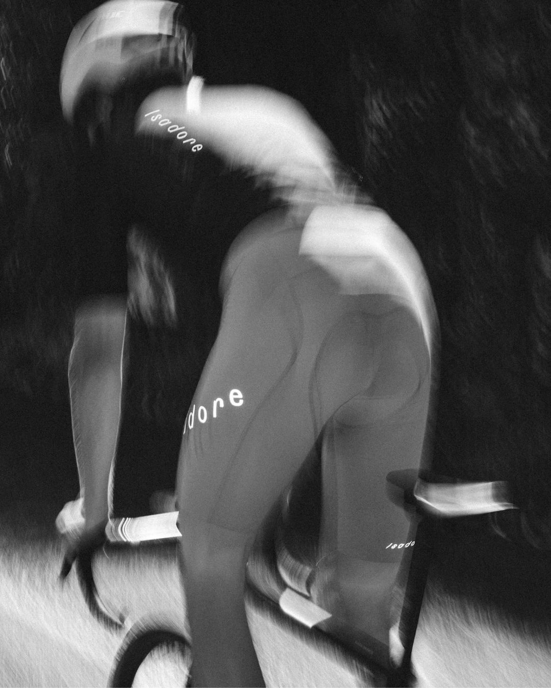

Hero Header
Andrej & Andrej: Isadore (Copyright © Andrej & Andrej, 2024)
Share Article
Further Info
About the Author
—
Ellis Tree (she/her) is a staff writer at It’s Nice That. She joined as a junior writer in April 2024 after graduating from Kingston School of Art with a degree in Graphic Design. Across her research, writing and visual work she has a particular interest in printmaking, self-publishing and expanded approaches to photography. [email protected]
To submit your work to be featured on the site, see our Submissions Guide.