




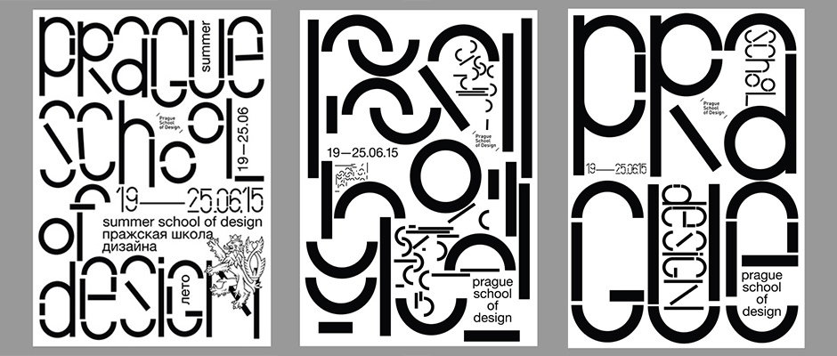
Anna Kulachek creates a playful modular identity from illustrations of Prague
The very best graphic identities, as designer Anna Kulachek would attest, take on a life of their own. The Moscow-based creative has been working on identities for the Prague School of Design since 2012, and they’ve since grown into an evolving body which grows and reforms with each new brief. “In the beginning it was built on the illustrations of the city,” Anna explains, “because one of the points in the brief was to show what’s happening in Prague. So I decided to draw the school in simple shapes.”
Since then, Anna has simplified these illustrations down to their most basic forms, creating a kind of modular vocabulary which can be used in a multitude of different ways. “For a few years now I have been experimenting with the detail in the illustrations,” she continues. “Basically it became a game of construction with these details, which I can use as I want.”
This year she has gone as far as to create a typeface with them, employing curves and straight lines to build a fun, playful and malleable font. “For me it’s like next level of the game. I can’t stop playing with it!”
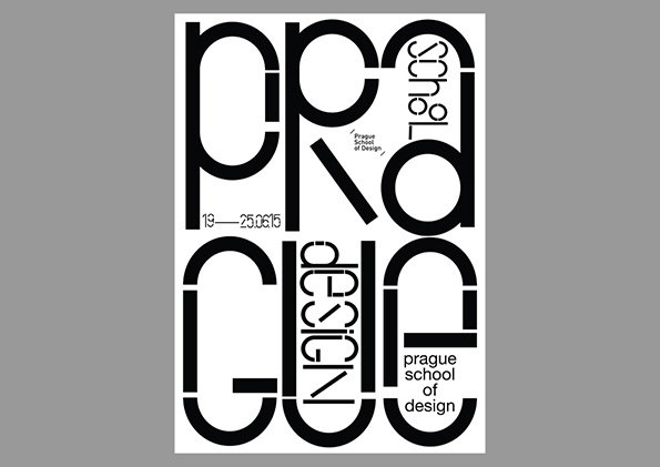
Anna Kulachek: Prague School of Design, Summer Show Identity 2015
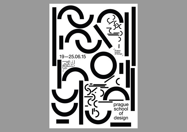
Anna Kulachek: Prague School of Design, Summer Show Identity 2015
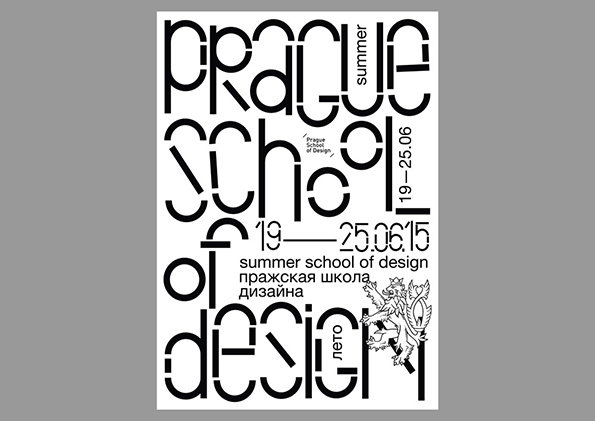
Anna Kulachek: Prague School of Design, Summer Show Identity 2015
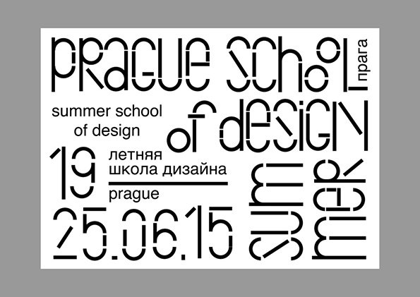
Anna Kulachek: Prague School of Design, Summer Show Identity 2015
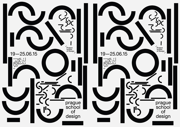
Anna Kulachek: Prague School of Design, Summer Show Identity 2015
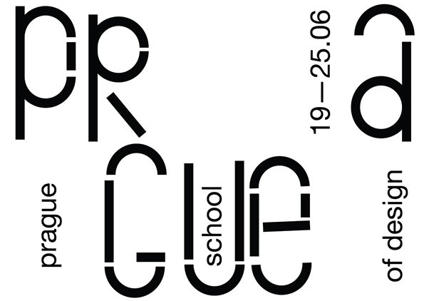
Anna Kulachek: Prague School of Design, Summer Show Identity 2015
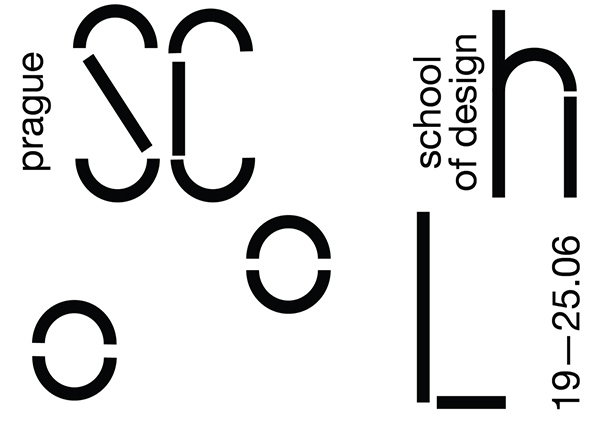
Anna Kulachek: Prague School of Design, Summer Show Identity 2015
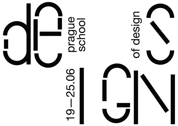
Anna Kulachek: Prague School of Design, Summer Show Identity 2015
Share Article
Further Info
About the Author
—
Maisie joined It’s Nice That fresh out of university in the summer of 2013 as an intern before joining full time as an Assistant Editor. Maisie left It’s Nice That in July 2015.

