




Nejc Prah and Ansambel opt for eclecticism over consistency in identity for Center Rog
The collective have created a system for the Ljubljana creative institution that nestles a bold graphic logo amongst a “cacophony” of content.
Ljubljana’s Center Rog is a creative hub of immense scale. Once a leather factory and then a bicycle factory, it runs over a massive 10,000 square metres. It hosts ten different production labs – including ceramics, glass, jewellery and wood – has 20 free studio spaces, seven shops, a cafe, a bar, a library and more. With such a wide programme of activities, crafts and recreational spaces on offer, it begs the question, how would you go about creating a cohesive, all-encompassing visual identity. The answer? You don’t.
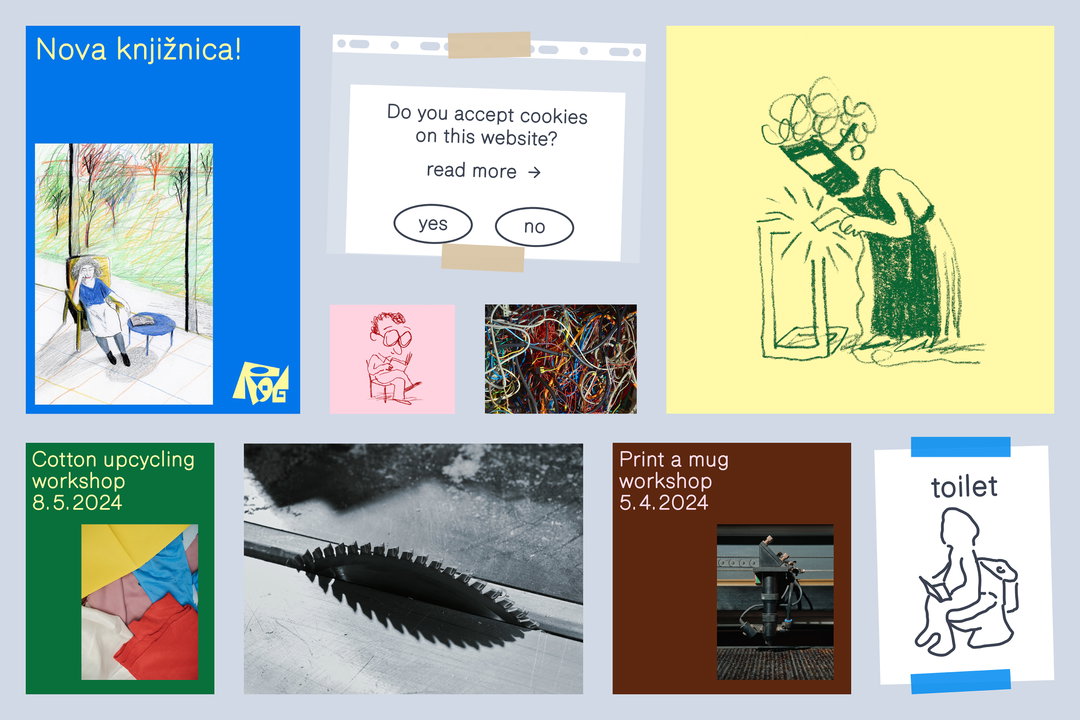
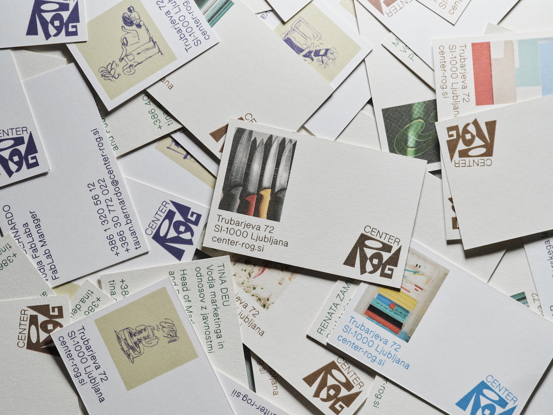
The centre’s identity (including everything from core brand to building signage, web design and campaign graphics) has been created by Ansambel – a “loose collective” of creative friends who occasionally work on projects together. The designer Nejc Prah led the identity, working on the art direction, alongside the photographer Klemen Ilovar, the illustrator Matija Medved, product designer Dan Adlešič, with Studio Loopa helping on motion too. To encapsulate the diverse space, and the core ethos that the space is one “for everyone”, the team decided to form an identity that didn’t have strict rules or limitations. Instead, the visual look is a vibrant collection of many parts. “Of course, there are brand guidelines and to some extent it functions like any other institutional identity,” says Nejc, “but consistency isn’t always the primary consideration.”
GalleryCenter Rog, motion by Studio Loopa (Copyright © Ansambel, 2023)
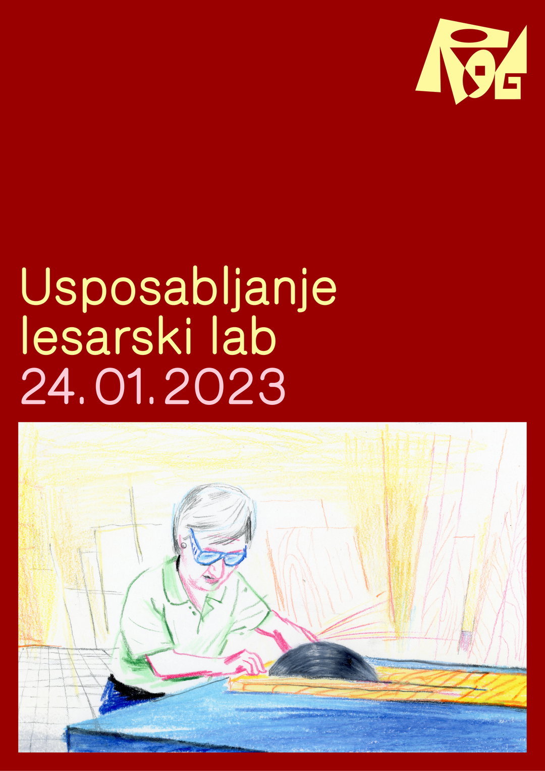
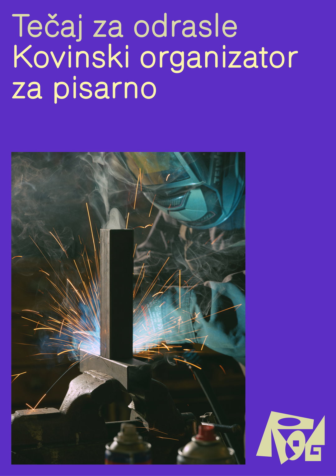
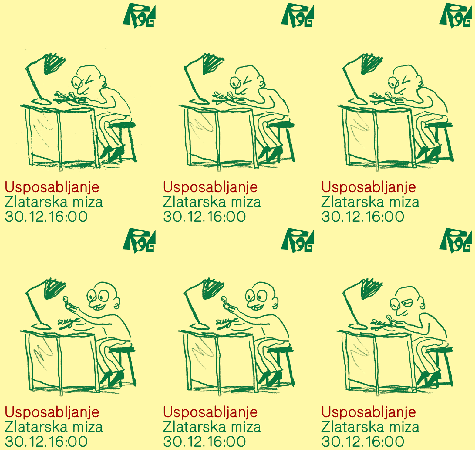
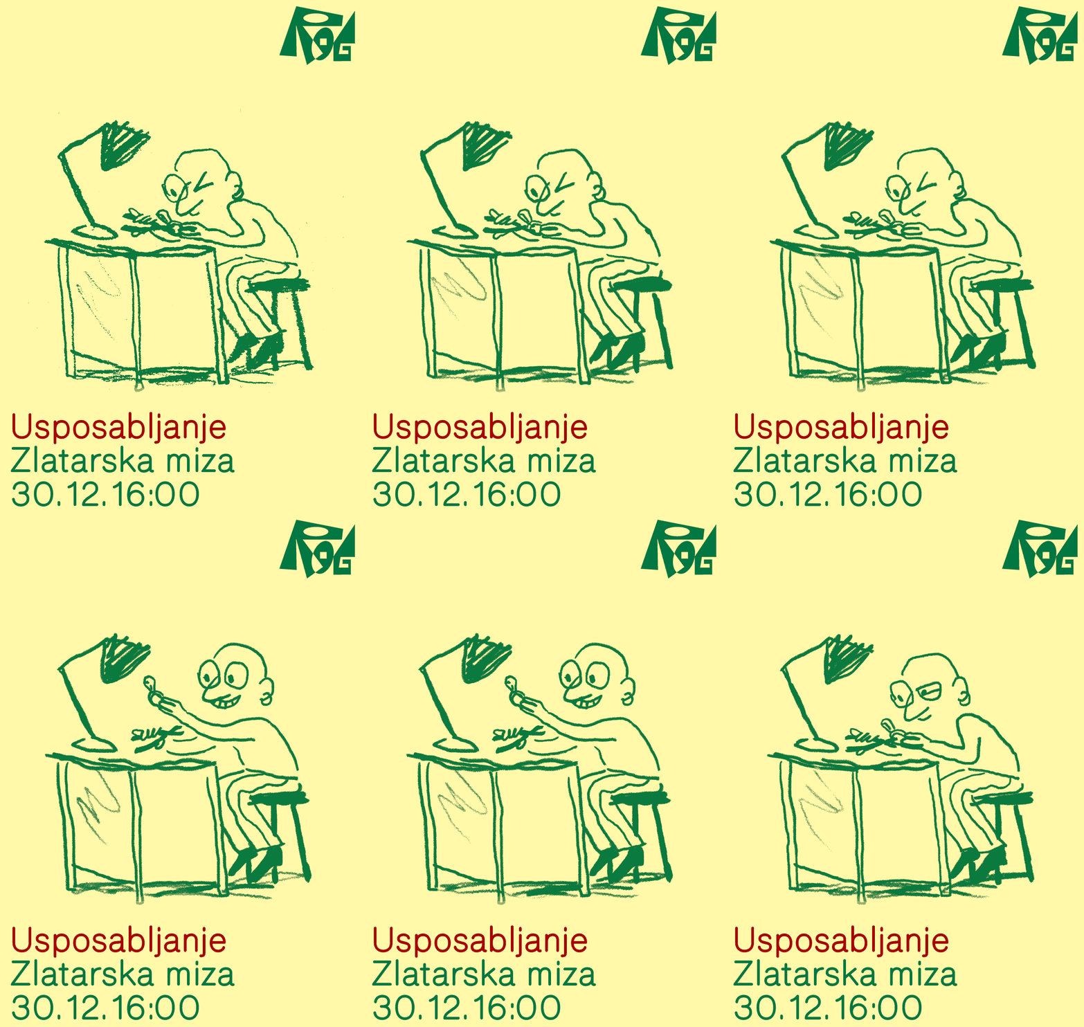
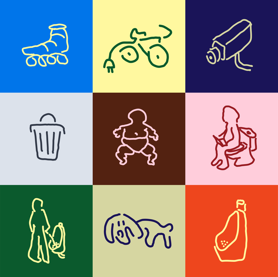
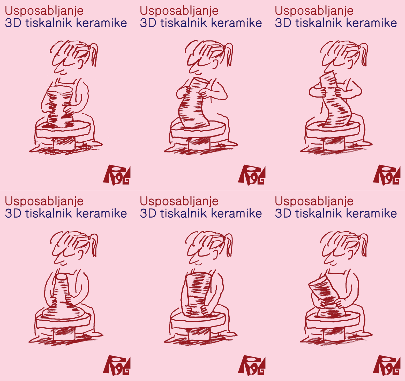
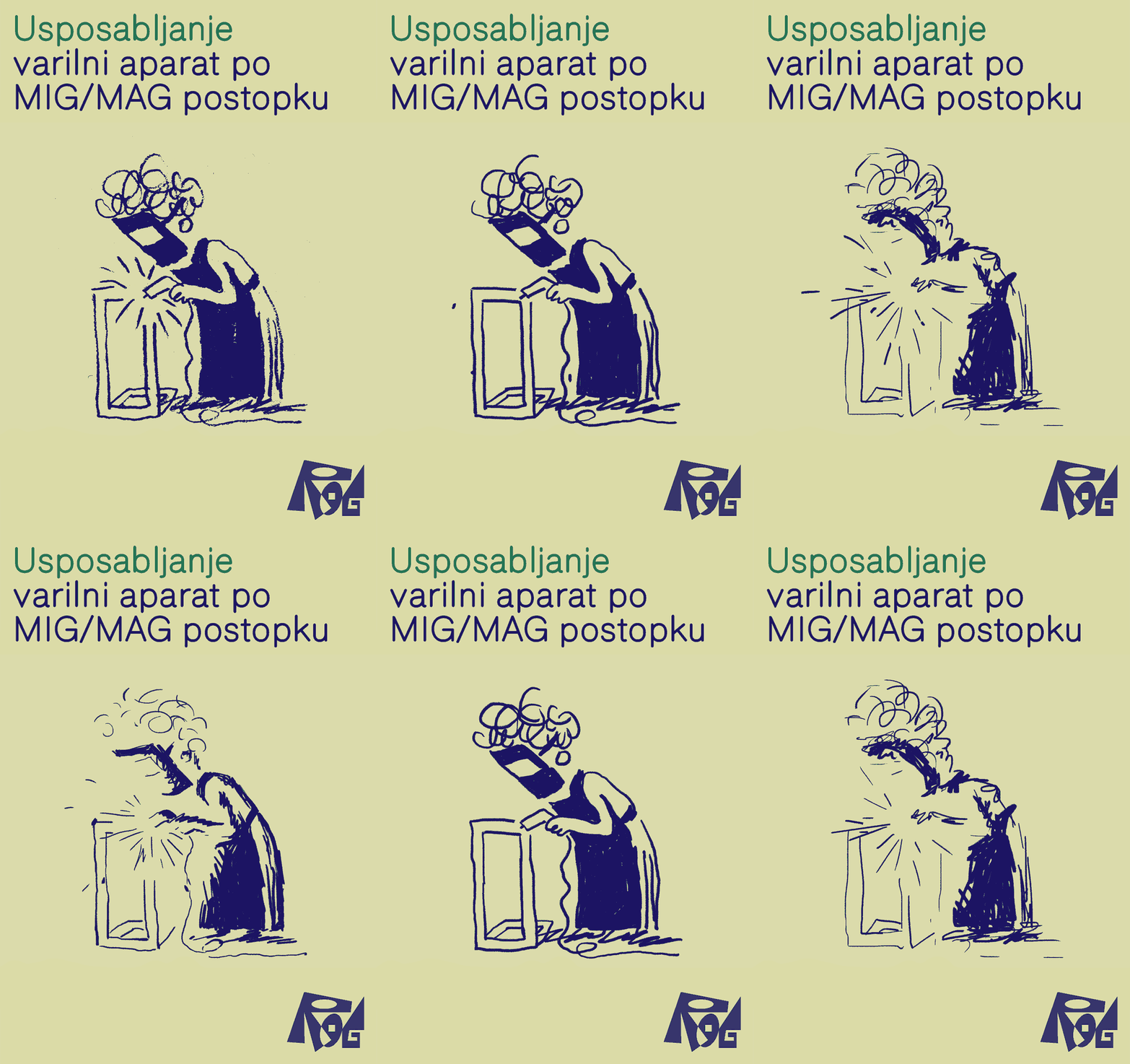
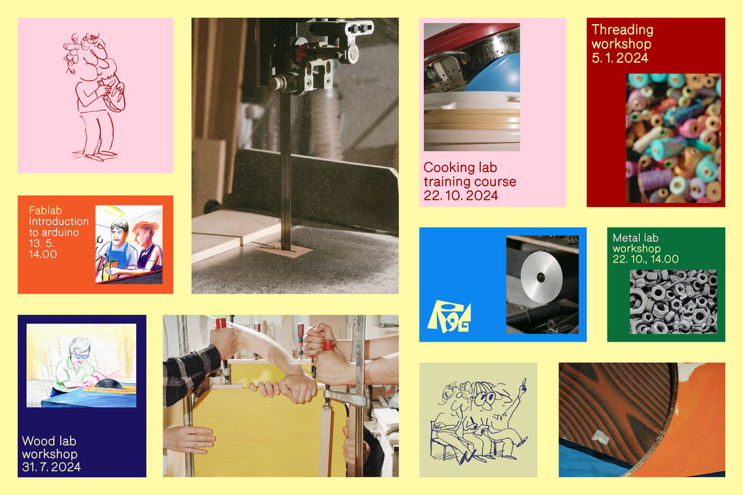
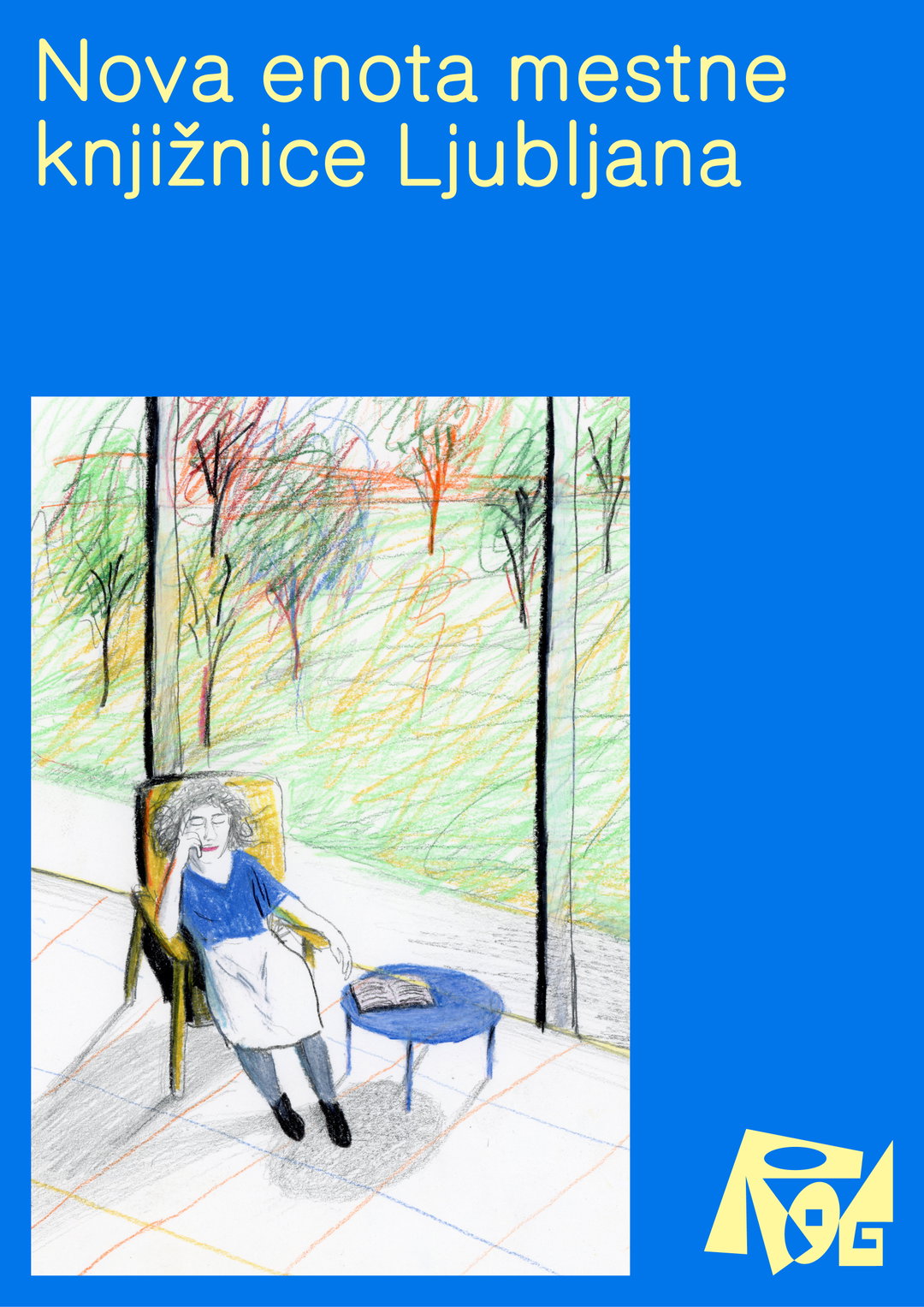
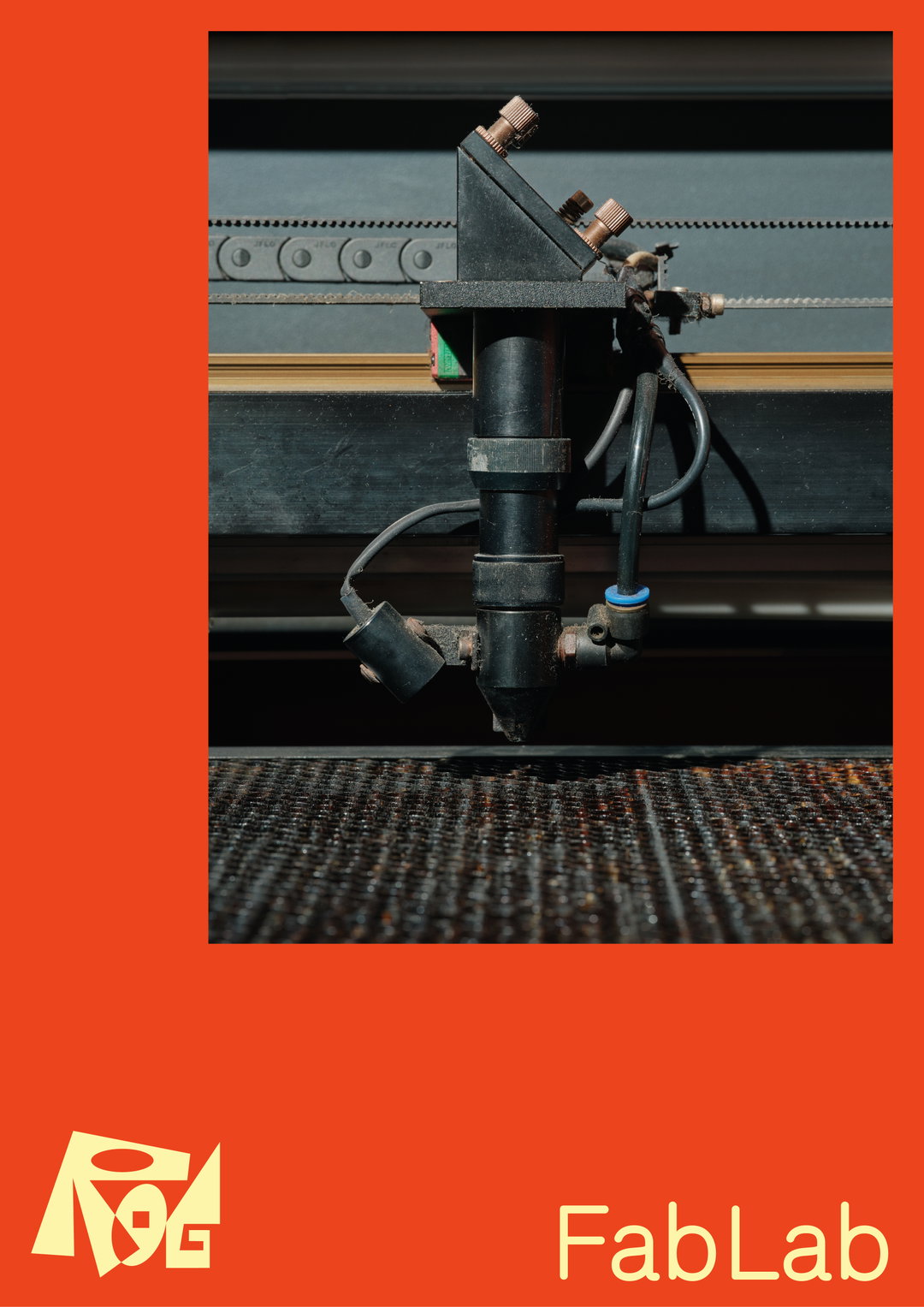
In terms of imagery, the identity uses illustration and photography interchangeably. Matija’s illustrations come in two distinct styles, as sketchy line drawings or more realised coloured pencil illustrations, often showing people at work or relaxing in the space. Klemen’s photographs, however, are much more focussed, lensing in on details, textures and machines, like a metal cutter, wrenches and a line of kitchen knives. This avoidance of people is to ensure that the imagery doesn’t appear too much like stock imagery, and together, the illustration and photos make a “growing collection of images that hint at what Rog is”, Nejc says. He’s aware that this mix might be perceived as “diluting the brand a bit”, but, he says: “I think that some (still quite controlled) mess within this polished renovated building feels right and is actually what the institution needs right now.”
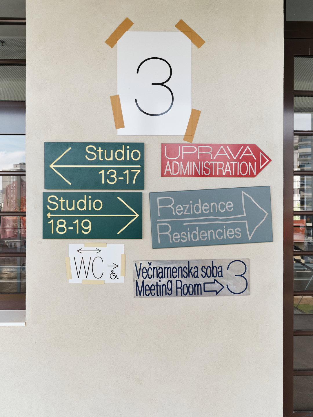
This eclectic approach is also mirrored in the signage the team created. Each sign is made from different materials and dimensions, connected by the use of Rog typography and colours. “Given all the things that are daily happening there, I knew that no matter how many rules I set, the walls would soon be filled with various signs, event identity posters, A4 notes, warning signs and other types of impromptu communication,” says Nejc. “Rather than fight it, the signage blends in.” While colour is varied – a wide palette of 21 colours organised into four triads – there is some restriction to prevent countless combinations, and cool grey is used instead of white as the default background.
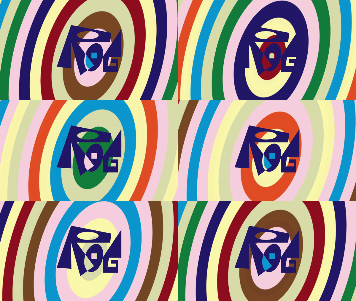
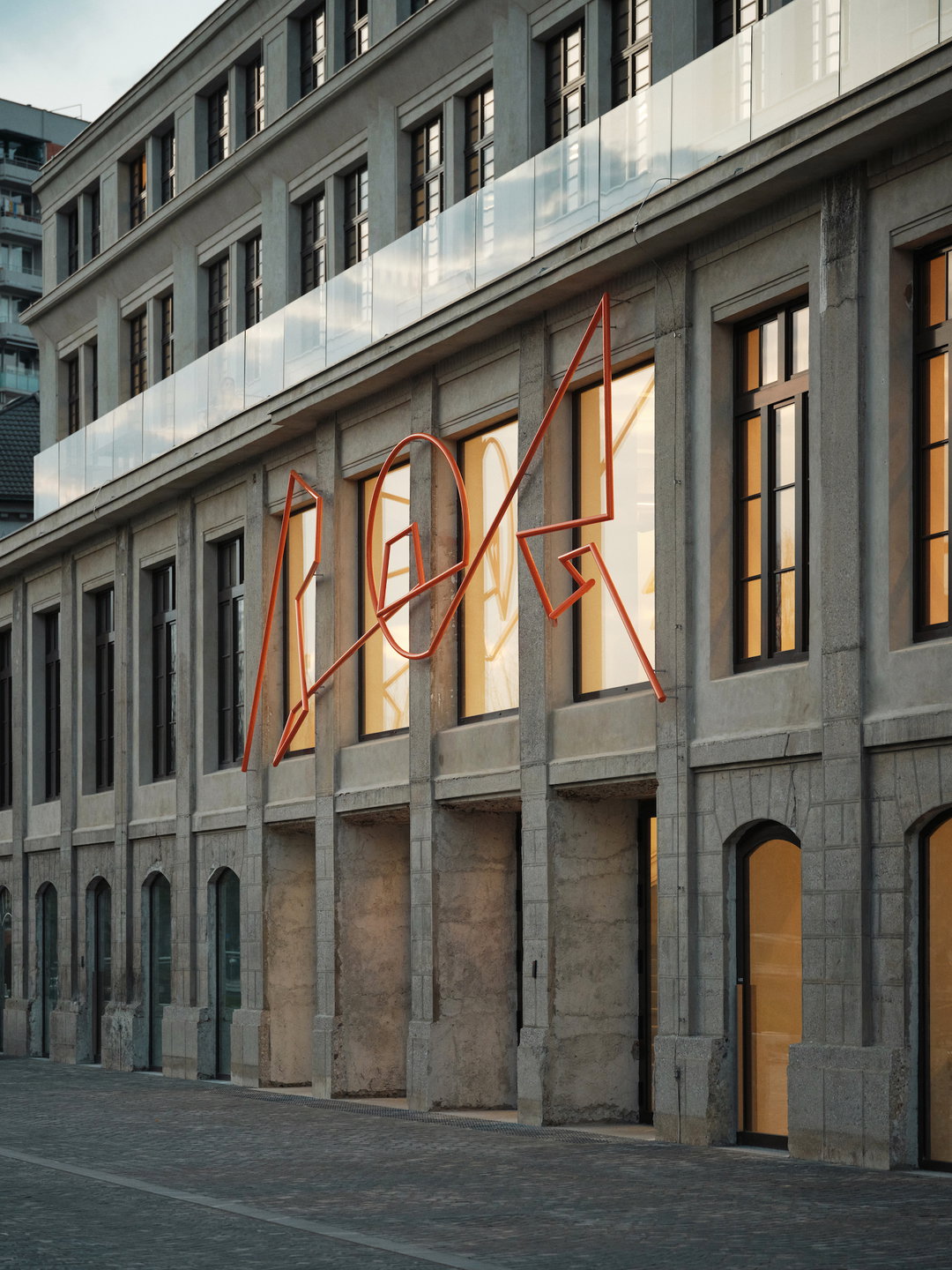
The hub’s logo was the main channel for the team to accurately represent what sort of space Rog is. “We definitely wanted to avoid something that resembles a modern art institution, since lots of people think that is what Rog is,” says Nejc. “We thought of a logo that is bold and graphic, one that can work as a signifier on its own when surrounded by the cacophony of Rog’s content.” Its three-letter name makes it the perfect aspect to create something “graphically strong and compact while maintaining legibility” – the result is spiky, slightly off-kilter and bursting with character. But for Nejc, the logo is still the most ‘traditional’ aspect of the whole design; its balance of positive and negative space, a mix of angles and curves and it’s effortless simplicity, which means it’s just as impactful when downsized.
Ansambel will continue working on the identity, and it’s set to keep growing to ensure that it continues to encompass every aspect of the creative hub. In an industry that can be fixated on consistency and cohesion, the Centre Rog identity is a breath of fresh air – proving that eclectic doesn’t have to mean messy.
GalleryCenter Rog, motion by Studio Loopa (Copyright © Ansambel, 2023)

Hero Header
Center Rog, motion by Studio Loopa (Copyright © Ansambel, 2023)
Share Article
Further Info
About the Author
—
Olivia (she/her) is associate editor of the website, overseeing the day-to-day editorial projects as well as Nicer Tuesdays events. She joined the It’s Nice That team in 2021. ofh@itsnicethat.com
To submit your work to be featured on the site, see our Submissions Guide.


