Launch Recite Me assistive technology
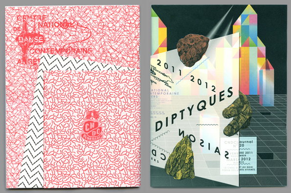
Two brochure covers side by side. The first features a red and white squiggly pattern with the text “Centre National de Danse Contemporaine Angers”. The second shows a 3D render of geometric shapes and floating rocks with the word “Diptyques” across the centre.

Antoine et Manuel: a real party bag of design and feel good graphics

—
Date
16 July 2012

The portfolio of French duo Antoine & Manuel is essentially a weighty party bag of graphic design, graciously bestowed upon you before the party has even begun. As creators of some of the most inviting events posters to date – and not afraid to use coloured pencils and felt tips when the computer gets boring – these guys are leading the way in French graphic design.

Top marks to them for proving that the key to a good poster is not just being on trend; it’s to make things look as if you were in a really good mood when you made it. Buy their beautiful prints in their shop here or check out some of their pretty spectacular furniture.
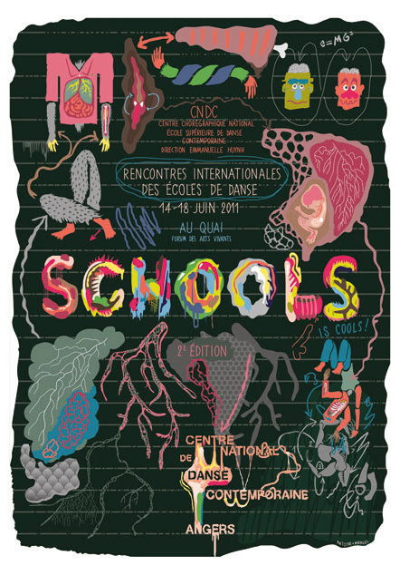
A colourful illustration on a dark green background for a dance event. Bold, stylised lettering reads “SCHOOLS IS COOL!” surrounding text that reads “Rencontres Internationales des Écoles de Danse” and the dates “14–18 Juin 2011”. The composition is filled with surreal, organic shapes, abstract figures and anatomical forms.
Above

Antoine et Manuel: SCHOOLS FESTIVAL Poster
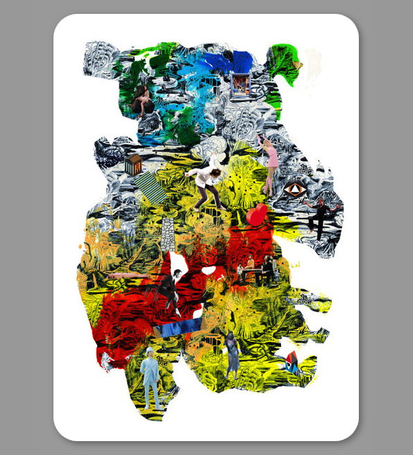
A vibrant collage of fragmented images, textures and bold colours arranged in an organic, irregular shape. Small figures of people are scattered throughout the composition, appearing to move across a surreal landscape of red, yellow and blue.
Above

Antoine et Manuel: Comedie de Clermont
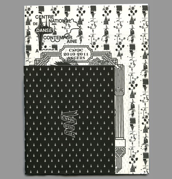
Two publications are layered on a grey background. The top booklet is black with a white teardrop pattern and a central logo that reads “CNDC Journal No 18”. Behind it is a white book with black abstract illustrations and the text “Centre National de la Danse Contemporaine”.
Above

Antoine et Manuel: CNDC journal 18, cover
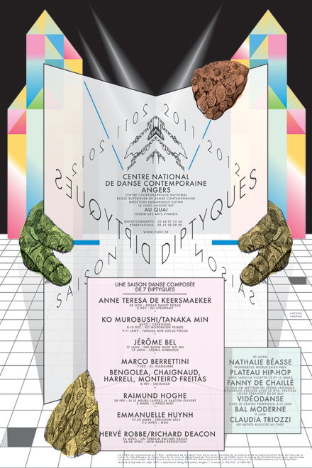
A graphic poster for the Centre National de Danse Contemporaine d’Angers. A pair of textured, stone-like hands hold up a translucent, folded structure containing a list of performers and dates for a dance season.
Above

Antoine et Manuel: CNDC – Centre national de danse contemporaine, Angers
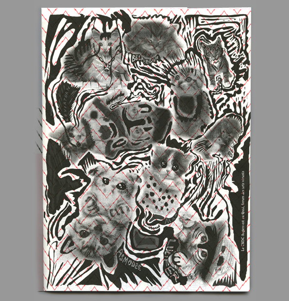
A black and white illustration of several stylised cats, rendered with distorted shapes and halftone patterns. The figures are layered over a background of swirling lines and a red zig-zag border.
Above

Antoine et Manuel: CNDCjournal 19, cover, front
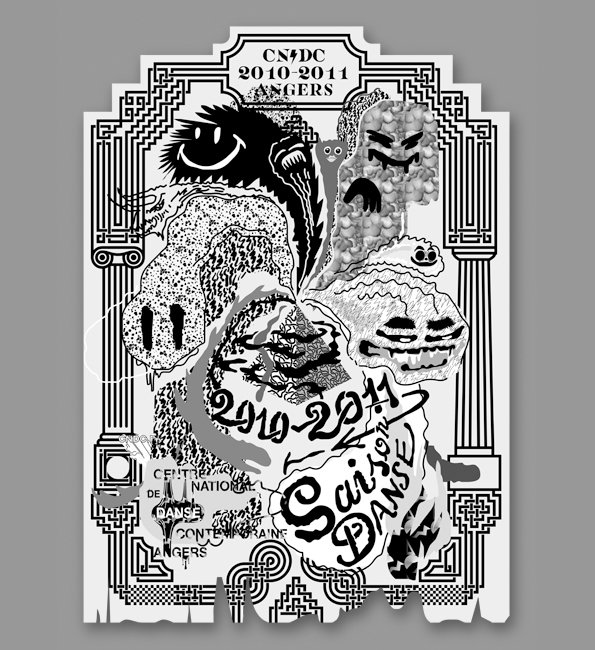
A black and white illustration for a dance season, featuring surreal, distorted faces and organic shapes. Text at the top reads “CNDC 2010–2011 ANGERS”, while the bottom reads “Saison DANSE”.
Above

Antoine et Manuel: CNDC Saison 2010-2011 card, June 2010
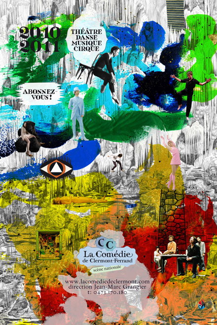
A vibrant, chaotic collage for a performing arts season. It features various figures in dance and theatrical poses set against a backdrop of bold, expressive paint splashes in green, blue, yellow and red. Text at the top reads “2010 2011” and “Théâtre Danse Musique Cirque”. The bottom section includes the logo for “La Comédie de Clermont-Ferrand” and a website address.
Above

Antoine et Manuel: Comedie de Clermont
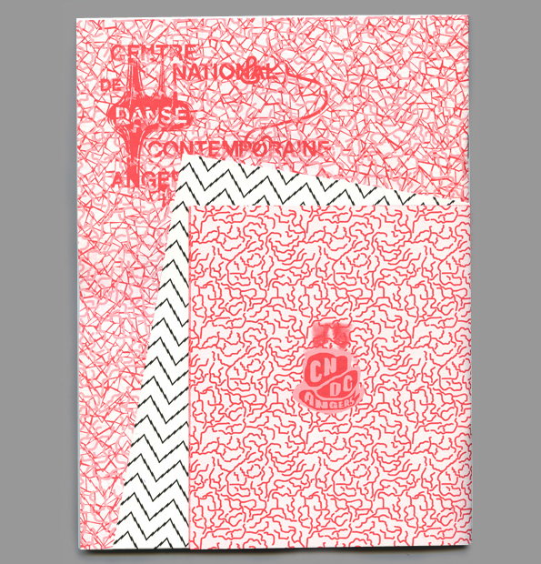
A stack of three printed sheets featuring red and white patterns. The top sheet displays a dense, scribbled texture with the text “Centre National de Danse Contemporaine Angers” laid over it.
Above

Antoine et Manuel: CNDCjournal 19, cover, front and back

Share Article

About the Author

Liv Siddall

—

Liv joined It’s Nice That as an intern in 2011 and worked across online, print and events, and was latterly Features Editor before leaving in May 2015.
It's Nice That Newsletters

Fancy a bit of It's Nice That in your inbox? Sign up to our newsletters and we'll keep you in the loop with everything good going on in the creative world.