Launch Recite Me assistive technology
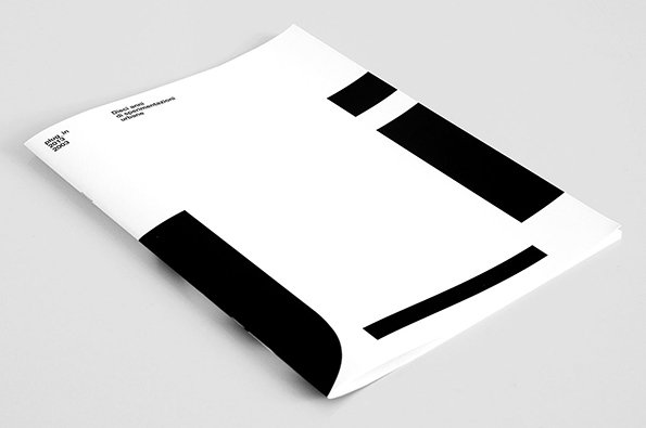
A white booklet lies flat on a grey surface, featuring bold black geometric shapes. Small text in the top left reads “plug in 2013 2003” and “Dieci anni di sperimentazioni urbane”.

Artiva Design's bold black and white catalogue for contemporary art show

—
Date
5 August 2014

I don’t know what the Italian for “Jack of all trades” is – maybe “Giacomo of all trades” if that’s not clumsily xenophobic – but Genoa based studio Artiva Design seem to fit the bill. The “About” section of their website lists more than 30 areas in which they offer their services, from user interface to book design, copywriting to video editing.

But that’s not to suggest for one second that Daniele De Batté and Davide Sossi are spreading themselves too thinly; in fact a quick romp through the pair’s portfolio throws up all manner of interesting work. We’ve chosen to focus on this catalogue for the exhibition at Genoa’s Museum of Contemporary Art in the Villa Croce, which celebrated ten years of architecture, media and art laboratory Plug_in.

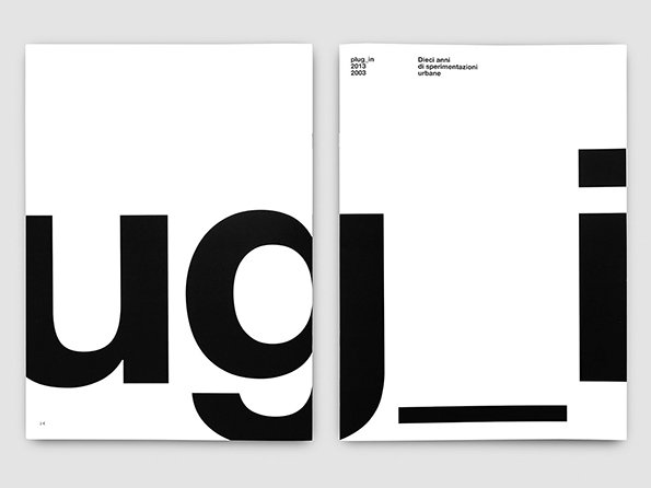
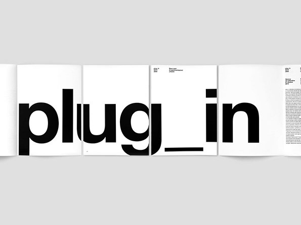
The big, bold typographic treatment which runs around the cover and title pages apes the connected nature of Plug_in’s activities and can only be fully appreciated with a little bit of lateral thinking. Its continuation through the numbers that order the content ties together what appears to be pretty disparate material (although as we’ve established my Italian is somewhat limited).

A couple of years ago we were bowled over by Artiva’s exhibition design skills; it appears the duo have lost none of their sparkle.
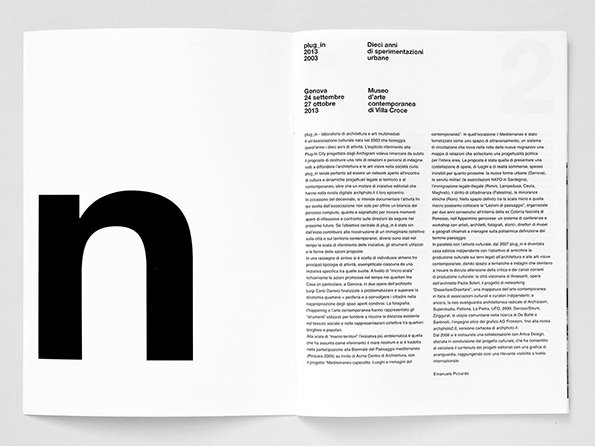
An open book shows a bold, black lowercase “n” on the left page. The right page contains columns of Italian text under the headings “plug in 2013 2003” and “Dieci anni di sperimentazioni urbane”.
Above

Artiva Design: Plug_In 2013 – 2003

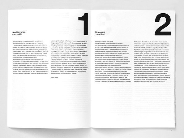
An open book showing two pages of text in Italian. Large, bold numerals “1” and “2” sit at the top of each page.
Above

Artiva Design: Plug_In 2013 – 2003

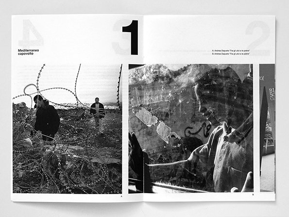
An open book showing two black and white photographs. The left page shows a person standing behind a barbed wire fence, while the right page features a close-up of a person looking through a shattered pane of glass.
Above

Artiva Design: Plug_In 2013 – 2003

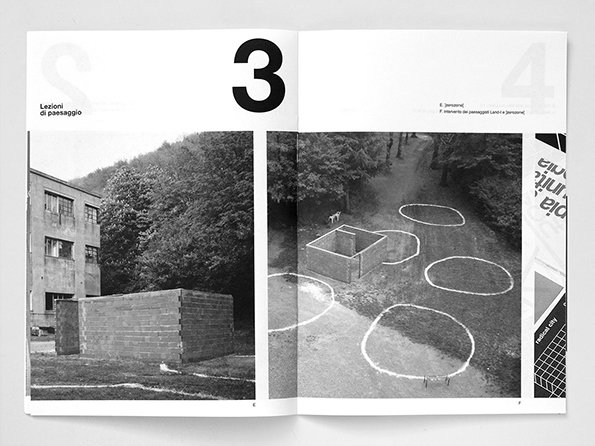
An open book shows two black and white photographs of concrete structures in a wooded landscape. The left page features a low concrete block and the text “Lezioni di paesaggio” beside a large number “3”.
Above

Artiva Design: Plug_In 2013 – 2003

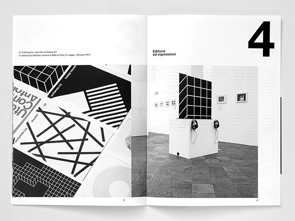
An open book shows a black and white spread. The left page features a collage of geometric architectural drawings, while the right page shows a gallery installation with a large black grid sculpture on a plinth.
Above

Artiva Design: Plug_In 2013 – 2003

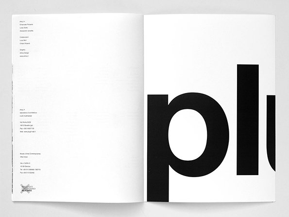
An open book shows a minimalist layout. The left page contains several columns of small, left-aligned text, while the right page features a large, cropped black wordmark reading “plu”.
Above

Artiva Design: Plug_In 2013 – 2003

A two-page spread from a publication featuring bold, black typography on a white background. The large letters spell out “ugli” across the pages, with smaller text at the top reading “plug_in 2013 2003” and “Dieci anni di sperimentazioni urbane”.
Above

Artiva Design: Plug_In 2013 – 2003

An open book shows a bold, black typographic layout across four pages. The words “plug_in” are split across the spread in a heavy sans-serif font.
Above

Artiva Design: Plug_In 2013 – 2003

Share Article

Further Info

About the Author

Rob Alderson

—

Rob Alderson is a freelance writer, editor and strategist. He was previously editor-in-chief of It’s Nice That and WePresent, and editor of Design Week. He publishes the newsletter Undo, which tries to make sense of how AI is changing design work, the design process and the design industry.

It's Nice That Newsletters

Fancy a bit of It's Nice That in your inbox? Sign up to our newsletters and we'll keep you in the loop with everything good going on in the creative world.