Athletics’ identity for GOCA references traditional Japanese script and incorporates “infinite” patterns
Centred around championing Asian creatives, GOCA’s wordmark opens up to spotlight art and artists.
Share
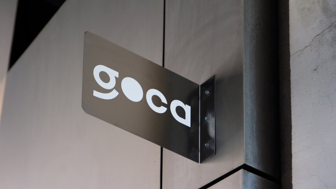
Athletics has created the visual identity for Gallery of Contemporary Art (GOCA), a new gallery in New York dedicated to emerging Asian artists – an underrepresented demographic in art spaces in the city. “The brand identity for GOCA is designed to bridge cultural divides,” senior designer Sebastian Páez Delvasto says. “The identity balances sophistication with approachability,” he adds, “ensuring it resonates within New York’s elite art scene while maintaining the warmth of its featured artists.” To achieve this, Athletics developed a rigorous, flexible creative system that allowed the gallery to champion individual artists whilst nurturing and encouraging cultural conversations.
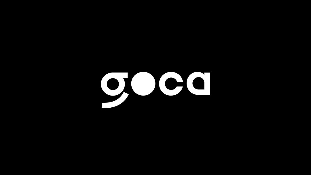
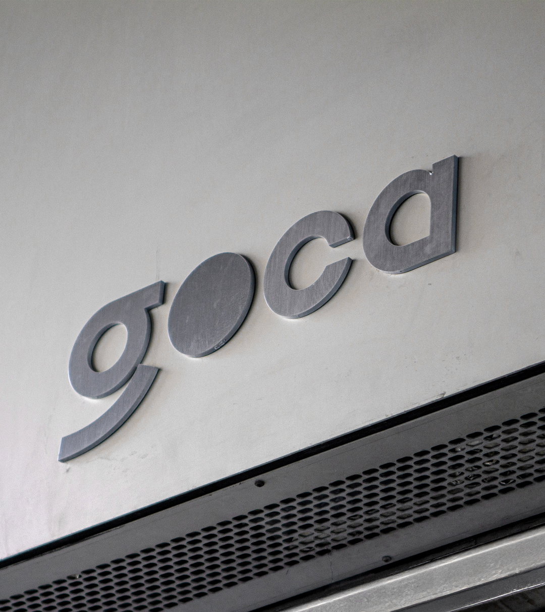
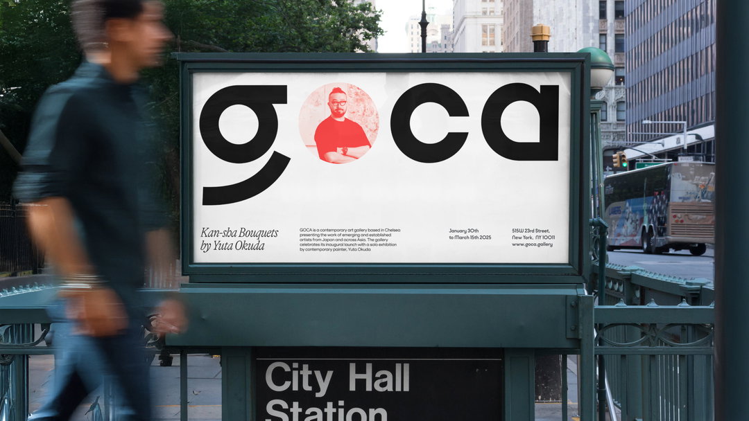
Leading the charge, GOCA’s wordmark draws on one of Japan’s scripts, Katakana, and references the language system’s curves, creating a warm tone mirrored across Athletics’ dutiful type choices. “The primary typeface is Kobe from VJ Type, chosen for its letterforms inspired by Japanese script,” Sebastian says. “The ‘o’ in the wordmark was modified into a perfect circle to symbolise a spotlight,” something that reinforces the gallery’s focus on artists.
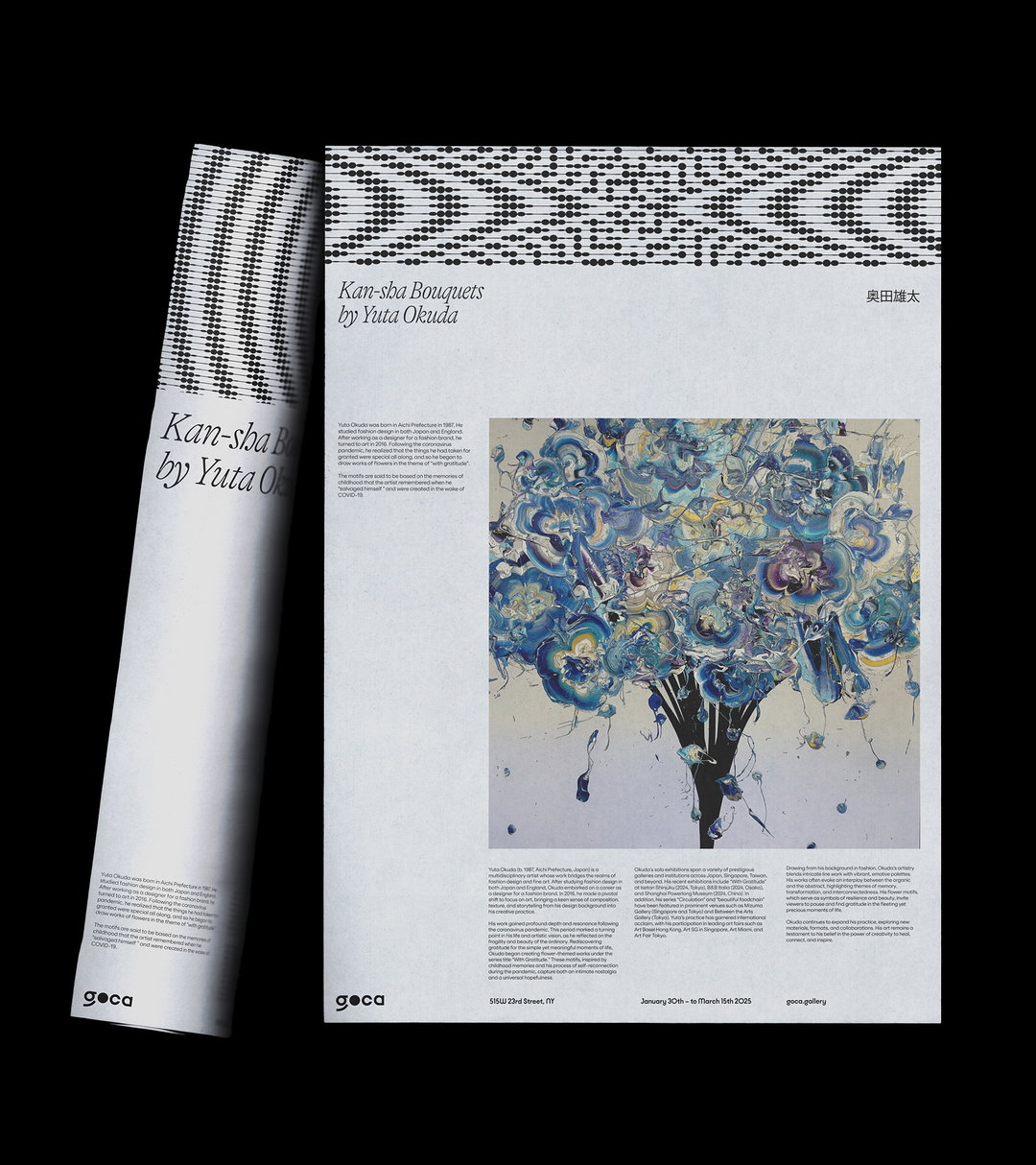
This concentration on individual artists is mirrored in the use of GT Alpina, from Grilli Type, for GOCA’s headlines, the soft, enticing forms of which distill a palpable human touch across the brand. “GOCA’s typographic system balances functionality with expressiveness,” Sebastian explains, introducing the utilitarian workhorse sans serif, ES Klarheit, for the identity’s body copy, “making it adaptable across various brand applications”.
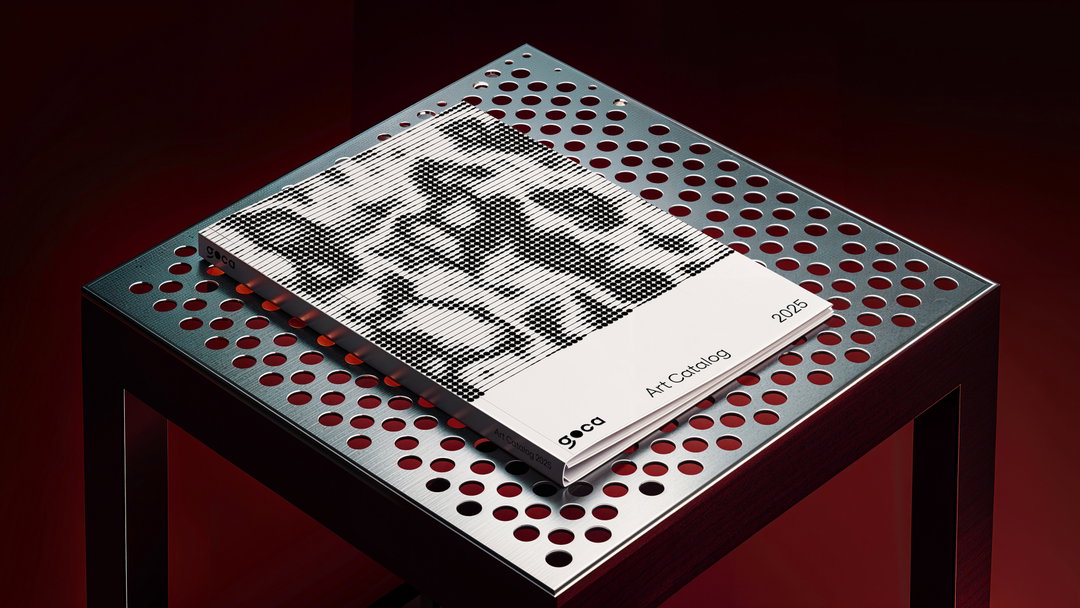
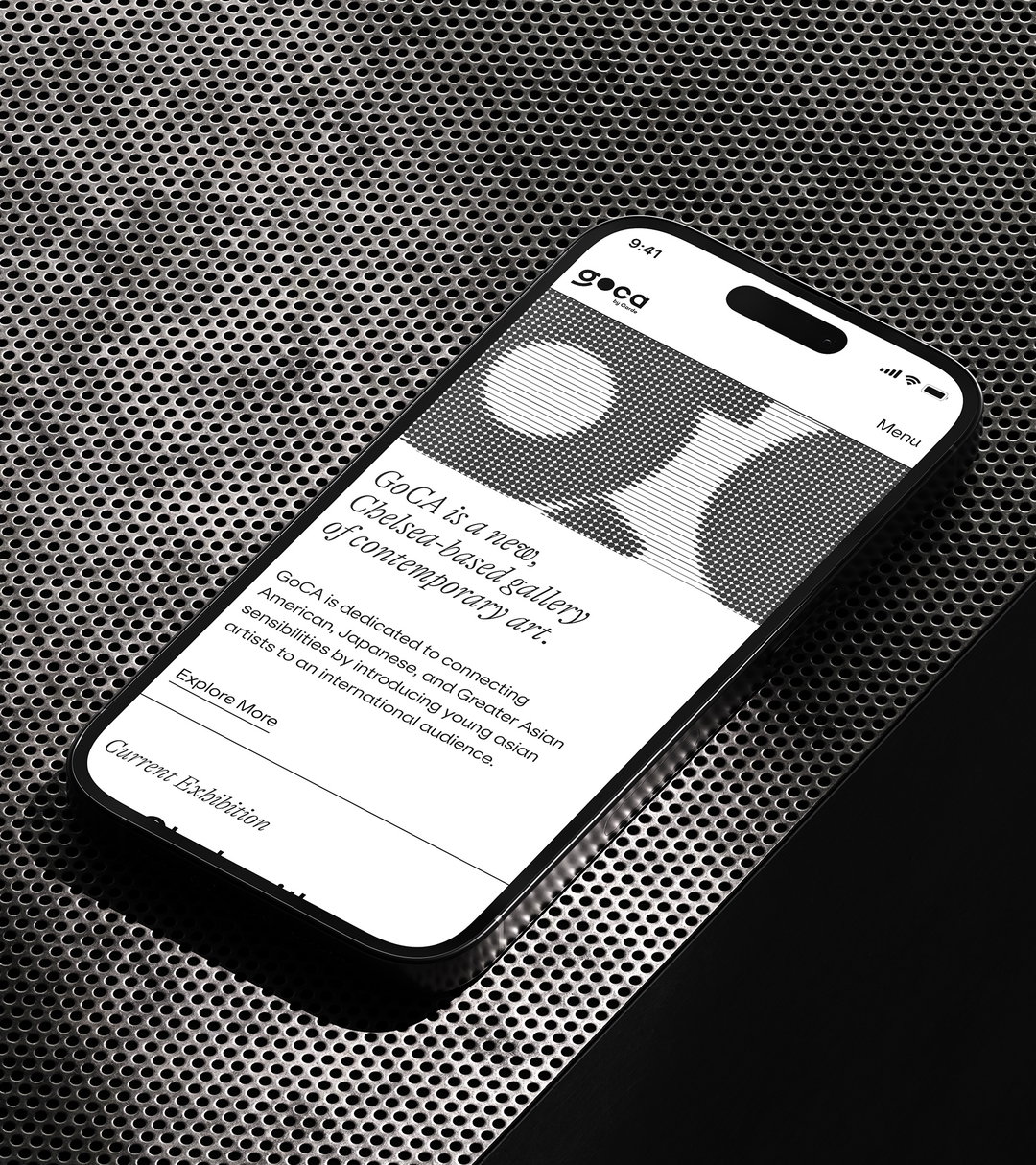
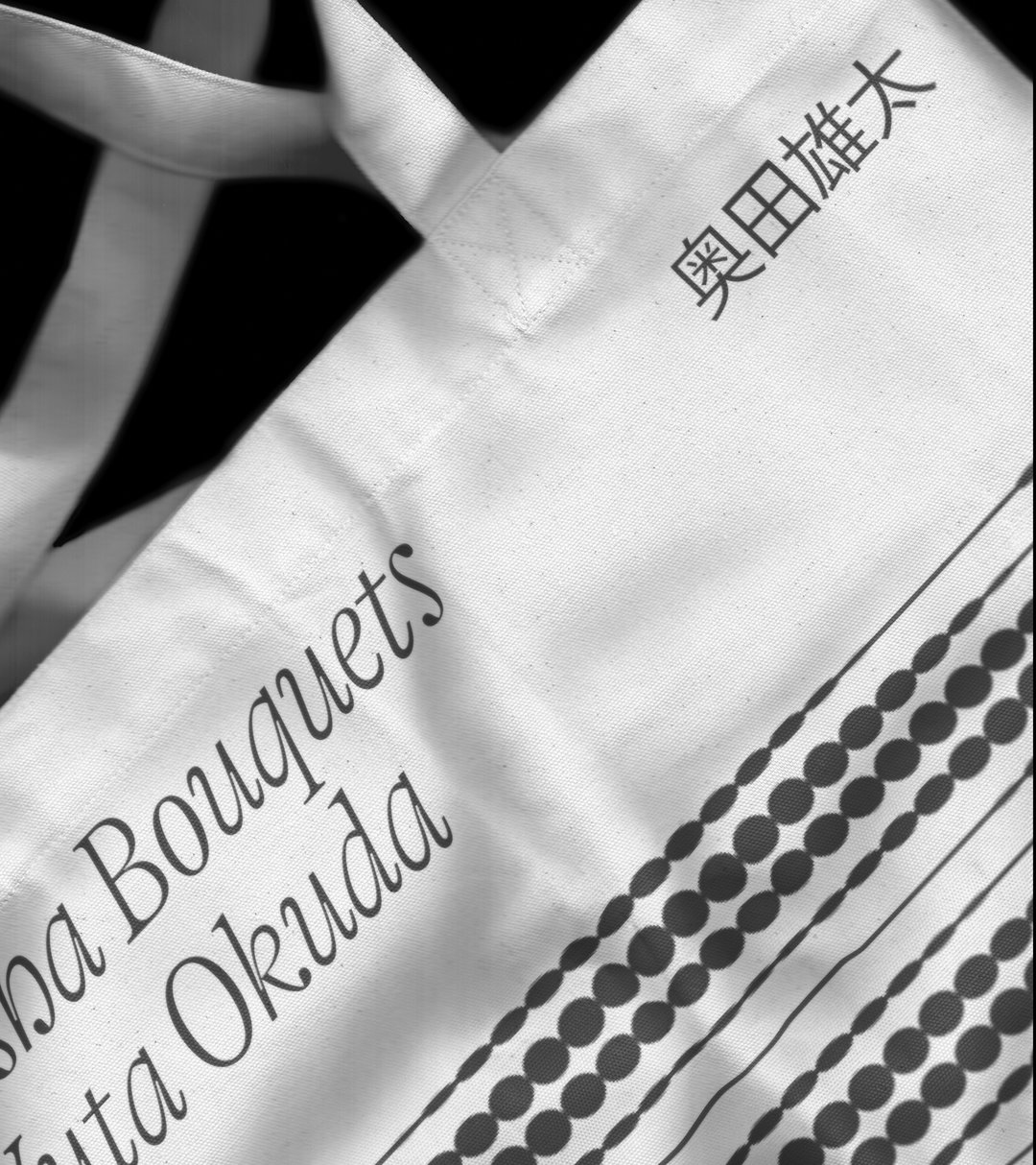
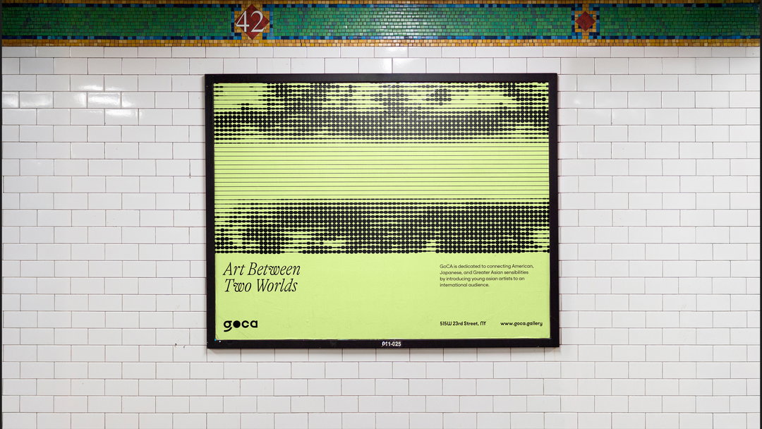
Alongside its typographic output, pattern plays a large role in GOCA’s brand identity, reinforcing its ever-evolving nature whilst complementing the fundamentally tactile, material-led brand output. “The generative patterns are derived from the geometric DNA of the wordmark,” Sebastian explains, “and are created using algorithmic design tools, allowing infinite variations.” In use, the patterns act as complementary backdrop to the featured artwork, carefully programmed to not compete with the work on display.
“Motion is also integral to the identity, particularly in digital applications,” Sebastian continues. “The patterns animate fluidly, creating a living brand experience that mirrors the gallery’s dynamic nature,” an approach reflected in the brand’s choice of colour palette. Finally, the palette was used to denote the gallery’s balance between forward progress and tradition. “The colour system was selected to ensure a neutral, elegant, and contemporary aesthetic,” Sebastian ends.
GalleryAthletics: GOCA (Copyright © Athletics, 2025)
Hero Header
Athletics: GOCA (Copyright © Athletics, 2025)
Share Article
Further Info
About the Author
—
Hailing from the West Midlands, and having originally joined It’s Nice That as an editorial assistant in March 2020, Harry is a freelance writer and designer – running his own independent practice, as well as being one-half of the Studio Ground Floor.