



Launch Recite Me assistive technology
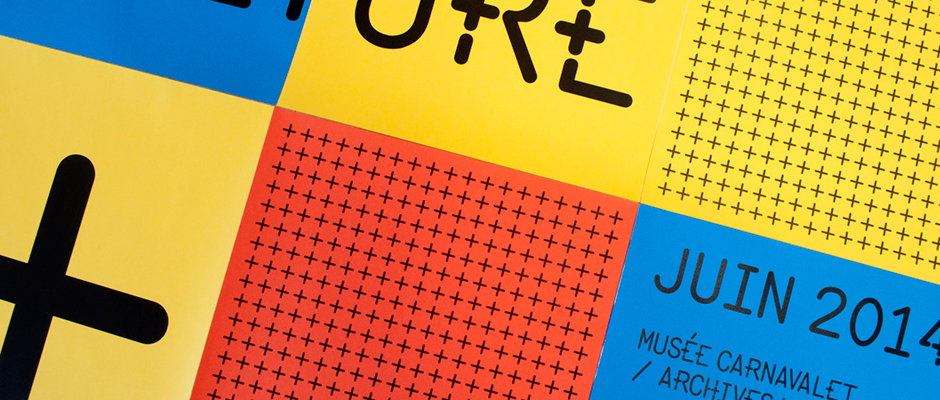
A close-up of a graphic layout featuring bold blocks of yellow, red and blue. One blue section contains the text “JUIN 2014” and “MUSÉE CARNAVALET / ARCHIVES”.

Axel Pelletanche Thévenart is a young graphic designer with a big talent

—
Date
7 April 2015

Across the It’s Nice That studio there’s a heck of a lot of people looking at creative work all day, every day and so on occasions it comes to pass that two people will suggest the same person for the site. That’s exactly what happened this week with the marvellously-named Axel Pelletanche Thévenart, a French graphic design student currently interning with HelloMe in Berlin. Axel’s site is in French and the oddities of Google Translate mean that it’s pretty tricky to get your head round the intricacies of his projects, but from the visuals alone it’s clear that Axel has a really developed graphic sensibility and an ease with type and colour that belies his young age. We’re keen to see what he gets up to once his studies finish and his talents are fully unleashed on the world.
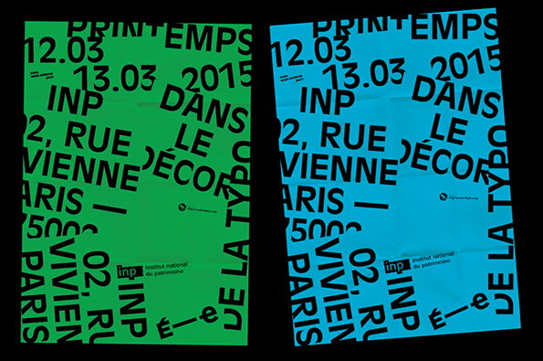
Two posters with bold black typography on bright green and blue backgrounds. The text includes the dates “12.03” and “13.03 2015”, the address “02, rue vivienne paris”, and the phrase “dans le décor”.
Above

Axel Pelletanche Thévenart: Printemps de la Typographie
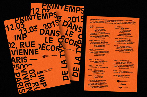
Three orange posters with bold black typography. One poster displays the event title “Printemps dans le décor 2015” and the address “02, rue Vivienne, Paris”. Another lists a detailed schedule of speakers and workshops for the event.
Above

Axel Pelletanche Thévenart: Printemps de la Typographie
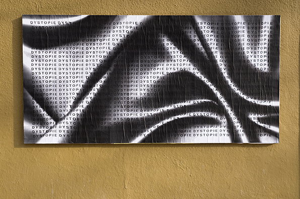
A black and white print on a yellow wall features the word “DYSTOPIE” repeated in a dense grid. Distorted, fluid white shapes sweep across the composition, blurring and warping the text.
Above

Axel Pelletanche Thévenart: Ficciones Typografika
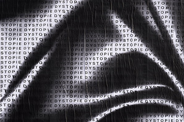
A black and white image of a crumpled, textured surface covered in repeating rows of the word “DYSTOPIE”. Bright, curved streaks of light cut across the frame, partially obscuring the text.
Above

Axel Pelletanche Thévenart: Ficciones Typografika
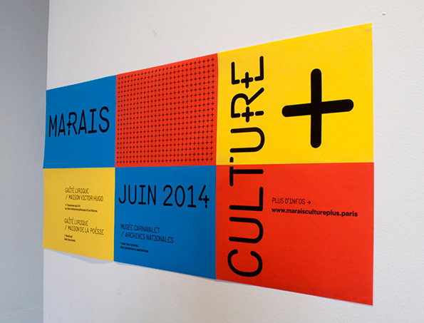
A colourful grid poster on a white wall divided into four quadrants of blue, red and yellow. It reads “Marais”, “Culture +” and “Juin 2014”, with smaller text listing various Parisian museums and a website.
Above

Axel Pelletanche Thévenart: Identité pour Marais Culture
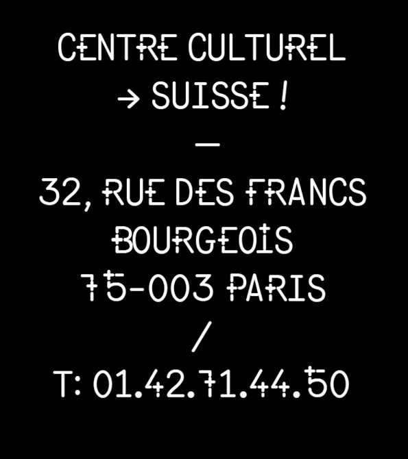
A typographic image with white text on a black background. It reads “Centre Culturel → Suisse!” followed by the address “32, Rue des Francs Bourgeois 75-003 Paris” and a telephone number.
Above

Axel Pelletanche Thévenart: Identité pour Marais Culture
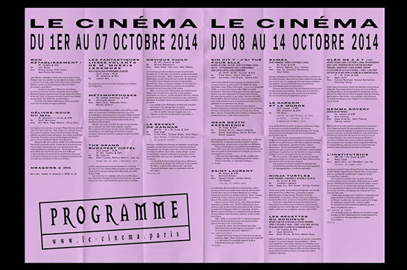
A pink cinema programme divided into two weekly sections for October 2014. The header reads “LE CINÉMA” above the dates “DU 1ER AU 07 OCTOBRE 2014” and “DU 08 AU 14 OCTOBRE 2014”. The layout features columns of film titles and descriptions, including “The Grand Budapest Hotel” and “Ninja Turtles”. A boxed logo at the bottom left reads “PROGRAMME” above the website “www.le-cinema.paris”.
Above

Axel Pelletanche Thévenart: Le Cinéma
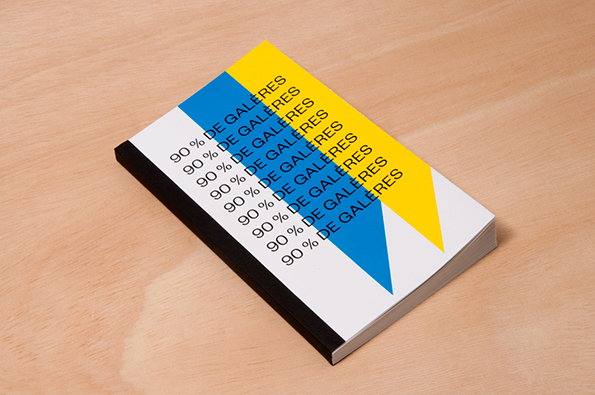
A small book with a white cover rests on a light wood surface. The cover features a yellow and blue geometric design with the phrase “90 % DE GALERES” repeated in blue text.
Above

Axel Pelletanche Thévenart: Diploma Project
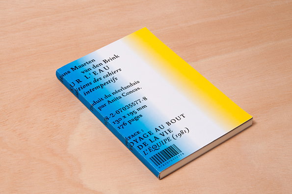
The back cover of a book with a yellow to blue gradient background. French text includes the author “Maarten van den Brink” and the title “Voyage au bout de la vie”.
Above

Axel Pelletanche Thévenart: Diploma Project

Share Article

About the Author

Rob Alderson

—

Rob Alderson is a freelance writer, editor and strategist. He was previously editor-in-chief of It’s Nice That and WePresent, and editor of Design Week. He publishes the newsletter Undo, which tries to make sense of how AI is changing design work, the design process and the design industry.


It's Nice That Newsletters

Fancy a bit of It's Nice That in your inbox? Sign up to our newsletters and we'll keep you in the loop with everything good going on in the creative world.
