





Bao’s BFF branding embodies the best of fast food and convenience stores
Designed in collaboration with Hato, the brand design for the Bao founders’ new restaurant represents fast culture – and is also entirely open-source.
Have you ever heard of an open-source restaurant? No? Well, that’s because this is the first one. BFF, which stands for Bao Fast Foods – or Best Friends Forever, take your pick – is an entirely new concept from Taiwanese-inspired restaurant group, Bao. A fan-favourite in its hometown of London, BFF marks a departure from Bao’s curated restaurant experience, turning its attention to fast food with the aim of bringing Taiwanese fast-food culture to the wider world.
The project as a whole is rather unconventional, embracing Taiwan’s aptitude for technological innovation, starting with the release of Bao’s source code in summer 2026 – a decision that dates back to when Bao was first launched. “All of us founders came from creative backgrounds,” Bao and BFF co-founder Shing Tat Chung tells It’s Nice That, “so when we entered F&B we wanted to inspire through food.” The founders considered food a vessel for emotion, design and creativity in its own right; naturally, as the years have gone by, they wanted to build on this philosophy.
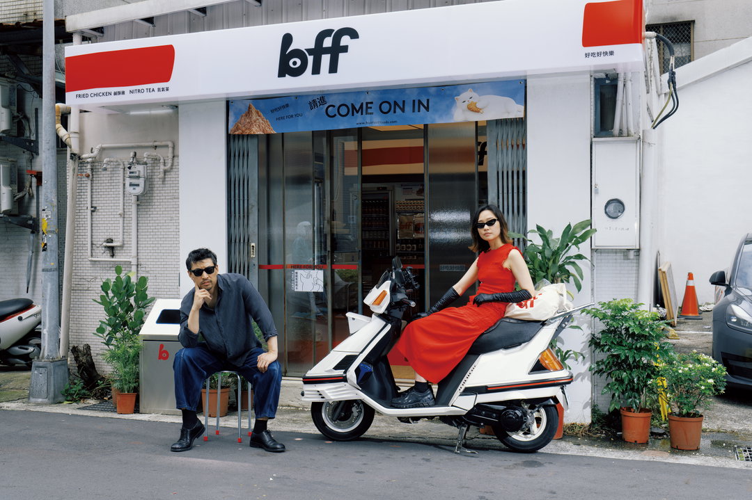
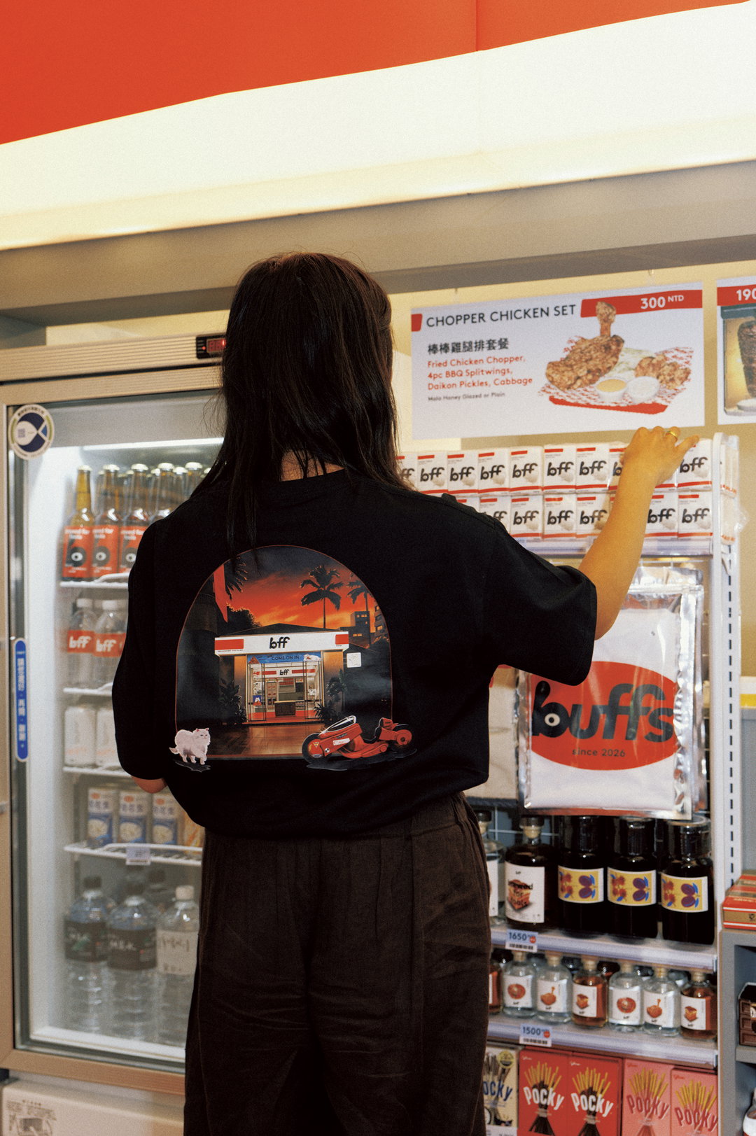
GalleryBao x Hato: BFF brand identity, photography by Puzzleman Leung (Copyright © Bao, 2026)
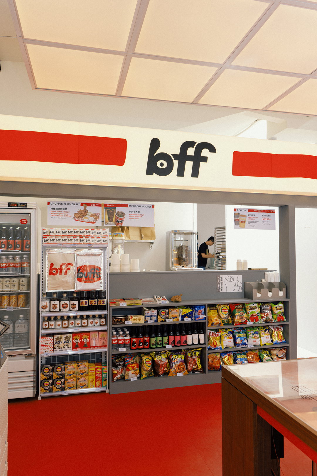
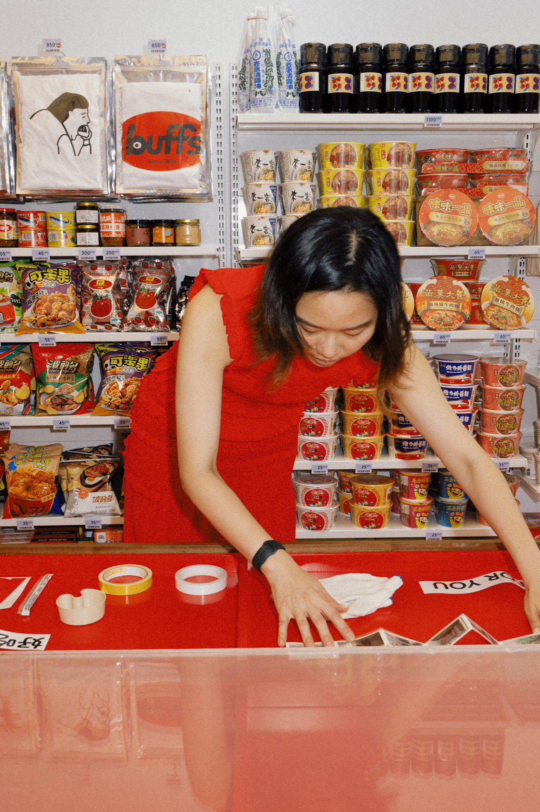
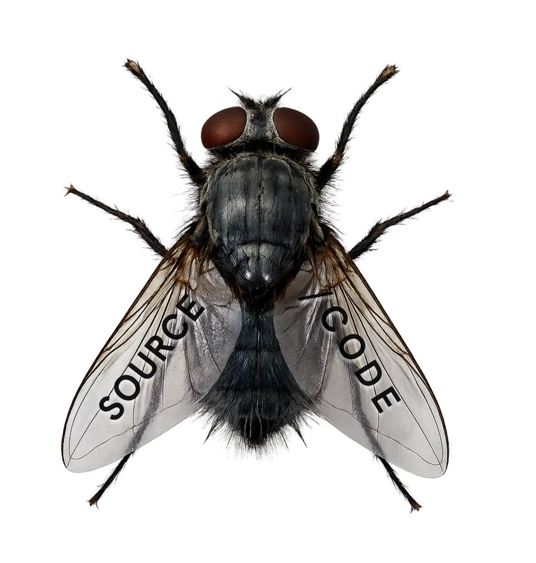
Practically, BFF’s open-source approach means that the brand has a completely transparent setup, with processes and recipes that people can use, adapt and evolve. “We see this by what we call hard and soft,” Shing explains, “hard is the centre, our central source of truth,” meaning the main website (accessible by clicking the fly on Bao). “Here we publish our papers, our source code, but also have other fun things mixed in,” including an inconsequential radio show, for example, balancing Bao’s lighthearted wit that sits alongside its sincerity. Shing clarifies: “We’re very careful not to misrepresent open source,” (ie. it’s not necessarily something you can download and edit) “we start with open source as an intent of transparency and two-way dialogue with the community.” Design-wise, this transparency means that as the brand is built and developed, it will be open to others. “How we design our hospitality, what the interior spaces mean to us, how the chicken is designed to be convenient,” Shing suggests, “we’ve been working on this premise and developing what we have to this date” – something, he says, will continue to evolve.
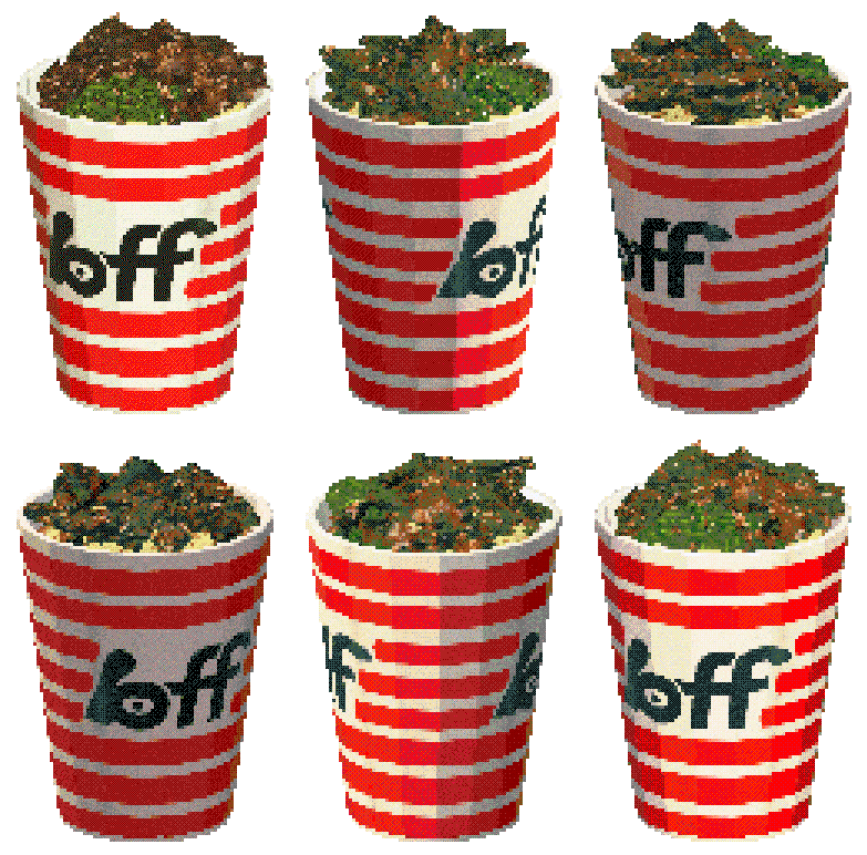
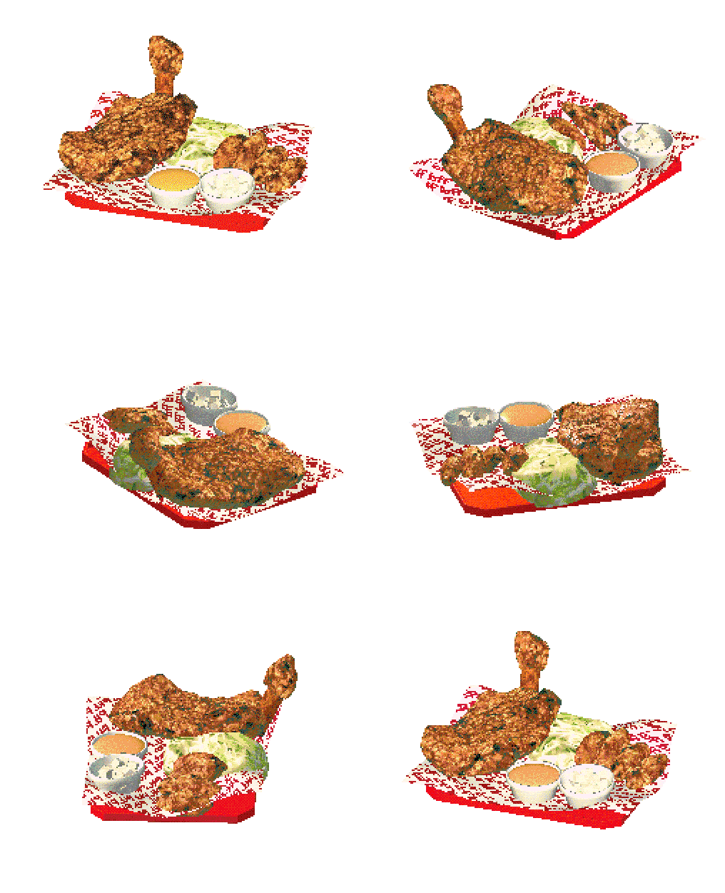
GalleryBao x Hato: BFF identity; low res poly art by Yakuiit (Copyright © Bao, 2026)
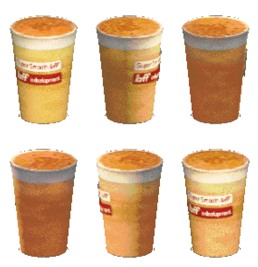
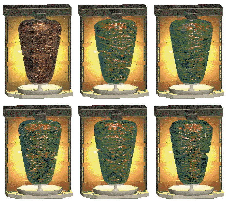
The overall approach to BFF maintains the core values of Bao but, importantly, reflects the founder’s interests in fastness. “We like the term Fast Culture,” Shin says, “what that meant was being more energetic about it,” which can be seen across the eclectic, nostalgic visuals illuminating the brand. Designed in collaboration with Hato, strands of the original Bao can be seen digitally and in BFF’s in-person pop-up, but the rest of the identity explores the fast culture it references. “The proposition leans towards the cultural wrapper of a convenience store, and with that comes the energy,” he explains, “but at Bao, that’s what we always have fun with.”
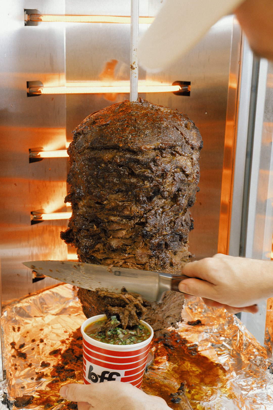
The menu itself is devoted to quality ingredients and leans on the practicality and visual aesthetics of Asian convenience stores, with passersby equally able to buy some tissues and a pack of instant noodles as well as a split wing. All of this is subject to evolution as BFF is technically still a work-in-progress and is open to ideas as it continues to develop the concept over 2026 before a permanent site in 2027. For BFF, the restaurant concept represents a rather progressive approach to branding in a world obsessed with IP, and its focus inevitably comes back to the community it serves. “In this day and age you see people opening up processes and transparency,” Shing says, “we’re only going to see more of it. Naturally you want to protect your IP,” he says, with competitors taking advantage or new brands copying it, for example, “but the IP in question here isn’t necessarily what we think it is, it’s the community we grow from it,” Shing ends, “that’s our new IP.”
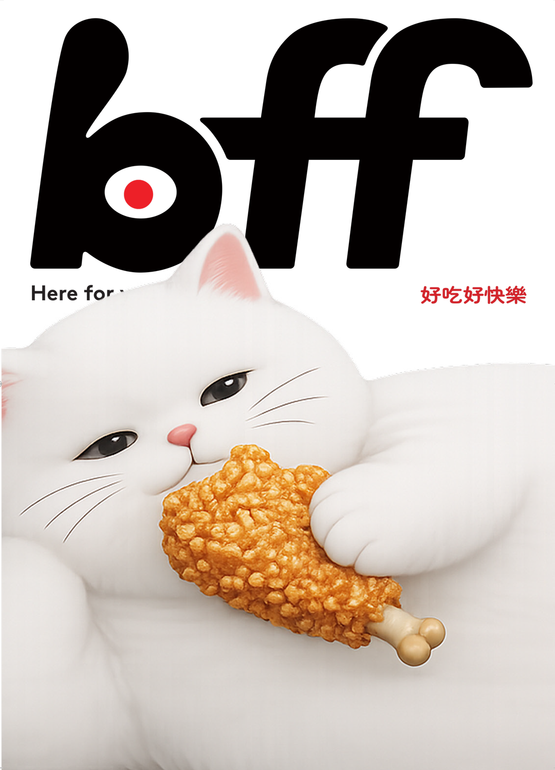
GalleryBao x Hato: BFF brand identity (Copyright © Bao, 2026)
Puzzleman Leung

Puzzleman Leung
Puzzleman Leung
Puzzleman Leung

Hero Header
Bao x Hato: BFF brand identity; illustrations by Centre For Research (Copyright © Bao, 2026)
Share Article
Further Info
About the Author
—
Hailing from the West Midlands, and having originally joined It’s Nice That as an editorial assistant in March 2020, Harry is a freelance writer and designer – running his own independent practice, as well as being one-half of the Studio Ground Floor.





