




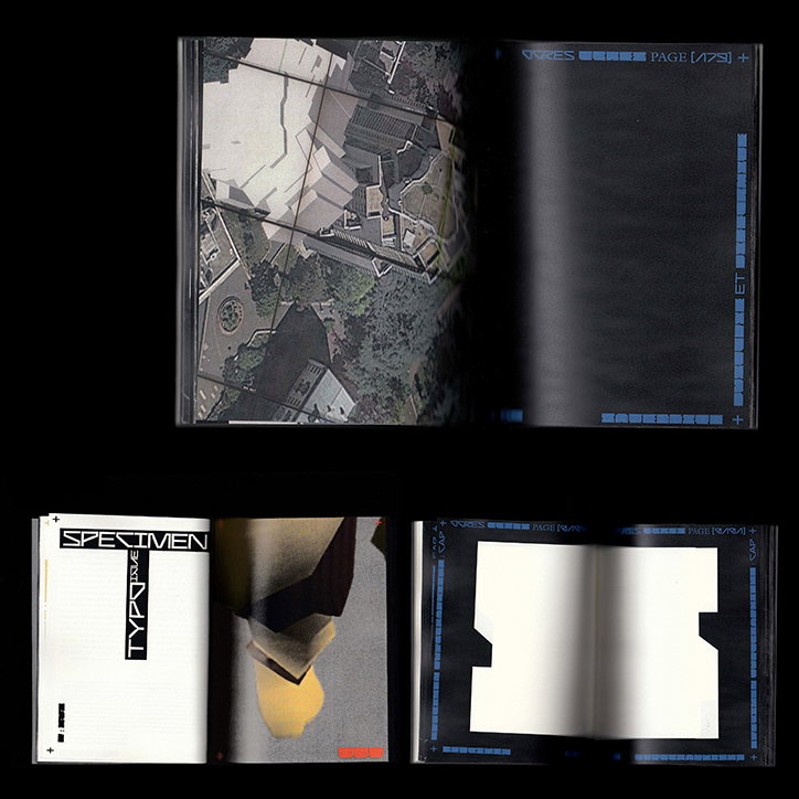
Baptiste Bernazeau draws on a degenerating building complex for his latest typeface
Orgues de Flandre is a group of residential buildings in Paris’ 19th arrondissement built in the 1970s by architect Martin van Treeck, which sharply contrast the romantic, uniform architecture we usually associate with the capital. The building complex may not be conventionally poetic, but it is nonetheless the unlikely inspiration for graphic designer Baptiste Bernazeau’s latest typeface Ogres.
Baptiste is currently in his fourth year at Ecole d’Art, Design et Animation in Paris, but has spent the past few months in Munich interning at Bureau Borsche. Having focused his attention on typography for the past year and a half, the designer has discovered a newfound incentive to broaden his creative endeavours. Baptiste’s latest publication Ogres, Analyse des Orgues de Flandre & Specimen Typographique hones in on Orgue de Flandre’s history, vision and social impact and interprets the buildings’ brutalist aesthetic.
“Orgues de Flandre is a modern take on monumental, gothic design. The architecture is really recognisable thanks to its excessively tall towers and massive buildings that loom over the streets. Martin van Treeck aimed to build a city within a building, a cocoon of concrete,” Baptiste tells It’s Nice That. The project was clearly an ambitious attempt to create affordable housing for local Parisians. However, this didn’t work out as van Treeck had hoped. The housing complex was so isolated from the neighbouring community that drug rings and gang crime found a safe, undisturbed home in the complex during the 1990s. Orgues de Flandres’ secluded architecture made it difficult for the local police force to access and prevent it. In Baptiste’s words, the cocoon became a den.
It is the deterioration of Orgues de Flandre that inspired Baptiste’s latest typeface. The once impeccable towers started to disintegrate like “crushing ogres”, hence the font’s name. Baptiste illustrates the increasing harshness of the buildings’ facades and environment through the bold harsh lines of the typeface. “I used the emblematic and strong geometric lines, particularly the diagonals, of the buildings to build the letters. The sci-fi aesthetic draws on the modernist appearance of the buildings. As the project had both utopian and dystopian elements, I decided to create a black version to reflect the pejorative part of the buildings,” Baptiste discloses. These stylistic choices not only capture the social history of this architectural complex but also elevate it to an artistic project with a distinctive modernist character.
Ogres, Analyse des Orgues de Flandre & Specimen Typographique consists of satellite screenshots from various devices, software and pages dominated by single letters. “The bad texture on the already questionable 3D models perpetuated this idea of conceptual and physical degenerescence. In this way, the text, the typeface, and the images respond to each other.”
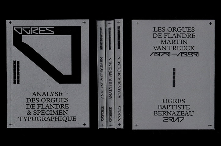
Baptiste Bernazeau: Ogres, Analyse des Orgues de Flandre & Specimen Typographique
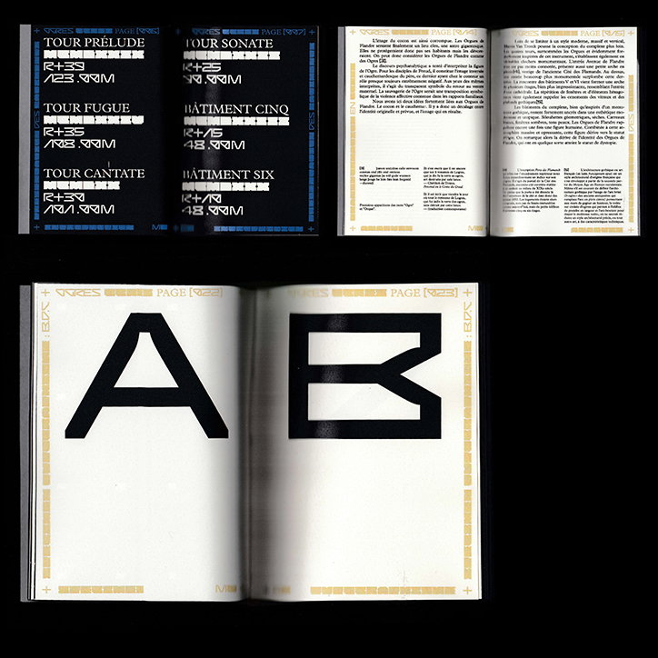
Baptiste Bernazeau: Ogres, Analyse des Orgues de Flandre & Specimen Typographique
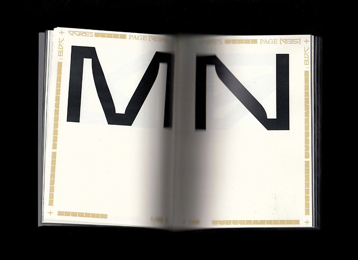
Baptiste Bernazeau: Ogres, Analyse des Orgues de Flandre & Specimen Typographique
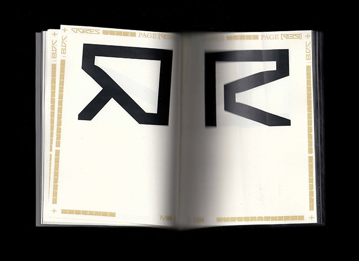
Baptiste Bernazeau: Ogres, Analyse des Orgues de Flandre & Specimen Typographique
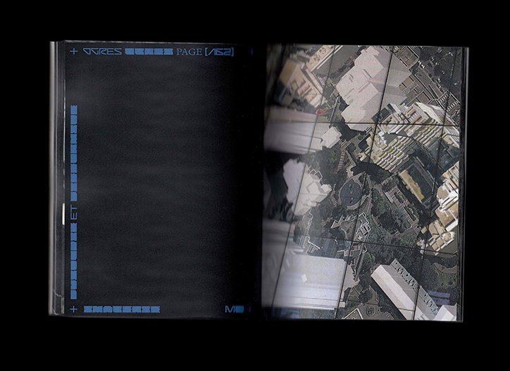
Baptiste Bernazeau: Ogres, Analyse des Orgues de Flandre & Specimen Typographique
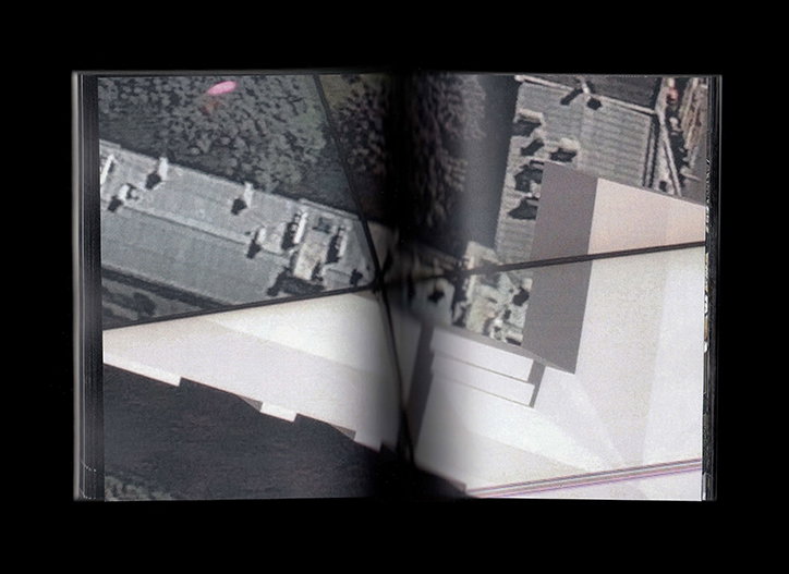
Baptiste Bernazeau: Ogres, Analyse des Orgues de Flandre & Specimen Typographique
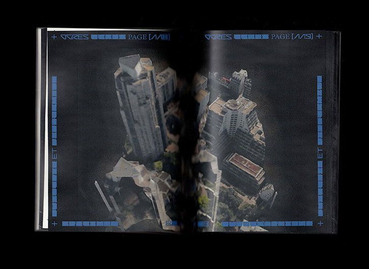
Baptiste Bernazeau: Ogres, Analyse des Orgues de Flandre & Specimen Typographique
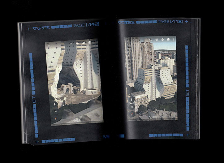
Baptiste Bernazeau: Ogres, Analyse des Orgues de Flandre & Specimen Typographique
Baptiste Bernazeau: Ogres, Analyse des Orgues de Flandre & Specimen Typographique
Share Article
Further Info
About the Author
—
Daphne has worked for us for a few years now as a freelance writer. She covers everything from photography and graphic design to the ways in which artists are using AI.
