




Baptiste Bernazeau’s ode to ruins told through crumbling typography and illustration
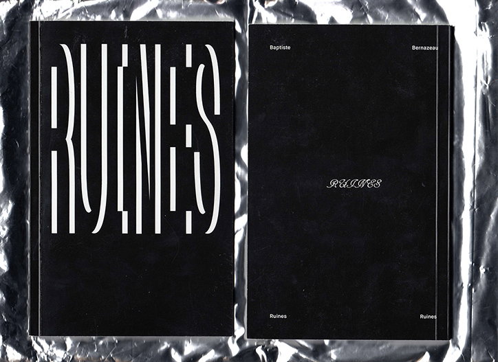
Graphic designer Baptiste Bernazeau is currently studying at École de Communication Visuelle (ECV) and his project Ruines is a monochrome zine that takes a “philosophical, scientific, metaphysical” look at the ruins of buildings and unpicks the impact of these crumbling structures.
The zine is the second part of a three volume work called Triple Six which consists of Humain, Ruines and 1-6 Dieux. “The main concept originated from Humain, the first zine I worked on with a friend. We really like scientific, occult and philosophical stuff so we decided to describe humans as a set of six criteria,” explains Baptiste. “We worked exclusively in monochrome and it served us really well in the scientific/esoteric notebook feel we want to create. One month later I worked alone on Ruines, which is connected in terms of aesthetic to Humain.”
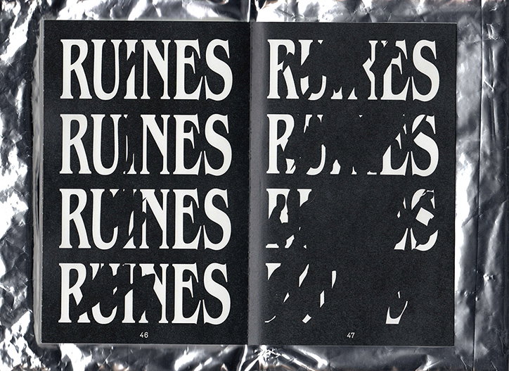
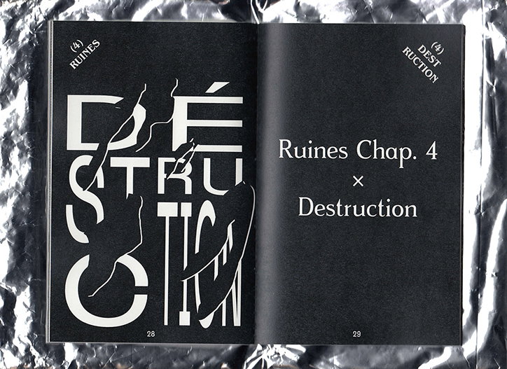
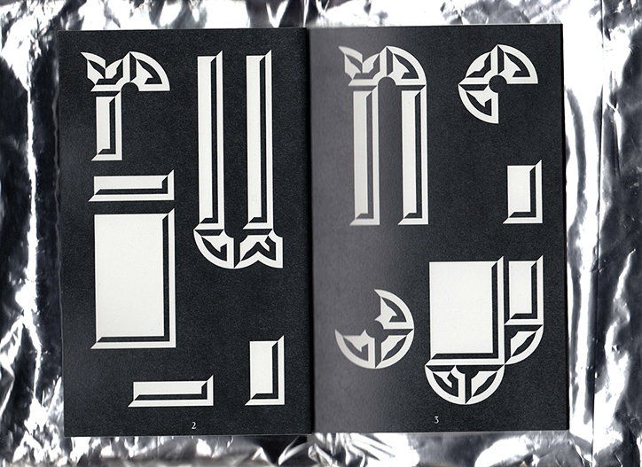
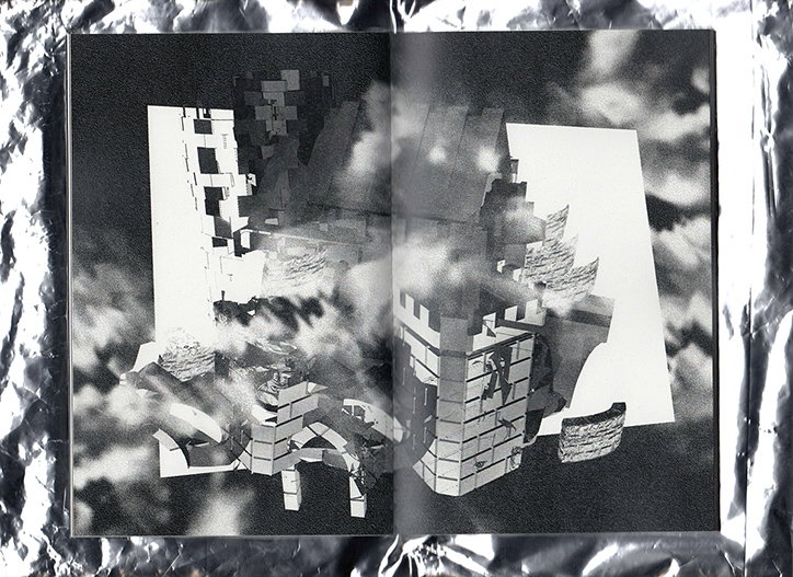
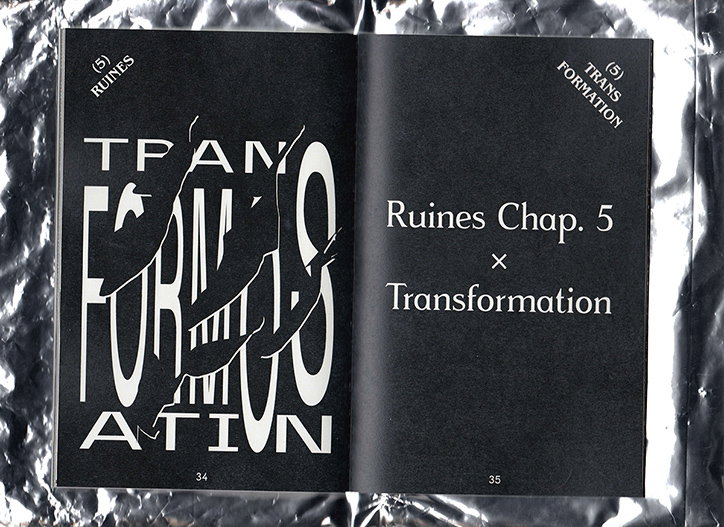
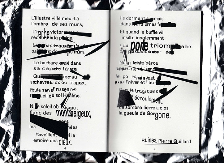
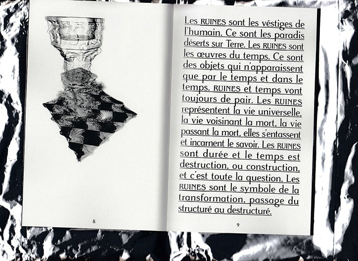
Baptiste sees the set of zines as having an encyclopaedic feel to them. For Ruines, he split the publication into six ambiguous chapters like Time, Life, Transformation and Destruction, which has allowed the designer to explore these loose themes using typographic experiments, illustration and graphic icons. “I really like illustration and typography so I focused on that first. The first part is an introduction with a lot of typographic elements, representing ruins in different ways, through highly distorted texts, tilted letters and broken words,” explains Baptiste. The second part of the zine is a range of texts discussing ruins in an academic, philosophic way, around these blocks of information is a composition of a building being excavated and as such becoming a ruin. The last section ends with a series of illustrations by Baptiste made out of digitised materials.
The highlight in the project is the typographic elements scattered throughout. Inventive, experimental and clever, Baptiste uses familiar ruin-themed styles, shapes and materials to create interesting typefaces and graphic formations. “The typography was done with the idea of typographic ruins in my head. I really like to break and transform a basic sans serif typeface to get a more complex form.”
Baptiste Bernazeau: Ruines
Baptiste Bernazeau: Ruines
Baptiste Bernazeau: Ruines
Baptiste Bernazeau: Ruines
Baptiste Bernazeau: Ruines
Baptiste Bernazeau: Ruines
Baptiste Bernazeau: Ruines
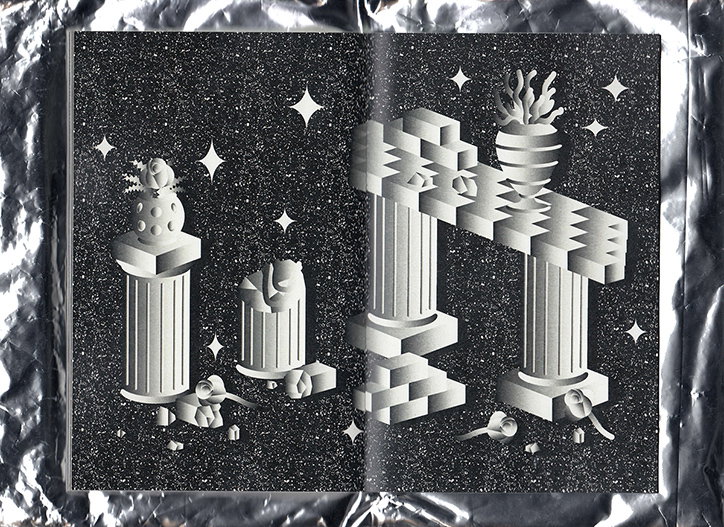
Baptiste Bernazeau: Ruines
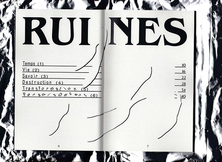
Baptiste Bernazeau: Ruines
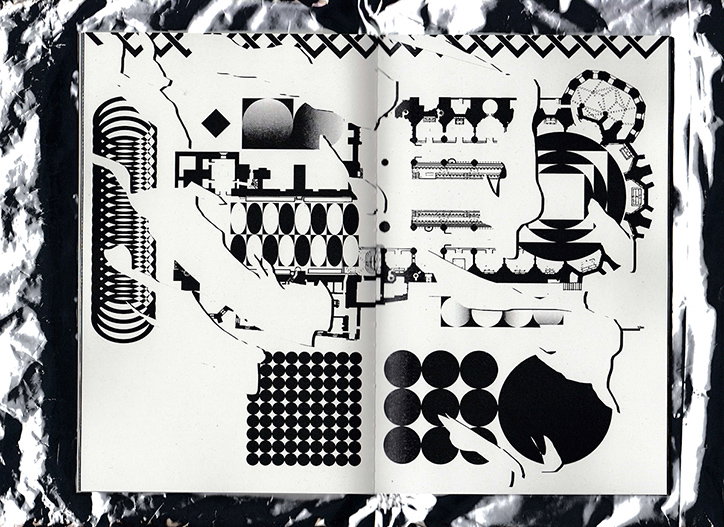
Baptiste Bernazeau: Ruines
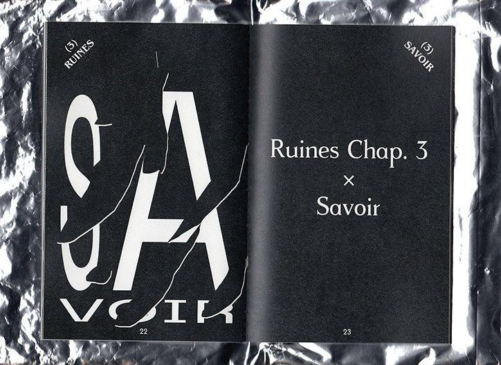
Baptiste Bernazeau: Ruines
Share Article
Further Info
About the Author
—
Rebecca Fulleylove is a freelance writer and editor specialising in art, design and culture. She is also senior writer at Creative Review, having previously worked at Elephant, Google Arts & Culture, and It’s Nice That.


