BEAT magazine editor Hanna Hanra on her title and the state of the music press
Music publishing is in a strange place. There are certain places we go to get our fix: Dazed, Pitchfork, Rolling Stone, NME, ’SUP and FACT to name but a few, but the atmosphere of the industry feels slightly scattered. Do people still want their music news in printed form when the internet will always get there first? We were curious to speak to Hanna Hanra who is the editor of BEAT magazine, on how she started, why the hell she’s doing it, and what the publication aims to do. I asked Hanna who the magazine was aimed at and she answered: “Well, myself, primarily.” Here she is…
Why did you decide to make BEAT?
Because although there is no shortage of magazines, I felt like there was no magazine that I wanted to read – that was funny with good pictures and easy to read and informative and had cool people in, that wasn’t £45. I wanted to make something that was really inclusive that everyone can feel they’d taken something away from.
BEAT Magazine
What do you think about the current state of music editorial and publishing?
Well I feel that the purpose of magazines has changed greatly in the past few years. Like it’s not where you go to find out what cool clubs there are, is it? And I think that some magazines haven’t updated their format. When I see a “news” section, it never really feels like anything in it is new, you know? I guess what I’m trying to say is that publishing is in an interesting place right now. People put so much value on having stuff in print still, which is wonderful. I love having a nice picture that I can hold and put up on my wall and look at. But at the same time, the internet is…you know… our leader.
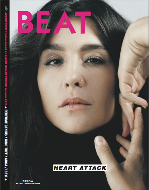
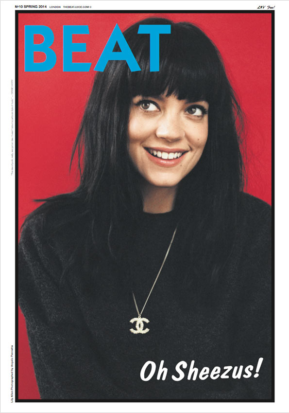
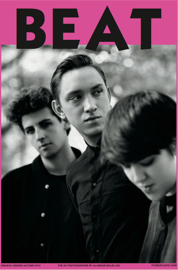
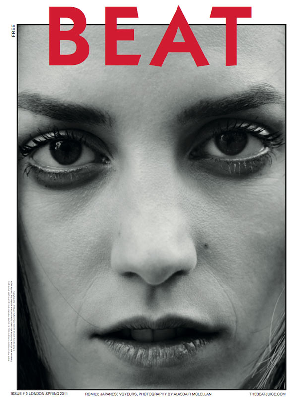
For me your magazine covers are some of the best out there – tell us about a few of your faves…
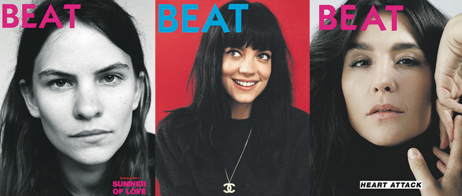
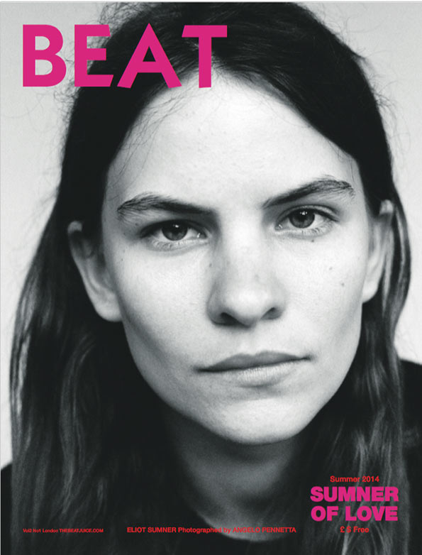
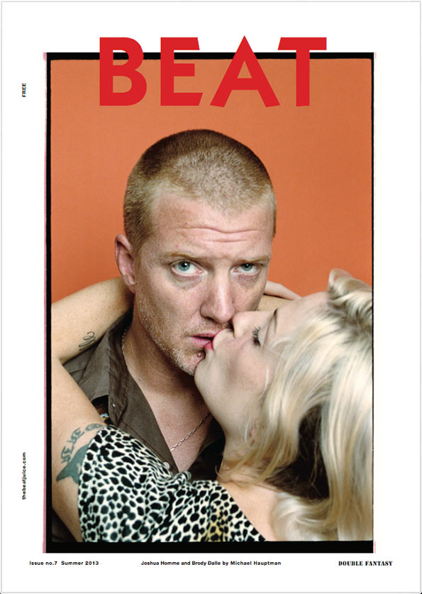
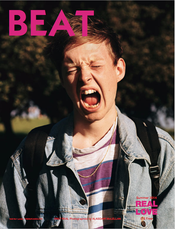
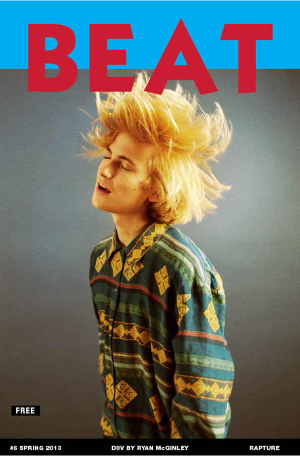
Ah thanks! They’re my faves too. I don’t have a specific favourite. I love the one of Josh Homme and Brody Dalle. It was the first time they’d been shot together. The shoot inside we shot them in a bed (in the Ace Hotel in NY) peeping out from under the covers. I think the first one, of Warpaint, is amongst the best; so stripped back. Clare Shilland’s photography is like an old Derek Ridgers picture – really timeless. And then there’s the last two, which we printed on a gloss. Jessie Ware looks insane and iconic. I loved that shoot.
BEAT Magazine
Did you look at any old music mags for inspiration when created BEAT?
Yeah and I still do. I like, don’t ever want to not look at old music press. Even from ten years ago, it’s still interesting. I love old zines from the punk era the most though, because they were so raw and gutsy and a bit silly.
Some people say that the world of music is sliding down the toilet into the depths of hell – how much do you agree with that?
It’s never going to go away, is it? So I disagree. I think the world of music as people who worked in record labels in the 1990s and early 2000s once knew it is changing. And that can be good and bad – for example, yes people are buying less music than they used to, so artists have to find a new way of monetising themselves and are becoming savvier at how much they’re worth. But is that bad?
BEAT Magazine
BEAT Magazine
BEAT Magazine
BEAT Magazine
BEAT Magazine
BEAT Magazine
Share Article
Further Info
About the Author
—
Liv joined It’s Nice That as an intern in 2011 and worked across online, print and events, and was latterly Features Editor before leaving in May 2015.