






The professional and adept joint portfolio of students Ben Chan and Malone Chen
Ben Chan and Malone Chen are a creative duo currently in their third year studying graphic design at Central Saint Martins. The pair have been collaborating for nearly two years now with a focus on using contemporary and digital techniques with a multitude of creative outputs and are in the process of establishing themselves as “twomuch,” with the launch of their new website today.
Ben and Malone discovered that their styles of working aligned well – while helping each other on separate projects – at the end of their first year at university. Their similar interests in design, as well as in real life, led to a series of seamless collaborations over the following year. “We bounce ideas off each other and aren’t afraid to challenge each other’s work which I think is important. If we don’t like something the other has made we don’t dance around trying to find a nice way to tell them,” Ben tells us.
Their joint portfolio demonstrates an incredibly wide range of skills for designers so early in their career with much of their work incorporating sophisticated motion graphics. This is a result of a working relationship that sees them pushing each other to learn new programs and techniques that will, in turn, enhance their collective skill set. When asked about what is was that attracted them to forming a creative partnership, they explained “our strengths and weaknesses balance out nicely, which tends to mean that the work we make together has more depth and quality than when we work separately.”
The duo first collaborated on a series of posters for D&I Debates – a weekly debate held by their course inviting external speakers to give their two cents on topics such as Hangout or Layout? A debate which asked Gilad Vistosky and the designers from work-form to discuss whether social skills or technical skills are more important for success in the creative world. Ben and Malone’s concept sees two “blobs” moving towards each other, merging and passing by as a reflection of the “sharing and swapping of knowledge which takes place in a debate.”
Their posters and animations for events Dance Lab and Design for Dance were both born out of a simple idea: movement. “We tasked ourselves with representing movement in an abstract, non traditional way,” they explained. As both a creative and playful exercise, the pair created hundreds of tests and experiments pushing themselves until they established visuals that embody the gestures and motions of dancers but in a less literal way. CSM aLive was somewhat of an extension of these concepts, however, the pair really built on their animation skills to create something of an incredibly professional standard.
Even when working in more traditional mediums, the pair tend to incorporate technological or contemporary elements. For example, in Islands of Sadness, they created a 384-page book documenting the emotions of Twitter users over a two week period. Using the Twitter API, they calculated the ratio of happy to sad tweets every five minutes. Using Processing, this data was then turned into a grid where the ratio is represented by “islands of sadness in a sea of positivity.”
It’s clear from their work that Ben and Malone have an innate ability to turn very simple ideas and concepts into intriguing visuals. Their posters already show adeptness worthy of the professional world and with the rest of their final year of study still left to complete, we’re very excited for what the future of "twomuch” will bring.
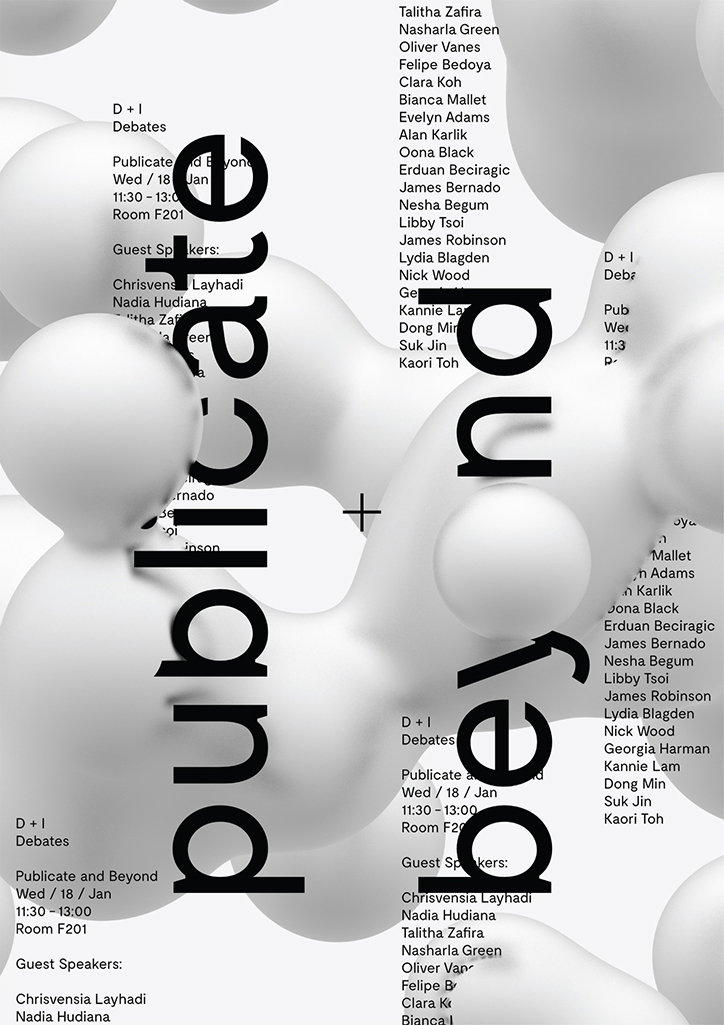
Ben Chan and Malone Chen: D&I Debates Poster
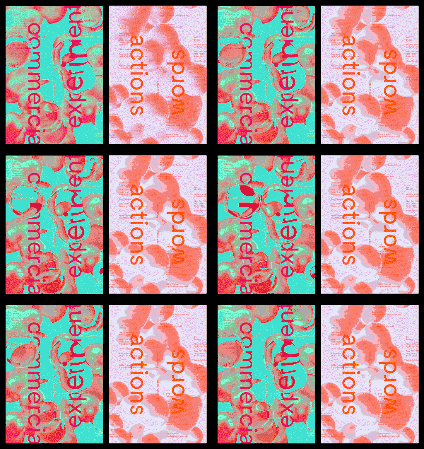
Ben Chan and Malone Chen: D&I Debates Poster
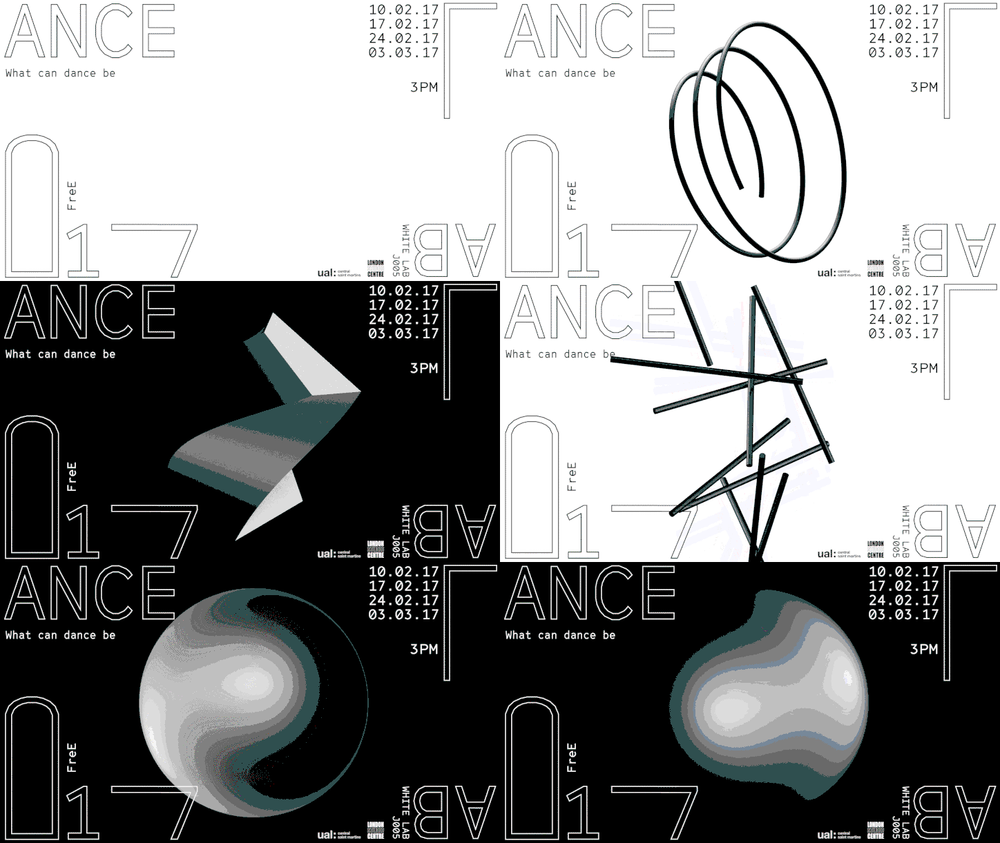
Ben Chan and Malone Chen: Dance Lab Posters
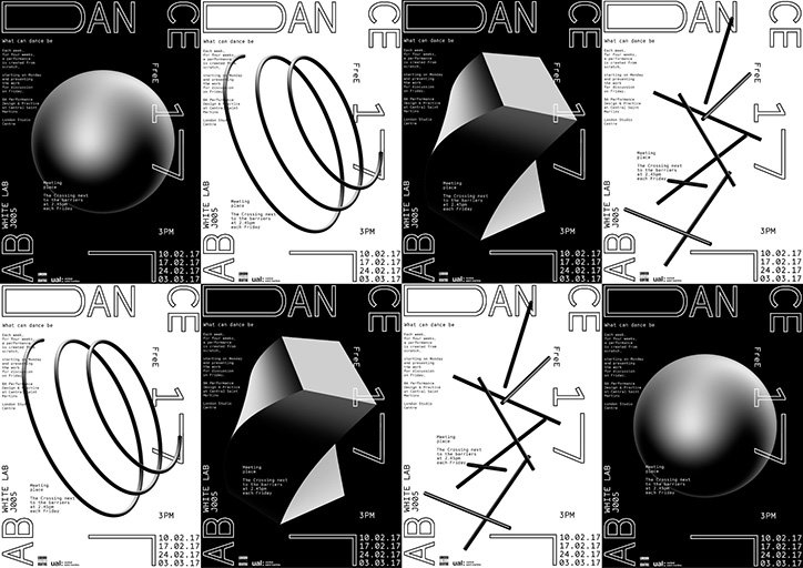
Ben Chan and Malone Chen: Dance Lab Posters
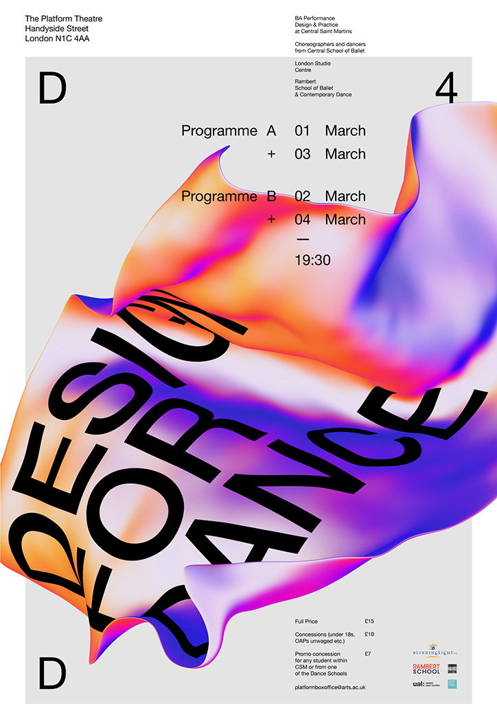
Ben Chan and Malone Chen: Design For Dance Poster
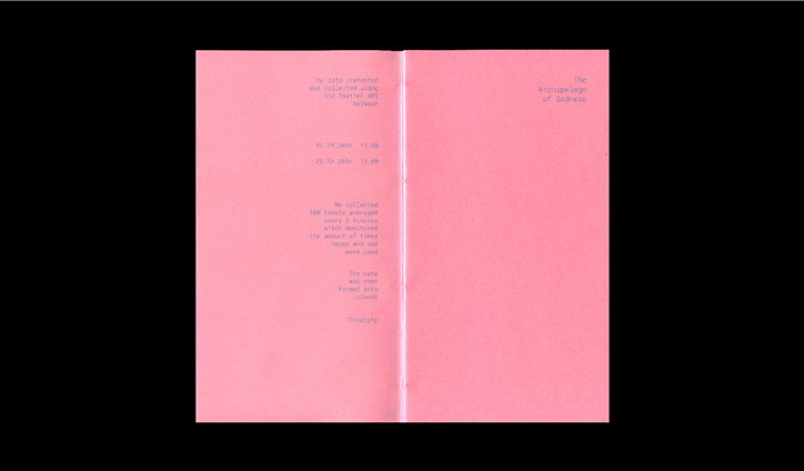
Ben Chan and Malone Chen: Islands of Sadness
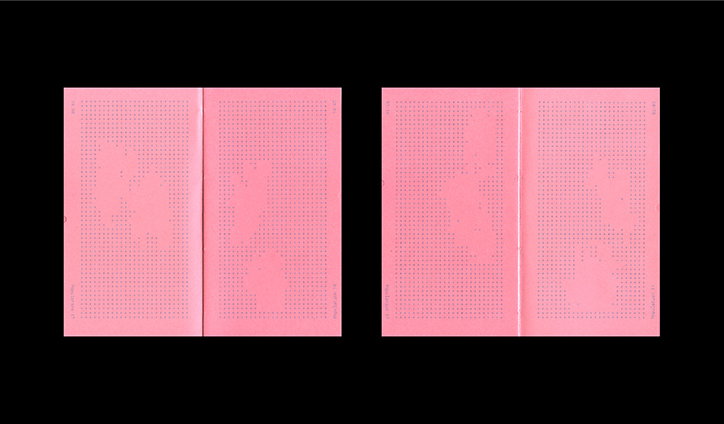
Ben Chan and Malone Chen: Islands of Sadness
Share Article
Further Info
About the Author
—
Ruby is Senior Creative at It's Nice That, overseeing our visual output across platforms and projects. Before that, she was associate editor on the editorial team, after joining in September 2017 following graduation from Central Saint Martins.

