Björn Giesecke allows printing processes and techniques to guide his design decisions
Recently relocated to Tallinn, the German designer experiments with offset, Riso, screen, digital and stamp printing.
Share
Björn Giesecke is a Berlin and Tallinn-based graphic designer who works in any medium or along any path that sparks his interest but always with a clear understanding that concept and process are everything. “I need an idea or a direction that will hold everything together,” he tells It’s Nice That. “I want my decisions to be able to withstand some questioning.” It’s a method of working Björn learned while studying in Rostock, Hamburg, Berlin and now finally at EKA in Tallinn, Estonia.
It was during his studies that Björn first started freelancing, which he has continued to do since graduating. But his interest in graphic design began much earlier, after he got his first computer and began making websites for himself and his friends with “basic knowledge”. This tinkering led him towards graphic design, a creative avenue he values because it is “direct and precise”. He describes the process of combining all the elements of graphic design like playing in an orchestra, “hitting that very special tone at the right timing.”
When he begins a project, therefore, “anything is possible,” as Björn rejects a formula or “recipe” in his process. “I like to have time to try out different directions before going for one,” he says. “I don't start something and know how it will turn out.”
In terms of which element of graphic design he favours, Björn is unwavering in his love of type design and the printing process. In fact, Björn’s projects often think about how a specific printing technique can lead all his design decisions. “The careful consideration of production and print-specific details have always interested me and I have been wanting to translate the knowledge from offset printing back into graphic design decisions,” he elaborates.
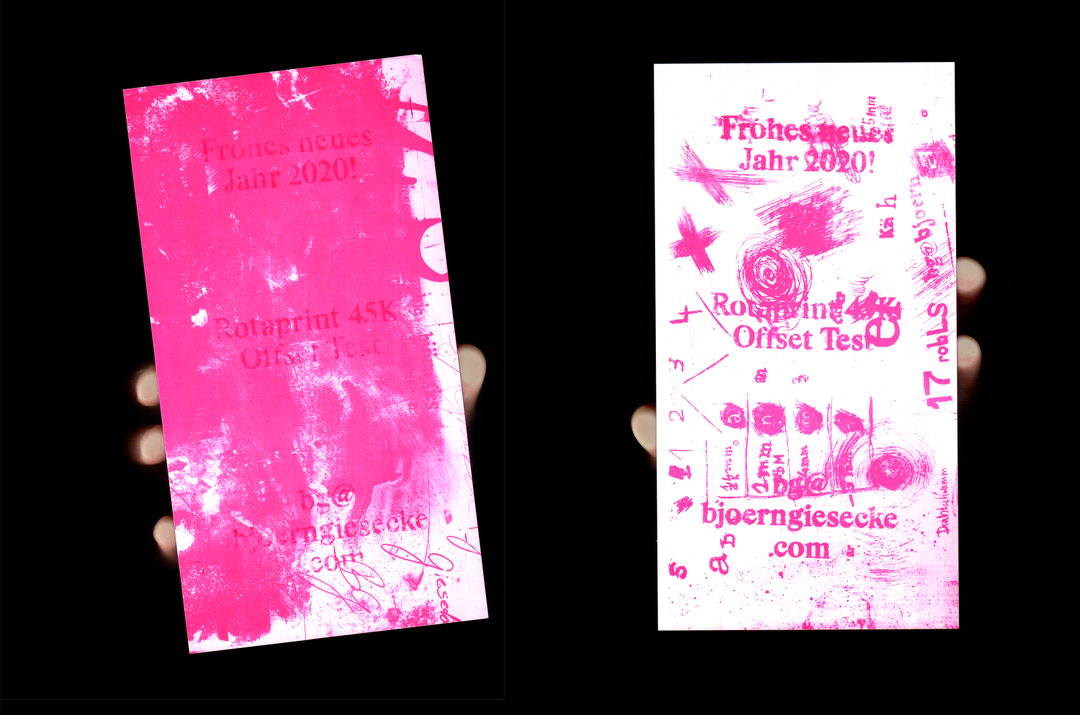
Björn Giesecke: New Year’s Card 2020 (Copyright © Björn Giesecke, 2020)
Much of his knowledge around offset comes down to three weeks he spent at Druckerei zu Altenburg (DZA) last September where Björn was able to ask all the questions he had about the process. Now, he often collaborates with a smaller scale local printer in Berlin. “Because he’s open for experiments, I go there with an idea and we’ll see how it’s printed and maybe use it for larger print runs,” Björn explains. “Bringing printing and design together to take it to the point where print decisions determine the graphic design. I understand printing much more as a translation of the given material, as graphic design is too.”
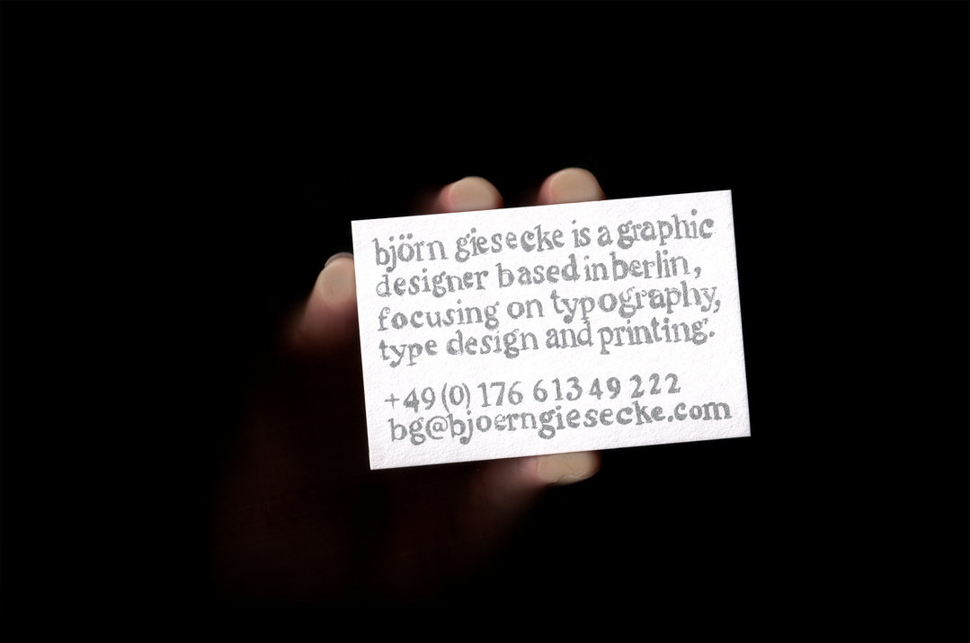
A perfect expression of the designer’s experiments with printing is his own business cards, which were printed at a printer next to the former Rotaprint factory site and which still uses small offset machines, built like the Rotaprint 45K. The design was scratched directly onto the offset plate using a screwdriver and, when printed using silver ink, “may now look like it was drawn with a pencil.” He also created a New Year 2020 card there, printed resting offset plates from previous tests where he’d been scratching, marking, using a ballpoint pen, acetone transfers and an accidental chemical reaction “which I could not control, but looked great,” Björn adds.
Another project was for a two-day symposium at the Berlin University of the Arts which brought together staff and students to exchange thoughts and experiences on teaching in the arts, design and sciences. Björn explains the printed matter he produced for the event, in collaboration with Lucas Liccini: “Symbolising the teacher-scholar dialogue, every item of printed communication for the event combines two different printing techniques, splitting the contents into two colours and making use of screen print, Riso, digital, offset and stamping. The difficulty of completing the two halves and the near impossibility of making them fit perfectly represents the constructive confrontation of diverse opinions and views in the university education system.”
Having just moved to Tallinn to study towards a master’s in graphic design at EKA, there’s a lot more to come from Björn who is eager to continue working on freelance projects, he tells us, “using what I’ve learned in offset printing in a larger scale of real projects.”
GalleryBjörn Giesecke
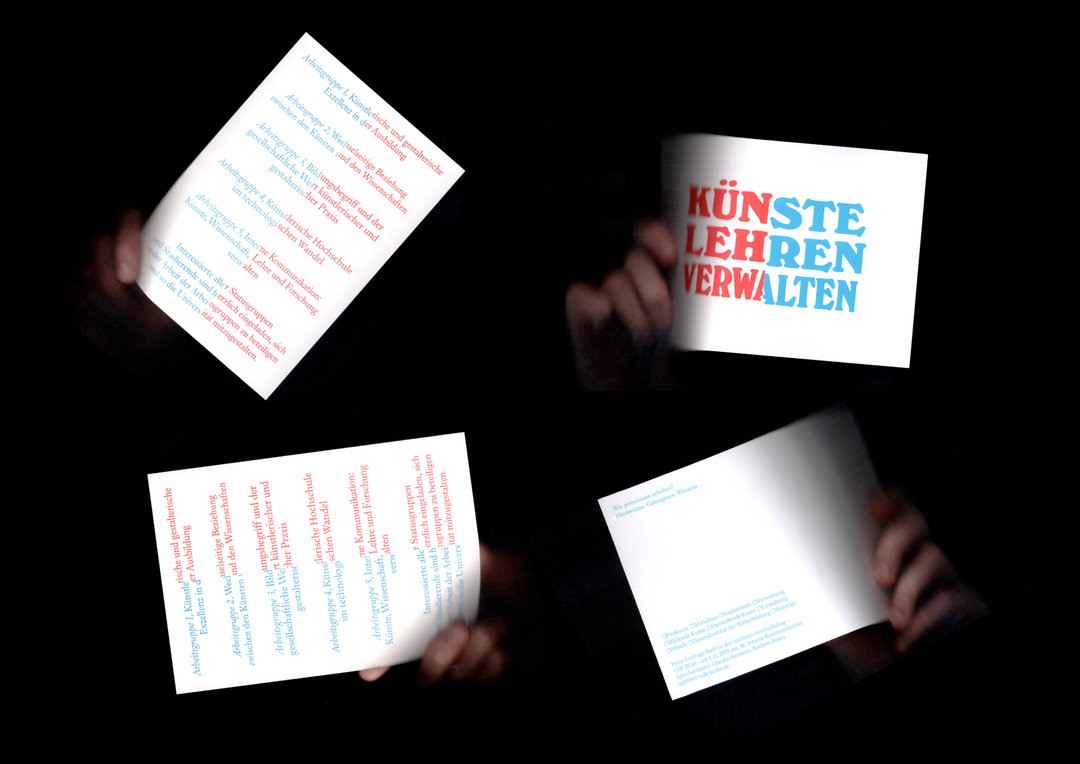
Künste Lehren at the University of the Arts Berlin, with Lucas Liccini (Copyright © Björn Giesecke and Lucas Liccini, 2019)
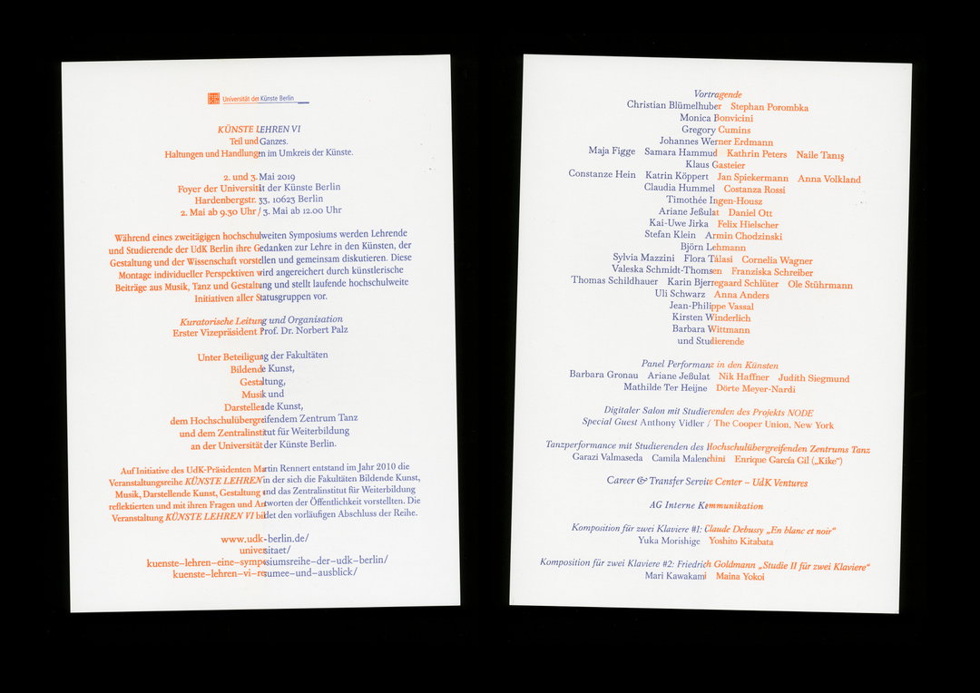
Künste Lehren at the University of the Arts Berlin, with Lucas Liccini (Copyright © Björn Giesecke and Lucas Liccini, 2019)
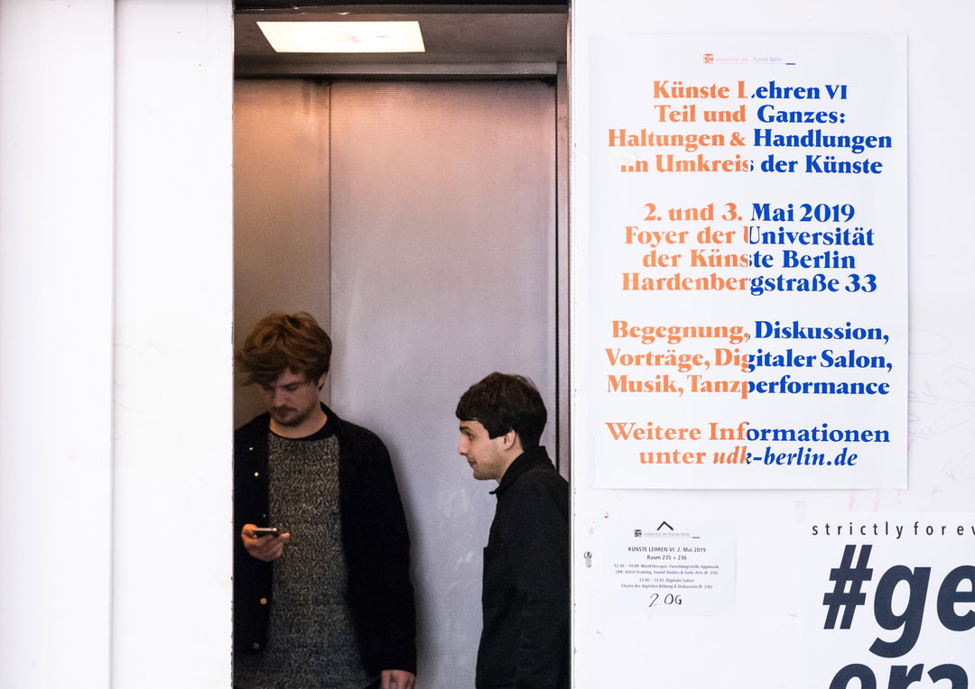
Künste Lehren at the University of the Arts Berlin, with Lucas Liccini (Copyright © Björn Giesecke and Lucas Liccini, 2019)
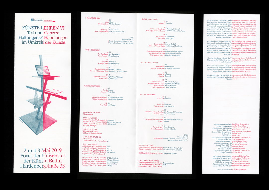
Künste Lehren at the University of the Arts Berlin, with Lucas Liccini (Copyright © Björn Giesecke and Lucas Liccini, 2019)
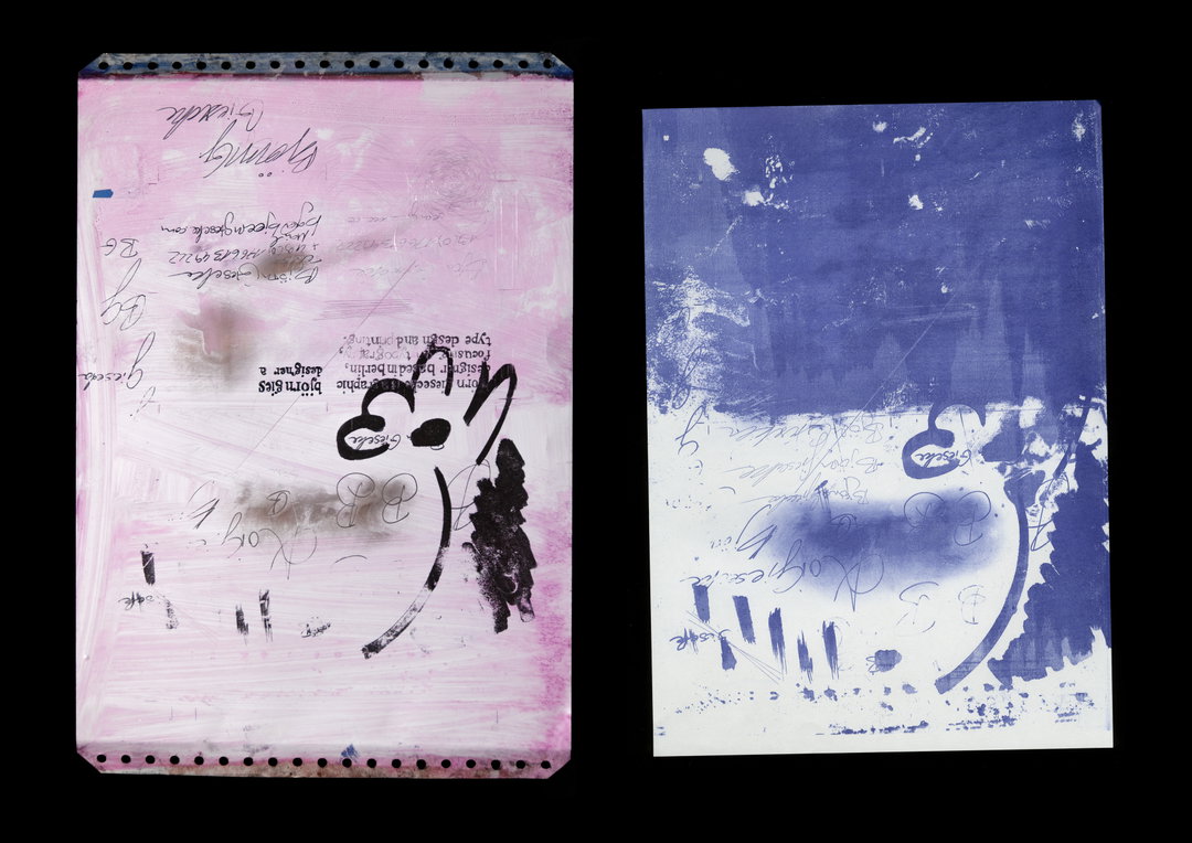
Offset test plates for New Year‘s card (Copyright © Björn Giesecke, 2020)
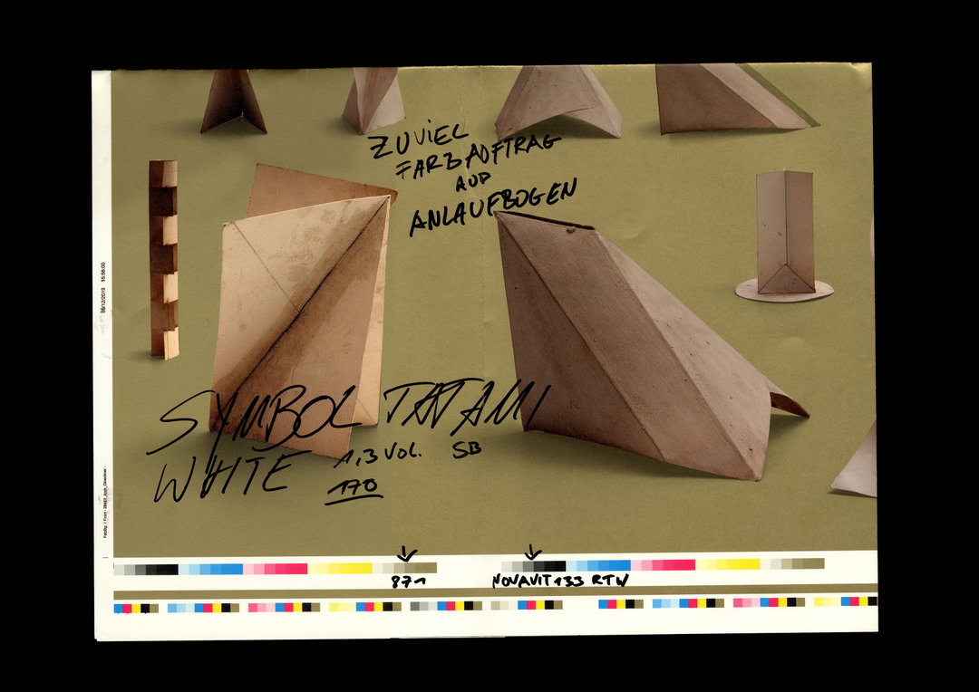
Collected Makulatur from DZA (Copyright © Björn Giesecke, 2019)
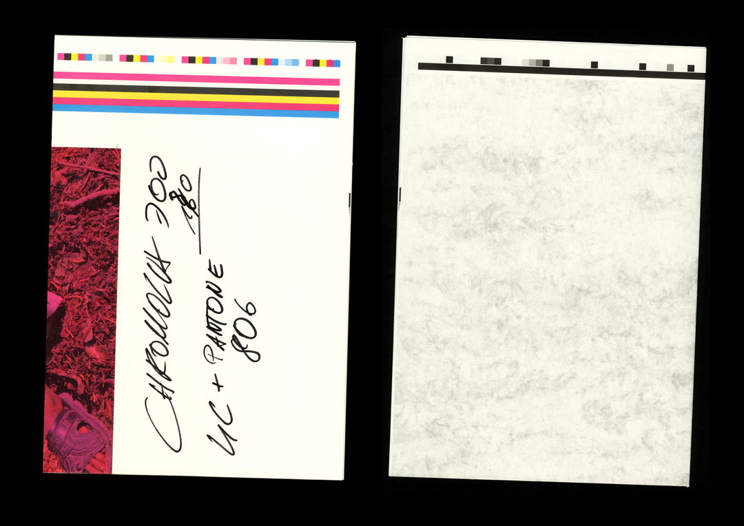
Collected Makulatur from DZA (Copyright © Björn Giesecke, 2019)
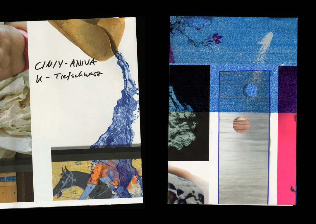
Collected Makulatur from DZA (Copyright © Björn Giesecke, 2019)
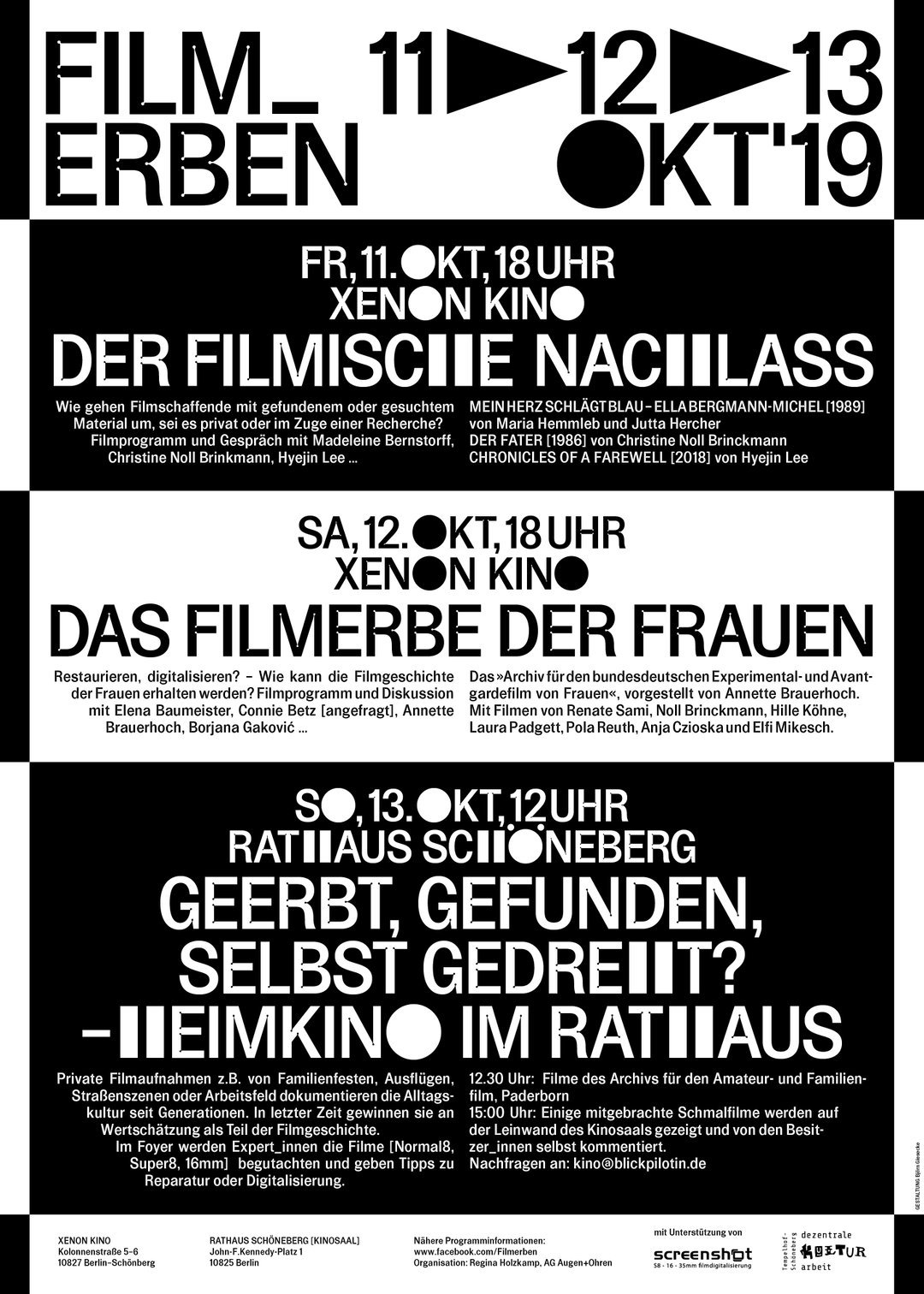
Poster for Film_Erben (Copyright © Björn Giesecke, 2019)
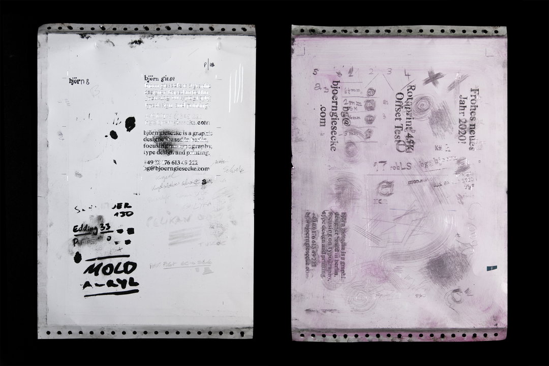
Offset test plates for business card (Copyright © Björn Giesecke, 2019)
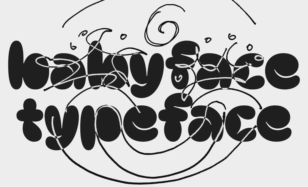
First steps for Babyface typeface (Copyright © Björn Giesecke, 2020)
Hero Header
Björn Giesecke: Business card (Copyright © Björn Giesecke, 2019)
Share Article
Further Info
About the Author
—
Ruby is Senior Creative at It's Nice That, overseeing our visual output across platforms and projects. Before that, she was associate editor on the editorial team, after joining in September 2017 following graduation from Central Saint Martins.