Bloomberg's Tracy Ma talks us through her best and worst uni projects
As Deputy Creative Director of Bloomberg Businessweek Tracy Ma is responsible for turning out page after page of stunningly-conceived graphics accompanying hard-hitting economic and political stories at breakneck speed. Together with Richard Turley and Rob Vargass she’s been responsible for transforming the title into a new benchmark for editorial design, receiving plenty of plaudits along the way. Of course it’s easy to assume that Tracy has always been visually gifted, but when we spoke to her about her university work she made it very clear that it took a long time for her to produce anything that she was really happy with…
Tracy Ma: The Reference Manual for Boredom and Distraction
Tracy Ma: The Reference Manual for Boredom and Distraction
Tracy Ma: The Reference Manual for Boredom and Distraction
My work from design school was pretty pretentious. Looking at it now there’s clearly this want for my work to be somehow more monumental than it actually is. Although the earnestness is refreshing, (considering the last things I worked on were this, this and this – all pretty satirical pieces), there’s something about the intimacy that really embarrasses me. I wish I was able to laugh about everything being so serious back then.
But seriousness was popular at the time for some reason. I started first year in late 2006. School was a pretty sweet place to ride out the recession but I think a lot of us were wondering what the hell we were going to do with a degree in telling people to buy stupid crap. So there was this weird trend in my graduating class to redefine what graphic design was.
I’m not sure the teachers caught our drift or our anxiety because they just continued giving us assignments like “make a poster for a horticultural festival!” or “make a book trailer!”
"School was a pretty sweet place to ride out the recession but I think a lot of us were wondering what the hell we were going to do with a degree in telling people to buy stupid crap. So there was this weird trend in my graduating class to redefine what graphic design was."
Tracy Ma
We never opened up a dialogue about how visual culture is being massively transformed by the internet and how the heck to prepare for that as a person who communicates visually. I look at some projects now and I think that those must have been some of the things I was thinking about.
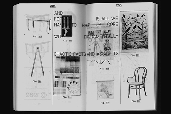
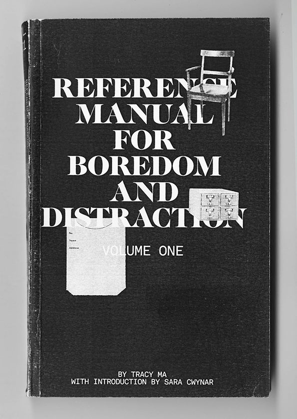
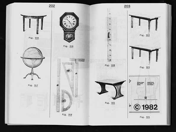
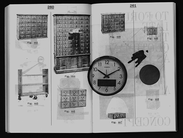
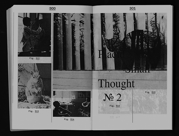
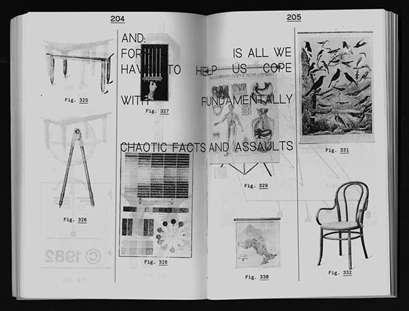
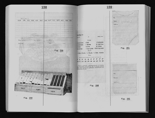
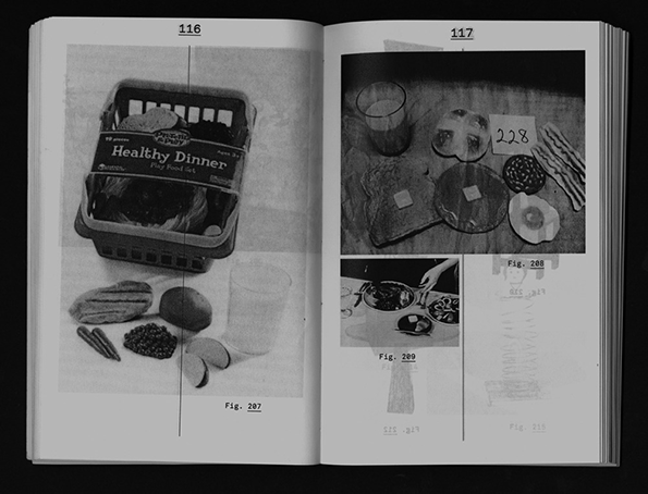
I made this book called The Reference Manual. It’s a flood of images and quotes that seems like it’s strung together by a narrative, but it’s really hard to make out. As a reader you go through it and you get the feeling you’re being left out of some big revelation. It’s in part about my experience at the time of being completely punched in the face by the visual richness of the internet and not knowing how at all how to react or talk about it.
After the rigamarole of learning all the major art movements I remember feeling really disappointed that the stylistic movement of my own time was just a mass recycling of older styles. In The Reference Manual, yearbook images from the 1970s, old photographs of monuments and scans of old textbooks are all real images of real things from a real time. By presenting them in this very flat catalogue I’m trying to avoid displaying them with any kind of nostalgia so they don’t provoke that kind of feeling.
Tracy Ma: The Reference Manual for Boredom and Distraction
Tracy Ma: The Reference Manual for Boredom and Distraction
Tracy Ma: The Reference Manual for Boredom and Distraction
Tracy Ma: The Reference Manual for Boredom and Distraction
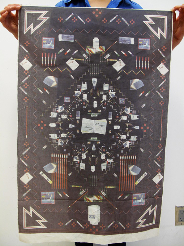
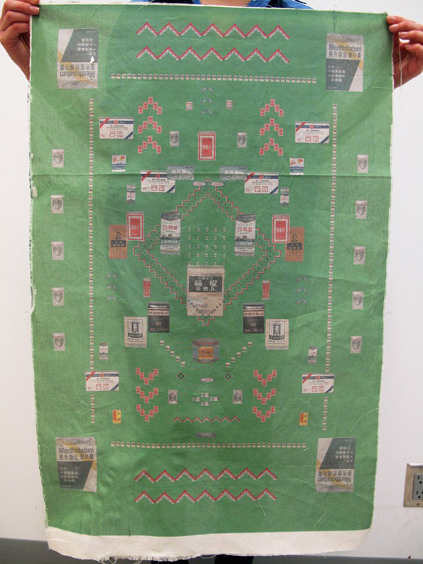
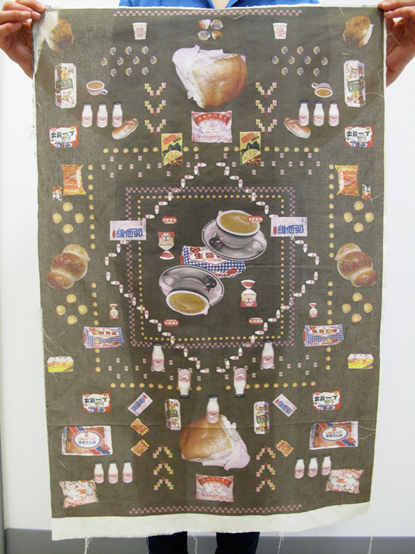
For a piece called Cute Things HK I collaged a bunch of consumable goods from when I was a kid growing up in Hong Kong: certain brands of crayons, candy wrappers, medicine labels. I thought it was neat how there are 7.188 million people out there with whom I share a similar culture, and for those people these visual cues mean a great deal of things and command strong memories and emotions. But in my new home, to my new Western audience, these objects are completely empty of meaning. So these tapestries were kind of a way of purging my entire visual vocabulary.
Tracy Ma: Hong Kong Tapestries
Tracy Ma: Hong Kong Tapestries
Tracy Ma: Hong Kong Tapestries
I also made a magazine about movies from Hong Kong. Mostly the project was about me freaking out at the idea that the place that I identify most with is about to vanish before I even got a chance to really know it. The project might seem totally angsty but in light of recent protests maybe the sentiment isn’t entirely unfounded after all.
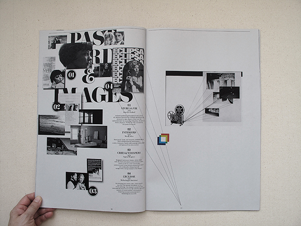
Tracy Ma: Hong Kong Movies
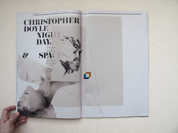
Tracy Ma: Hong Kong Movies
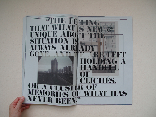
Tracy Ma: Hong Kong Movies
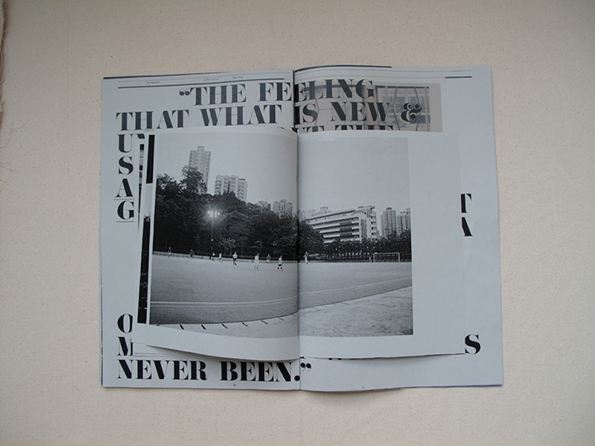
Tracy Ma: Hong Kong Movies
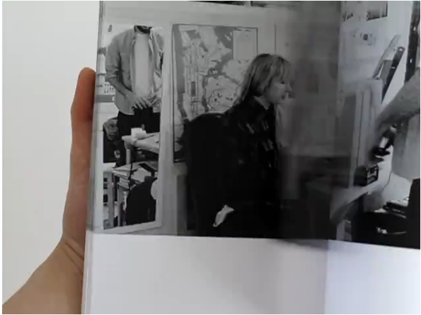
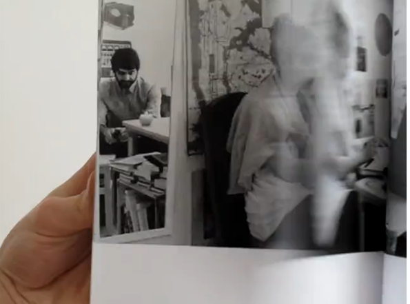
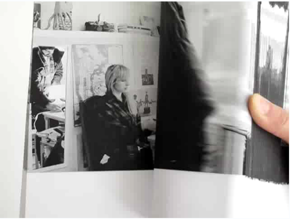
The absolute worst project I ever made are these five 500-page flip books that try way too hard to be important. They were supposed to talk about how we re-write our memories (cringe). I had two actors play the same scene five times each with slightly altered set and costumes. It’s like I ingested Sans Solei and barfed out a tree’s-worth of print outs.
Tracy Ma: Flipbooks
Tracy Ma: Flipbooks
Tracy Ma: Flipbooks
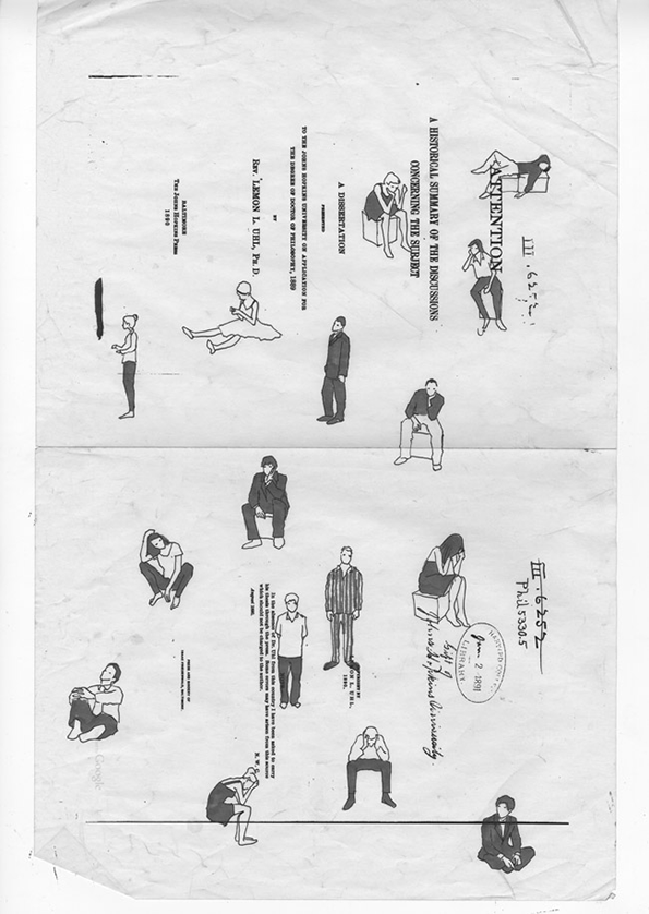
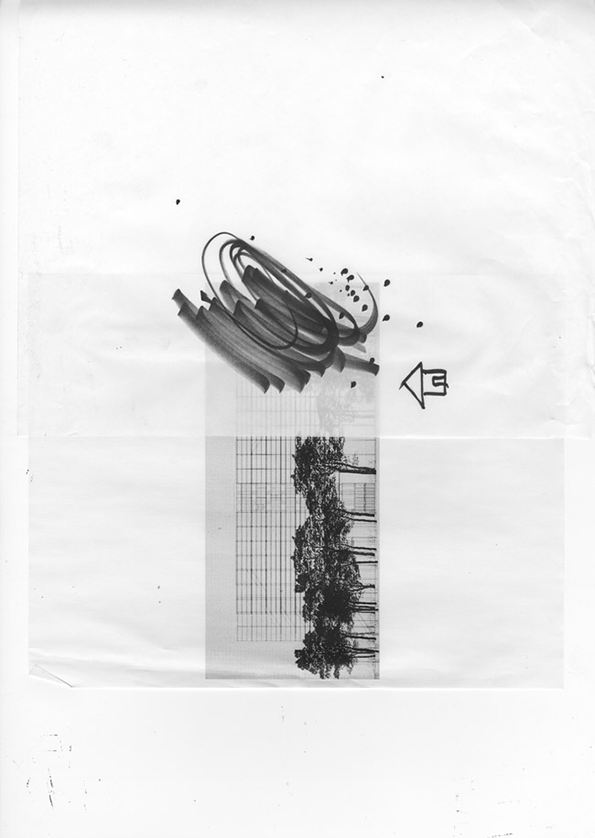
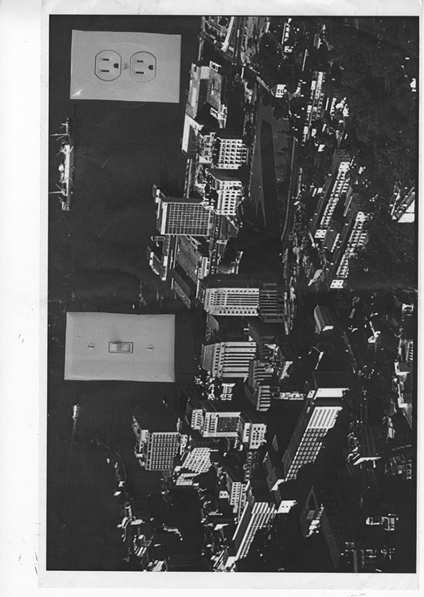
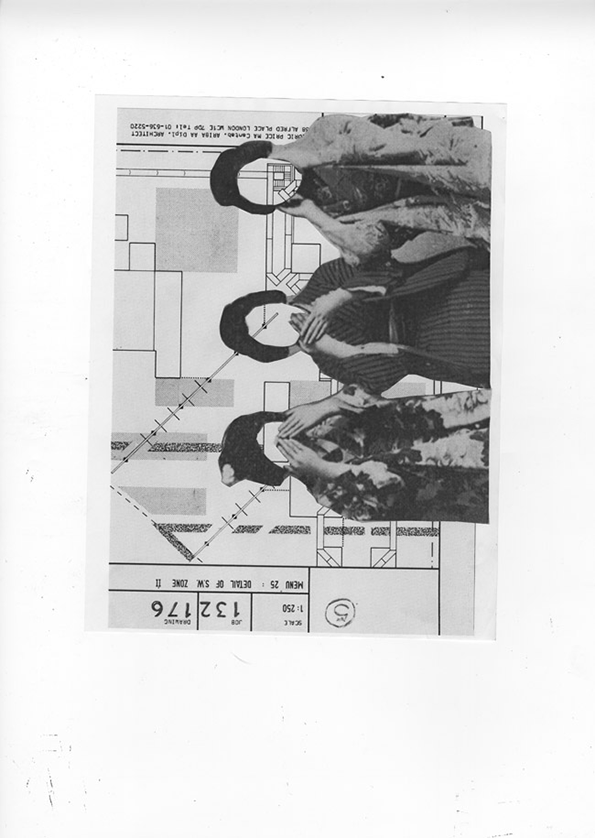
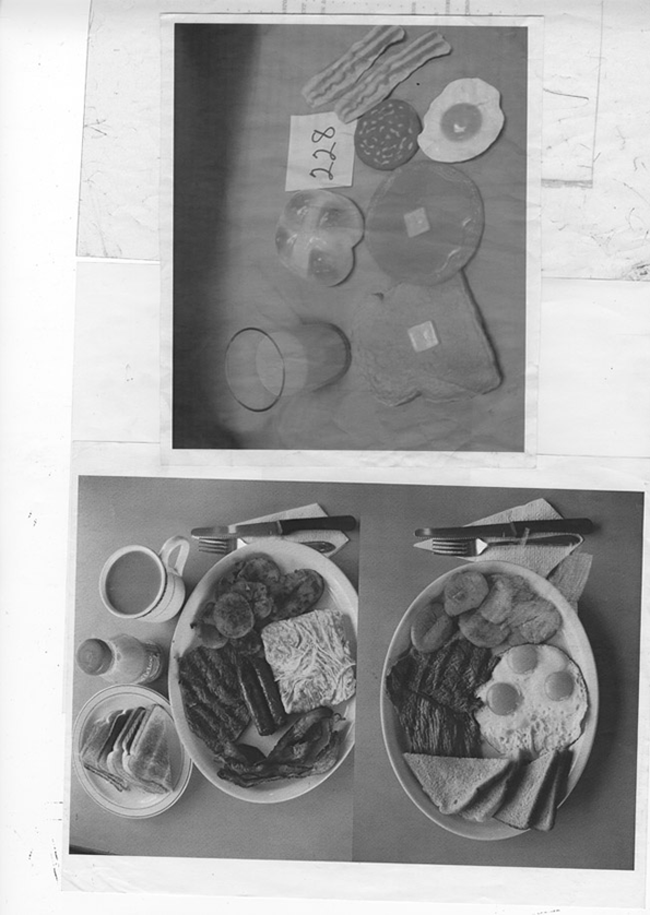
I think the best projects are these collages, which I made at school but not for any particular project or class. They don’t really form any one idea but I like how it shows a young girl trying to claw at lots of things all at once. All in all, I wish I had made some more lowbrow and brilliant stuff in school instead of trying to make highbrow and despicable flip books, but whatever; it just took me a bit longer to learn that lesson.
Tracy Ma: Collages
Tracy Ma: Collages
Tracy Ma: Collages
Tracy Ma: Collages
Tracy Ma: Collages
Back to School
Throughout the month of October we’ll be celebrating the well-known autumnal feeling of Back to School. The content this month will be focusing on fresh starts, education, learning tools and the state of art school in the world today – delivered to you via fantastic in-depth interviews, features and conversations with talented, relevant, creative people.
Share Article
Further Info
About the Author
—
James started out as an intern in 2011 and came back in summer of 2012 to work online and latterly as Print Editor, before leaving in May 2015.