Launch Recite Me assistive technology
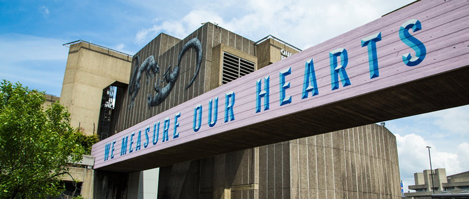
A large concrete building is partially obscured by a long, purple beam in the foreground. The beam features bold blue 3D lettering that reads “WE MEASURE OUR HEARTS”.

Graphic Design: Great new updates from the ever excellent Bread Collective

—
Date
23 September 2013

Like many of you I fight a constantly unsuccessful battle against the emails that pile into my inbox and so it’s hard to overestimate the importance of an eye-catching subject line. Those few short words have the power to hone in my scatty attention on the contents within and something like new updates from creative powerhouse the Bread Collective have me at hello. As ever the east London studio don’t disappoint; the identity work for online store Such & Such is smart and stylish but it’s the amazing murals for the Hayward Gallery on London’s South Bank that really stand out. They were created as part of the gallery’s Festival of Neighbourhood and bring the poetry of Cheryl Moskowitz to life on huge 35ft long concrete walkways which stretch 22 metres above the ground. These bright hand-painted pieces juxtapose with the brutalist surroundings and prove once again that Bread’s emails are a great source of inspiration.
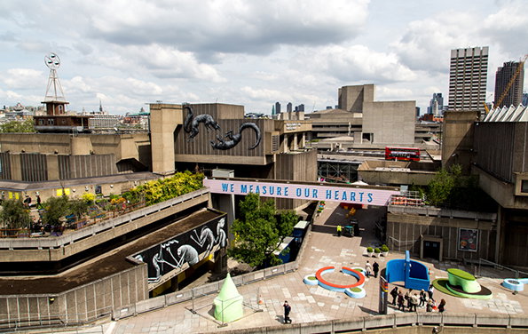
The brutalist concrete architecture of the Southbank Centre in London. A pink banner stretched across a walkway reads “WE MEASURE OUR HEARTS”, while large black sculptures of animals sit atop a building.
Above

Bread Collective: Murals for The Festival of Neighbourhood
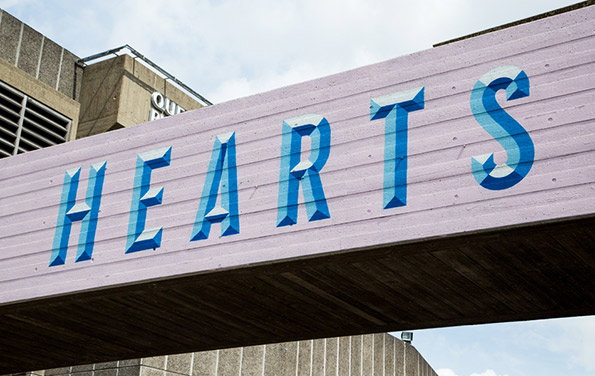
A light purple sign features the word “HEARTS” in bold, blue 3D lettering. A concrete building is visible in the background under a pale sky.
Above

Bread Collective: Murals for The Festival of Neighbourhood
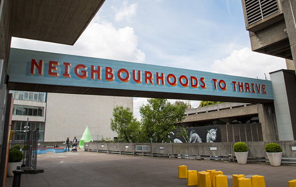
A large blue sign spans a concrete walkway, featuring the words “NEIGHBOURHOODS TO THRIVE” in bold, red 3D lettering. In the background, a brutalist building stands beside green trees and a black and white mural of horses.
Above

Bread Collective: Murals for The Festival of Neighbourhood
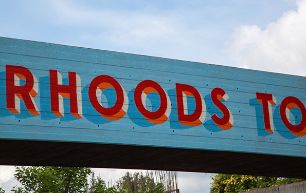
A light blue wooden sign features bold, red 3D lettering that reads “RHOODS TO”. The sign is set against a pale blue sky with soft white clouds.
Above

Bread Collective: Murals for The Festival of Neighbourhood
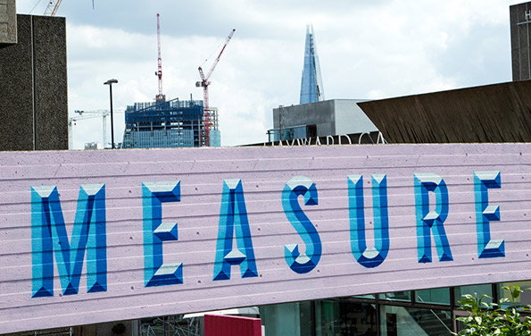
A large purple hoarding features the word “MEASURE” in bold, 3D blue lettering. In the background, construction cranes and the Shard rise against a cloudy sky.
Above

Bread Collective: Murals for The Festival of Neighbourhood
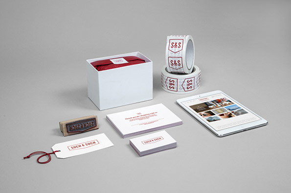
A branding identity kit for “Such & Such” laid out on a grey background. The set includes a white box with red tissue paper, business cards, a rubber stamp, a tablet and rolls of branded tape.
Above

Bread Collective: Such & Such branding
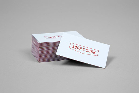
A stack of white business cards on a grey background. The top card leans against the pile, featuring the words “SUCH & SUCH” in red uppercase letters inside a thin red border.
Above

Bread Collective: Such & Such branding
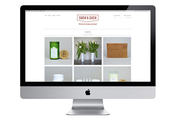
An iMac displays a clean, minimalist e-commerce website for a brand called “Such & Such”. The homepage features a grid of product photos, including a green candle, white vases with tulips and a brown leather pouch.
Above

Bread Collective: Such & Such branding

Share Article

About the Author

Rob Alderson

—

Rob Alderson is a freelance writer, editor and strategist. He was previously editor-in-chief of It’s Nice That and WePresent, and editor of Design Week. He publishes the newsletter Undo, which tries to make sense of how AI is changing design work, the design process and the design industry.


It's Nice That Newsletters

Fancy a bit of It's Nice That in your inbox? Sign up to our newsletters and we'll keep you in the loop with everything good going on in the creative world.