Launch Recite Me assistive technology
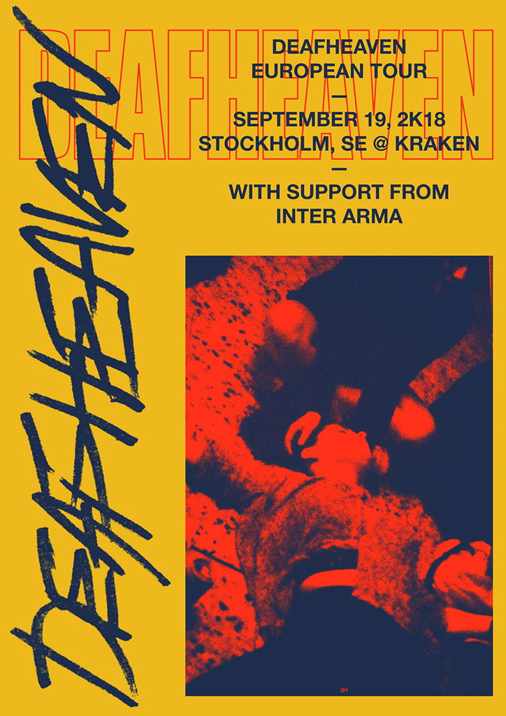
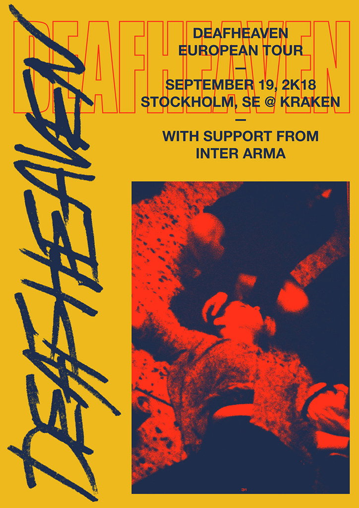
A yellow concert poster for the band Deafheaven. Bold text reads “Deafheaven European Tour”, “September 19, 2K18”, “Stockholm, SE @ Kraken” and “With support from Inter Arma”. A high-contrast red and dark blue image shows a person leaning back with their eyes closed. The band name “Deafheaven” is written in large, expressive blue script along the left side.

Designer Brodie Kaman on how creative outlets can help control mental illness and addiction

—
Date
30 July 2018

We’ve long admired the work of Australian graphic designer Brodie Kaman, with its DIY aesthetic and experimental, dogged visuals. Based in Los Angeles the last time spoke to him, the designer has since spent time in London, before recently settling in Berlin, and has begun to explore self-discovery and human individual suffering within his personal work, both as a coping mechanism and a creative outlet.

“I’ve been wanting to live [in Berlin] for a while now – a beautiful studio space and a room in a friend’s apartment simultaneously popped up, so I jumped at the opportunity,” he tells It’s Nice That. Born from a process of constant experimentation, Brodie has spent the last year working with musicians, fashion and record labels across everything from flyers and records to textile design and branding.

When it comes to his self-initiated projects, mental health and addiction have emerged as themes within his personal practice. Both have informed his work “from the moment I put pen to paper,” he describes, “but in more recent times, I have started to further expose myself. Mental illness and addiction run rampant in my life if left unchecked, they’re chronic conditions which have to be worked at on a daily basis; they’re never far away.”

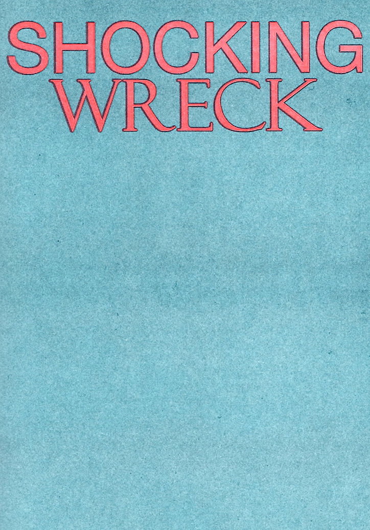
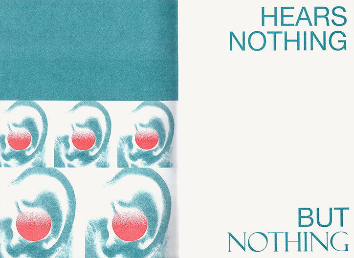
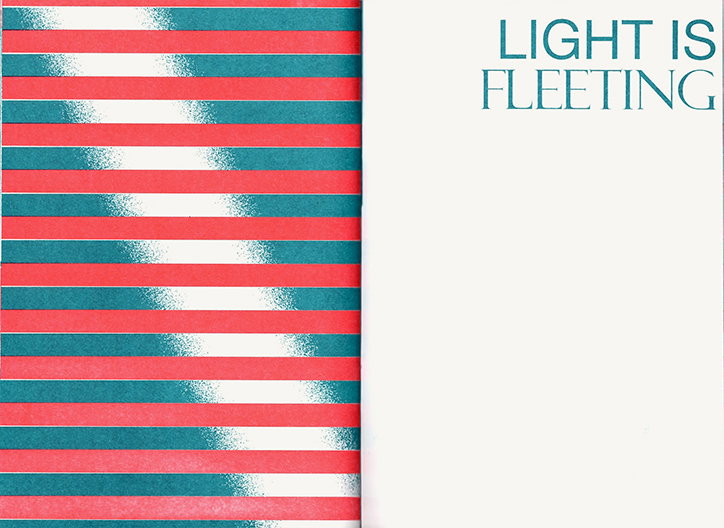
Earlier this year, Brodie created Shocking Wreck for These Days in LA, which encapsulates a rocky moment in the designer’s life. “Low times can inform my best work,” he explains, “and I’m thankful for those times in retrospect.” Printed on Risograph, the zine utilises this notion, turning a “self-imposed isolation” into a series of poetic, visual elements running alongside Brodie’s writings. “Mental illness affects so many of us – within the creative universe and beyond – it can be debilitating and sometimes fatal if not addressed. By shining my own light on it, I hope to further open up the dialogue around such issues,” Brodie explains.

Although graphic design forms the majority of Brodie’s creative practice, he works across various mediums. “I have a lot of gratitude for self-expression,” he remarks, “without trying to sound like an asshole, poetry has been a great source of motivation for me when I’m hitting a wall – the written word is powerful!” The same applies to music, which the designer uses to “douse the spark” or redirect his energy whenever he’s feeling deflated. In this sense, Brodie’s creative outlets inform each other, creating a synergy between whatever techniques, processes, concepts or motifs he works within.

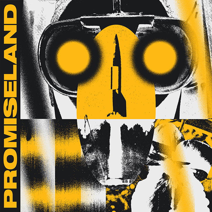
Despite having clear-cut ideas on what it is that helps keep him inspired, when it comes to his process, “I try to avoid a systematic approach,” he explains, “I wouldn’t say that there is a blueprint for my practice.” It’s this spontaneity which produces some of Brodie’s most exciting work, even on commercial projects. When producing the artwork for Promiseland’s 7”, he allowed the music itself to inform his outcome. “I was listening to the tracks super loud and messing around with all these different images and elements one night until the resulting graphic felt done,” he recalls.

Whether working on personal or commercial projects, design gives Brodie a reason to be “mentally, physically and spiritually fit,” he explains, concluding that “When I notice I’m vulnerable or foresee myself falling back into old patterns, creating gives me a reason to step back and regain composure.”
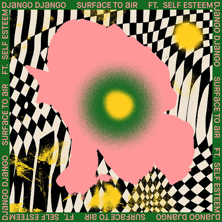
An album cover featuring a large, abstract pink shape with a glowing yellow and green centre. The figure is set against a distorted black and white checkerboard background with yellow splatters. A green border contains the repeated text “Django Django”, “Surface to Air” and “ft. Self Esteem”.
Above

Brodie Kaman

A collage in black, white and yellow. A high-contrast image of binoculars is overlaid with a yellow silhouette of a missile and the word “PROMISELAND” running vertically along the left edge.
Above

Brodie Kaman

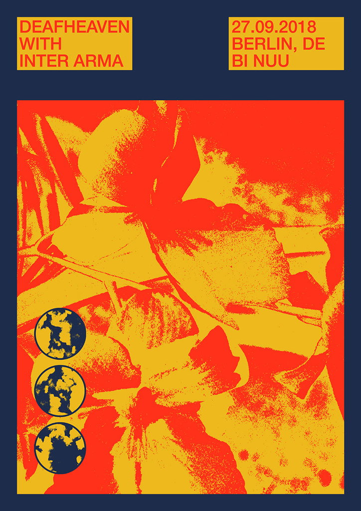
A concert poster in red, yellow and navy blue. Text at the top reads “Deafheaven with Inter Arma” and “27.09.2018 Berlin, De Bi Nuu”. Below, a high-contrast image shows abstract floral shapes with three small circular motifs in the bottom left.
Above

Brodie Kaman

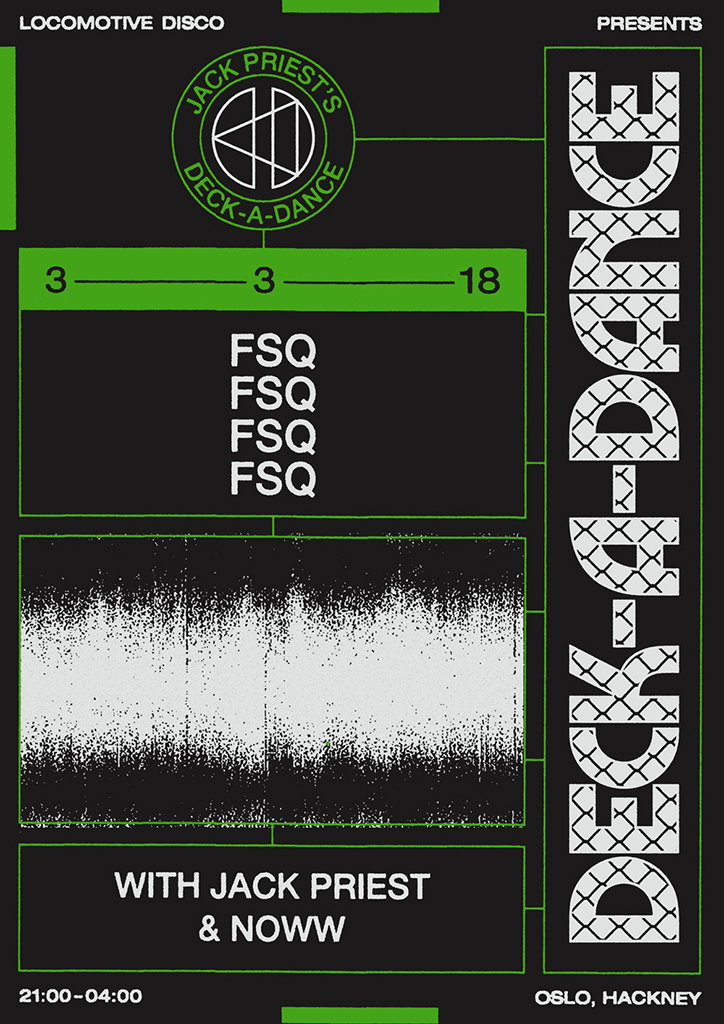
A black and green poster for a music event. Large vertical text on the right reads “Deck-a-Dance”, while a circular logo at the top reads “Jack Priest’s Deck-a-Dance”. The poster lists the performers as “Jack Priest & Noww” and the location as “Oslo, Hackney”. The time is listed as “21:00–04:00”.
Above

Brodie Kaman

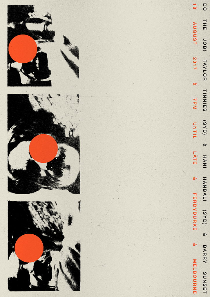
A poster featuring three high-contrast, black and white photographs of a person’s face, each overlaid with a bright orange circle. Vertical red text on the right lists the date “18 August 2017” and a line-up including “Jobi Taylor”, “Tinnies (Syd)”, “Hani Hanbali (Syd)”, “Ferdydurke” and “Barry Sunset Melbourne”.
Above

Brodie Kaman

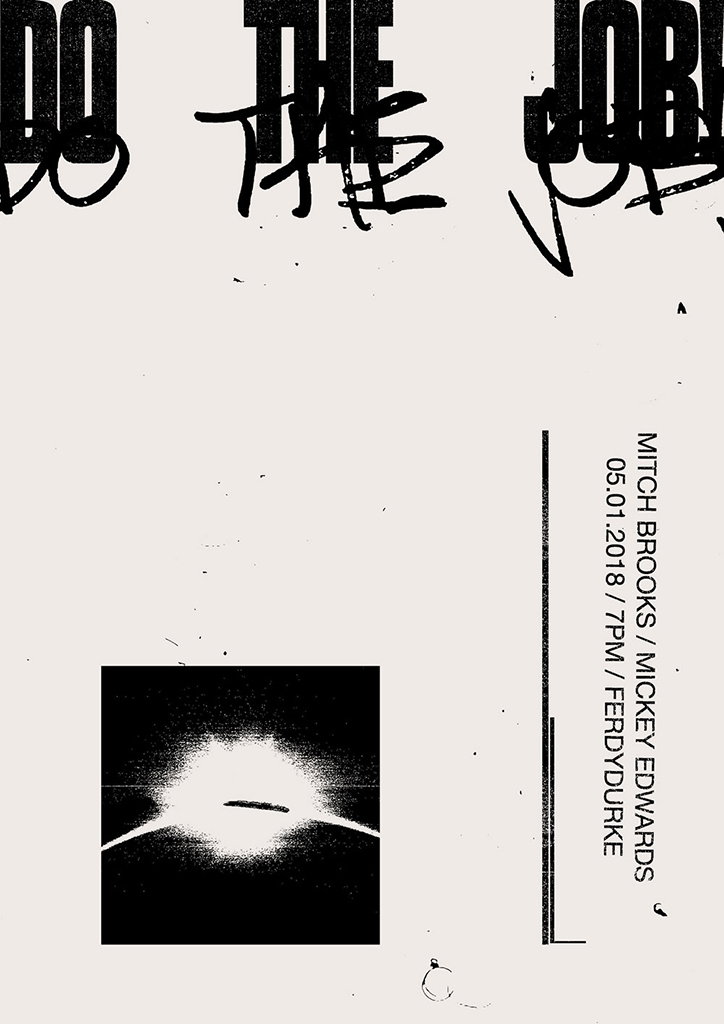
A black and white poster featuring the bold words “DO THE JOB” at the top, with handwritten scribbles layered over the text. A small, high-contrast image of a glowing horizon sits in the lower left. Vertical text on the right reads “MITCH BROOKS / MICKEY EDWARDS” and “05.01.2018 / 7PM / FERDYDURKE”.
Above

Brodie Kaman

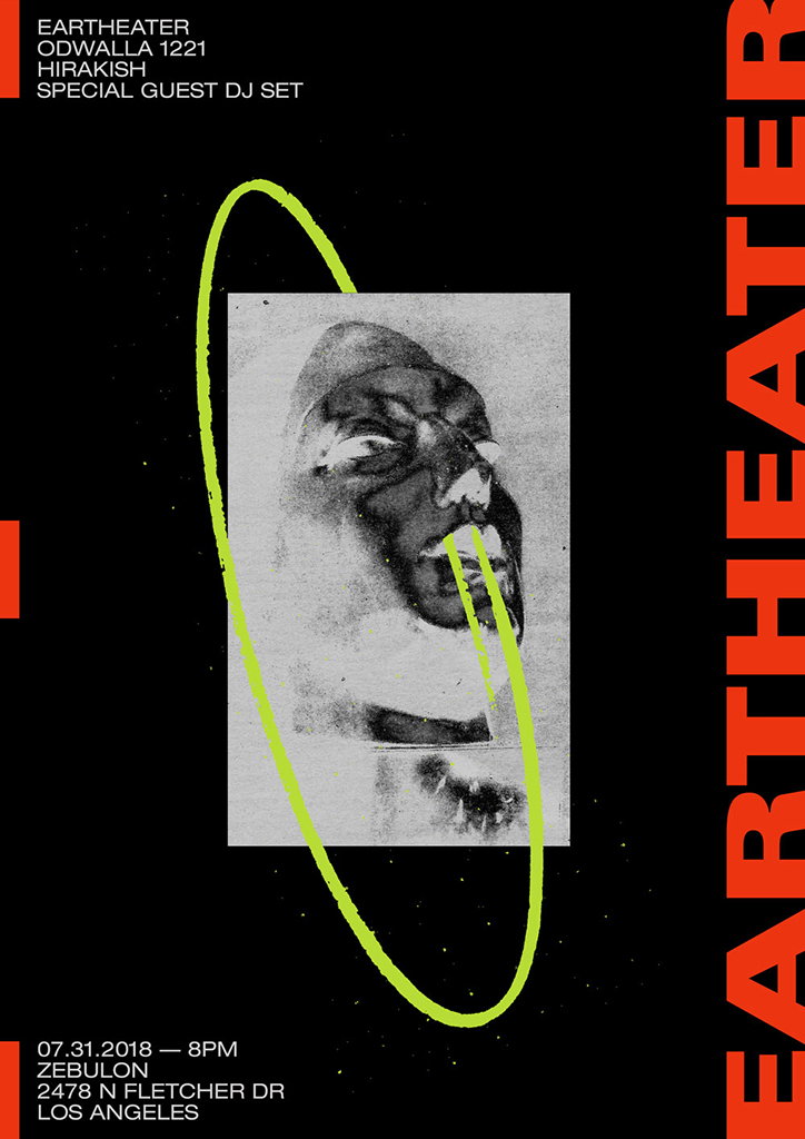
A graphic poster for an event featuring a high-contrast, grainy black and white portrait of a person. A lime green hand-drawn circle loops around the image against a black background. Red vertical text on the right reads “Eartheater”. Other text includes “Eartheater”, “Odwalla 1221”, “Hirakish” and a date and address in Los Angeles.
Above

Brodie Kaman

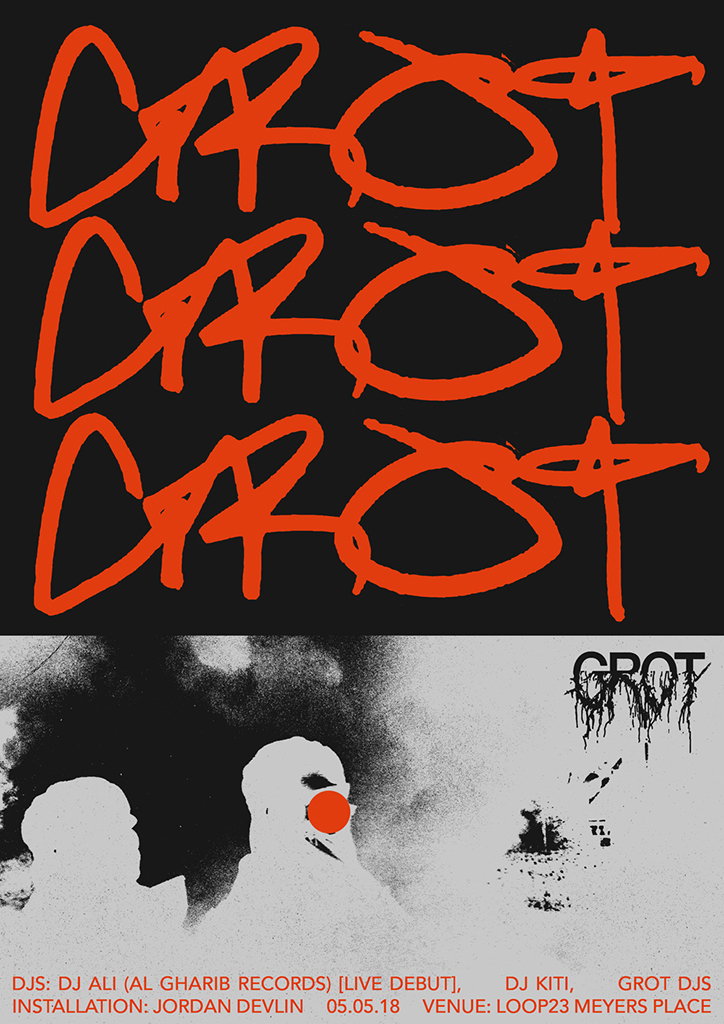
A poster for an event featuring the word “GROT” repeated three times in bold, red, gestural lettering against a black background. Below, a grainy black and white image shows two figures, one with a red circle over their face. Text at the bottom lists the DJs, an installation by Jordan Devlin, the date “05.05.18” and the venue “Loop23 Meyers Place”.
Above

Brodie Kaman

Red typographic text reads “SHOCKING WRECK” against a textured light blue background.
Above

Brodie Kaman

A collage featuring five teal-coloured images of human ears, each with a red circle placed over the ear canal. To the right, teal text on a white background reads “HEARS NOTHING” at the top and “BUT NOTHING” at the bottom.
Above

Brodie Kaman

A graphic design featuring a split composition. The left side shows alternating red and teal horizontal stripes with white, glowing highlights in the centre. The right side is plain white with the text “LIGHT IS FLEETING” in a teal serif font.
Above

Brodie Kaman

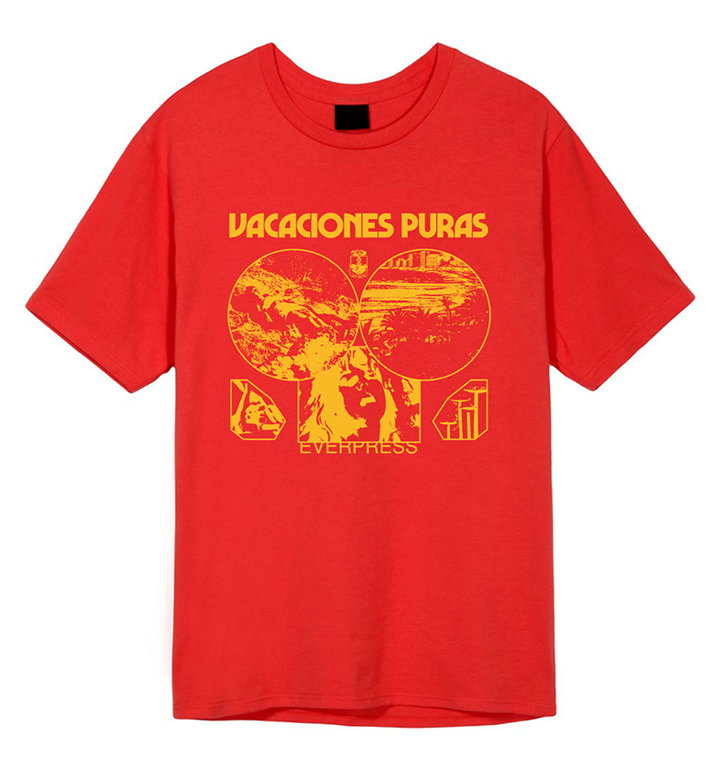
A red T-shirt featuring a yellow graphic on the chest. The design includes the text “VACACIONES PURAS” above a collage of circular and rectangular images, with “EVERPRESS” written below.
Above

Brodie Kaman

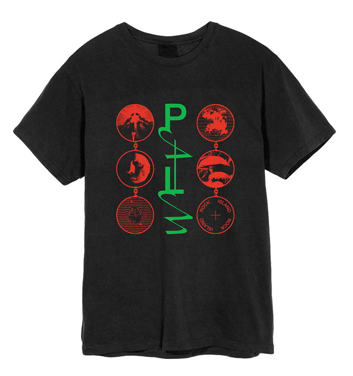
A black T-shirt featuring a graphic in red and green. The word “Palm” is written vertically in green script, flanked by six red circular icons containing various landscapes and symbols.
Above

Brodie Kaman

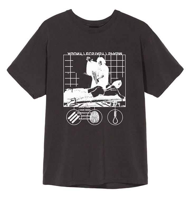
A dark grey T-shirt featuring a white graphic print on the chest. The design includes a high-contrast image of a person reclining, mirrored text, and a small box containing the phrase “I HAVE BEEN INTERESTED IN ABNORMAL SITUATIONS”.
Above

Brodie Kaman

Share Article

About the Author

Ruby Boddington

—

Ruby is Senior Creative at It's Nice That, overseeing our visual output across platforms and projects. Before that, she was associate editor on the editorial team, after joining in September 2017 following graduation from Central Saint Martins.

It's Nice That Newsletters

Fancy a bit of It's Nice That in your inbox? Sign up to our newsletters and we'll keep you in the loop with everything good going on in the creative world.