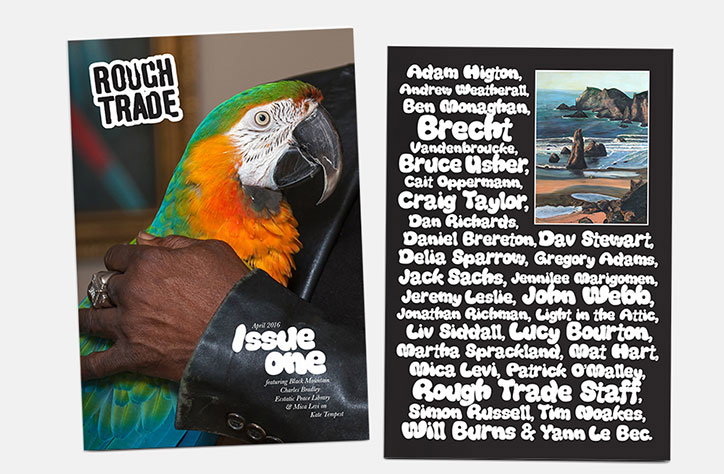
Rough Trade launches magazine with strict "non-wanker" policy
“There’s an unwritten rule for everyone at Rough Trade: don’t be a wanker. As long as the magazine’s going to be interesting and non-wanky, that’s the absolute goal,” says Liv Siddall, editor of the brand new magazine from record store and label Rough Trade, and ex-It’s Nice That features editor.
Alongside non-wankery, the magazine – launching to mark Rough Trade’s 40th anniversary – is inspired by a more unusual reference point: the Rough Trade East store’s toilets. Anyone who’s visited them will have them etched in their memory just as many have etched the dank space’s smelly walls. When Liv was briefing the magazine’s designer Bruce Usher, the first thing she did was sit him down in the toilets to immerse him in this pungent manifestation of a design brief.
“I took him to the toilets and said ‘I want the magazine to look like this,’” says Liv. “ Rough Trade isn’t about being perfect. It’s not a cut-and-paste zine, but we wanted to evoke the feeling of being in a Rough Trade store. Bruce says: “Each Rough Trade store has layers upon layers of additions on every spare inch of its walls (markered-on graffiti, posters, scratched out names etc) which was something we wanted to manipulate somehow into a design language without it feeling too full-on.”
“We were looking at a lot of 70s magazines for inspiration – so you’ll see a lot of key lines around images and slightly loose justified columns of text, we really didn’t want to make the magazine feel like it had been rigorously designed, a lot of the structures are there to help things feel incidental.”
“Whatever you buy in there, even if it’s Queen or Yes, the staff are positive and polite even though they might hate it. It’s not a scary judgemental record shop – it’s about people who are friendly and passionate.”
This idea of being a welcoming, celebratory place for people who love music takes a physical form in the shop’s huge double doors, which are always open, “even when it’s blisteringly cold,” says Liv. As such, the magazine aims to be an open-armed affair too, as reflected in a strictly smiles-only photography policy.
“I want everyone to be smiling on every page,” says Liv. “There’s absolutely no moody, posing band photography. Hopefully that’ll give a sense of happiness: when I first read iD and The Face everyone looked like they were having a really good time, and I wanted to make Rough Trade like that.”
Bruce adds: “We decided we didn’t want this to feel like a music-news magazine, but something a lot more comfortable – we decided that we’d avoid PR shots of bands at all costs and aim that the cover should never be an obvious artist shot.”
“We agreed that the architecture of the magazine should be simple and super readable, which is reflected in the size of it, but still human and imprecise.”
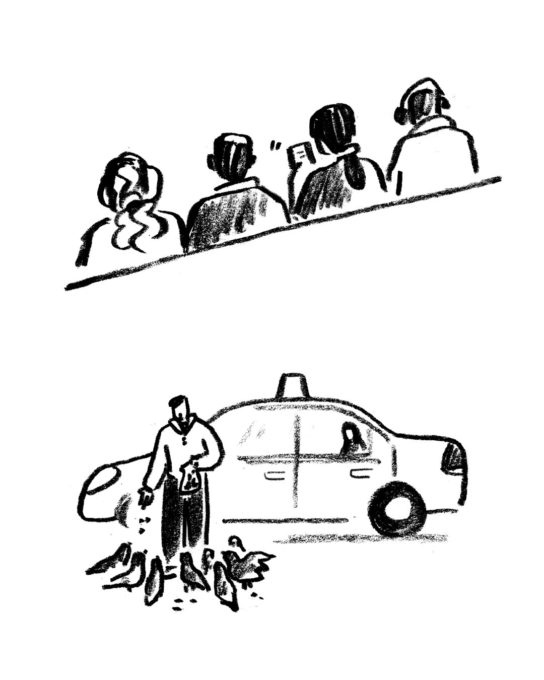
The first issue features photography by Cait Opperman and illustrations by the likes of Brecht Van Den Broucke, who created the imagery for Jonathan Richman’s agony aunt column (yes, he’s actually writing an agony aunt column), Adam Higton and Yann le Bec.
Rough Trade will be a monthly magazine, available to buy in the record stores.
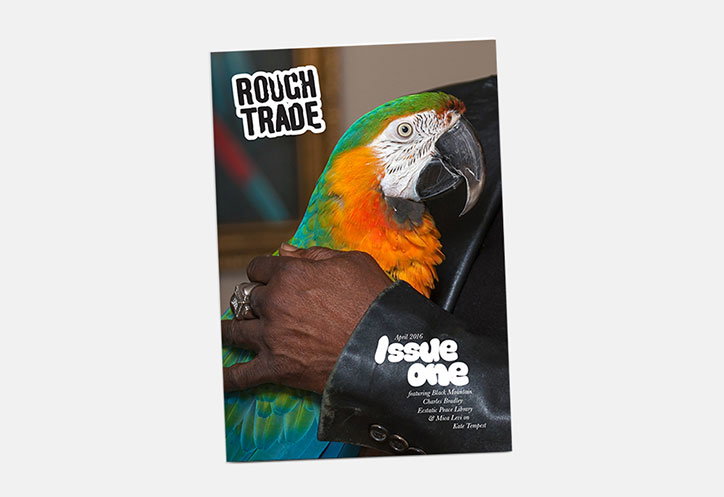
Bruce Usher: Rough Trade
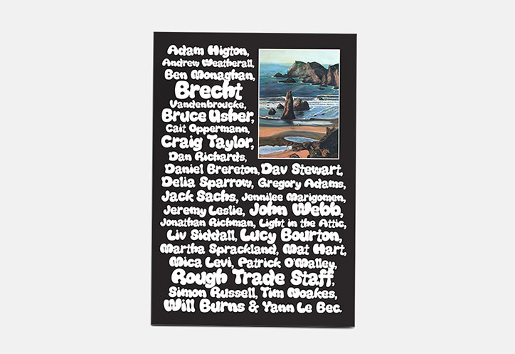
Bruce Usher: Rough Trade
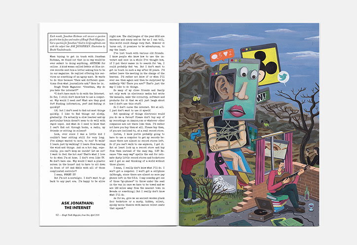
Bruce Usher: Rough Trade
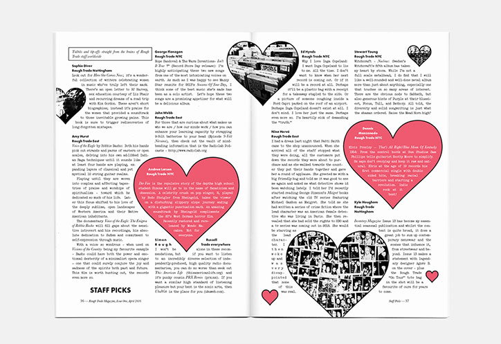
Bruce Usher: Rough Trade
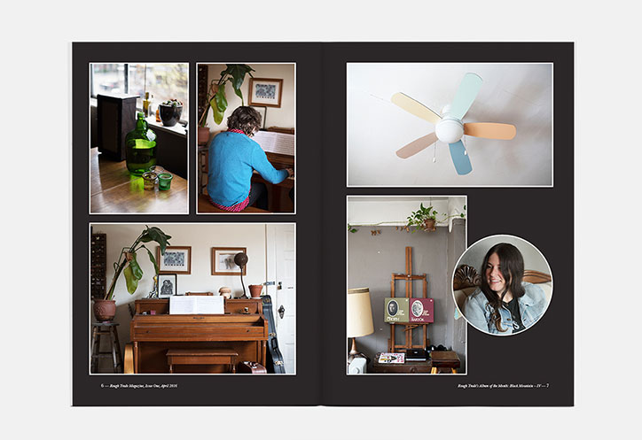
Bruce Usher: Rough Trade
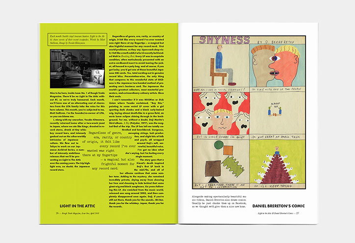
Bruce Usher: Rough Trade
Share Article
Further Info
About the Author
—
Emily joined It’s Nice That as Online Editor in the summer of 2014 after four years at Design Week. She is particularly interested in graphic design, branding and music. After working It's Nice That as both Online Editor and Deputy Editor, Emily left the company in 2016.