




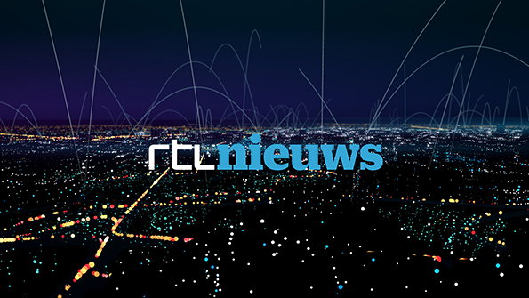
Behind The Scenes: Mark Porter discusses redesigning Holland's premier news channel
Graphic designer Mark Porter is synonymous with the far-reaching 2008 redesign of The Guardian newspaper, and not content with mastering one huge media’s look and feel, he’s now turned his talents to TV. RTL is the biggest commercial network in The Netherlands and RTL Nieuws produces news bulletins, business, weather and traffic across its channels.
Mark and Dylan Griffith of Studio Smörgåsbord spent 18 months redesigning the entire look and feel of RTL Nieuws, from logos to title sequences, studio sets to websites, as well as on-screen graphics across the content pillars.
In the next of our Behind The Scenes features we asked Mark to give us an insight into the creative process.
What were the initial reference points you looked at when starting work on this project?
We started by looking at what was already out there in TV news design worldwide, what their direct competitors were doing, and their own design history. But we concluded early on that the standard was very disappointing. Nearly all TV news channels use the same set of visual clichés, and the same look.
We wanted to step away from that to something flatter and less glossy, so we turned to a more stripped-down approach. The European modernist look is very familiar in print and even digital, but it felt fresh and radical when applied to TV, and very well-suited to news.
How did the changing role of TV news influence this look and feel?
The whole project has been about responding to changes in the way people get their news. The basic iconography of TV news — spinning globes and pulsating radio waves — hasn’t changed for 50 years. But during those 50 years we’ve experienced the biggest revolution in media since the invention of printing, so we wanted to create a TV news identity which made sense in a world where people are just as likely to get their news from Twitter as from a TV broadcast.
The Dutch obviously have a strong graphic design heritage; was this something you tried to embrace? If so in what ways did that manifest itself?
Well, I’m Scottish and Dylan is Welsh so there was no point in us trying to design like the Dutch, but we were very aware of that strong graphic tradition right from the start. It gave us a lot to live up to, and it did influence our thinking. When we started looking for inspiration we both pulled out the same Wim Crouwel references! Then we knew we were on our way.
"The basic iconography of TV news — spinning globes and pulsating radio waves — hasn't changed for 50 years."
Mark Porter
As with The Guardian work for which you’re very well-known this is a very wide-ranging project. What is your approach for tackling a project that has so many different parts?
This was an enormous project and included areas that I’ve never worked on before, like set design, and music. But with big assignments it’s simply a question of being organised, and getting the best possible people on the team. Dylan’s studio and mine are very small, but we were able to bring in some excellent collaborators — a fantastic Dutch motion designer called John Beckers, Universal Everything, Commercial Type, and many others. I love to work like that as I’m constantly learning from the others.
What was the most challenging part of the rebrand?
Maybe the weather. The weather presenters are professional meteorologists, who are (rightfully) very concerned about scientific accuracy. But sometimes that means that simple and clear delivery of the necessary information to the viewer can suffer. We had a lot of meetings over the weather, but I think we ended up with something that works in both ways.
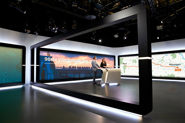
Mark Porter Associates/Studio Smörgåsbord: RTL Nieuws
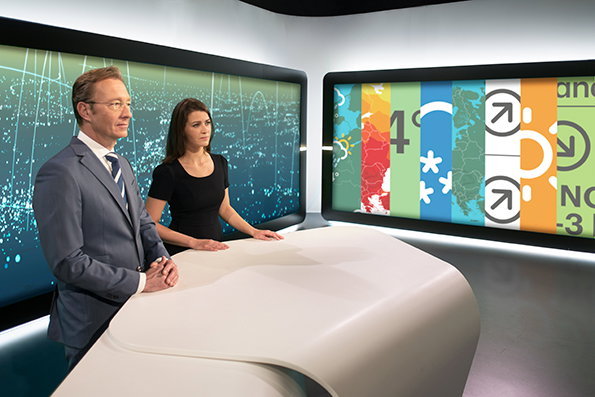
Mark Porter Associates/Studio Smörgåsbord: RTL Nieuws
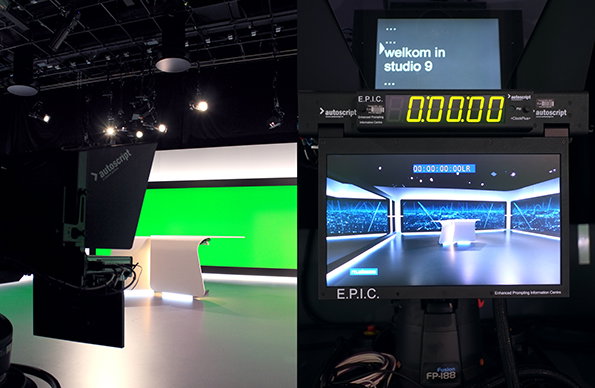
Mark Porter Associates/Studio Smörgåsbord: RTL Nieuws
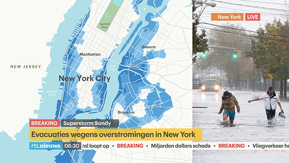
Mark Porter Associates/Studio Smörgåsbord: RTL Nieuws
Mark Porter Associates/Studio Smörgåsbord: RTL Nieuws
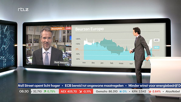
Mark Porter Associates/Studio Smörgåsbord: RTL Nieuws
Share Article
Further Info
About the Author
—
Rob Alderson is a freelance writer, editor and strategist. He was previously editor-in-chief of It’s Nice That and WePresent, and editor of Design Week. He publishes the newsletter Undo, which tries to make sense of how AI is changing design work, the design process and the design industry.



