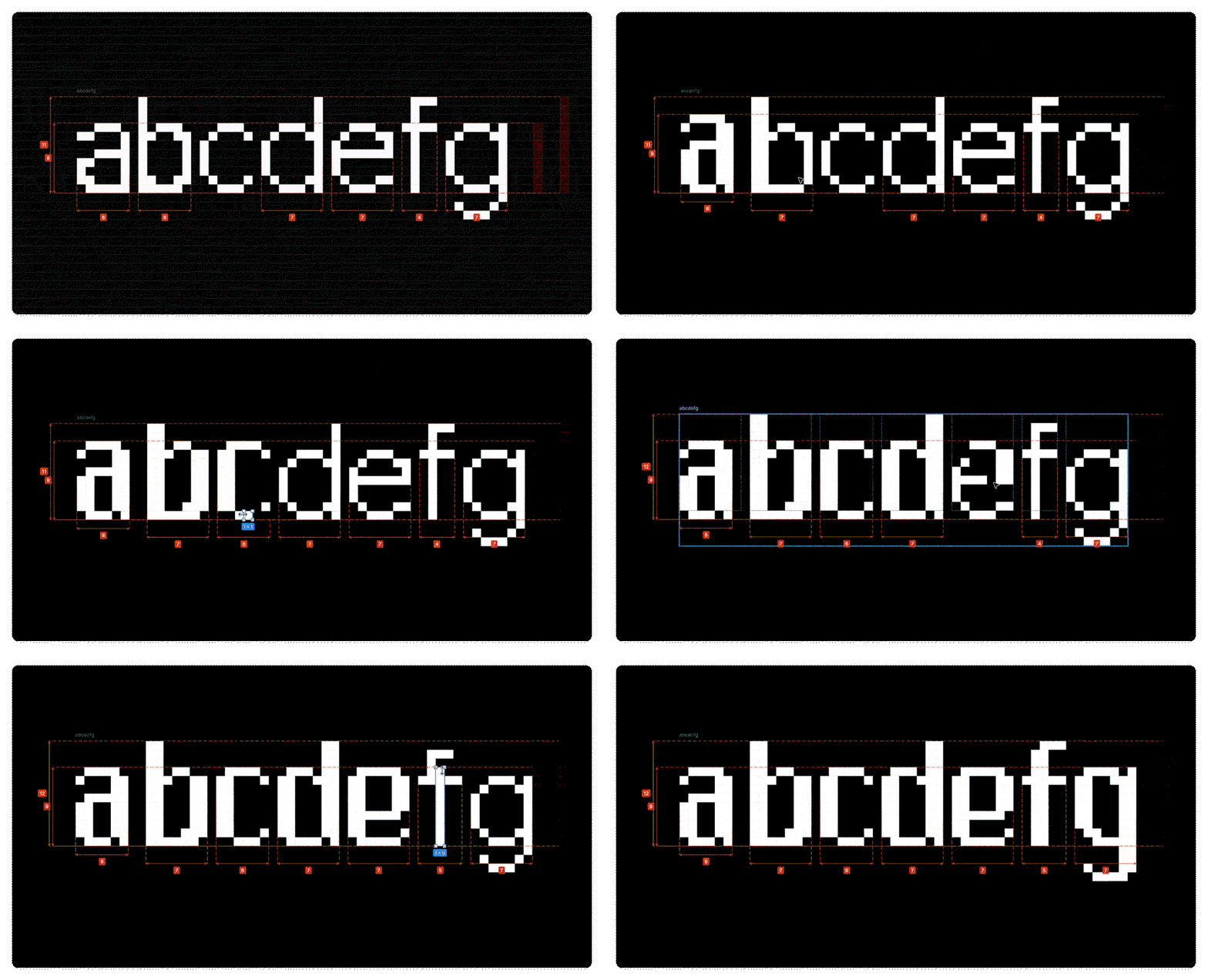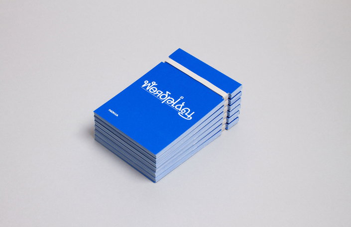
Some combinations just make sense – banana and toffee, coffee and doughnut, salt and pepper, Salt-n-Pepa but typography and illustration flicks all manner of switches. This new project from Build uses Dalton Maag’s Nokia Pure font to create typographic illustrations based on pangrams (nope us neither – sentences that use every word in the alphabet). Across posters, postcards, an animation and an app there’s a delightful ingenuity in the work more than matched by top-quality execution and presentation. Don’t mind if we do.
Share Article
Further Info
About the Author
—
Rob Alderson is a freelance writer, editor and strategist. He was previously editor-in-chief of It’s Nice That and WePresent, and editor of Design Week. He publishes the newsletter Undo, which tries to make sense of how AI is changing design work, the design process and the design industry.