



Launch Recite Me assistive technology
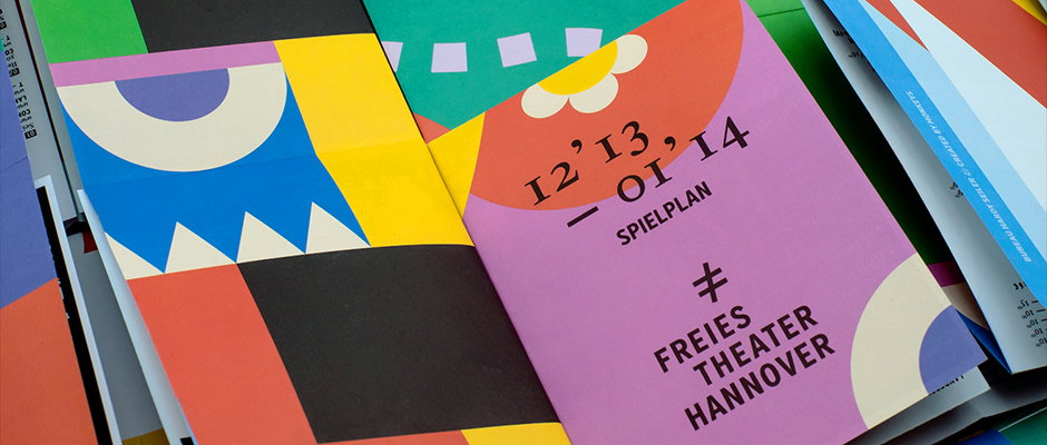
A colourful brochure for Freies Theater Hannover features bold geometric shapes in red, yellow, blue and purple. The cover reads “12’13 – 01’14 SPIELPLAN” and “FREIES THEATER HANNOVER”.

Bureau Hardy Seiler creates a jazzy identity for Hanover's free theatre

—
Date
23 January 2015

When Hanover-based designers Bureau Hardy Seiler and web design agency Created by Monkeys decided to pitch to design the identity for the Freies Theater Hannover, they found themselves faced with a dilemma. The theatre hosts every flavour of live performance going, from puppetry and musical shows to experimental dance, and all in one flexible and family-friendly space. How could they create a graphic language to match that?

Their solution takes the form of an identity littered with colourful geometrical shapes and recognisable forms, a clear and indisputably fun embodiment of variety. The programme, or “game-plan,” is a kind of folder containing various bright printed ephemera and relevant information. They’ve even cleverly incorporated the F, T and H of Freies Theater Hannover into the mathematical symbol representing equality, a motif which reappears throughout the identity, further signalling the cultural diversity the theatre represents. It’s entertaining and informative, and it’d look bloody great blu-tacked to your fridge. 
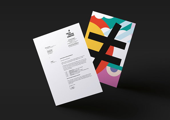
Two sheets of stationery for “Freier Theater Hannover” float against a black background. One page is a white letterhead with a logo and a block of text, while the other features a bold, black abstract symbol over a colourful geometric pattern.
Above

Bureau Hardy Seiler: Freies Theater Hannover
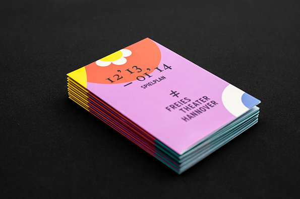
A stack of colourful brochures on a black background. The top cover is purple and yellow, featuring the text “12’ 13 – 01’ 14”, “SPIELPLAN” and “FREIES THEATER HANNOVER”.
Above

Bureau Hardy Seiler: Freies Theater Hannover
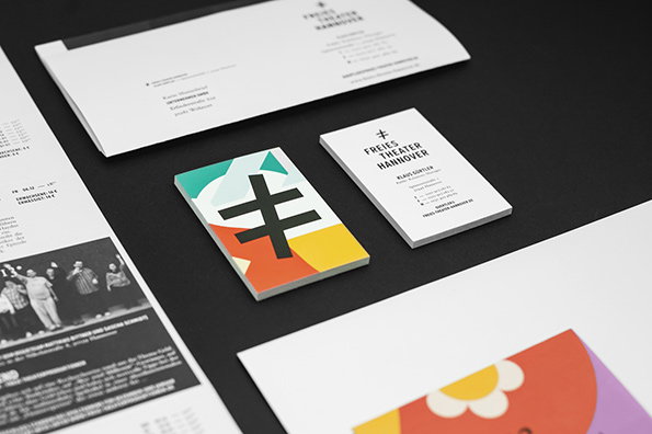
Stationery for Freies Theater Hannover, including a business card and letterhead, laid out on a dark surface. A small square notebook features a bold black logo over abstract shapes in teal, red and yellow.
Above

Bureau Hardy Seiler: Freies Theater Hannover
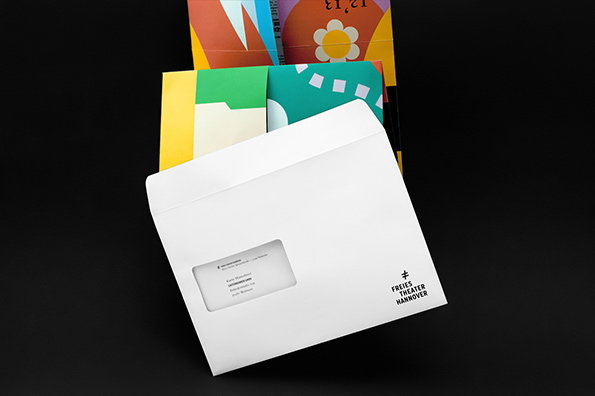
A white envelope with a transparent address window sits atop a stack of colourful, abstract brochures. The envelope features a small logo and the text “Freies Theater Hannover”.
Above

Bureau Hardy Seiler: Freies Theater Hannover
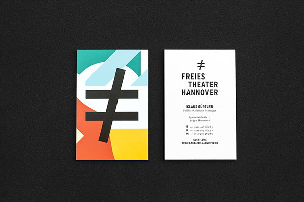
Two business cards for Freies Theater Hannover are laid side by side on a dark grey surface. One card features a bold black symbol over a colourful geometric background, while the other is white with the theatre’s name and contact details for “Klaus Gürtler”.
Above

Bureau Hardy Seiler: Freies Theater Hannover
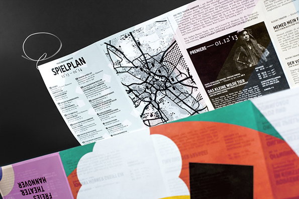
A folded brochure for Freies Theater Hannover features a black and white map and a schedule titled “SPIELPLAN”. A black panel on the right shows a person in a textured garment and the title “DAS KLEINE WILDE TIER”.
Above

Bureau Hardy Seiler: Freies Theater Hannover
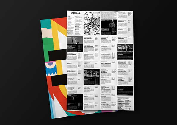
A folded white brochure with black text and images is laid over a colourful, abstract graphic print. The brochure is titled “SPIELPLAN” and features a grid of event listings, a map, and small black-and-white photographs.
Above

Bureau Hardy Seiler: Freies Theater Hannover
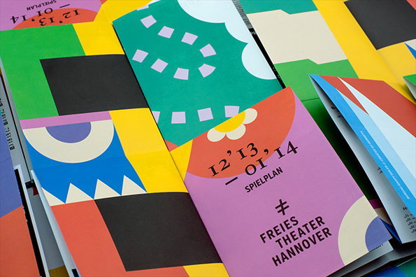
A collection of colourful brochures and posters with bold, geometric patterns. One pink brochure reads “12’13 – 01’14 SPIELPLAN” and “FREIES THEATER HANNOVER”.
Above

Bureau Hardy Seiler: Freies Theater Hannover

Share Article

Further Info

About the Author

Maisie Skidmore

—

Maisie joined It’s Nice That fresh out of university in the summer of 2013 as an intern before joining full time as an Assistant Editor. Maisie left It’s Nice That in July 2015.


It's Nice That Newsletters

Fancy a bit of It's Nice That in your inbox? Sign up to our newsletters and we'll keep you in the loop with everything good going on in the creative world.