Launch Recite Me assistive technology
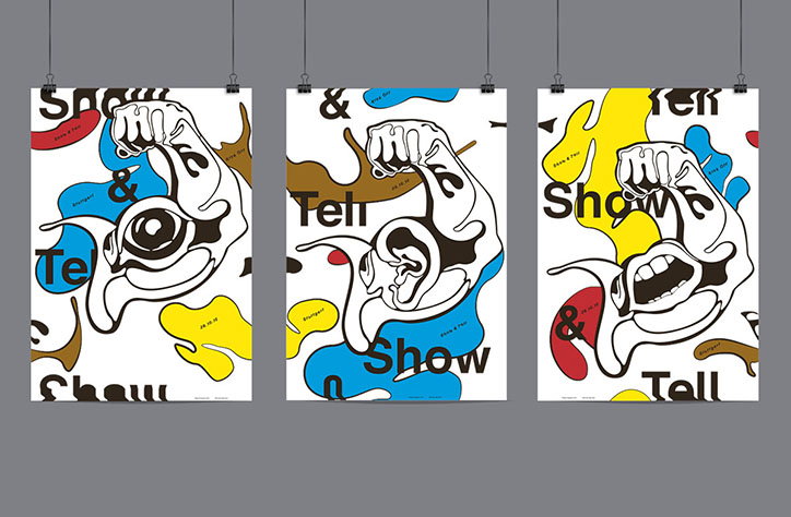
Three posters featuring bold, black line illustrations of distorted faces and hands. The designs use a primary colour palette of red, blue and yellow, with the words “Show & Tell” repeated across the compositions.

A polished and sophisticated update from German studio Bureau Progressiv

—
Date
12 November 2015

Bureau Progressiv was featured on the site last year for its beautiful book design and print projects and this update encompasses those skills but also highlights its ability to create quiet but effectively-designed things in a sophisticated, grown-up way. Making work for cultural institutions, businesses and artists there’s an undeniable sleekness to the studio’s poster work, identities and editorial design and that’s helped by the team’s time spent studying at Stuttgart Academy of Fine Arts. Bureau Progressiv’s use of colour is thoughtful and sparing, introducing tones and shades in sharp bursts or blended subtly into a monochrome base of typography.  
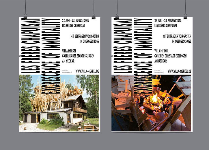
Two posters hang side by side against a grey wall. Both feature the vertical text “Les Frères Chapuisat” and “Obsolescence of Immortality”, alongside the dates “27. Juni – 23. August 2015”. The left poster shows a house with a chaotic, sprawling wooden structure built over its roof. The right poster shows a night scene of people gathered around a glowing fire inside a similar wooden structure.
Above

Bureau Progressiv: Les Frères Chapuisat
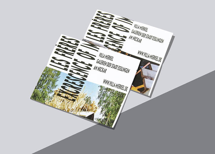
Two identical brochures lie angled on a grey surface. Bold black text reads “LES FRERES” and “EXCRESCENCE OF IN”, alongside the address “VILLA MERKEL GALERIEN DER STADT ESSLINGEN AM NECKAR” and a website.
Above

Bureau Progressiv: Les Frères Chapuisat
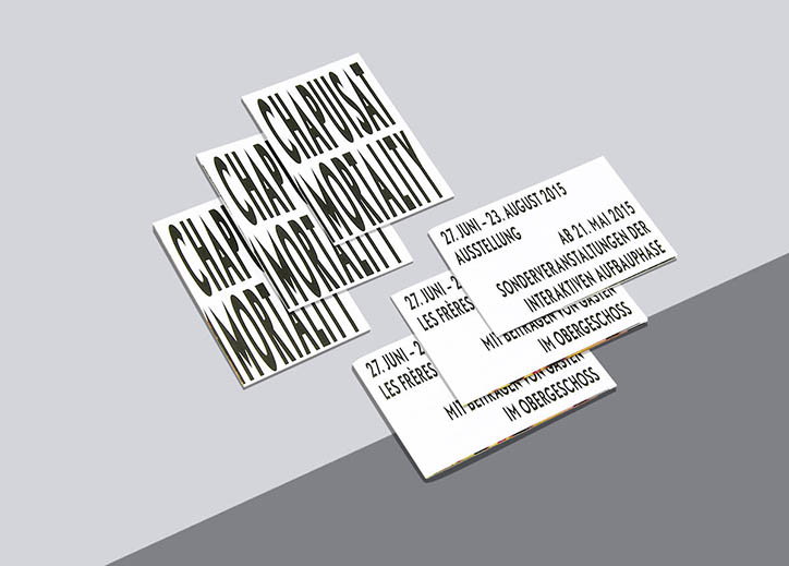
Six white cards are scattered across a grey surface. Three cards feature bold, distorted black typography that reads “CHAPUSAT MORTALITY”, while the others contain German text including the dates “27. JUNI – 23. AUGUST 2015”.
Above

Bureau Progressiv: Les Frères Chapuisat
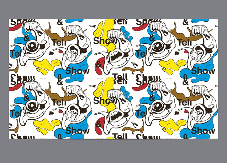
A repeating pattern illustration of stylised, distorted faces and hands. The figures are drawn in black line work over splashes of yellow, blue and red, accompanied by the words “Show”, “Tell” and “&”.
Above

Bureau Progressiv: Show and Tell kick off
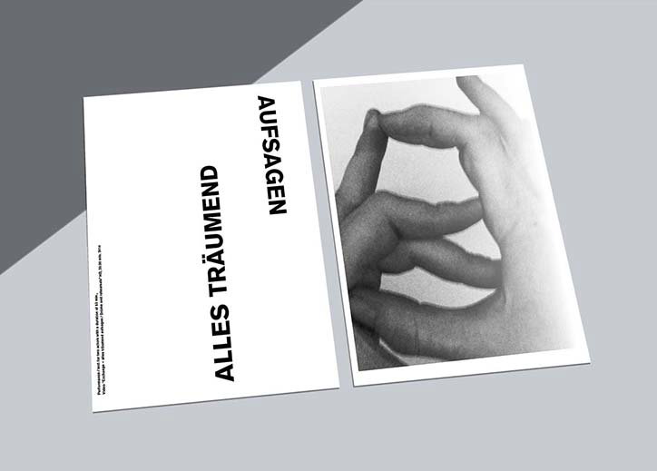
Two white cards lie side by side. One features a black and white photograph of a hand with fingers curled, while the other displays the bold text “AUFSAGEN” and “ALLES TRÄUMEND”.
Above

Bureau Progressiv: Florian Klette

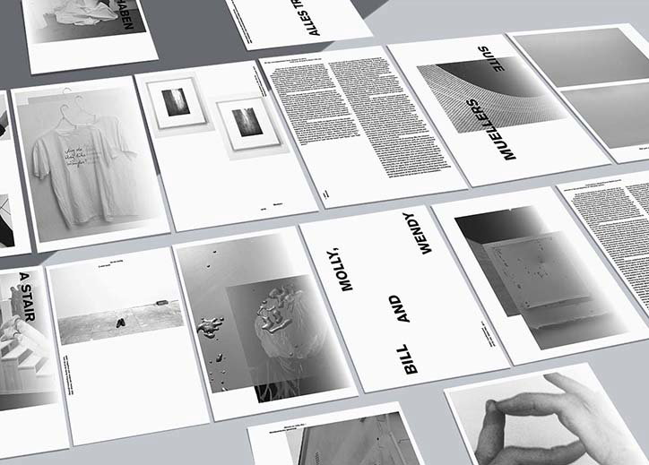
A collection of black and white printed pages laid out on a grey surface. The pages feature a mix of photography, dense blocks of text and bold typography, including the words “Molly, Bill and Wendy”.
Above

Bureau Progressiv: Florian Klette

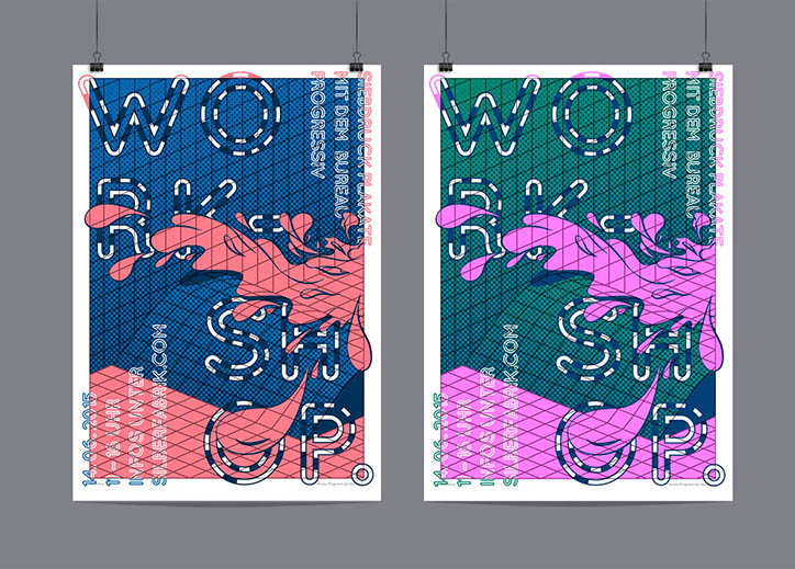
Two posters hang side by side, each featuring a bold, distorted typographic layout that reads “WORKSHOP”. A fluid, organic shape in pink and purple splashes across the centre of the compositions.
Above

Bureau Progressiv: Workshop Plakate

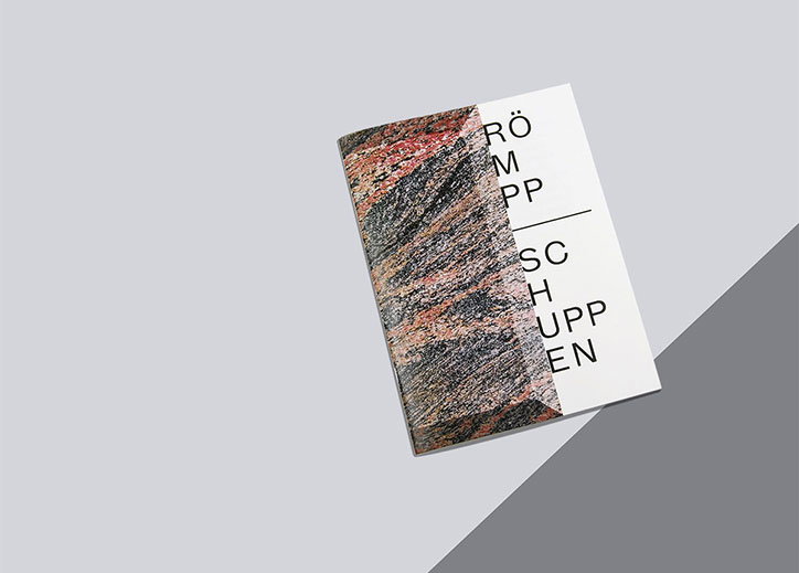
A booklet lies on a grey surface, its cover split between a textured, marbled image and a white section. Black typographic text on the white side reads “RÖMPP” above a thin line and “SCHUPPEN” below.
Above

Bureau Progressiv: Künstlerpublikation
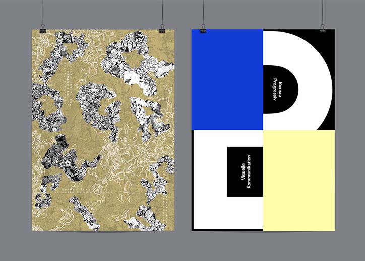
Two posters hang side by side against a grey wall. The first features abstract, jagged black and white shapes scattered across a textured gold background. The second is a geometric composition of blue, white, black and yellow blocks, containing the vertical text “Bureau Progressiv” and “Visuelle Kommunikation”.
Above

Bureau Progressiv: Untitled

Share Article

About the Author

Rebecca Fulleylove

—

Rebecca Fulleylove is a freelance writer and editor specialising in art, design and culture. She is also senior writer at Creative Review, having previously worked at Elephant, Google Arts & Culture, and It’s Nice That.


It's Nice That Newsletters

Fancy a bit of It's Nice That in your inbox? Sign up to our newsletters and we'll keep you in the loop with everything good going on in the creative world.