Caleb Halter's instinctual design practice produces considered and refined work
“My first experience with design was at age 12 when my uncle installed a copy of Photoshop 6 on the family computer,” recalls Massachusetts-based designer Caleb Halter, “I taught myself how to use it, and would spend hours totally abusing it, rearranging everyone’s faces in family photos, or designing (shitty) imaginary jerseys for my favourite basketball teams.” Unsurprisingly, Caleb calls himself a self-taught designer, although this has more to do with the fact that he chose to forgo art school, and less to do with this early introduction to the medium.
Originally from Ohio and having spent eight years in New York City before settling at his current base, Caleb’s career began designing tour graphics (mainly for country musicians) aged 19, and has bounced around motion graphics, visual effects, illustration and print ever since. “I didn’t have this (what I imagined to be) formative art school experience where you emerge knowing what kind of graphic designer you want to be, I just sort of figured it out as I went,” he explains.
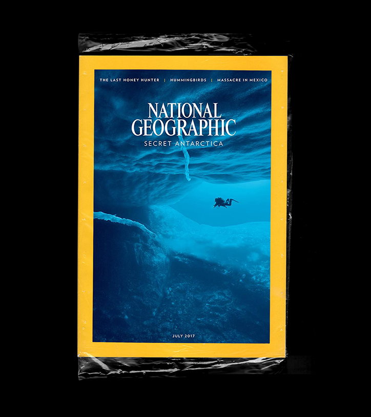
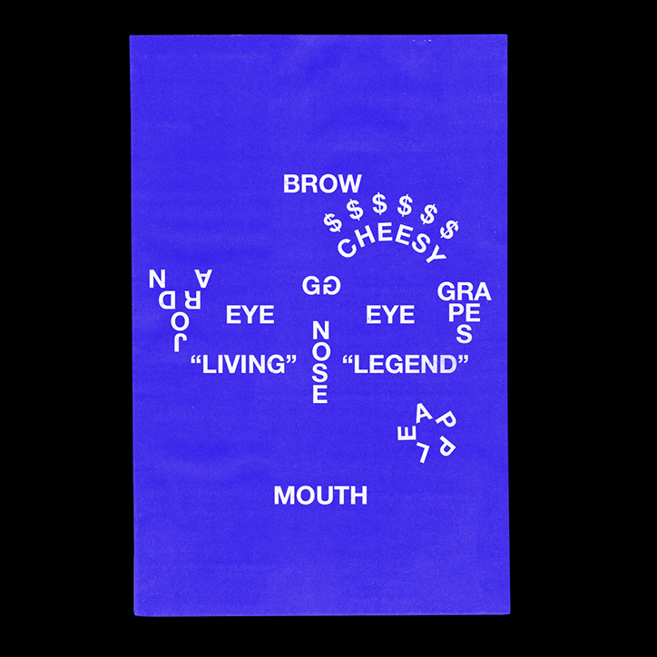
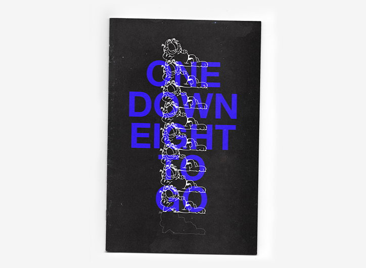
In recent years, however, his focus has shifted largely towards identities, an adjustment which has also affected his design perspective. “I think in the past I was only focused on aesthetics,” Caleb tells It’s Nice That, “But if all you have is an aesthetic approach, that look really only serves itself, not your client or your audience. My focus now is trying to strike a balance between, yes, strong visuals and a relevant aesthetic, but also a concept that couldn’t work for anyone else.”
Caleb Halter
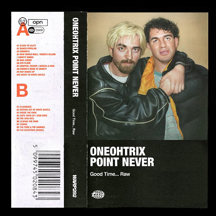
To ascertain what these concepts are, Caleb understates a period of research into a given topic; “trying to immerse myself in the subject as much as I can and distilling that information down, to its most singular form and then finding a striking way to express it,” he adds. When working on the artwork for Oneohtrix Point Never’s soundtrack for Good Time, this immersion included delving into behind the scenes and pre-production materials for the film.
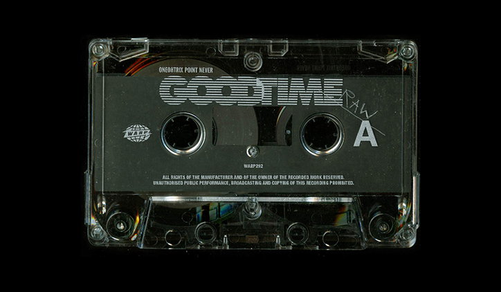
“The brief from the label was simply to design a special collector’s edition of the film score, and the only specific direction from Dan (OPN) was ‘Keep it weird. Blow my mind.’” Caleb outlines, “The whole thing was basically just Dan and me using production stills, wardrobe tests, even photos from Dan’s phone from the recording process.” The result is a cassette – a medium chosen to reflect the film’s gritty and raw nature – with a six-panel artwork wrapping around it. “I wanted each individual canvas to have impact, while hanging together within a single piece. The final artwork combines simple elements in unexpected, even crude ways – almost like an artefact you’d find in the film itself.”
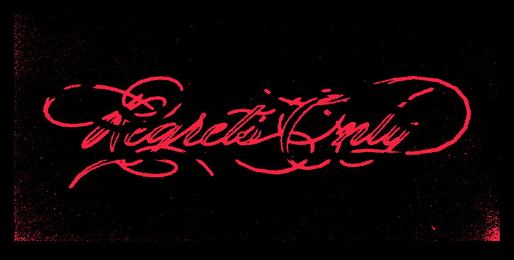
Caleb’s practice also spans to include designing material for his own musical output Feral – a place where he can take a break from design as a job, and produce visuals which are “almost like design muscle-memory”. But his commercial work is no less compelling, and often encompasses the same instinctual way of working. When recently producing visuals for the New York Times’ podcast The Daily, the entire campaign transpired from Caleb’s original sketch. “It’s difficult getting to a place where you trust your instincts, so it was really encouraging to have those instincts resonate with a client I respect as much as the Times,” he muses.
It’s this innate response to briefs which enables Caleb to produce such varying, yet always such considered work. Having learned to balance style and substance, his designs always fit, and hit, the mark. “I would say my style walks the tightrope between refined and instinctual,” he concludes, “considered without overworking things too much.”
Caleb Halter: Oneohtrix Point Never Good Time soundtrack
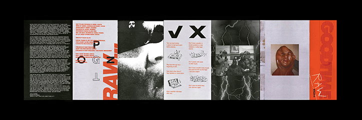
Caleb Halter: Oneohtrix Point Never Good Time soundtrack
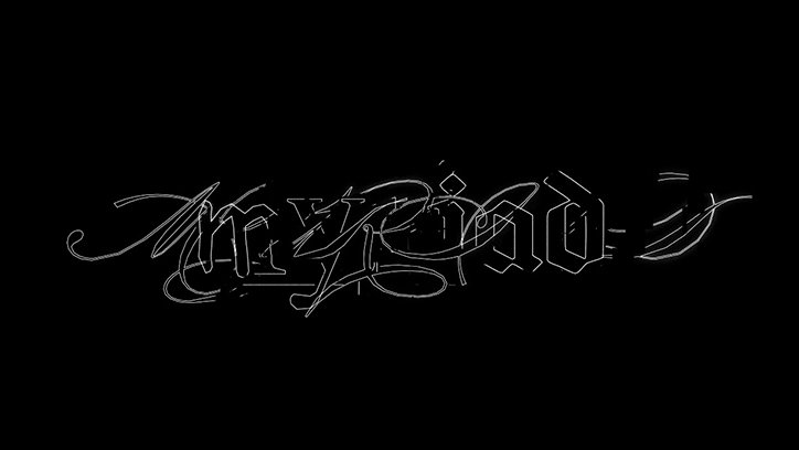
Caleb Halter
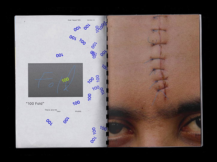
Caleb Halter: Feral
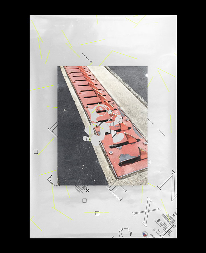
Caleb Halter: Feral
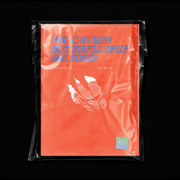
Caleb Halter: Feral
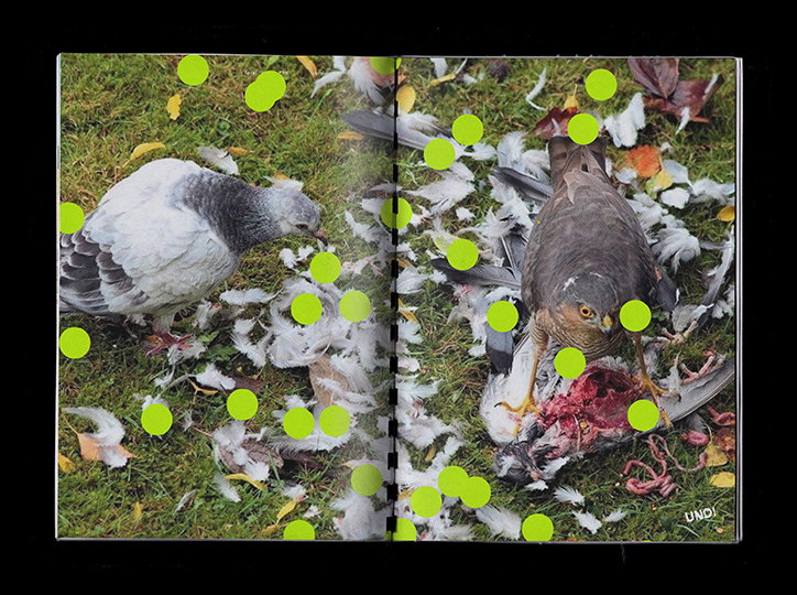
Caleb Halter: Feral
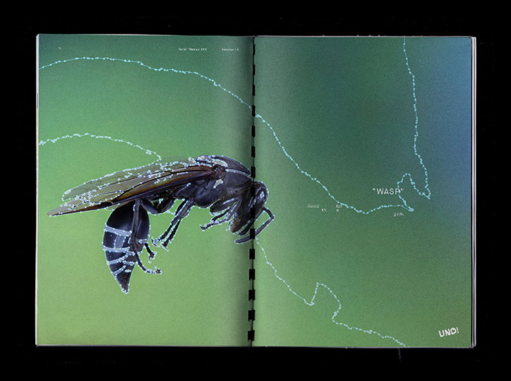
Caleb Halter: Feral
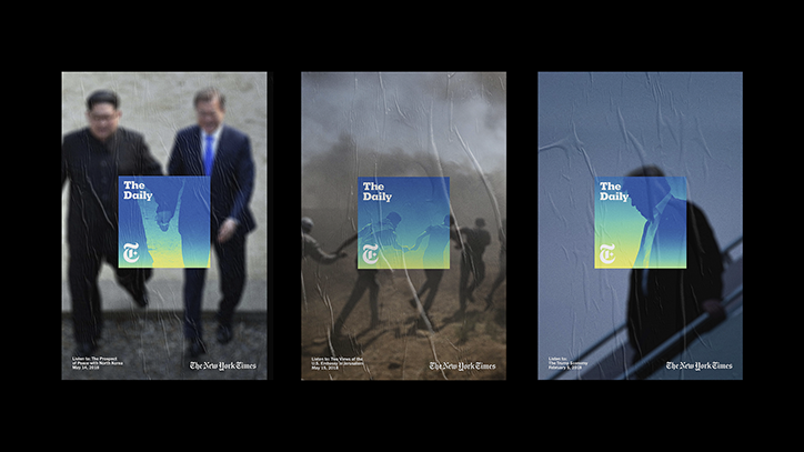
Caleb Halter: The New York Times’ The Daily
Caleb Halter
Caleb Halter
Caleb Halter
Share Article
Further Info
About the Author
—
Ruby is Senior Creative at It's Nice That, overseeing our visual output across platforms and projects. Before that, she was associate editor on the editorial team, after joining in September 2017 following graduation from Central Saint Martins.