




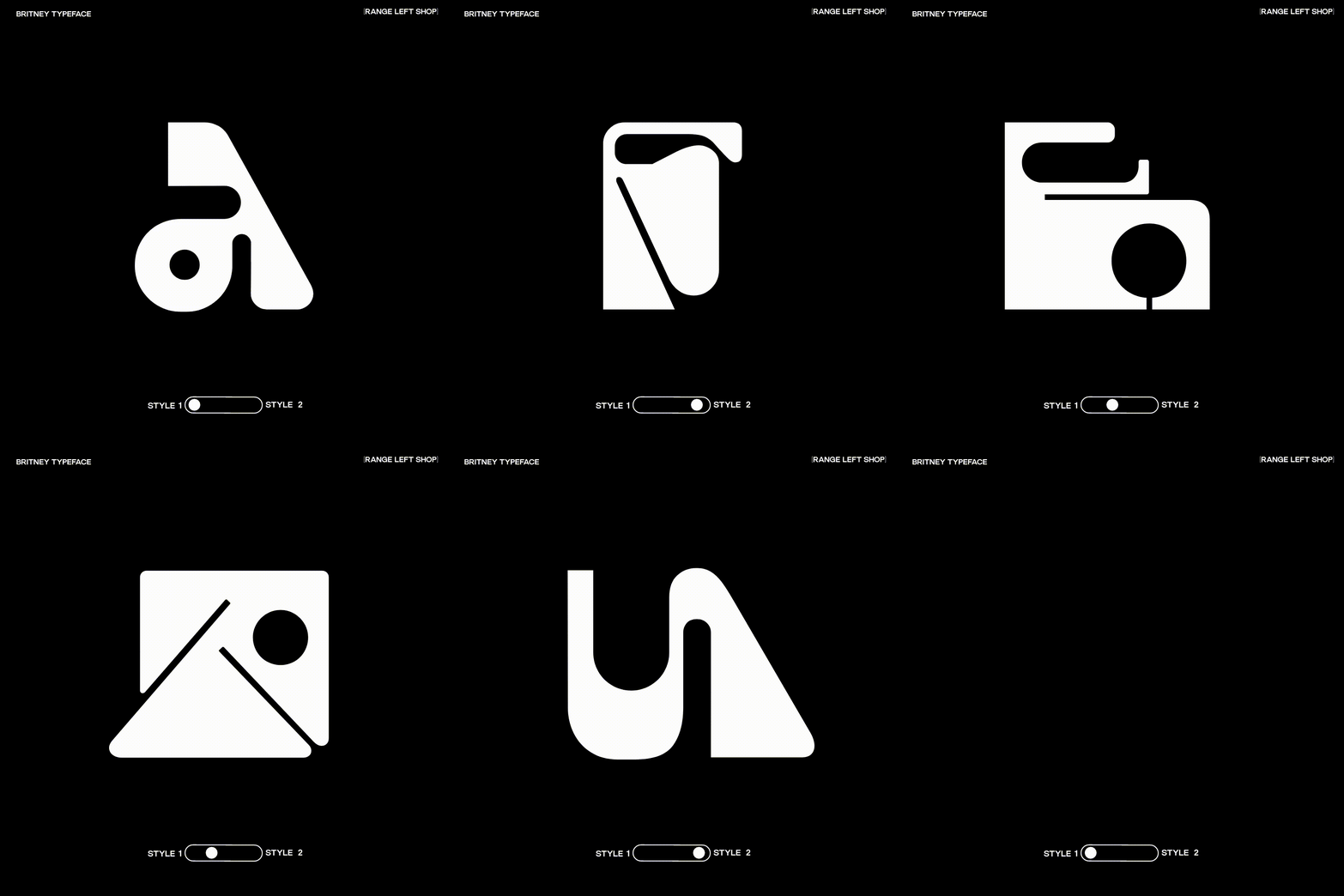
Clement Cases’ new typeface is both eccentric and legible as he creates with designers in mind
The London-based designer takes inspiration from the arts and unusual moments around the city to create a uniquely familiar typeface.
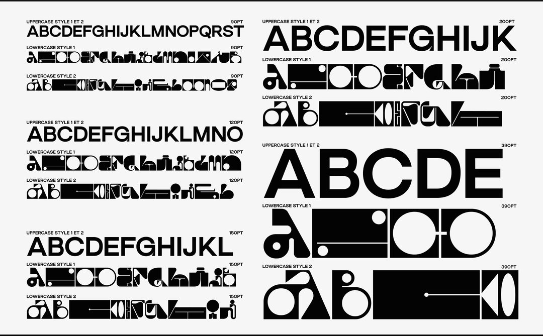
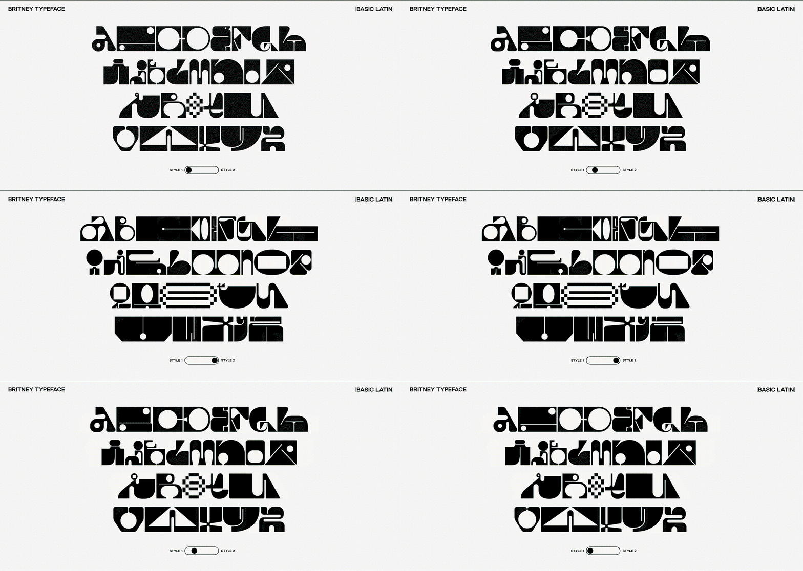
A lover of all things art and design, Clement Cases’ journey started over 15 years ago with a spray paint can and a desire to run wild with letters. Drawn to graffiti for its complex nature, overtime Clement wanted to focus on something more legible, through the creation of “real letters,” he tells us. “One of the things that drew me to typography design was the importance of visibility. With graffiti it’s all about being seen everywhere without people noticing you. With typography I love the idea of leaving my mark in a subtle yet powerful way,” he adds. Now the London-based print and type designer has created a “super-mega-experimental-display-variable typeface” called Britney, consisting of one legible sans-serif font and two eccentric styles.
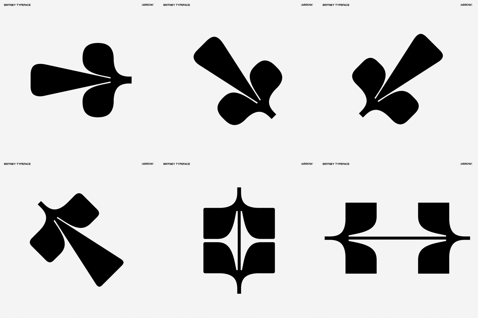
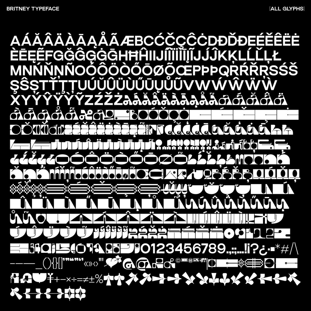
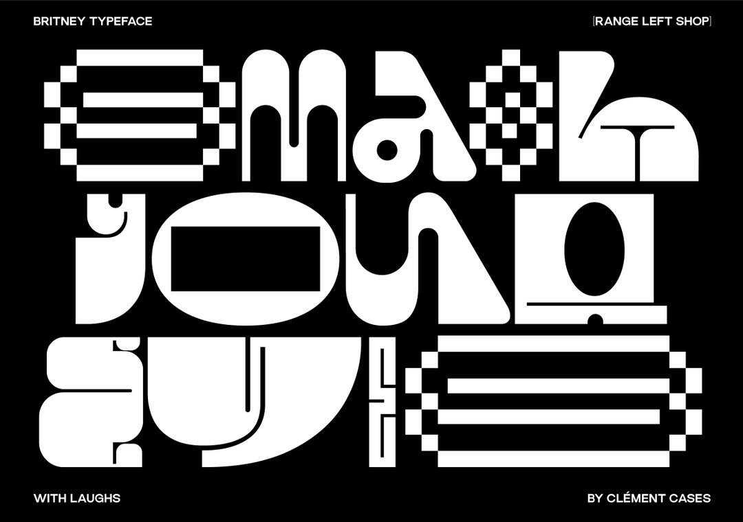
Each of the letters making up the eccentric logo-esque typeface are both hand-drawn and animated, a “tedious, time consuming and a highly precise task,” he tells us. Starting the project by completing the 36 Days of Type challenge – founded by Barcelona-based graphic designers Nina Sans and Rafa Goicoechea – each day saw him push himself toward his unique perspective in the realm of variable typefaces. “The main challenge was finding different shapes that can work together, but I achieved my goal of combining them in a way that can be harmonious, but also be used independently,” Clement adds. There is a unique rhythm throughout the project, and intentions that can’t be missed. “I am giving designers the opportunity to customise their work and find their own unique approach. I like the idea that the typeface is like a material for the user, where they can compose and play. ”
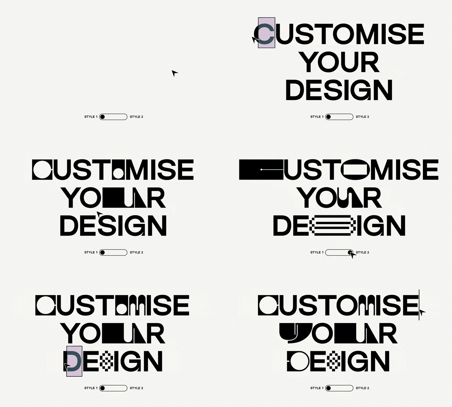
Clement Cases: Britney (Copyright © Clement Cases, 2023)
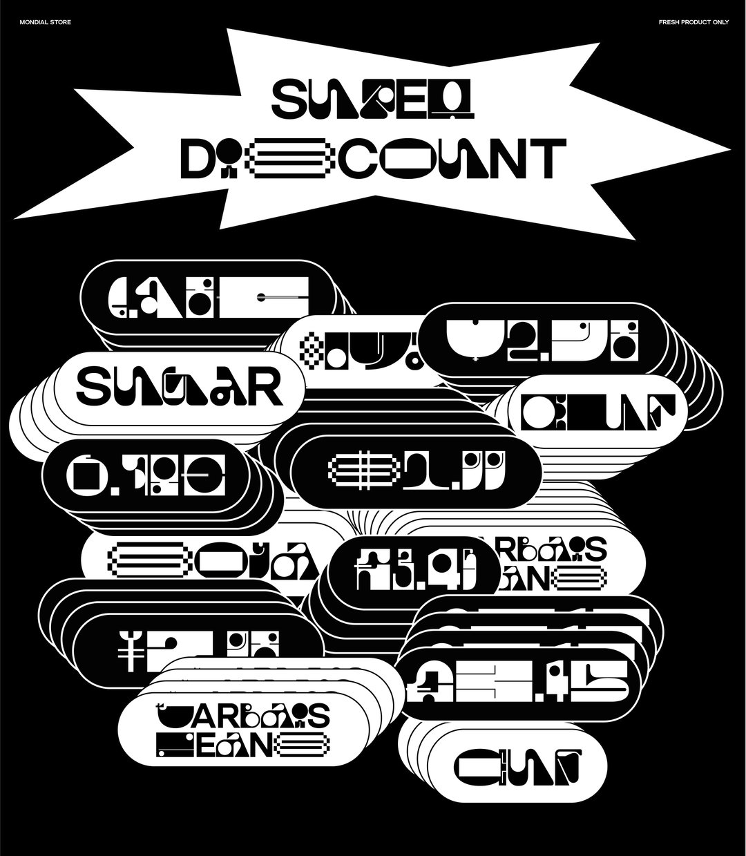
In turn Britney resembles everything from commonplace activity to nostalgic symbols. The ‘S’ is like the “Cool S” that kids would draw in their books in schools all over, and the ‘J’ looks like a person sitting at a table – making his work equally familiar and refreshing. “My sketchbook is filled with all sorts of quirky and unconventional shapes and letters,” he tells us. A lot of the inspiration behind these sketches he finds in moments of surprise when musing on films – especially Albert Dupontel films – music or peculiar noises and sights he comes across while riding his bike around London. Also, drawing inspiration from the world of graphic design, in the work of individual creatives and agencies alike, he holds the craft of brand identity close as it “truly captivates me and fuels my creativity.”
All in all, Clement is a designer’s designer, keeping his fingers on the pulse of what makes others tick. With another typeface coming out soon for a shop in Bufala, his endeavours have led him to the realm of brand identity that he is so fond of. As for Britney, he has gifted us a style that is an ode to his artistic beginnings, but now it’s tangible, allowing you to create from his playful shapes and compositions.
GalleryClement Cases: Britney (Copyright © Clement Cases, 2023)
Hero Header
Clement Cases: Britney (Copyright © Clement Cases, 2023)
Share Article
Further Info
About the Author
—
Yaya (they/them) was previously a staff writer at It’s Nice That. With a particular interest in Black visual culture, they have previously written for publications such as WePresent, alongside work as a researcher and facilitator for Barbican and Dulwich Picture Gallery.




