




Dalton Maag’s Monte Stella typeface celebrates the “imperfect” post-war vernacular lettering of Milan
Milanese designer Riccardo De Franceschi took inspiration from the “accidental” aesthetic of 50s, 60s and 70s signage around his home city.
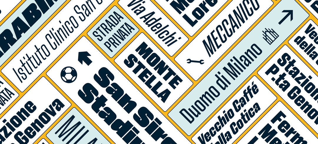
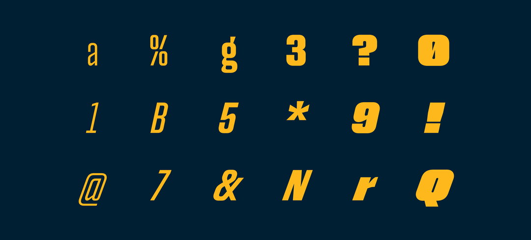
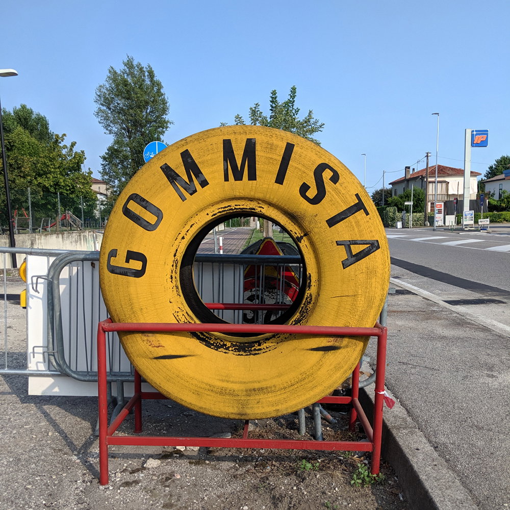
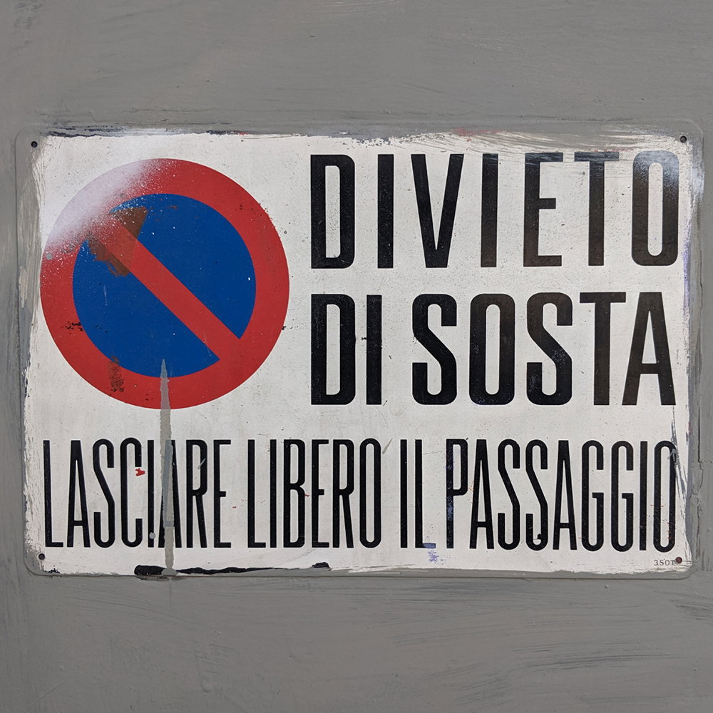
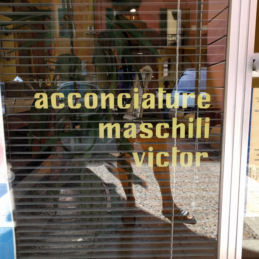
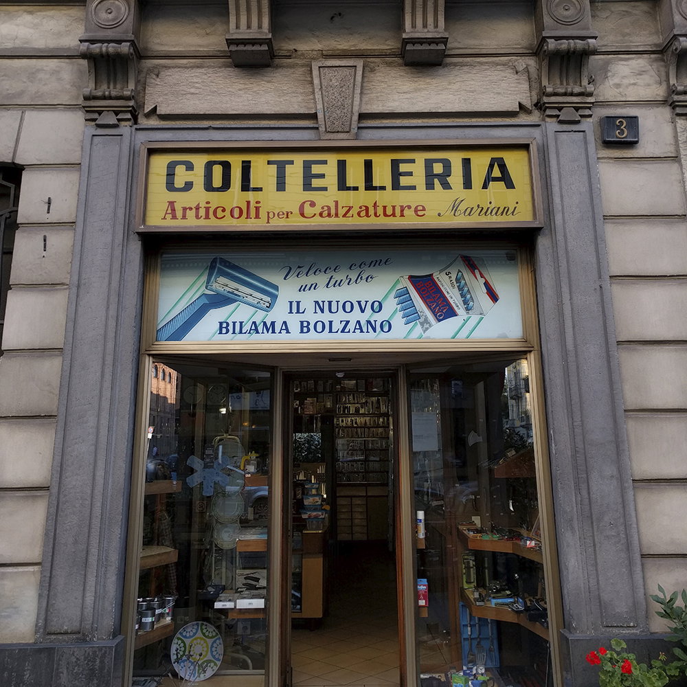
It seems a perfect moment for a Milanese designer in London to pay homage to his home city, and Dalton Maag creative director Riccardo De Franceschi has done so by celebrating something he loves – and misses – about the place, its signage. Monte Stella, a new typeface launched by the typeface design studio this week, takes its name from the artificial mountain in the San Siro district, symbolising the city’s renaissance after World War II. It’s this aesthetic era of the city’s history he chose to focus on for his design, looking to the shop signs, print designs and public space graphics of the 1950s-70s and their “imperfect” handmade feel.
“The project originated from a passion for vernacular letter shapes, as my own interpretation of the look and feel of Milan, a visual landscape I grew up in,” Riccardo explains. “In the decades following World War II, a Milanese design elite produced revolutionary advertisements, objects and buildings for progressive brands, by taking advantage of the latest technical and industrial developments. But it also worked elbow-to-elbow with expert local craftsmen, who partook in the development of the city in their own right. These artisans and small family-run businesses tell us another design story of Milan; and it is this which Monte Stella celebrates.”
Hence the typeface is an "ode to the forgotten artisans of yesterday's Milan," he says, and a celebration of "informal aesthetics and design found in unexpected places". This could be shop window stickers, commercial signage or editorial design, such as Compacta by Letraset or Metropol by Nebiolo. "Imagine a shoemaker or car mechanic making their own sign," Riccardo says. "Typography is not their native territory so they will try to make their own life easy [and] figure out a modular system to build the counters of their round letters. They will push the height of ‘t’ up so that it aligns with the ascenders of ‘b’ and ‘h’. Their fresh point of view on letter design will result in unorthodox construction for the more complex characters such as ‘a’ and ‘g’." The letterforms of Monte Stella are directly reflect this analysis.
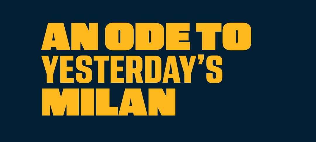
Dalton Maag: Monte Stella
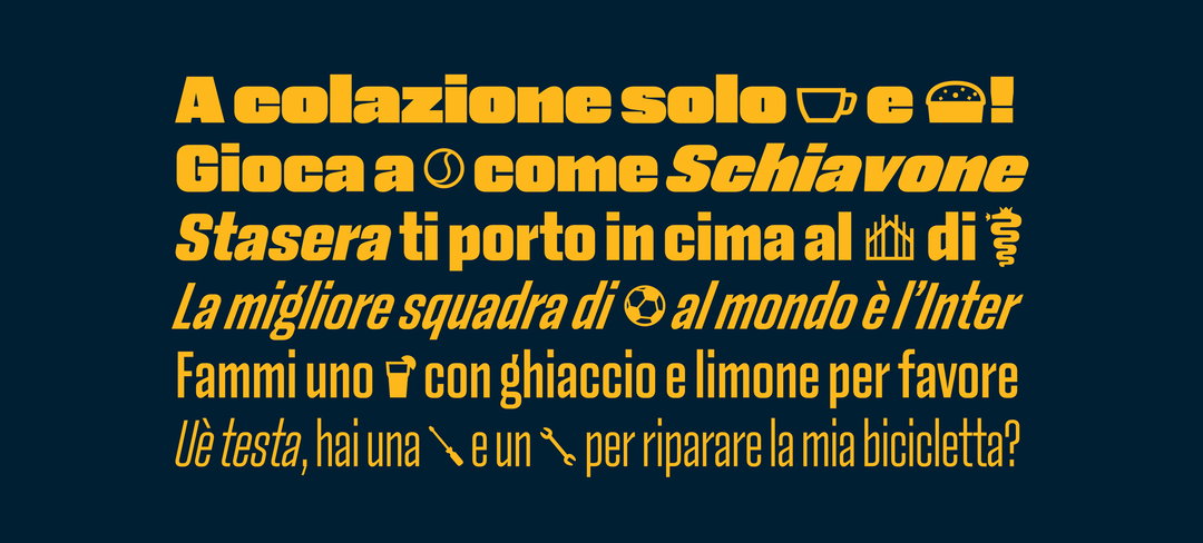
Amid the font there is also a set of icons that reference Milan – including the snake found on the city's shield, a panettone, the Duomo, an espresso cup and a wrench – to symbolise its hard-working industrial demographic.
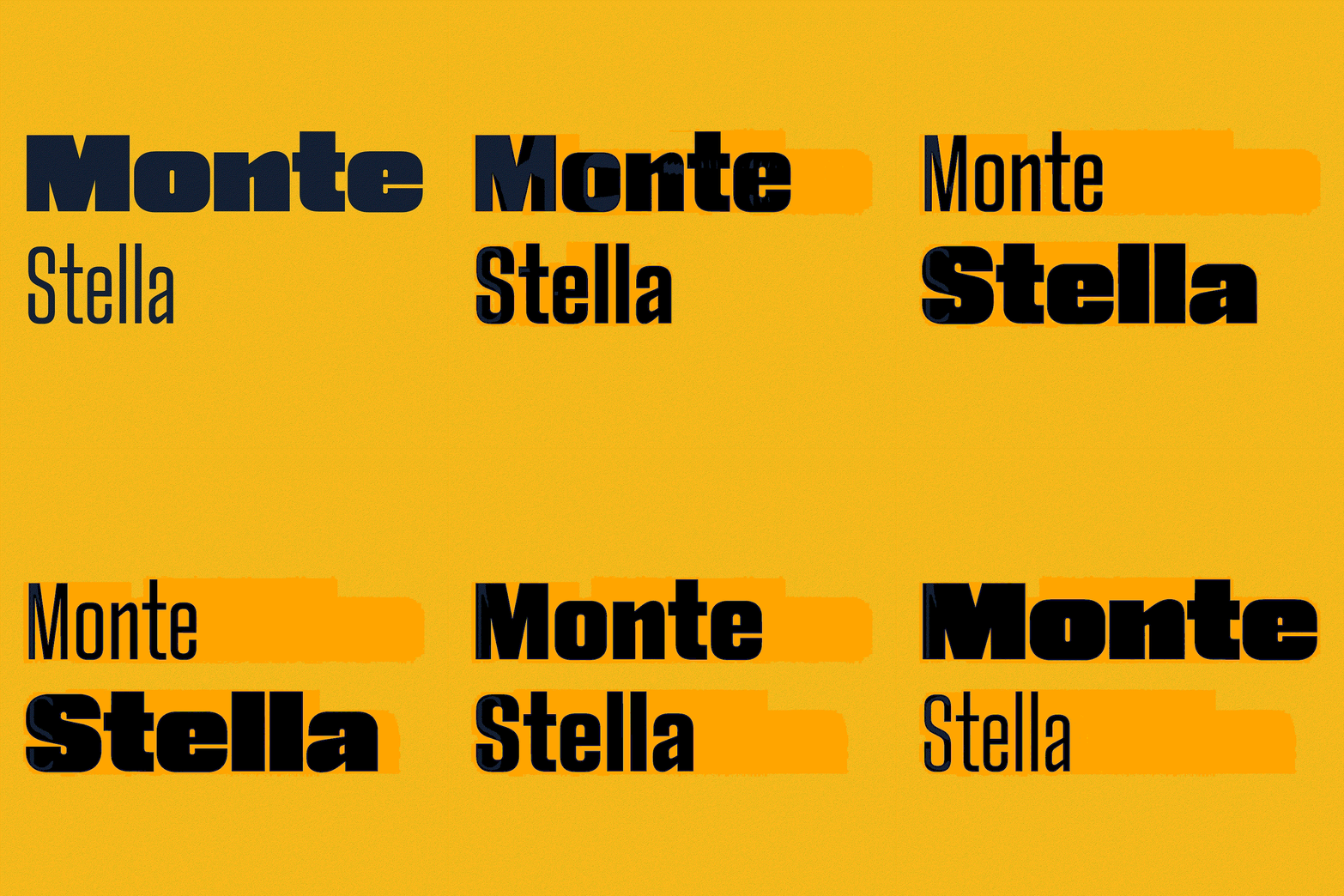
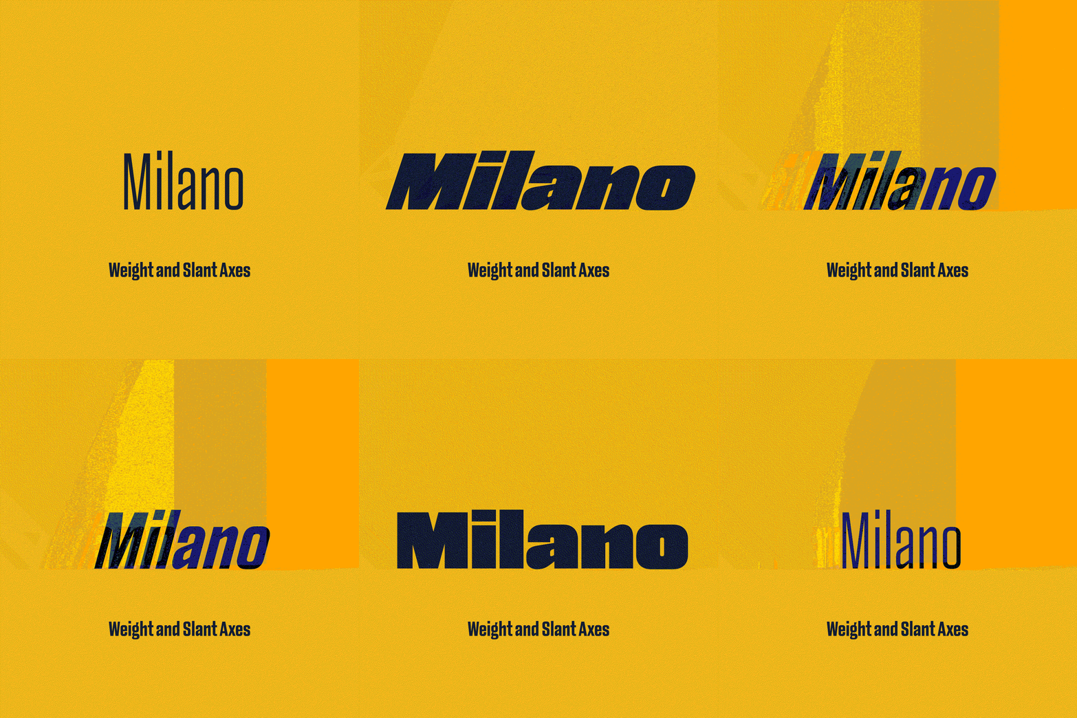
Monte Stella has six cuts each with a matching italic and turbo italic and a variable option that allows you to vary the angle of the italic. Due to the design's compact proportions and narrow counters, as the weight increases, so does the width – from a compressed Thin to wide Heavy. Riccardo says, while it is designed as an attention-grabbing and distinctive display typeface it is still utilitarian, as the compressed letter shapes allow a designer to use space effectively. "In short, Monte Stella has the boldness of the Milanese entrepreneur, and the practical sense of the Milanese worker."
GalleryDalton Maag: Monte Stella

Hero Header
Dalton Maag: Monte Stella
Share Article
About the Author
—
Jenny oversees editorial output across It’s Nice That. Get in touch with writing pitches for features or opinion pieces, big creative story tips, or questions about all things editorial. [email protected]
To submit your work to be featured on the site, please see our Submissions Guide.

