



Launch Recite Me assistive technology
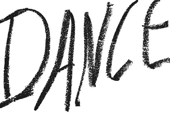
The word “DANCE” is written in bold, black charcoal lettering against a plain white background. The handwriting is expressive and textured, with rough, grainy edges.

A wonderfully innovative, movement-based Dance festival identity

—
Date
18 December 2014

At its core, dance is about innovation, beauty and movement – ideas executed brilliantly in this identity for a European contemporary dance festival by Verena Hennig and Ludwig Janoff. The clever designs take a very hand-crafted, even scrawled look, aiming to play on the idea that “the classic ballet thrives on the idea of perfection,” according to Verena.

She explains that while she wanted to create something different with the new identity, it was vital to create a look that would remain true to the roots of the festival in celebrating dance “as one of the most innovative forms of the performing arts and its different forms.” She adds: “Black and white is a reduction of human movement and content. Combined with different handwritten types, the identity creates a strong unique language, just like the dancers themselves.”
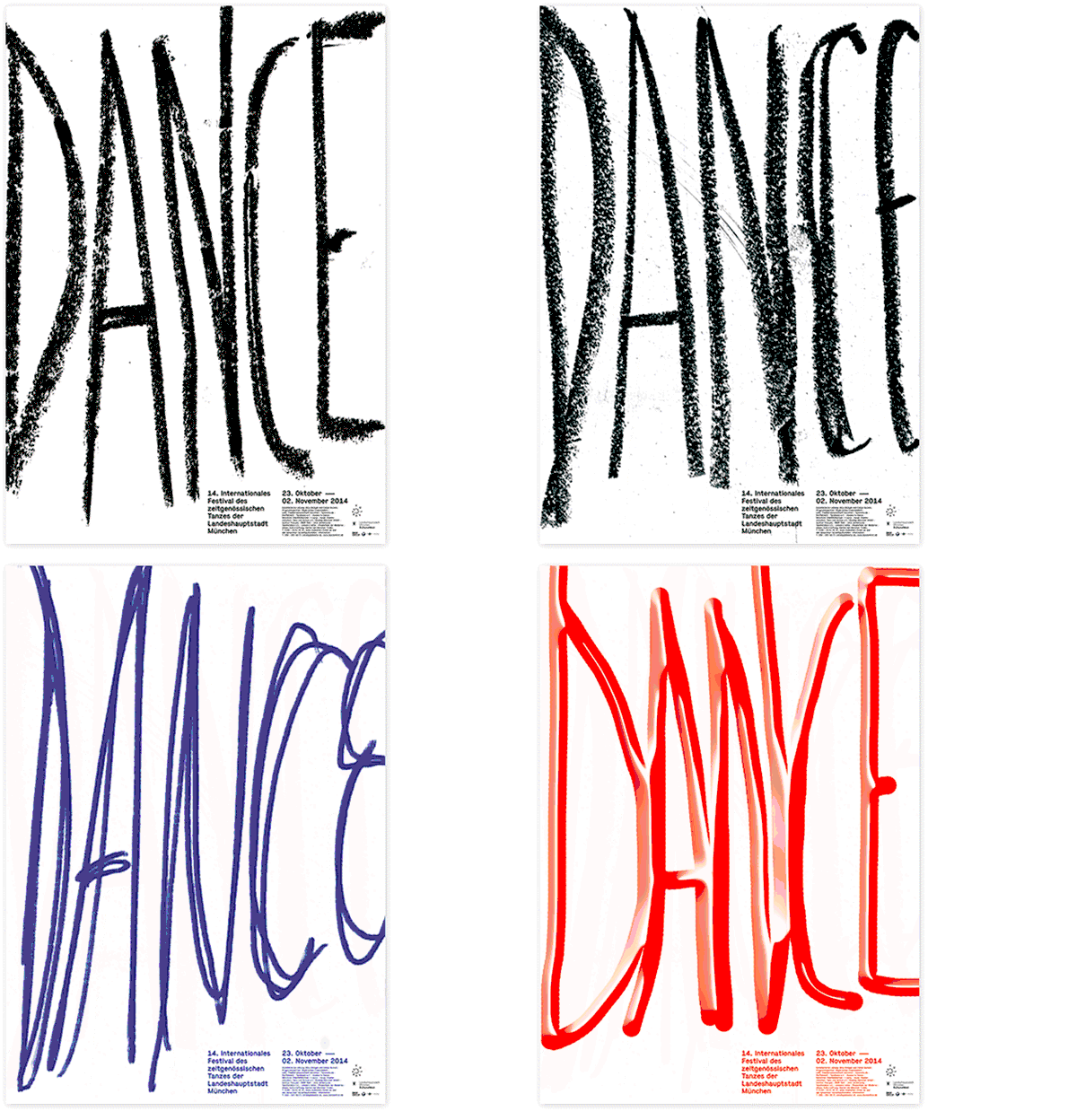
An animation of a poster in which the word “DANCE” morphs through different styles, colours and textures. Small text at the bottom reads “14. Internationales Festival des zeitgenössischen Tanzes der Landeshauptstadt München” and lists dates in October and November 2014.
Above

Verena Hennig and Ludwig Janoff: Dance identity
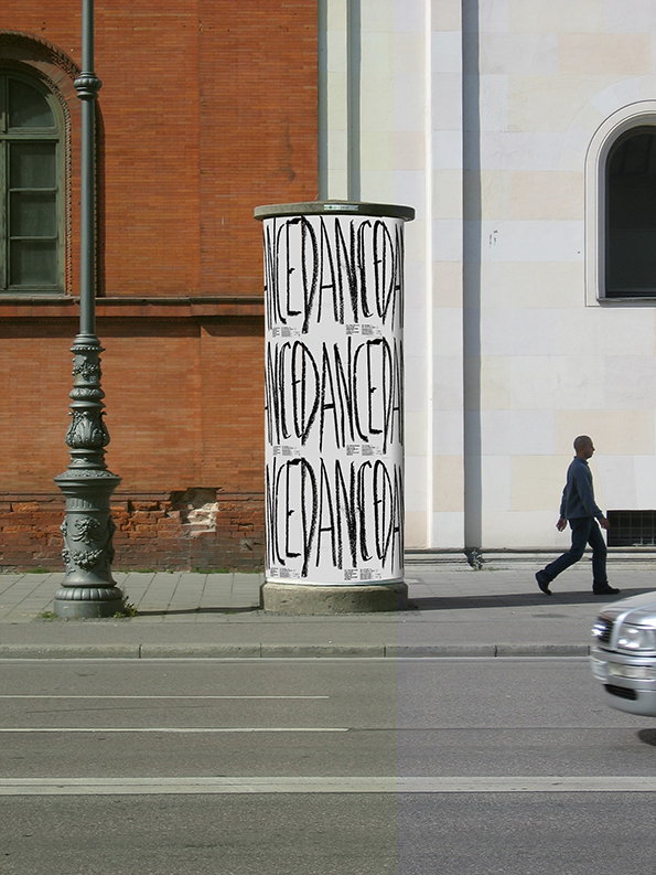
A cylindrical advertising pillar stands on a city pavement, wrapped in a white poster with the word “DANCEDANCE” repeated in black, gestural lettering. A person walks past the pillar against a backdrop of a red brick building and a white wall.
Above

Verena Hennig and Ludwig Janoff: Dance identity
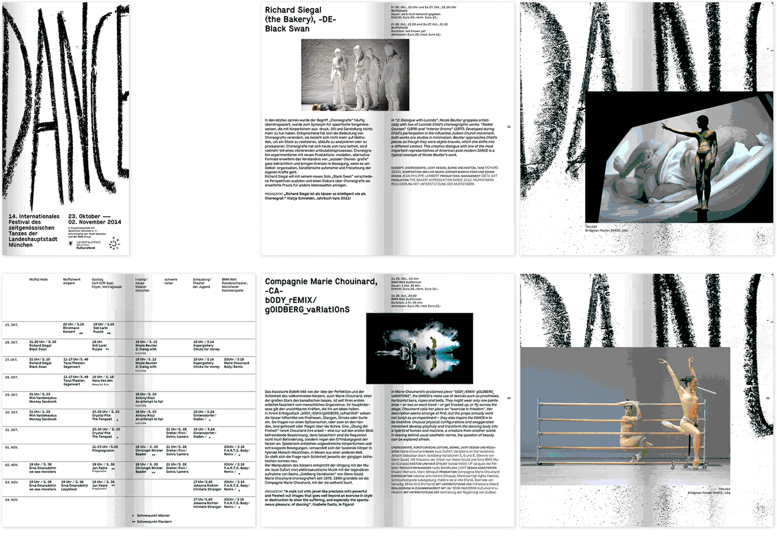
An animation of a programme for the “14. Internationales Festival des zeitgenössischen Tanzes der Landeshauptstadt München”. It cuts between a bold typographic cover, a detailed performance schedule, and pages featuring photographs of dancers in various poses.
Above

Verena Hennig and Ludwig Janoff: Dance identity
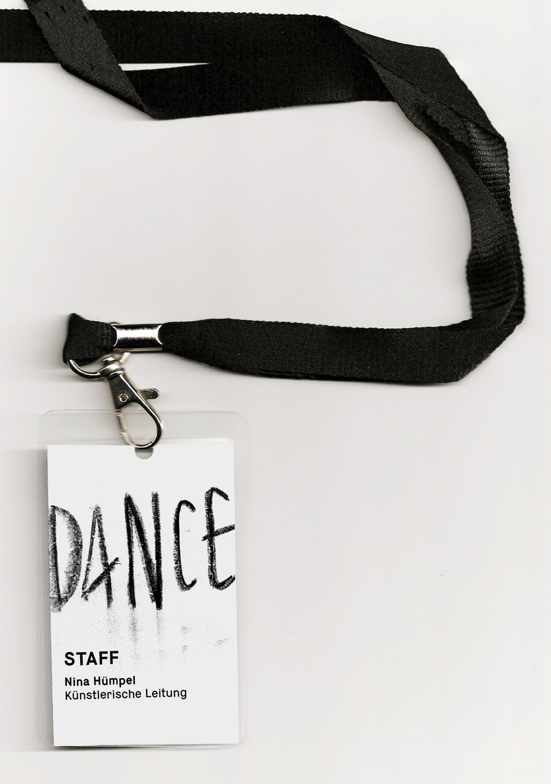
A black fabric lanyard holds a white ID badge in a clear plastic sleeve. The badge features the word “DANCE” in bold, charcoal-style lettering above the text “STAFF”, “Nina Hümpel” and “Künstlerische Leitung”.
Above

Verena Hennig and Ludwig Janoff: Dance identity
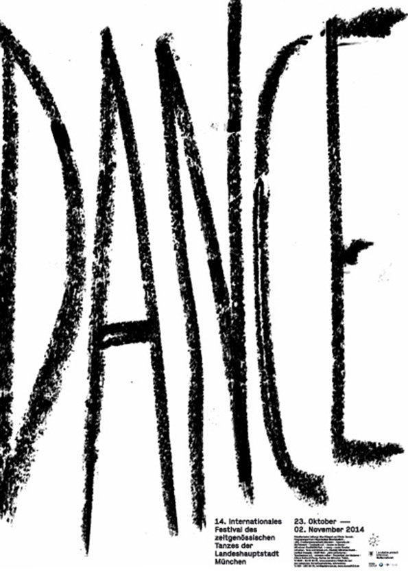
A black and white poster featuring the word “DANCE” in large, rough, charcoal-style lettering. Smaller text at the bottom reads “14. Internationales Festival des zeitgenössischen Tanzes der Landeshauptstadt München” and lists the dates “23. Oktober – 02. November 2014”.
Above

Verena Hennig and Ludwig Janoff: Dance identity
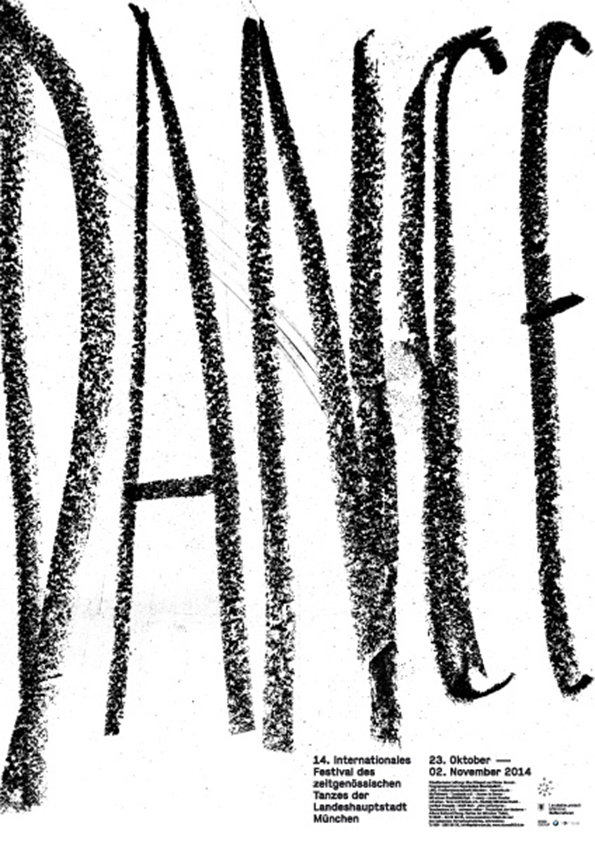
A black and white poster featuring the word “DANCE” written in large, textured charcoal strokes. Smaller text at the bottom reads “14. Internationales Festival des zeitgenössischen Tanzes der Landeshauptstadt München” and lists the dates “23. Oktober – 02. November 2014”.
Above

Verena Hennig and Ludwig Janoff: Dance identity

Share Article

About the Author

Emily Gosling

—

Emily joined It’s Nice That as Online Editor in the summer of 2014 after four years at Design Week. She is particularly interested in graphic design, branding and music. After working It's Nice That as both Online Editor and Deputy Editor, Emily left the company in 2016.


It's Nice That Newsletters

Fancy a bit of It's Nice That in your inbox? Sign up to our newsletters and we'll keep you in the loop with everything good going on in the creative world.
