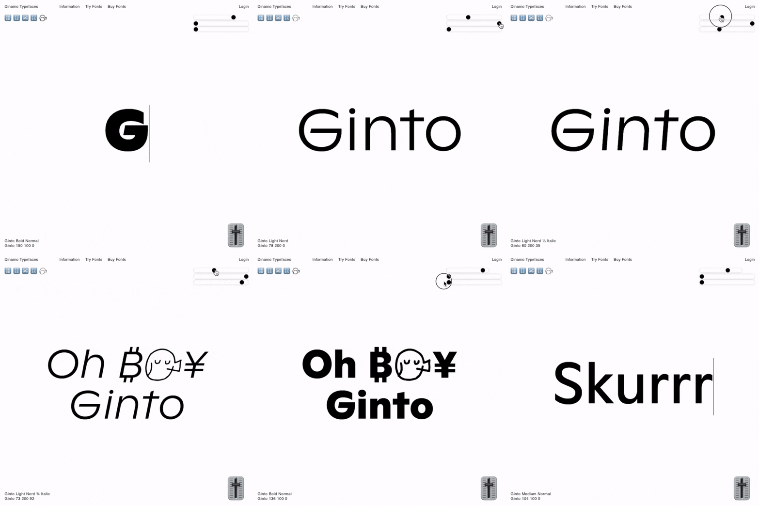
Daniel Wenzel's interactive type specimen for Ginto reacts to sound, movement and mouse position
Currently working at DIA Studio in New York City, Daniel Wenzel is a typographer, graphic designer and developer. Merging his artistic and scientific interests, Daniel creates experimental and exciting projects combining type and interaction. Taking a break from his communication design course at HTWG Konstanz, Daniel is developing rapidly as a designer (and developer) as his recent project GintoGX demonstrates.
“TrueType GX was part of an ambitious overhaul of the Macintosh graphics systems in the mid-1990s,” Daniel explains. “Like multiple master fonts, one file contains all the weights, widths and optical sizes of a typeface, and an infinite number of in-between fonts can be generated on demand by font users.” Although this technology has existed now for decades, it’s only much more recently that web browsers have begun to catch up; opening a world of possibilities in terms of interaction with fonts online.
It’s this technology that Daniel was able to exploit when creating the specimen for Ginto, a typeface family designed by Seb McLauchlan of OK-RM which is due to be released by Dinamo this summer. Ginto consists of two sister families; Ginto Normal and Ginto Nord. Normal is optimised for text use, featuring compact shapes and rational weights, whereas Nord is optimised for display use with a tall x-height and generous character widths.
“I was in contact with Fabian [Harb] from Dinamo for a while and I was doing all these experiments on my own fonts. I wanted to do something with a more sophisticated typeface,” Daniel recalls. “So, I asked if they could export Ginto as a variable font so that I could test some of my tools with it.” These tools were born from a series of experiments on how he could interact with a typeface: “I basically tested all the sensors and inputs my devices could offer,” he explains.
The result is an interactive type specimen; one that responds to sound, the position of your phone, the position of your mouse or its hover, and a series of sliders which enable you to explore all axes of the font manually.
This approach to design – one that encourages participation and experimentation – is at the heart of Daniel’s practice. “I love art,” he tells It’s Nice That, “but not necessarily the contemporary stuff they call art nowadays. I’ve always thought that design is closer to what I associate with the term – made for a large audience, public space and with an explicit purpose.”
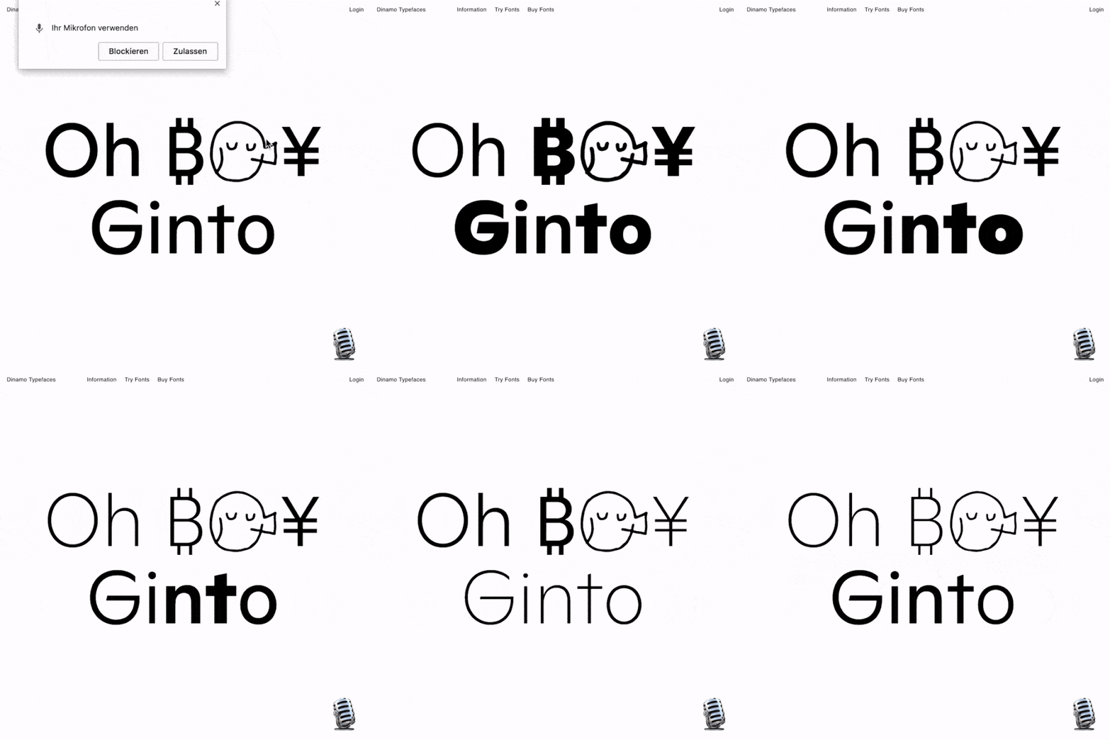
Daniel Wenzel: GintoGX
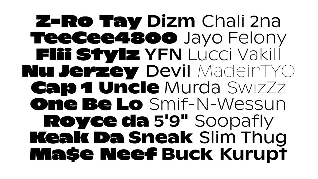
Daniel Wenzel: GintoGX
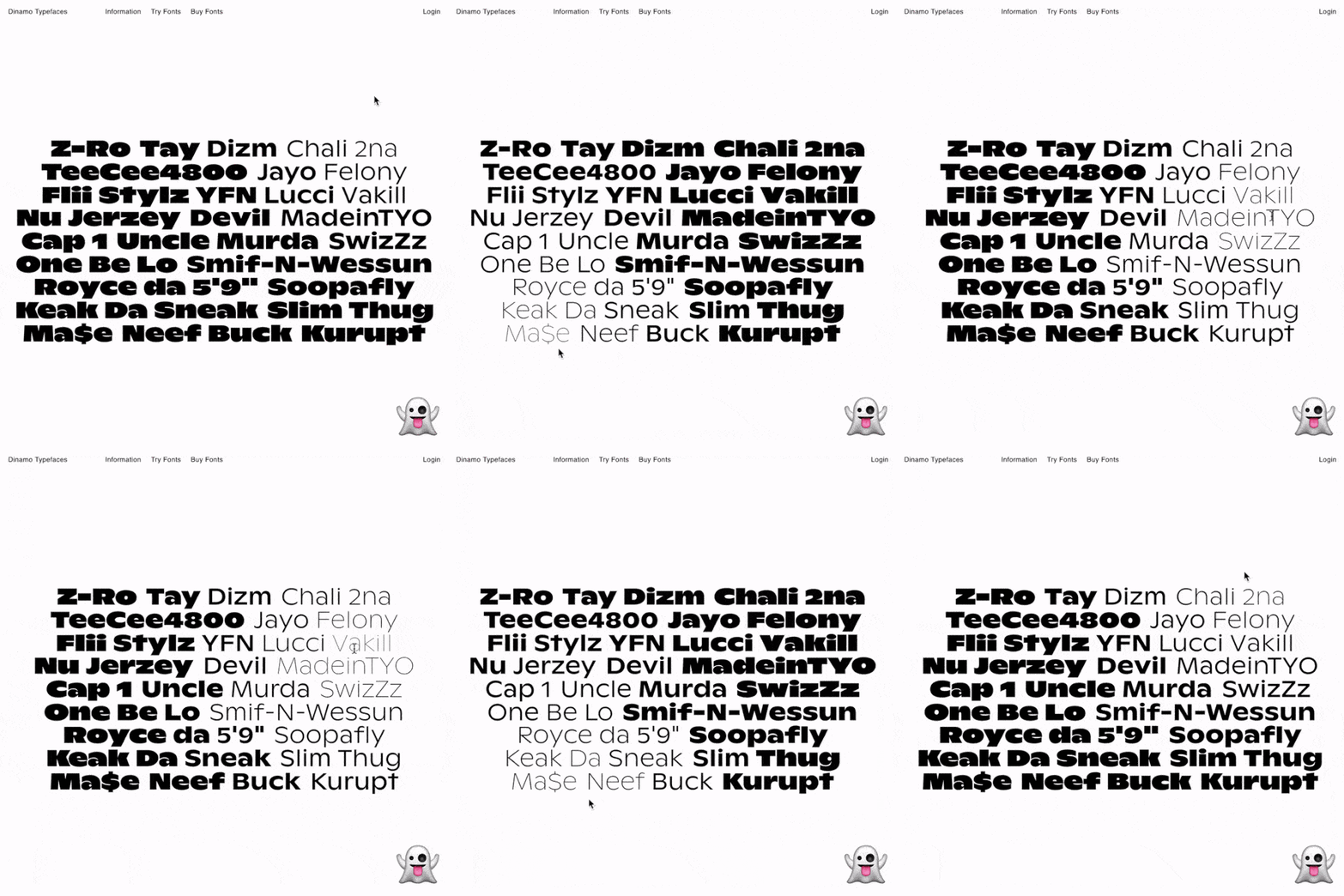
Daniel Wenzel: GintoGX
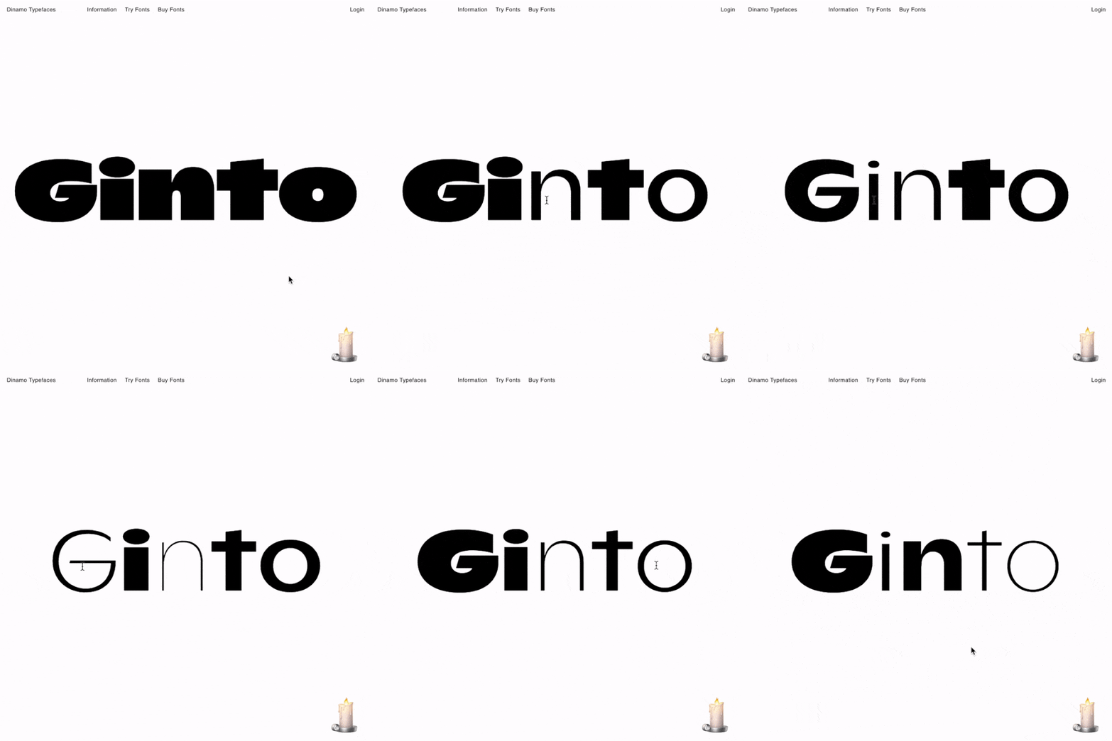
Daniel Wenzel: GintoGX
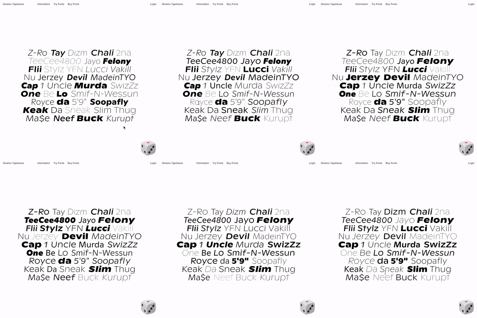
Daniel Wenzel: GintoGX
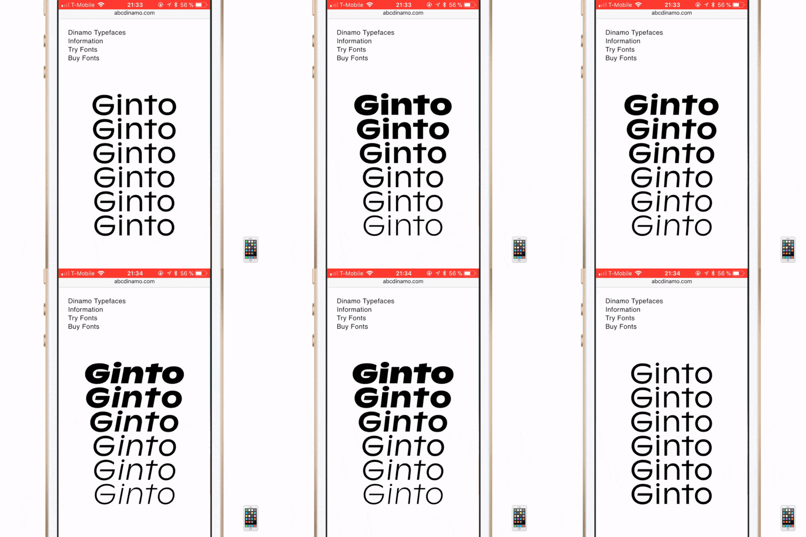
Daniel Wenzel: GintoGX
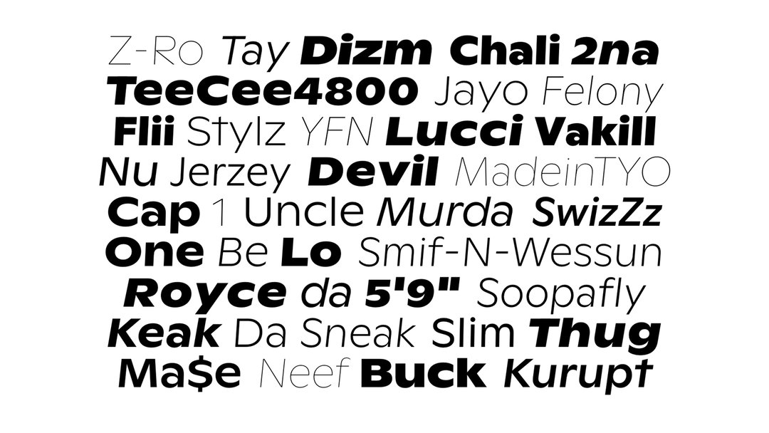
Daniel Wenzel: GintoGX
Share Article
Further Info
About the Author
—
Ruby is Senior Creative at It's Nice That, overseeing our visual output across platforms and projects. Before that, she was associate editor on the editorial team, after joining in September 2017 following graduation from Central Saint Martins.