A love letter to the lost tradition of queer matchbooks
Darian Newman’s new book compiles a collection of 80 matchbooks – once a pocketable souvenir, now an artefact of the headier days of the gay clubbing scene.
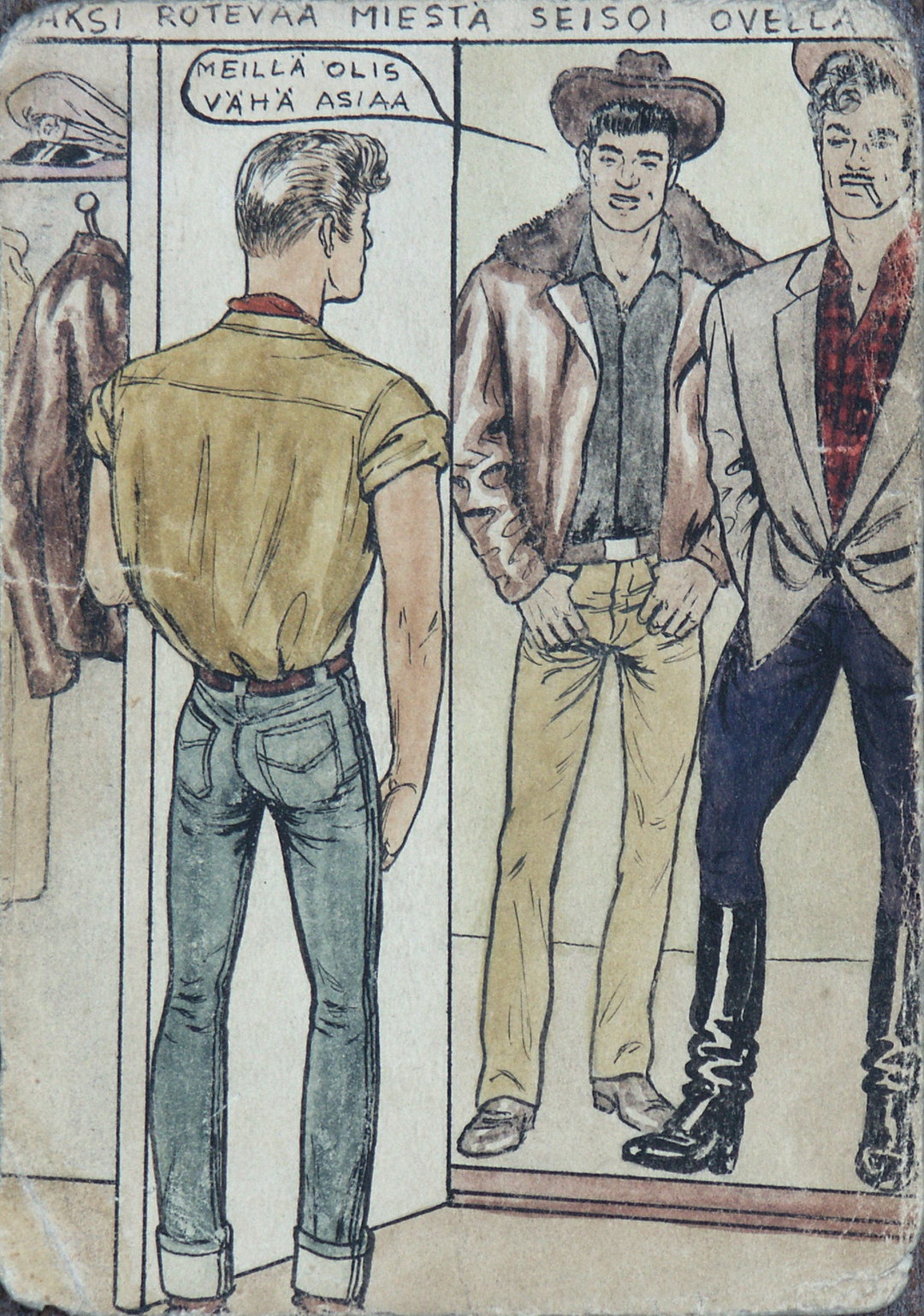
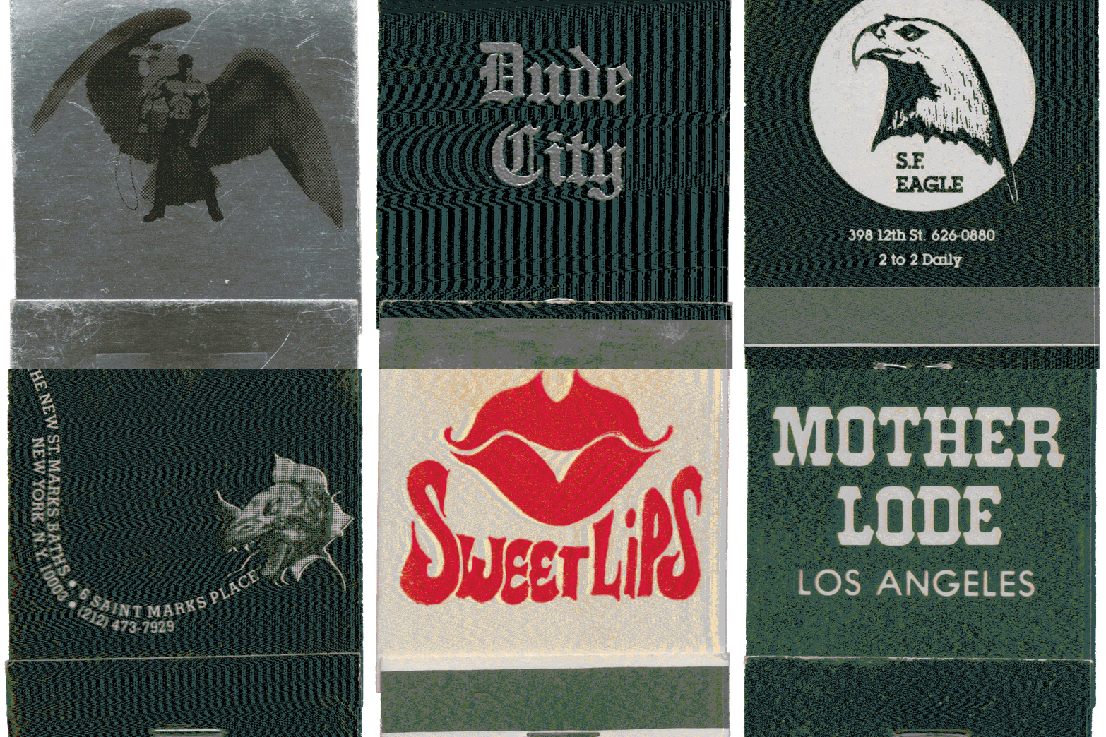
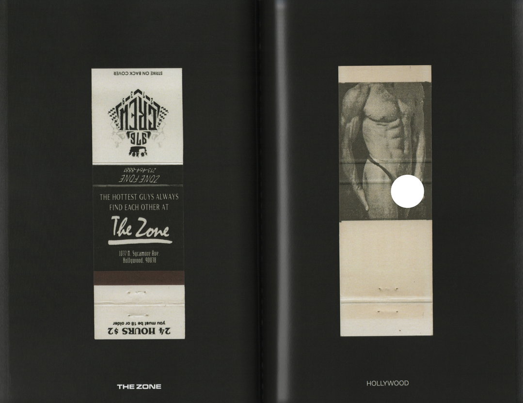
Before mobile phones existed, and before smoking was banned indoors, many queer spaces would print and hand out matchbooks as a marketing tool. Back in their heyday, these matchbooks, often featuring images of muscled Adonises and raunchy puns, were everyday disposable objects. Cruisers could flip it open and scrawl a phone number inside, passing them around from pocket to pocket. Now, with the closure of so many of these institutions, and the rise of apps like Grindr, these little objects have become treasured artefacts of a time gone by.
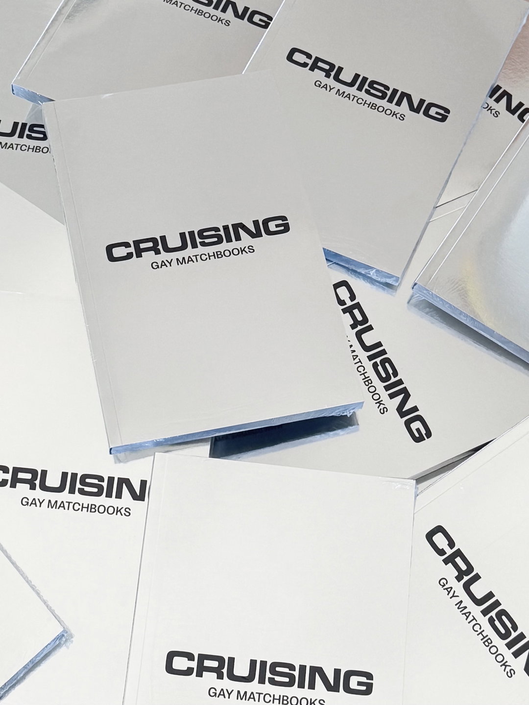
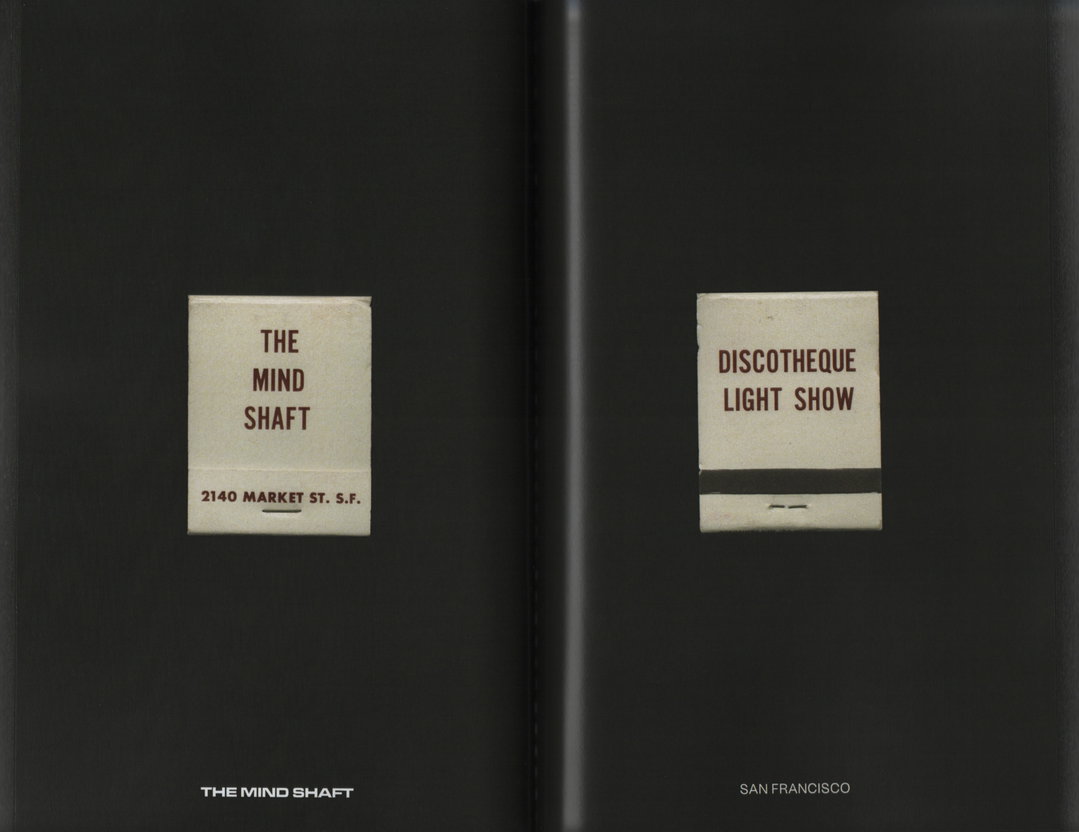
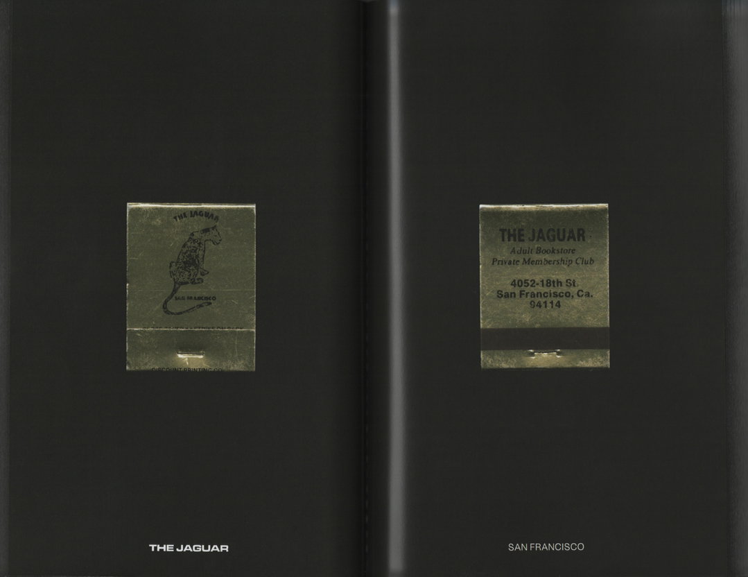
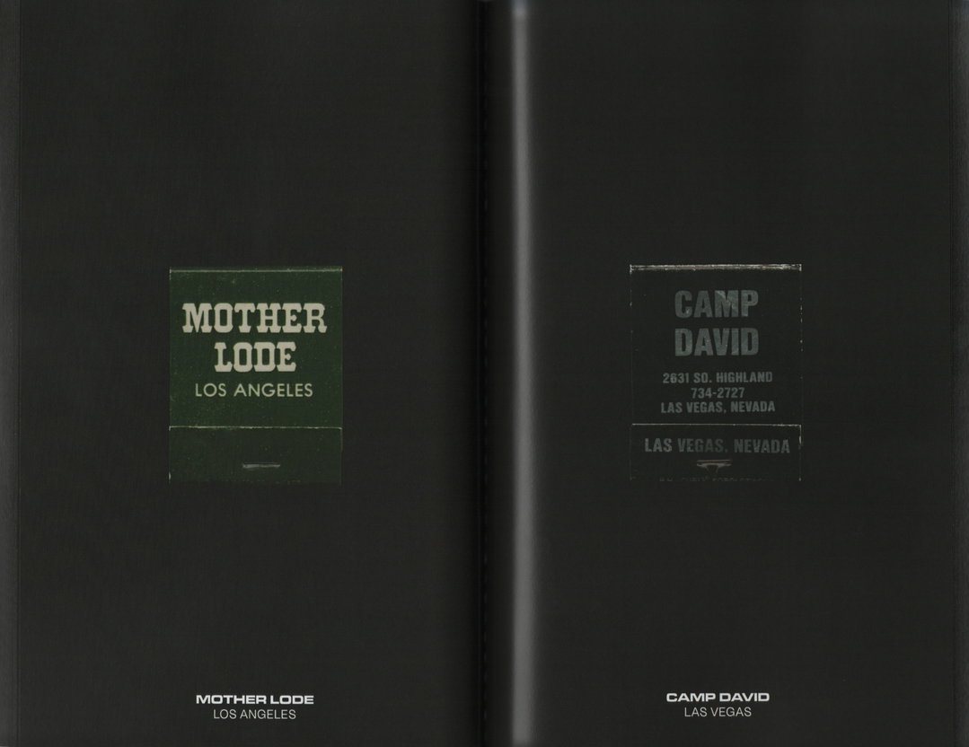
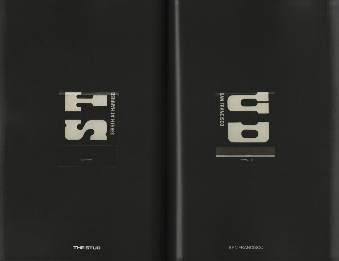
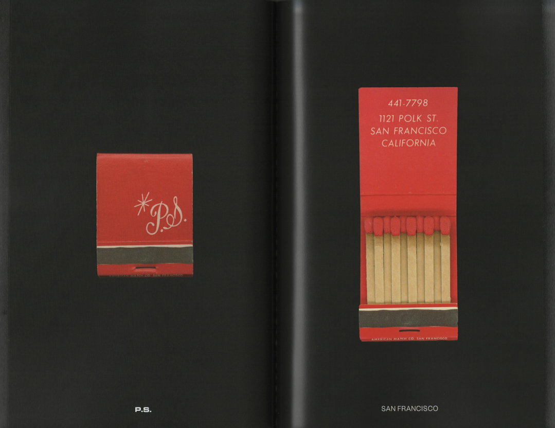
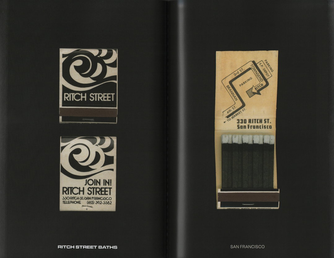
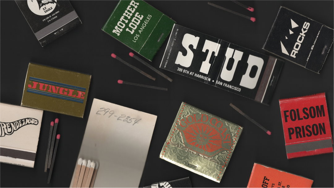
Cruising by Darian Newman presents 80 of these miniature calling cards, printed to scale on black paper and bound in a mirrored cover. “It resembles looking in a bar mirror after a few drinks,” says the artist. The whole book – capturing worn edges, missing matches, and scratched out paper – is a visceral reflection of what it might have felt like to stumble through a dark bar in the headier days of the gay clubbing scene.
GalleryCruising: Gay Matchbooks by Darian Newman (Copyright © Darian Newman, 2025)
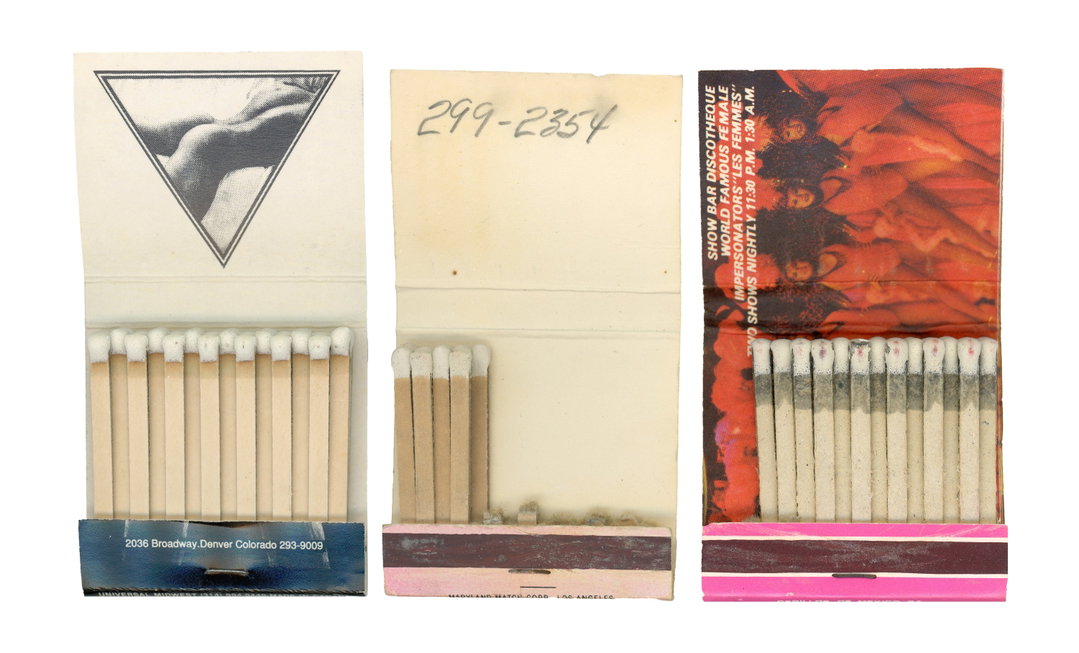
“I wanted people to have to get up close to the book and rotate it around to see some of the finer details, to really get cozy with it,” says Darian, originally from Massachusetts and now based between San Francisco and Connecticut. The designer first came across these matchbooks while working for an athleticwear company. He was designing a t-shirt featuring a matchbook design, and discovered how prevalent these objects were in gay bars. “My initial response was, why aren’t we still doing this?”
Darian set out on a mission to collect as many of these keepsakes as he could, searching for variations in design, but also location. He dug through eBay to look for specific matchbooks, from iconic institutions like St. Mark’s Baths, The Stud and The Saint. Some of his personal favourites are ones with little surprises on the interior. “Many of them feature what you’d expect to see, buff men in various degrees of undress,” he explains. “They get really fun when they stray from that. Kissy lips, monsters, sail boats, there’s such a range of imagery.” They also speak to the different archetypes of gay men – “from looking at them you could get a good sense of which bar may be for you,” says Darian.
In that sense, Cruising tells a greater story – about subcultures, community and the importance of design and physical objects to speak to a specific audience. “You can tell through the design that people really knew their community... So much design right now feels mass market, especially when it comes to the gay community,” says Darian. “You see design trying to reach a gay audience, and often it’s still full of rainbows or things that feel like caricatures.” These matchbooks reflect a time when queer spaces had their own distinct identities – designed by and for the people who gathered there. Each crease and fold is an indication of a real lived experience, a reminder of a once-thriving subculture that lost its home to time, gentrification, and digital convenience.
“These matchbooks have come to mean so much to me, and a big part of that has been from seeing how much they mean to other people,” Darian reflects. “They come to life when someone interacts with the book… I’ve watched people flip through and have such a strong emotional response… That’s what makes them so exciting to this specific moment in time – both audiences get to interact with the book in different ways.”
GalleryCruising: Gay Matchbooks by Darian Newman (Copyright © Darian Newman, 2025)
Hero Header
Cruising: Gay Matchbooks by Darian Newman (Copyright © Darian Newman, 2025)
Share Article
Further Info
About the Author
—
Marigold Warner is a British-Japanese writer and editor based in Tokyo. She covers art and culture, and is particularly interested in Japanese photography and design.