Launch Recite Me assistive technology
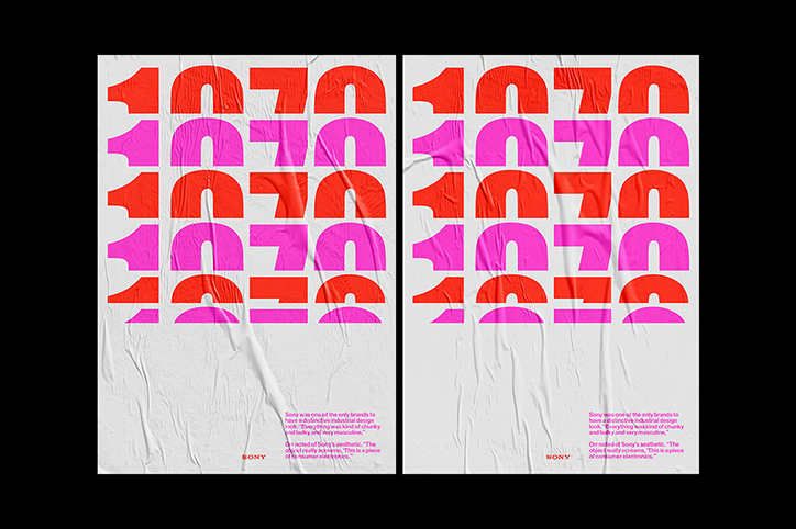
Two identical posters featuring a grid of bold, abstract shapes in red and pink. Below the graphics, a block of text discusses the design look of Sony, accompanied by the Sony logo.

Denis Kovalchuk’s club posters experiment with type and composition

—
Date
7 November 2017

Art director and designer Denis Kovalchuk is currently based in Moscow and first became interested in the world of design when he started collecting examples of vector graphics as a hobby. Denis then went on to study design formally and mastered the basic principles of design, which inform his work today.

Adapting these ideas, Denis often favours experimental typography over simply using what’s expected. Working across disciplines on editorial, branding and identity projects, Denis’ most recent work sees him create club posters for Deve Dk, Kiki, Pompeya, Frivolous and many more. With an emphasis on type, shape and composition, Denis’ posters are graphic, colourful and bold, offering the right amount of ambiguity found in this style of poster.

In every project Denis aims to define the problem before starting any practical work. He then works out what tone he should adopt and proceeds to “study and develop the visual concept”. “This gives the expected result without turning the design process into an endless game with fonts and colour,” explains Denis.
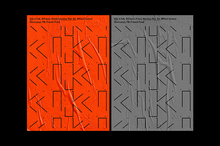
Two versions of a poster, one in bright orange and one in grey, featuring a grid of abstract black geometric shapes. Text at the top reads “Kiki 6 Feb. @French Fried, Morelos 944. Ba. BPitch Control (Germany), FB: French Fried”.
Above

Denis Kovalchuk

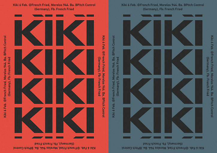
Two versions of a typographic poster, one in red and one in blue-grey. The word “KIKI” is repeated in a bold, black grid, surrounded by event details including the date “6 Feb.” and the location “French Fried, Morelos 944”.
Above

Denis Kovalchuk

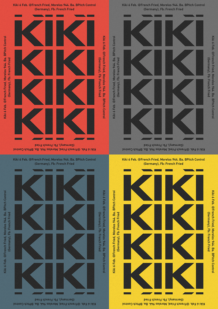
A grid of four posters in red, grey, blue and yellow. Each features the word “KIKI” repeated in a bold, black geometric typeface, surrounded by event details including the date “6 Feb.” and the location “French Fried, Morelos 944”.
Above

Denis Kovalchuk

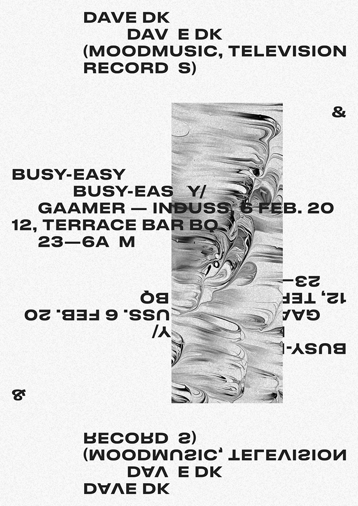
A black and white typographic poster featuring a central vertical strip of marbled, swirling textures. The text is mirrored and flipped, reading “Dave DK (Moodmusic, Television Record S)” and “Busy-Easy Gaamer — Induss 6 Feb. 2012, Terrace Bar BQ 23–6am”.
Above

Denis Kovalchuk

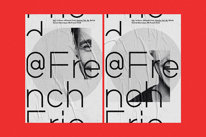
Two posters on a red background feature a black and white photograph of a person’s face, partially obscured by large, bold typography. The text reads “@French Fried” in a fragmented layout across a creased paper texture.
Above

Denis Kovalchuk

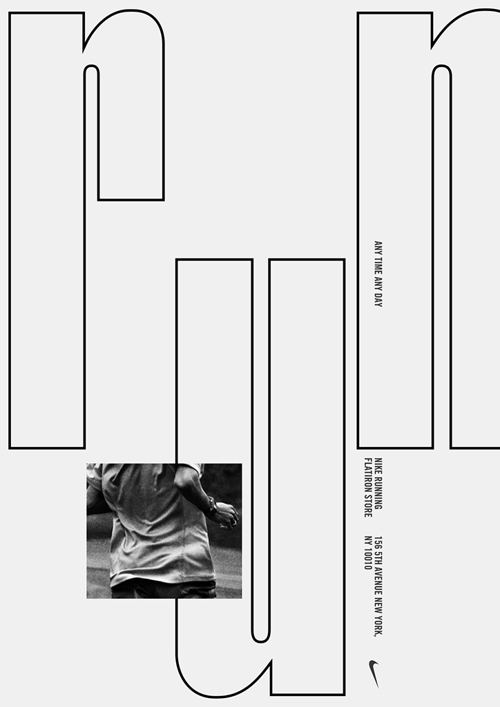
A flat layout of a packaging template featuring black outlines on a light grey background. A black and white photo of a person in athletic wear is inset, alongside the Nike swoosh and text reading “Nike Running Flatiron Store” and “Any time any day”.
Above

Denis Kovalchuk

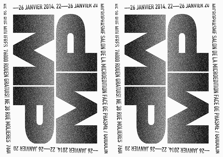
A black and white typographic poster featuring the letters “MP” repeated and mirrored in a bold, grainy gradient. Text around the border reads “22—26 JANVIER 2014” and “MICRÔPHASME SALON DE LA MICROÉDITION”.
Above

Denis Kovalchuk

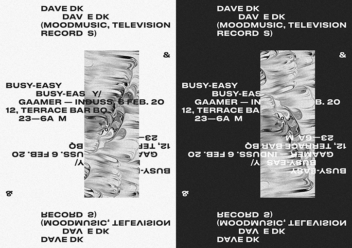
A black and white graphic design featuring mirrored typographic layouts and a central abstract image of swirling liquid. The text lists artists and event details, including “Dave DK”, “Busy-Easy”, and “Gaamer”, alongside the date “6 Feb. 20”.
Above

Denis Kovalchuk

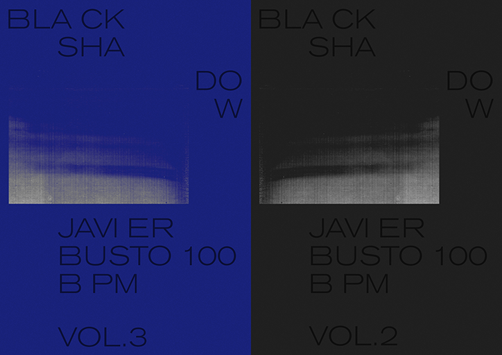
Two minimalist album covers side by side, one in deep blue and one in black. Both feature the text “BLA CK SHA”, “DO W”, “JAVI ER BUSTO 100 B PM” and a volume number. The blue cover is “VOL.3” and the black is “VOL.2”.
Above

Denis Kovalchuk

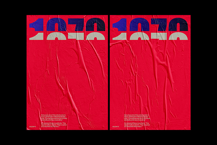
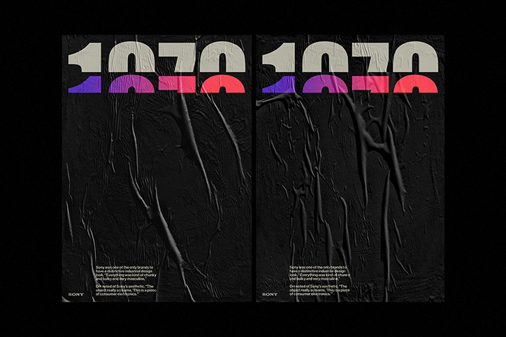
Two identical red posters with a crumpled, plastic-like texture. Bold, fragmented typography at the top reads “1970”, while a small Sony logo and a block of text appear at the bottom.
Above

Denis Kovalchuk

Two posters with a black, crumpled texture. The top of each features the year “1970” in a bold, white typeface with a purple and red gradient across the bottom. Small white text at the bottom describes Sony’s industrial design, alongside a small “Sony” logo.
Above

Denis Kovalchuk

Share Article

About the Author

Rebecca Fulleylove

—

Rebecca Fulleylove is a freelance writer and editor specialising in art, design and culture. She is also senior writer at Creative Review, having previously worked at Elephant, Google Arts & Culture, and It’s Nice That.


It's Nice That Newsletters

Fancy a bit of It's Nice That in your inbox? Sign up to our newsletters and we'll keep you in the loop with everything good going on in the creative world.