



Launch Recite Me assistive technology
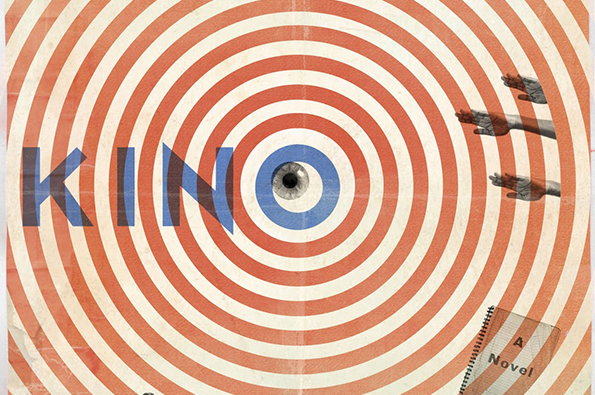
A collage featuring concentric red and white circles that draw the eye toward a central human eye. The word “KINO” is written across the middle in bold blue letters, with the “O” framing the eye. To the right, two pairs of hands reach into the frame, and a small notebook in the bottom corner reads “A Novel”.

Graphic Design: Design Observer honour best book designs of last year

—
Date
27 June 2013

Stand by to fill your boots because the daddy of design blogs has unveiled both its 50 best book designs and 50 best book covers of last year. Continuing a tradition first started by the American Institute of Graphic Arts in 1922, Design Observer has honoured 100 titles it believes encapsulate the best examples of a craft fighting for its future in the digital age.

“It is clear from the winning entries that designers and publishers are not just resigned to the new world but are actively challenging it,” Design Observer wrote in a blog post. "The books this year demonstrate astonishing attention to craft, as well as startling ambitions to disrupt expectations about what constitutes a “traditional” book in the first place.

“Covers as well do double and triple duty, functioning not just as alluring packaging on the bookstore shelf, but as telegraphic icons in the realm of online marketing and sortable rubrics in online libraries.”

It went on: “The designers who selected the fifty best books 92 years ago would be baffled, and perhaps even outraged, by some of the examples of the craft we honour today. Yet one hopes that they would recognise a familiar commitment to the authors, the readers, and the common culture that make these achievements so valuable, and so indispensable today.”

There were some things we knew and some we didn’t but a special mention to Everything Studio whose design for Curiosity and Method: Ten Years of Cabinet Magazine by Sina Najafi was given the nod in both categories.
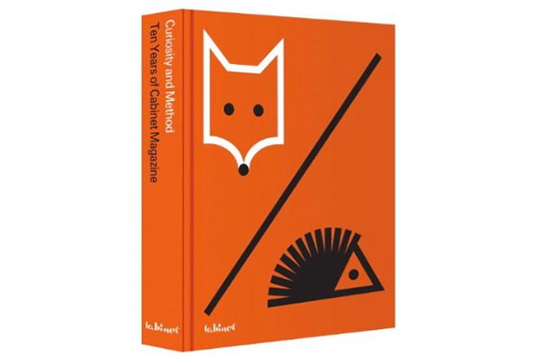
An orange book cover features a white minimalist fox head and a black geometric hedgehog. The spine reads “Curiosity and Method: Ten Years of Cabinet Magazine”.
Above

Everything Studio: Sina Najafi — Curiosity and Method: Ten Years of Cabinet Magazine
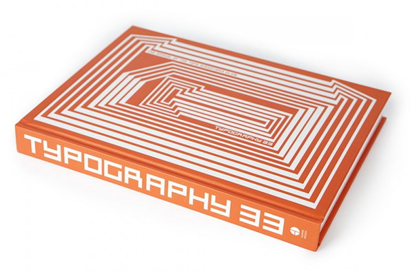
An orange book titled “Typography 33” lies flat against a white background. The cover features a series of concentric white lines that form a geometric, maze-like pattern.
Above

Kayla Jang, Ludwig Janoff and Paula Scher: Type Directors Club —Typography 33
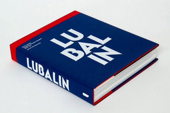
A blue hardcover book with a red spine and edges. The cover features the name “LUBALIN” in bold white typography, wrapped across the front and spine.
Above

Claudia Clat and Elena Carl/Spin: Adrian Shaughnessy — Herb Lubalin
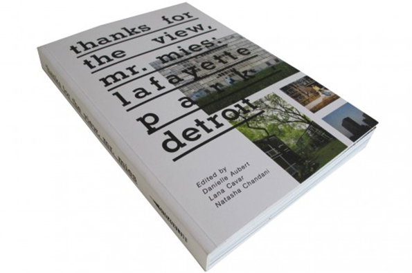
A white book titled “thanks for the view, mr. mies: lafayette park detroit”. The cover features a grid of architectural photographs and lists the editors as Danielle Aubert, Lana Cavar and Natasha Chandani.
Above

Placement: Danielle Aubert, Lana Cavar, Natasha Chandani —Thanks for the View, Mr. Mies: Lafayette Park, Detroit
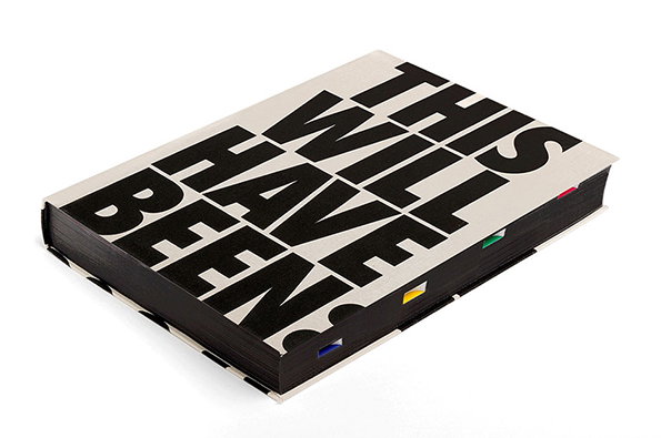
A thick book with a white cover and bold black typography that reads “THIS WILL HAVE BEEN”. Small, colourful tabs protrude from the right edge of the black pages.
Above
James Goggin and Scott Reinhard: Helen Molesworth — This Will Have Been: Art, Love, and Politics in the 1980s
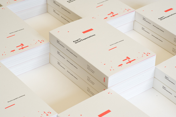
Stacks of white books are arranged in a grid on a plain surface. The covers feature red graphic elements and the text “Page 1: Great Expectations”.
Above

Lucienne Roberts, Rebecca Wright and John McGill: Lucienne Roberts, Rebecca Wright — Page 1: Great Expectations / Seventy graphic solutions
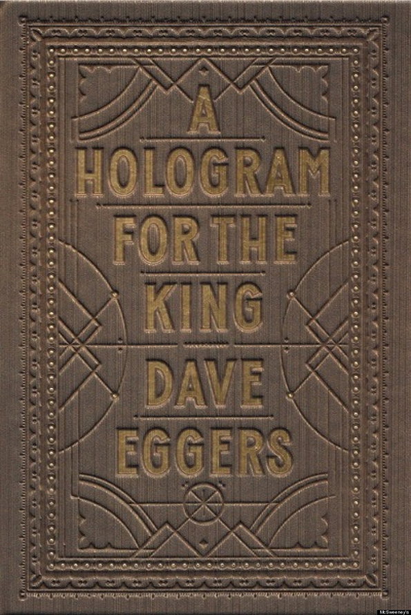
The embossed brown cover of a book reads “A Hologram for the King” and “Dave Eggers”. The text is framed by a decorative border of dots and geometric line work.
Above

Jessica Hische: Dave Eggers — A Hologram For The King
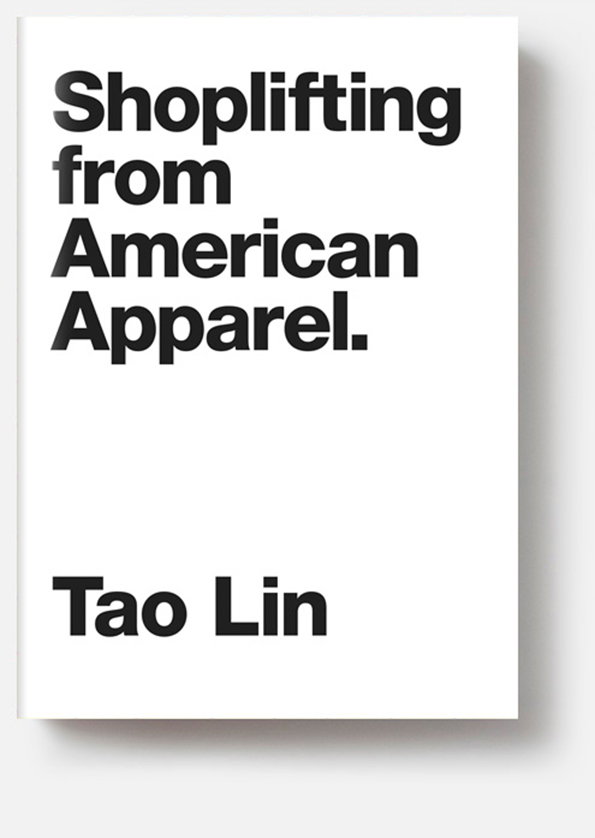
The white cover of a book features bold black typography. It reads “Shoplifting from American Apparel.” with the author “Tao Lin” printed below.
Above

Christopher King: Tao Lin — Shoplifting from American Apparel
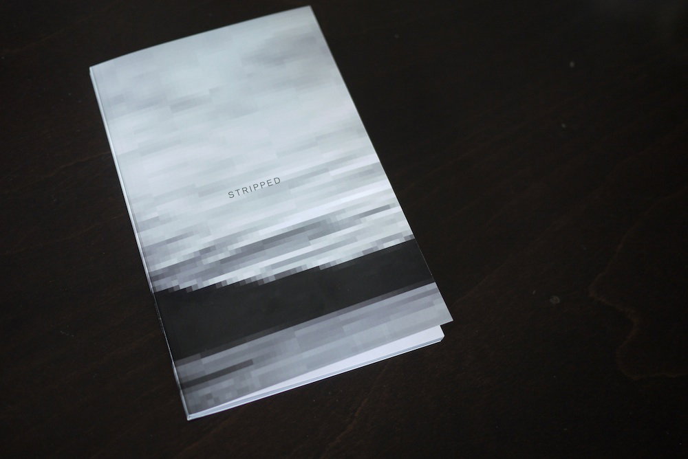
A booklet rests on a dark wooden surface. The cover features a blurred, grey-scale abstract image with the word “STRIPPED” printed in small, sans-serif capitals.
Above

Paul Soulellis: Paul Soulellis — Stripped (Sixty-Six Sunsets Stripped)
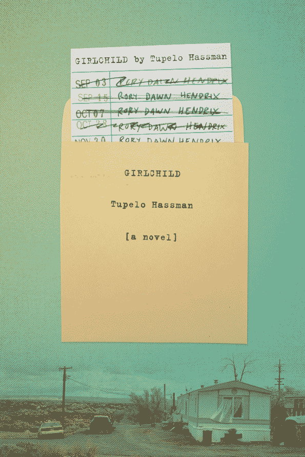
A book cover for “Girlchild” by Tupelo Hassman, featuring a yellow envelope against a pale green background. Inside the envelope are slips of paper with handwritten names and dates, including “Rory Dawn Hendrix”. A small landscape at the bottom shows a trailer home and cars in a flat, open terrain.
Above

Jennifer Carrow/Rodrigo Corral: Tupelo Hassman — Girlchild
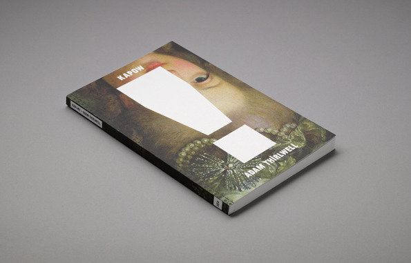
A hardcover book lies flat on a grey surface. The cover features a close-up of a classical painting with white geometric shapes obscuring the face, and reads “Kapow” and “Adam Thirlwell”.
Above

Studio Firth: Adam Thirlwell — Kapow!
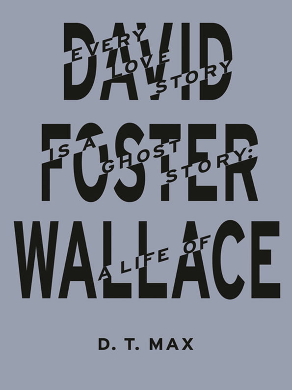
A book cover with bold black typography on a muted blue background. The main text reads “David Foster Wallace”, with the phrases “Every love story is a ghost story: a life of” woven through the larger letters. The author’s name, “D. T. Max”, is printed at the bottom.
Above

Damon Murray and Stephen Sorrell: D.T. MAx — Every Love Story Is A Ghost Story: A Life Of David Foster Wallace
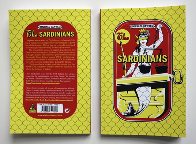
The front and back covers of a book titled “The Sardinians” by Michael Dawkes. The cover features a yellow honeycomb pattern and an illustration of a blindfolded figure holding scales of justice.
Above

Paul Woterink: Michael Dawkes — The Sardinians
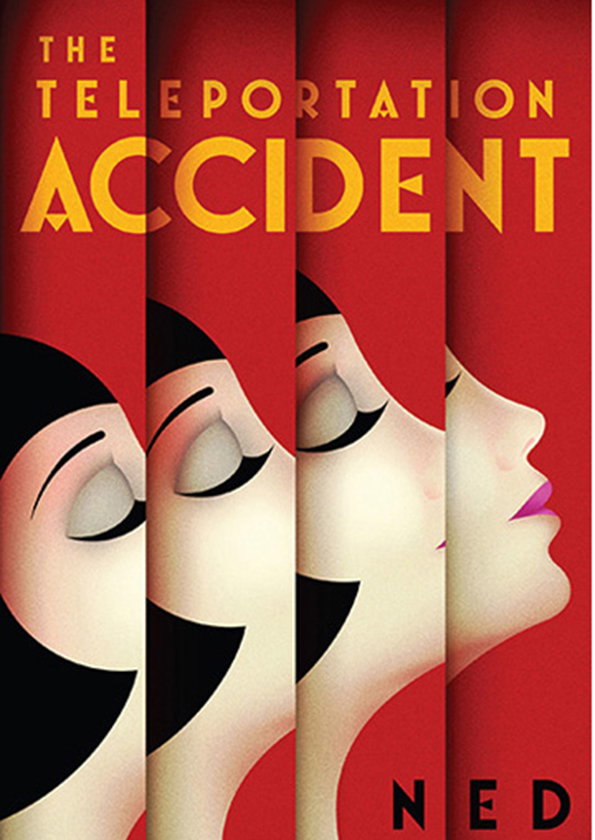
A book cover illustration featuring a person’s face split across four vertical red panels. The title reads “The Teleportation Accident” in bold yellow type, with the name “Ned” at the bottom.
Above

Scot Bendall, Richard Carey, Jon Lyen: Ned Beauman — The Teleportation Accident
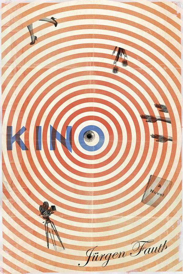
A book cover featuring a target of concentric orange and cream circles. The word “KINO” is written across the centre in blue, with a small black dot at the very middle. A vintage film camera on a tripod stands at the bottom left, while several blurred figures appear to fall through the rings. The author’s name, “Jürgen Fauth”, is written in script at the bottom, and a small tag reads “A Novel”.
Above

Jamie Keenan: Jürgen Fauth — Kino

Share Article

About the Author

Rob Alderson

—

Rob Alderson is a freelance writer, editor and strategist. He was previously editor-in-chief of It’s Nice That and WePresent, and editor of Design Week. He publishes the newsletter Undo, which tries to make sense of how AI is changing design work, the design process and the design industry.


It's Nice That Newsletters

Fancy a bit of It's Nice That in your inbox? Sign up to our newsletters and we'll keep you in the loop with everything good going on in the creative world.

