Designing London 2012: A look at BarberOsgerby's Olympic Torch
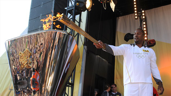
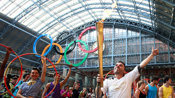
Throughout the Olympics we’ll be taking a look at all the creative collateral, what it looks like and how it performs in the context of the games. First up as it wings its away to east London for its big moment tonight, we look at the torch that has travelled the length and breadth of the country in the past 70 days.
It always seemed to make sense that BarberOsgerby were chosen to design the torch. The young Hackney-based partnership fitted the profile that London 2012 wanted to show the world with a design portfolio packed with projects that combine flair, style and effortless functionality.
They were clearly thrilled when they were given the much-coveted commission, saying: “As designers, this is quite simply the best project going: to design an icon for the Games.
“We have worked hard to develop a Torch that celebrates the Relay, and reflects the passion for London and the Olympic Games. We wanted to make the most of pioneering production technologies and to demonstrate the industrial excellence available in the UK – it’s a Torch for our time.”
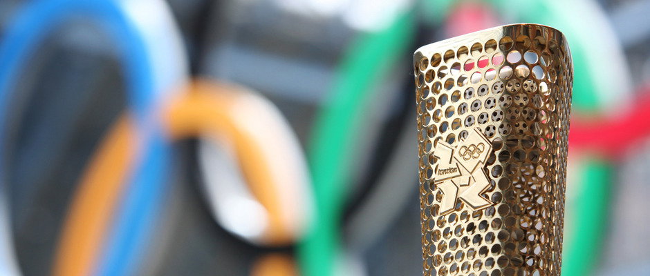
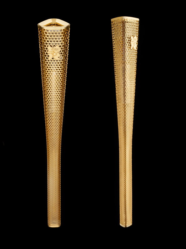
The triangular form was chosen because of the recurring significance of the number three – the number of Olympic values, the number of words in the motto, the number of times London has hosted the event. Then it was all about the 8’s – it’s 800mm heigh, weighs 800grammes and features 8,000 perforated circles representing the 8,000 torchbearers who would carry it on its journey.
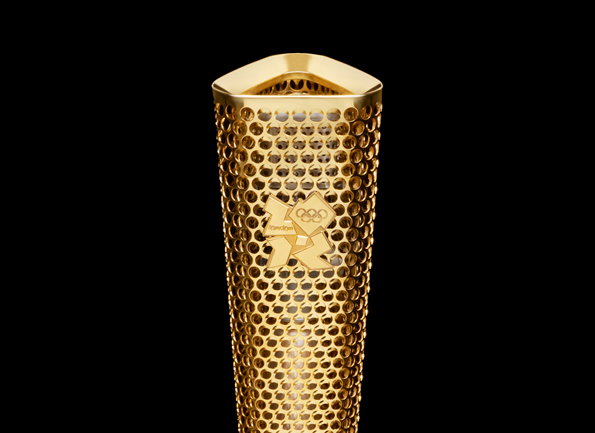
BarberOsgerby: The Olympic Torch
Made of an aluminium alloy developed for use in planes and cars, its lightweight nature and heat resistant properties were crucial while the gold colour was an eye-catching if slightly obvious choice (and perhaps not quite in keeping with the idea of a pared-back so-called austerity games).
When it was released Nicholas Serota of the Tate called it “elegant, light and understated” although others were less convinced, one Telegraph article compared it to “a cheese grater or an ice cream cone.”
I first saw one up-close at the Design Museum’s Designs of the Year show and in person it’s less less garish than you might expect, the perforations counteracting the rather bling colouring.
When it took the top prize there were grumbles that it was a safe or predictable choice by the judges but Deyan Sudjic’s explanation made a lot of sense. ”Nothing is harder to get right than designing for the Olympics,” he said. “The lightness and simplicity of Barber Osgerby’s London 2012 Olympic Torch does just that. The torch not only captures the spirit of London as Olympic host city but also demonstrates how design can celebrate traditional ideas in a modern way.”
Maybe that’s the point, that when designing such an iconic object broad acceptance is pretty much the best you can hope for and of all the creative projects associated with the games the torch has certainly attracted less opprobrium than others,which is perhaps a victory of sorts.
Interestingly it isn’t an object that translates to other visual media very easily and when I have seen it illustrated or animated in TV spots it seems to lose its appeal, although I did see a brilliant balloon version outside an east London pub.
All in all when we look back we may decide that the torch was one of the more successful design stories of London 2012.
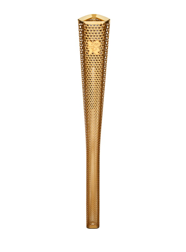
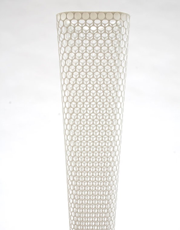
BarberOsgerby: The Olympic Torch
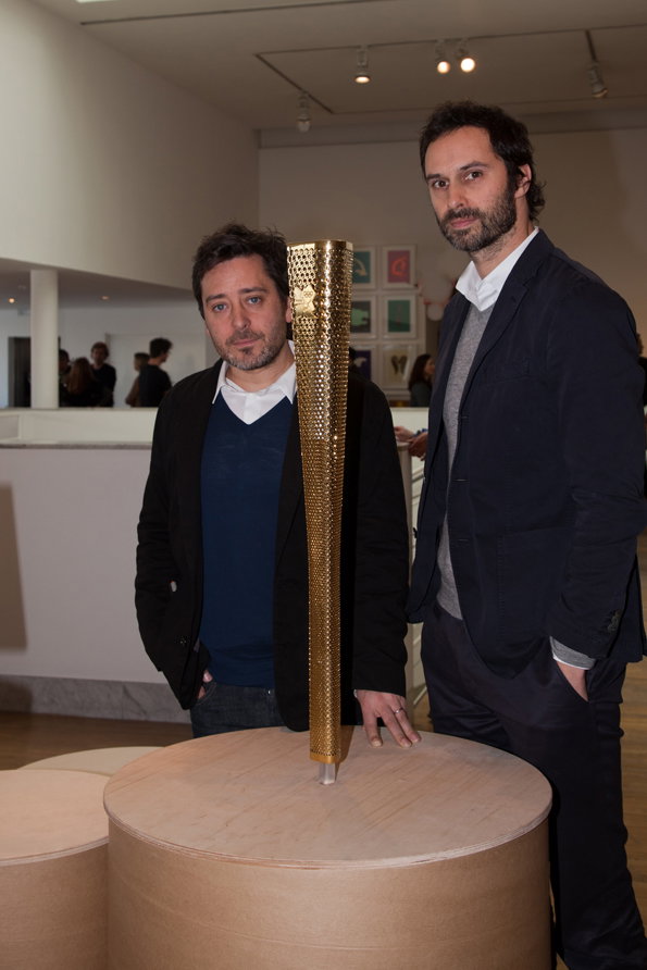
Edward Barber and Jay Osgerby with The Olympic Torch
BarberOsgerby: The Olympic Torch
BarberOsgerby: The Olympic Torch
BarberOsgerby: The Olympic Torch
Share Article
Further Info
About the Author
—
Rob Alderson is a freelance writer, editor and strategist. He was previously editor-in-chief of It’s Nice That and WePresent, and editor of Design Week. He publishes the newsletter Undo, which tries to make sense of how AI is changing design work, the design process and the design industry.