Launch Recite Me assistive technology
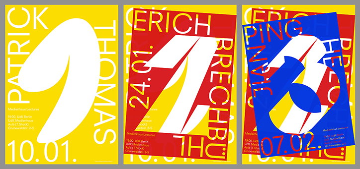
Three bold typographic posters in yellow, red and blue. Each features a large, stylised white number and a name, including “Patrick Thomas” and “Erich Brechbuhl”, alongside dates and event details for “Medienhaus Lectures”.

The intelligently bold type and graphic design of Elias Hanzer

—
Date
11 January 2017

Elias Hanzer is an Austrian graphic designer with an appetite for type. Letterforms of all shapes and serifs are an endless graphic delight on his tumblr, even more impressive when you learn that many typefaces are designed by Elias himself. 

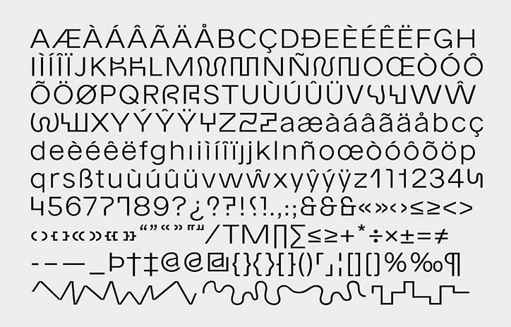
Currently studying visual communication at the University of the Arts in Berlin, Elias is spending his time “more and more focusing on type design,” he explains. The results are grotesque, in the design sense of course, recently creating a new typeface, Eh Normal. The typeface is available in three weights, light, regular and bold, and includes three different stylesheets, “Space, Jungle and City,” to showcase its differentiating characteristics.

Further typeface designs from Elias include Moment a “graffiti-inspired scribble typeface,” the designer tells It’s Nice That. To resonate with his inspiration of graffiti “each character comes with an alternate variation to simulate writing on a wall”. Working with designer Lucas Liccini, the font graced a recent cover of Protocol Magazin. 

In terms of graphic design output Elias’ most recent work, a series of posters for lectures at his university, display his ability to arrange and manipulate type. Each of the posters were screen printed “since we wanted to print the poster for the following talk over the previous one, creating an effect of layers," says Elias. The results pack a printed punch with primary colours thickly layered on top of one another. 

With an upcoming internship at abcDinamo a Berlin based type foundry, we look forward to seeing Elias’ growing portfolio and future in font. 
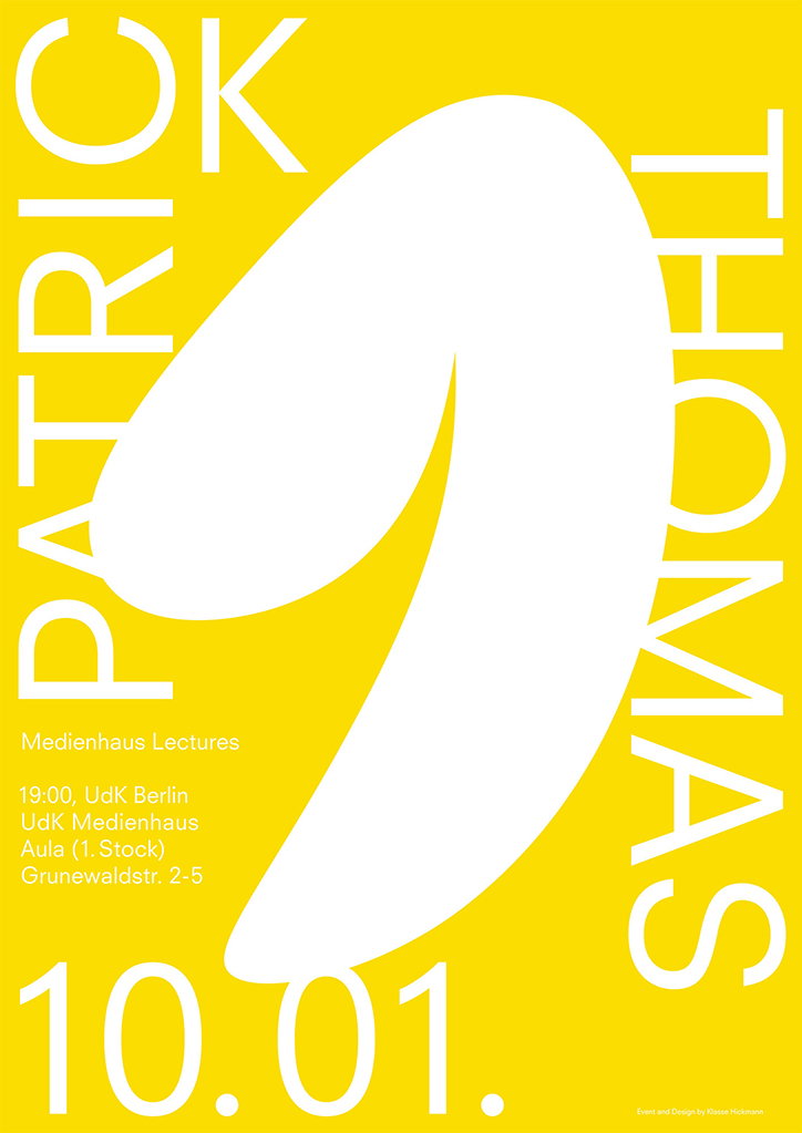
A bold yellow poster featuring a large, white abstract shape in the centre. Vertical text reads “PATRICK” and “THOMAS”, while the bottom reads “10.01.”. Smaller text lists the “Medienhaus Lectures” at UdK Berlin.
Above

Elias Hanzer & Katharina Nejdl: Medienhaus Lectures
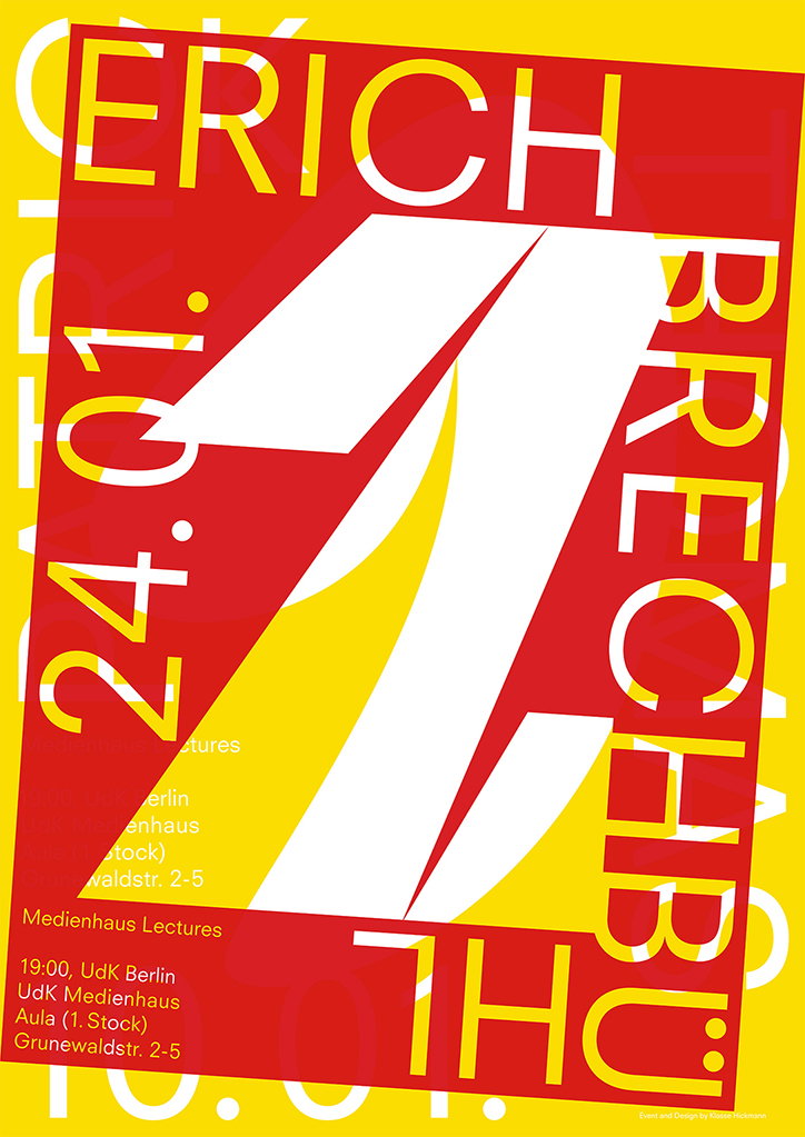
A bold typographic poster in red, yellow and white reads “ERICH BRECHBUHL”. The name is arranged around a large, stylised white letter “B”. Vertical text on the left reads “24.01.” and smaller text at the bottom provides event details for “Medienhaus Lectures” at UdK Berlin.
Above

Elias Hanzer & Katharina Nejdl: Medienhaus Lectures
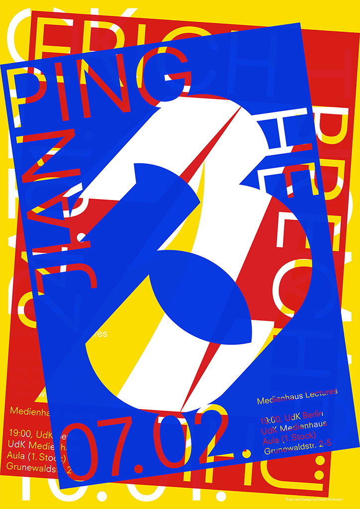
A bold typographic poster in red, blue and yellow. Large, overlapping letters and a giant number “3” dominate the composition, with text at the bottom reading “Medienhaus Lectures” and the date “07.02.”.
Above

Elias Hanzer & Katharina Nejdl: Medienhaus Lectures
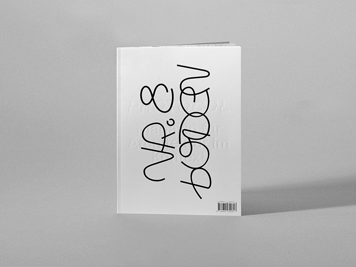
A white booklet stands upright against a grey background. Bold, black handwritten script curves across the cover, with a barcode visible in the bottom right corner.
Above

Elias Hanzer: Moment typeface for Protocol
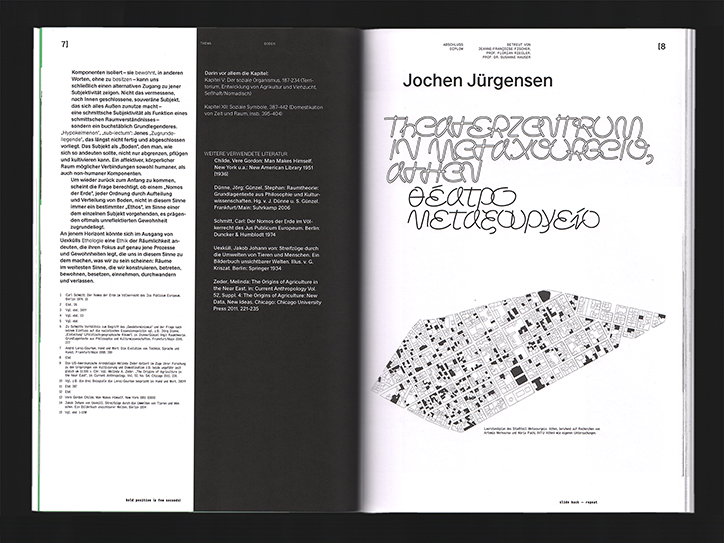
An open book showing a layout of German text on the left and a graphic design page on the right. The right page features the name “Jochen Jürgensen” above a large, abstract architectural plan and bold, stylised typography.
Above

Elias Hanzer: Moment typeface for Protocol
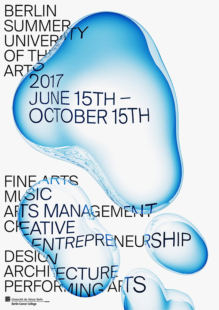
A poster for the “Berlin Summer University of the Arts 2017” featuring three translucent, blue 3D organic shapes. The main text reads “June 15th – October 15th” and lists various courses including “Fine Arts”, “Music” and “Architecture”.
Above

Elias Hanzer: Berlin Summer University
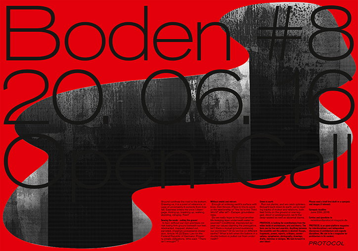
A bold red poster featuring a distorted, black and white architectural image. Large black text reads “Boden #8”, “20.06.16” and “Open Call”. Smaller blocks of text and the wordmark “Protocol” appear at the bottom.
Above

Elias Hanzer: Protocol

A specimen of a minimalist sans-serif typeface showing a full character set. The glyphs include uppercase and lowercase letters, accented characters, numbers, and various symbols.
Above

Elias Henzer: Eh Normal typeface specimen
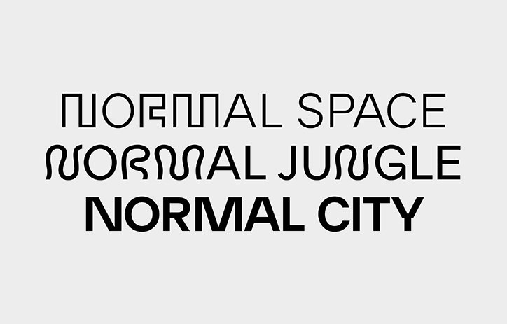
A typographic study showing the words “NORMAL SPACE”, “NORMAL JUNGLE” and “NORMAL CITY” stacked vertically. Each line uses a different font style, moving from a geometric, linear look to a fluid, organic shape and finally a bold, clean sans-serif.
Above

Elias Henzer: Eh Normal typeface specimen

Share Article

About the Author

Lucy Bourton

—

Lucy (she/her) was part of the It’s Nice That team from 2016–2025, first joining as a staff writer after graduating from Chelsea College of Art with a degree in Graphic Design Communication, eventually becoming a senior editor on our editorial team, and most recently at Insights, a research-driven department with It’s Nice That.


It's Nice That Newsletters

Fancy a bit of It's Nice That in your inbox? Sign up to our newsletters and we'll keep you in the loop with everything good going on in the creative world.