



Launch Recite Me assistive technology
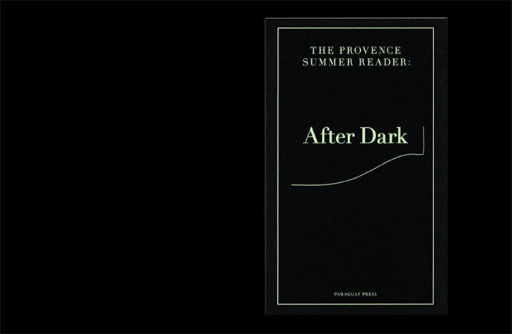
The black cover of a book titled “The Provence Summer Reader: After Dark”. A thin white border frames the text, with a single curved line sweeping across the center.

Fabian Bremer’s design work straddles the traditional and the postmodern

—
Date
13 November 2015

Leipzig-based designer Fabian Bremer’s practice is informed by tradition over trend, his editorial work utilises the tropes of the form of the book and pushes them into the new with informed typographic decision-making and postmodern details. Working predominately in editorial and exhibition design he has designed identities for Kunsthaus Dresden and performance artist Yvon Chabrowski as well as an artists’ book on the legend of Santa Casa, in which Maria receives the apparition of the Angel of Annunciation, and a monograph for artist Samuel Henne’s photography and sculpture. Most recently, Fabian has designed the identity for the German Pavilion at the Venice Art Biennale, which hosts the work of four artists reflecting on the themes of work, migration and revolt. His work manages to adapt to content and context, without ever compromising on consistent quality.
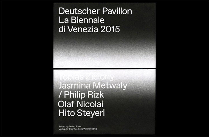
A book cover with a black background and a horizontal band of white light across the centre. White text reads “Deutscher Pavillon La Biennale di Venezia 2015” above the light and lists several artists, including “Hito Steyerl”, below.
Above

Fabian Bremer, in collaboration with Pascal Storz, Helmut Völter, and Nicola Reiter: Deutscher Pavilion
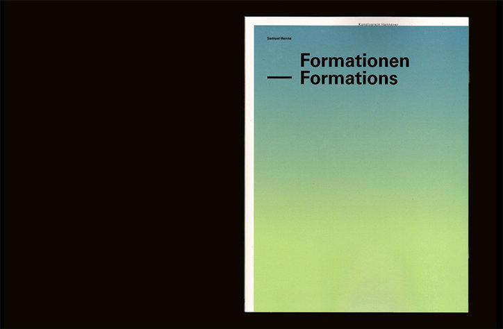
The cover of a book or catalogue featuring a soft gradient that fades from a pale blue to a lime green. Bold black text reads “Formationen Formations”, with the name “Samuel Henne” and “Kunstverein Hannover” in smaller type.
Above

Fabian Bremer, in collaboration with Tobias Wenig and Tim Wetter: Formationen
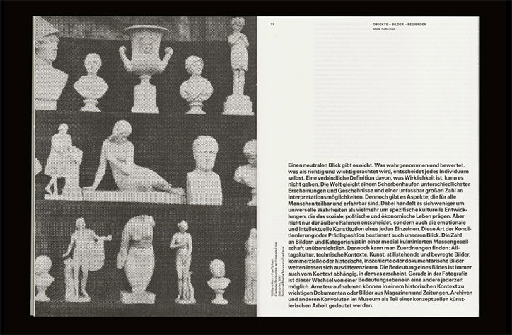
A black and white image of a book spread. The left page shows a collection of classical busts and vases, while the right page contains a block of German text under the heading “Objekte – Bilder – Begeirden”.
Above

Fabian Bremer, in collaboration with Tobias Wenig and Tim Wetter: Formationen
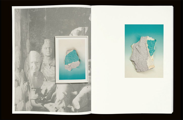
An open book shows a black and white photograph of ancient stone sculptures on the left page. A smaller colour image of a blue and grey stone fragment is laid over the photo and repeated on the right page.
Above

Fabian Bremer, in collaboration with Tobias Wenig and Tim Wetter: Formationen
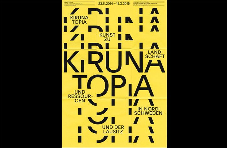
A yellow typographic poster with bold black text reads “Kiruna Topia”. Smaller text around the main title mentions “Kunst zu Landschaft” and “in Nord-Schweden und der Lausitz”.
Above

Fabian Bremer, in collaboration with Pascal Storz: Kirunatopia
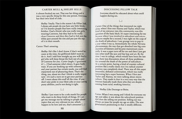
An open book shows two pages of a printed interview. The left page is titled “Carter Mull & Shelby Sells” and the right page is titled “Discussing Pillow Talk”.
Above

Fabian Bremer, in collaboration with Pascal Storz: The Provence Summer Reader
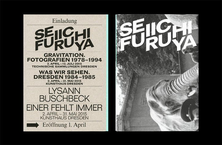
Two exhibition posters for Seiichi Furuya. The first is a typographic layout on cream paper that reads “Gravitation. Fotografien 1978–1994” and “Was wir sehen. Dresden 1984–1985”. The second poster features the artist's name laid over a black and white photograph of an elephant's head.
Above

Fabian Bremer, in collaboration with Pascal Storz and Jakob Kirch: Was Wir Sehen

Share Article

About the Author

Billie Muraben

—

Billie studied illustration at Camberwell College of Art before completing an MA in Visual Communication at the Royal College of Art. She joined It’s Nice That as a Freelance Editorial Assistant back in January 2015 and continues to work with us on a freelance basis.

It's Nice That Newsletters

Fancy a bit of It's Nice That in your inbox? Sign up to our newsletters and we'll keep you in the loop with everything good going on in the creative world.