




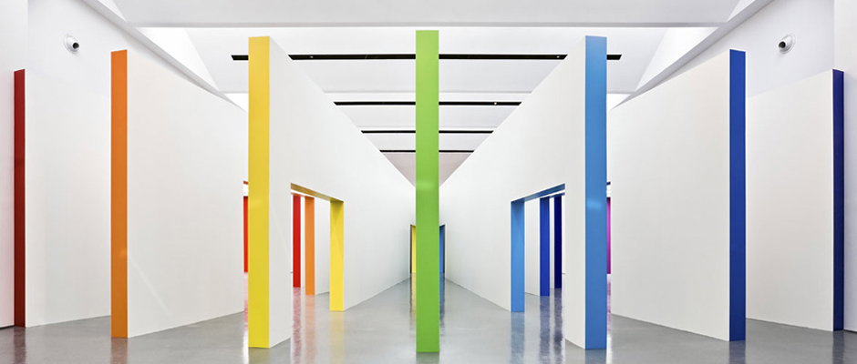
Fabio Novembre's colourful design brings Italian graphics show to life
The key to curating any big exhibition is structure – clear enough to help users navigate the space but not so heavy-handed that they feel patronised or put upon. If you can create something that looks great then so much the better, and Fabio Novembre’s work on the Triennale Design Museum’s Grafica italiana show ticks all the right boxes.
A simple but vibrant colour coding system helps make sense of a show that encompasses all sorts of Italian graphic design, including letters, books, magazines, culture and politics, advertising, packaging, visual identity, signposting and video. But it also adds a really pleasing visual element to a celebration of communication and aesthetics which adds enormously to the show’s appeal.
In a peerlessly charming write-off on his site, Fabio cheerfully admits that he was approached only after Enzo Mari pulled out and it begins: “It takes wisdom and cunningness to construct a sacred place for the Muses,” before going on to reference Goethe, Newton and various classical allusions.
It also includes the wonderful observation that: “There is only one Italian school of graphics, even though it has no proper structure, hardly surprising since the same could be said about everything connected with our dear old unpredictable country.”
The exhibition runs until February 24 2013.
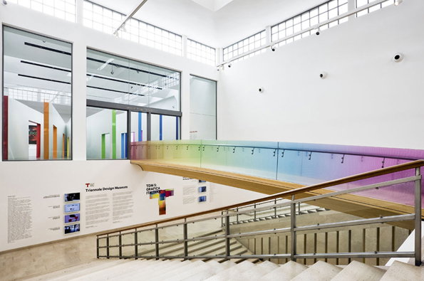
Fabio Novembre: Grafica italiana at Triennale Design Museum
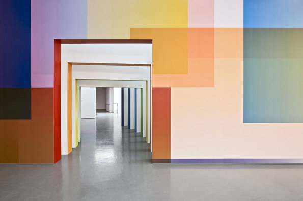
Fabio Novembre: Grafica italiana at Triennale Design Museum
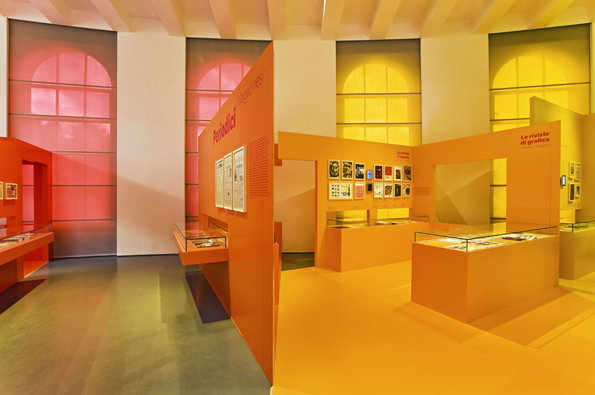
Fabio Novembre: Grafica italiana at Triennale Design Museum
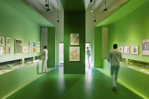
Fabio Novembre: Grafica italiana at Triennale Design Museum
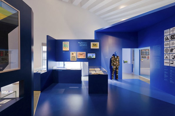
Fabio Novembre: Grafica italiana at Triennale Design Museum
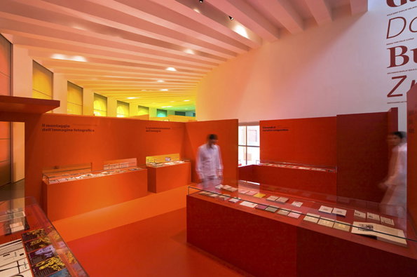
Fabio Novembre: Grafica italiana at Triennale Design Museum
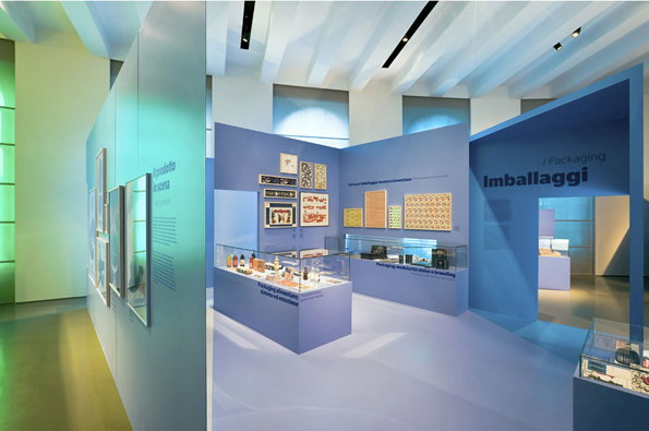
Fabio Novembre: Grafica italiana at Triennale Design Museum
Share Article
Further Info
About the Author
—
Rob Alderson is a freelance writer, editor and strategist. He was previously editor-in-chief of It’s Nice That and WePresent, and editor of Design Week. He publishes the newsletter Undo, which tries to make sense of how AI is changing design work, the design process and the design industry.

