Swiss type past and present combined in Fermin Guerrero's Genève face
When it comes to strong typographic tradition, Switzerland boasts a heritage few other countries can match. Undeterred by the pressure of the past and inspired by modern, multicultural Geneva, designer Fermin Guerrero created a typeface named after his home city.
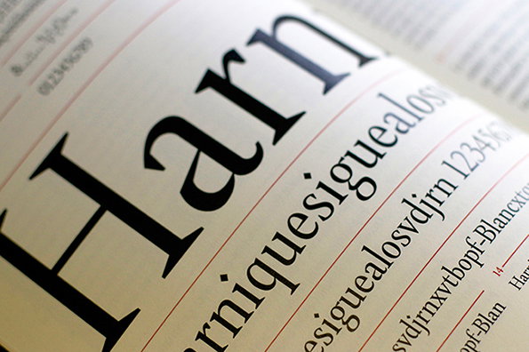
He took as his starting point Henri II Estienne’s book Thesaurus Linguæ Græcæ which was published in 1572 and helped shape the Swiss type design heyday of the ensuing century. Genève marries this historical context with contemporary Swiss culture to create its four styles: Classique (humanist serif), Austère (geometric serif), Spontanée (humanist sans-serif) and Alternative (stencil, display version). “These styles correspond to the different profiles of the city, reflecting its multiculturalism and diversity," Fermin explains. “This typography acts as a bridge between the past and present of the city.”
I am struggling to remember any typeface which has been documented this well. From early hand-drawn sketches to examples of it in use, a beautiful specimen book, the historical reference and various behind-the-scenes process photographs, Fermin provides a comprehensive introduction to his mighty impressive new creation.
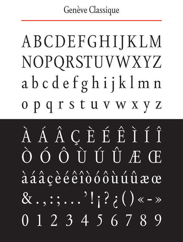
Fermin Guerrero: Genève
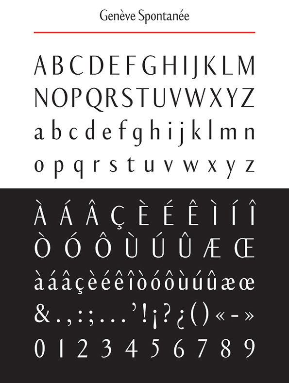
Fermin Guerrero: Genève
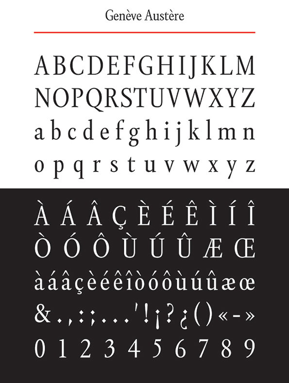
Fermin Guerrero: Genève
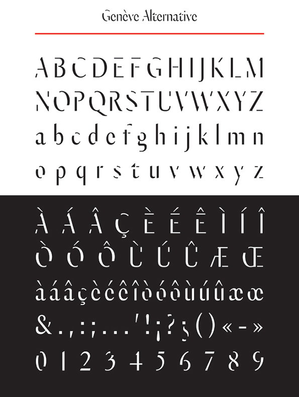
Fermin Guerrero: Genève
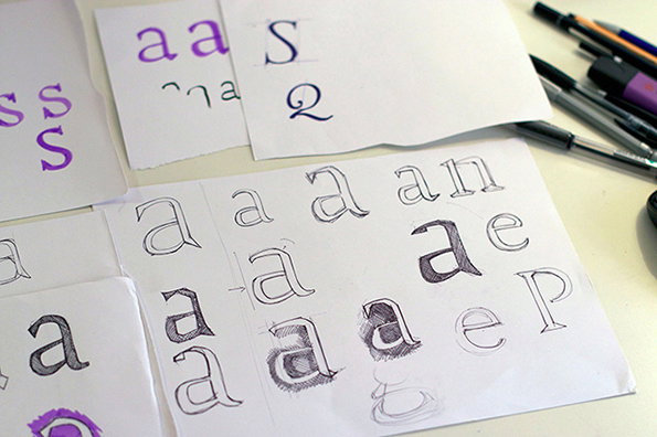
Fermin Guerrero: Genève (sketches)
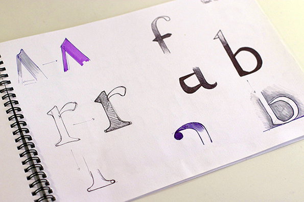
Fermin Guerrero: Genève (sketches)
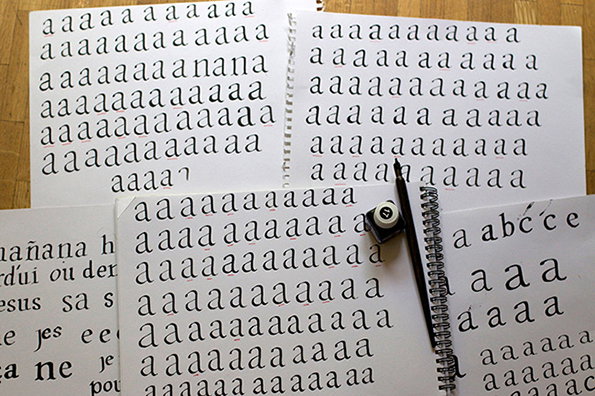
Fermin Guerrero: Genève (sketches)
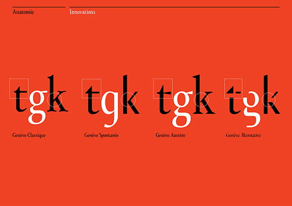
Fermin Guerrero: Genève
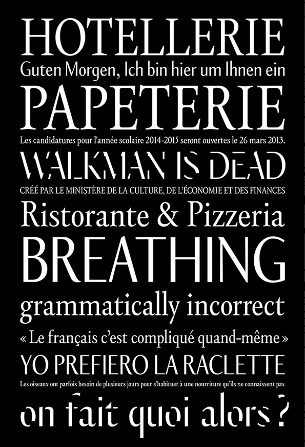
Fermin Guerrero: Genève
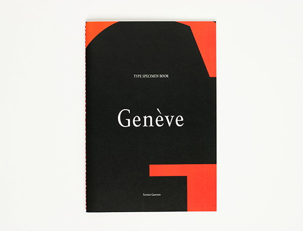
Fermin Guerrero: Genève (Specimen Book)
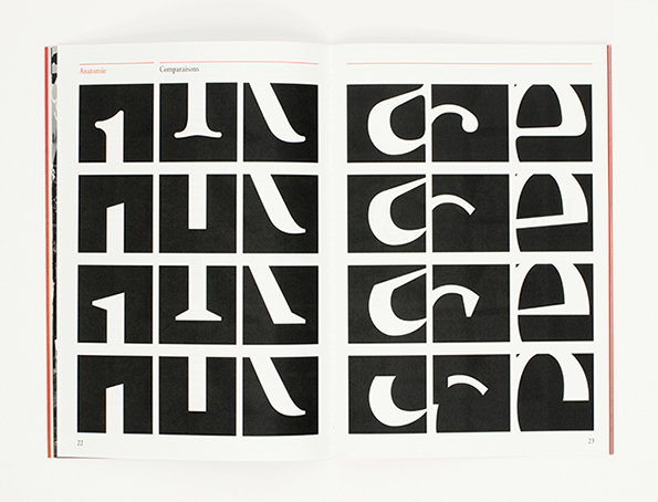
Fermin Guerrero: Genève (Specimen Book)
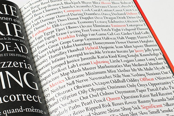
Fermin Guerrero: Genève (Specimen Book)
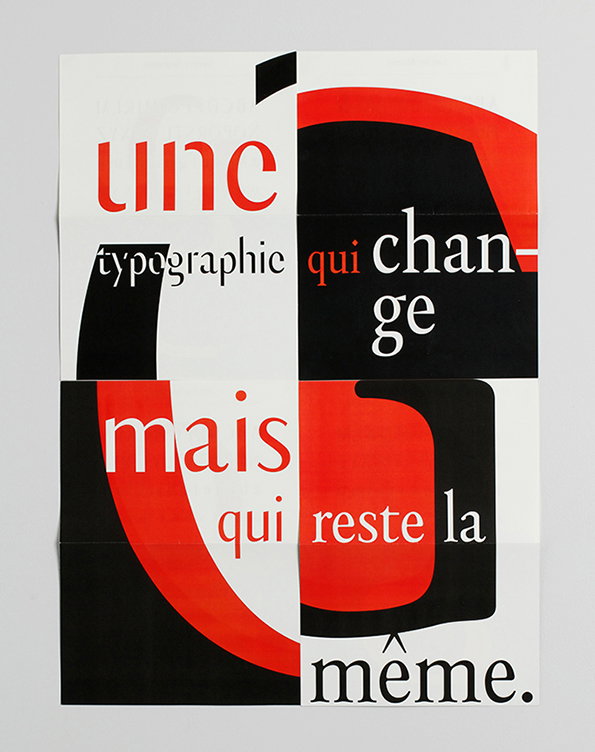
Fermin Guerrero: Genève (Poster)
Share Article
Further Info
About the Author
—
Rob Alderson is a freelance writer, editor and strategist. He was previously editor-in-chief of It’s Nice That and WePresent, and editor of Design Week. He publishes the newsletter Undo, which tries to make sense of how AI is changing design work, the design process and the design industry.