Fontsmith releases its ambitious typeface, FS Industrie, available in 70 variants
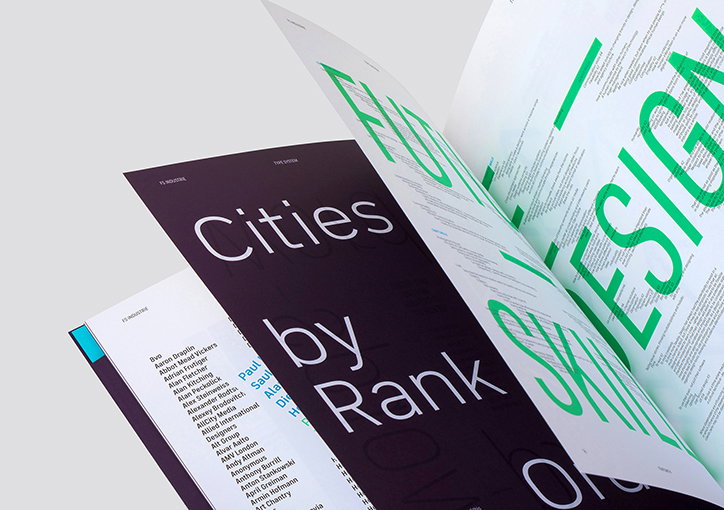
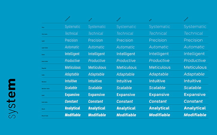
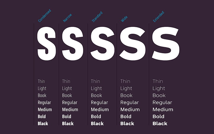
London-based type foundry Fontsmith has released its most ambitious typeface to date, FS Industrie. Designed around five different widths and seven different weights, there is a total of 70 variants including italics to play with. “We are on the cusp of a new age in digital typeface design,” says Fontsmith’s type design director Phil Garnham on the new release, “where the ability to vary a font’s weight and width axis offers limitless possibilities to graphic designers within any given space.”
In offering a huge range of styles FS Industrie has been named “an extraordinarily versatile new type system”. Since the idea of variable fonts was first introduced in 2016, the technology needed to fully implement them is still in development. But for now, “as well as new fonts, designers will need rendering engines, browsers and design tools, all working together to deliver on the promise offered by variable type,” says the foundry. “Until that happens, FS Industrie shows us the future.”
The concept for Fontsmith’s latest typeface grew out of conversations between its design team “asking fundamental questions about the role fonts might play” on developing platforms, while also considering “how designers might use typography in more interesting ways across the full range of brand and marketing communications, not just in digital and screen-based media.” In this sense, FS Industrie embodies the capability of literally growing, creating five versions from the smallest condensed option, a little larger with a narrow edition, then standard, wide and finally an extended width. “It is the spirit of variable design and flexibility that drove us to create FS Industrie,” adds Phil Garnham.
In terms of a graphic style, FS Industrie is inspired by German fonts originating from the 1930s, “with their roots in manufacturing and signage”. Designed by Phil Garnham and Fernando Mello, the pair were influenced by these typefaces’ “classic sense of functional utility,” Fontsmith explains. “FS Industrie has a precise and direct feel but, in typical Fontsmith style, without ever sacrificing its humanity.”
Creating five cohesive widths within one typeface is no easy task, particularly as “variable type requires both a systematic approach and a focus on craft,” says the foundry. By taking special care with the details of each width and weight, FS Industrie is able to adapt “as it moves across the system, ensuring each variant can play to its unique strengths while also pairing perfectly with its siblings.”
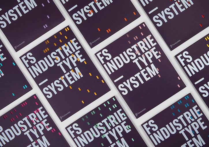
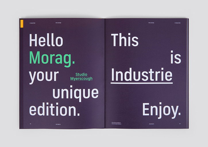
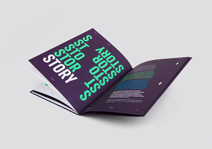
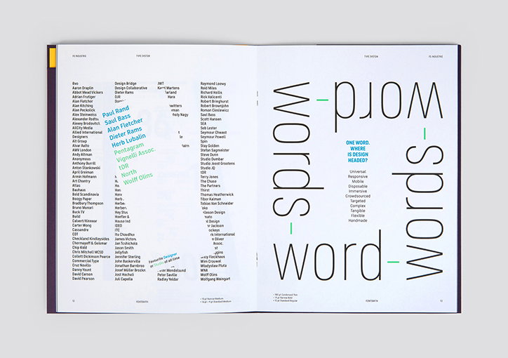
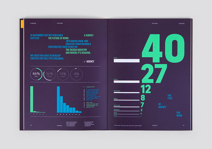
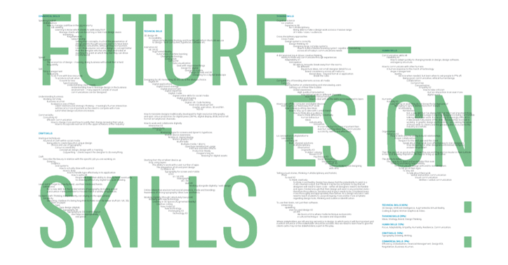
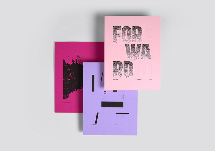
To help promote FS Industrie’s ambitious typographic qualities, Fontsmith embarked on creating an equally ambitious launch campaign working with long-term collaborators, studio Believe in®. . The campaign saw “1000 unique type specimens being created, each one personal to its recipient”. The content within each custom specimen displays information from a fascinating design survey Fontsmith conducted with over 400 creative professionals, voicing their opinions “on the design industry and where it’s heading,” explains the foundry.
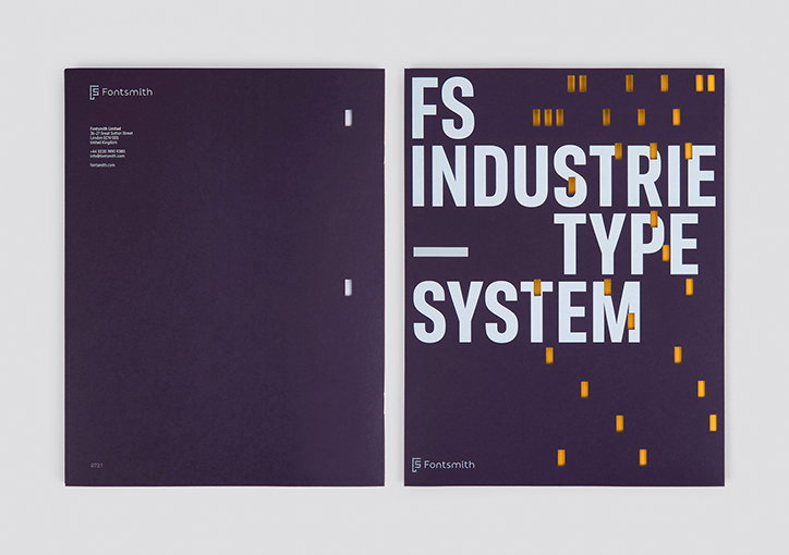
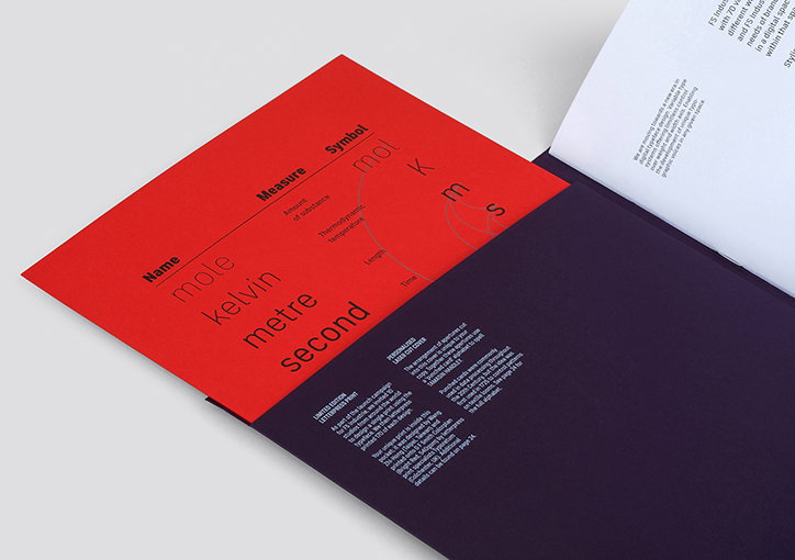
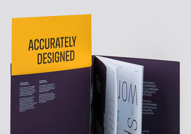
The detail retained in FS Industrie continues in its specimen. Each cover has the recipient’s name laser cut into it “using a ‘punched card’ alphabet, with the apertures revealing a limited edition letterpress print designed by one of 10 studios from around the world”. Blair Thomson, Believe In’s creative director explains: “The idea behind the campaign connects our industrial past to our technological future, combining traditional and more recent production methods, and pushing the limits of what’s currently possible. So many type specimens are designed to be seen but not read, we wanted to create something more interesting and engaging for our audience.”
To help promote FS Industrie’s ambitious typographic qualities, Fontsmith embarked on creating an equally ambitious launch campaign working with long-term collaborators, studio Believe in®. . The campaign saw “1000 unique type specimens being created, each one personal to its recipient”. The content within each custom specimen displays information from a fascinating design survey Fontsmith conducted with over 400 creative professionals, voicing their opinions “on the design industry and where it’s heading,” explains the foundry.
The detail retained in FS Industrie continues in its specimen. Each cover has the recipient’s name laser cut into it “using a ‘punched card’ alphabet, with the apertures revealing a limited edition letterpress print designed by one of 10 studios from around the world”. Blair Thomson, Believe In’s creative director explains: “The idea behind the campaign connects our industrial past to our technological future, combining traditional and more recent production methods, and pushing the limits of what’s currently possible. So many type specimens are designed to be seen but not read, we wanted to create something more interesting and engaging for our audience.”
Fontsmith: FS Industrie
Fontsmith: FS Industrie
Fontsmith: FS Industrie
Fontsmith: FS Industrie
Fontsmith: FS Industrie
Fontsmith: FS Industrie
Fontsmith: FS Industrie
Fontsmith: FS Industrie
Fontsmith: FS Industrie
Fontsmith: FS Industrie
Fontsmith: FS Industrie
Fontsmith: FS Industrie
Fontsmith: FS Industrie
Hero Header
Share Article
Further Info
About the Author
—
This article was sponsored by a brand, so is marked up by us as Sponsored Content. To understand more about how we work with brands and sponsorships, please head over to our Work With Us page.