Gail Bichler on design direction and bringing the story to life through canny, creative visuals at Here 2016
- Date
- 12 July 2016
- Words
- Jamie Green
- Tags
Share
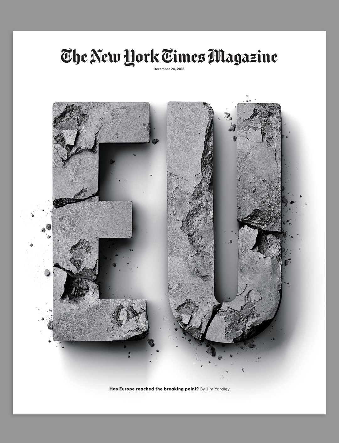
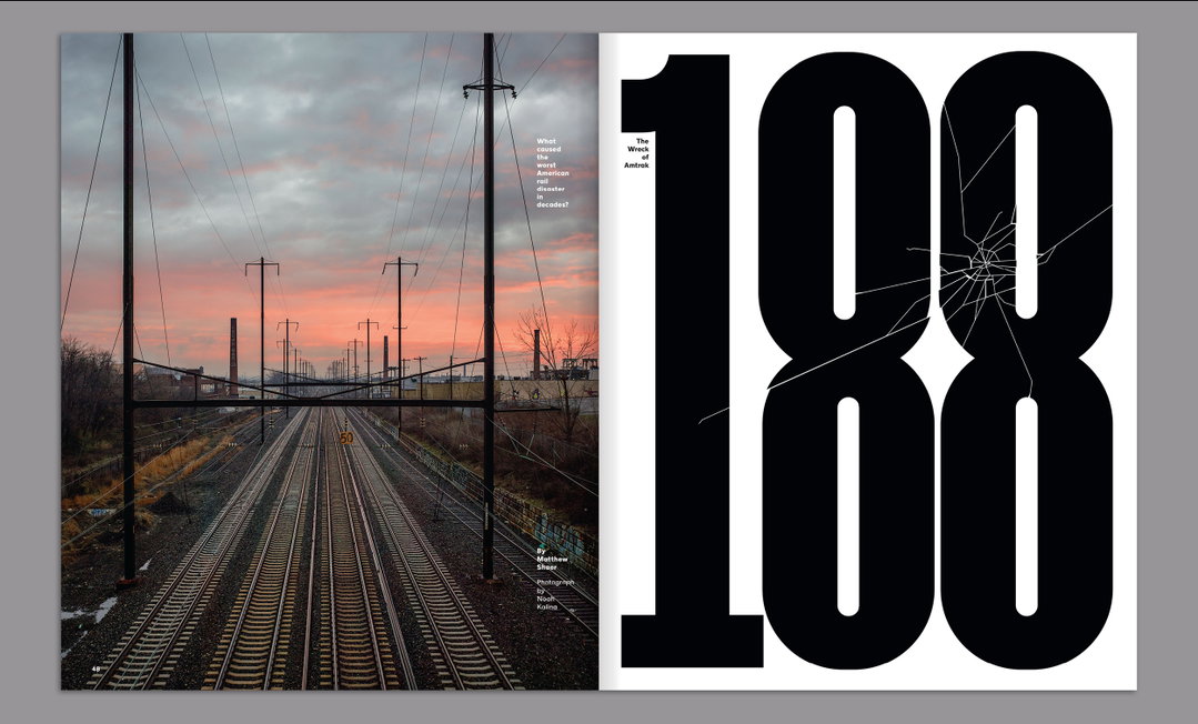
As design director of The New York Times Magazine Gail Bichler is responsible for some of its most iconic imagery, ideas and cover designs. With over ten years experience prior as the magazine’s art director, hers is an expert voice when it comes to distilling the contemporary cultural and political climate into cohesive, eye-catching visuals.
At Here 2016, Gail shared the inventive and collaborative ins and outs behind creating this celebrated magazine’s covers, detailing the collaborative process from ideation through pitch to the design and commission that brings the concept to life. She discusses stylistic choices across the fields of photography, graphic design, typography and art direction, as well as the motivations, reasons and obstacles that lead to their inclusion or exclusion from the final artwork.
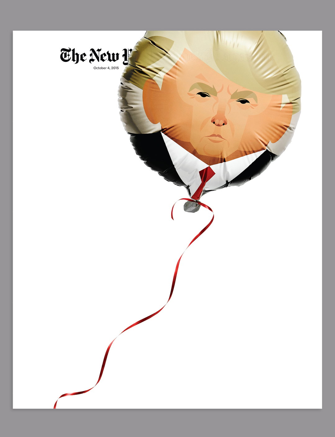
She talks in particular detail about the magazine’s powerfully simple political portraits, often illustrated and visualised, including the recent and famous Donald Trump balloon. She also takes time to humorously consider reader and media response for the magazine, which reaches some four million readers every Sunday.
Here is a fast-paced annual creative symposium curated by It’s Nice That. To stay up to date with Here announcements you can sign up to our newsletter at here-london.com, follow us on Twitter or like our Facebook page.


Share Article
Further Info
About the Author
—
Jamie joined It’s Nice That back in May 2016 as an editorial assistant. And, after a seven-year sojourn away planning advertising campaigns for the likes of The LEGO Group and Converse, he came back to look after New Business & Partnerships here at It’s Nice That until September 2024.