




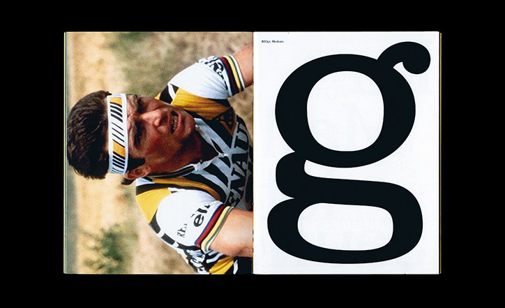
George Fletcher's typeface Hinault, inspired by 1980s cycling, is full of character and detail
It was during his final year of Glasgow School of Art’s (GSA) communication design course that George Fletcher took “a significant interest in the technicalities of typography”. Originally from Hampshire and now a recent graduate of the course, George’s portfolio is a technically apt one, where analogue typography and digital processes collide.
“I’m obsessive over the detailed technical control of what I’m creating,” George tells It’s Nice That, “I can spend hours attempting to improve a minuscule segment of a single letter.” This all-consuming approach to the production of type was one he developed after taking part in a workshop with Guðmundur Úlfarsson from OrType while at GSA. A few years prior, he was gifted a type specimen by his brother and, “to be honest, I didn’t understand the extent of his excitement,” he recalls, “The workshop [Guðmundur] gave was when it all came together for me, and I finally understood my brother’s enthusiasm!”
Now, his practice is one inspired by mundane experiences with design, viewed through his critical typographic eye. “I take inspiration from casual encounters with type when I’m out and about, signage and vintage graphic design, for example, that exists primarily in analogue,” he explains. With a particular love of cycling magazines from the 1940s–1980s, George creates typefaces inspired by snippets of lesser-known fonts resulting in comprehensive work with similar qualities to his original references that can then be used by contemporary designers.
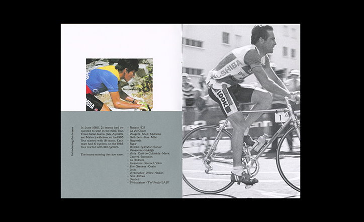
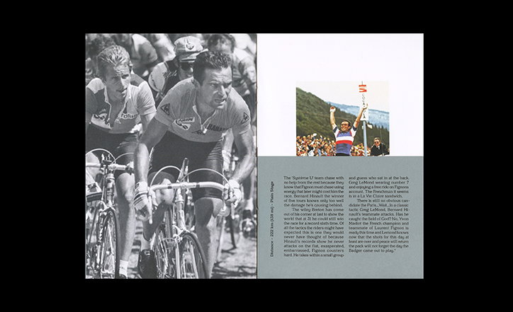
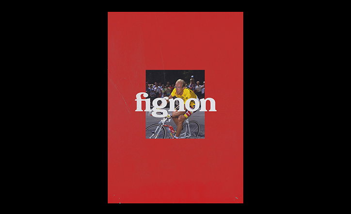
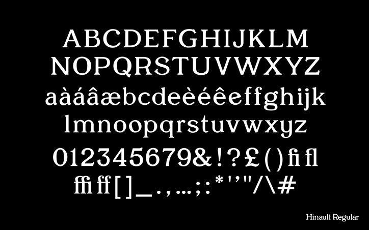
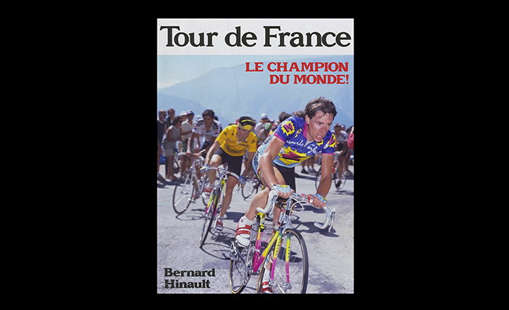
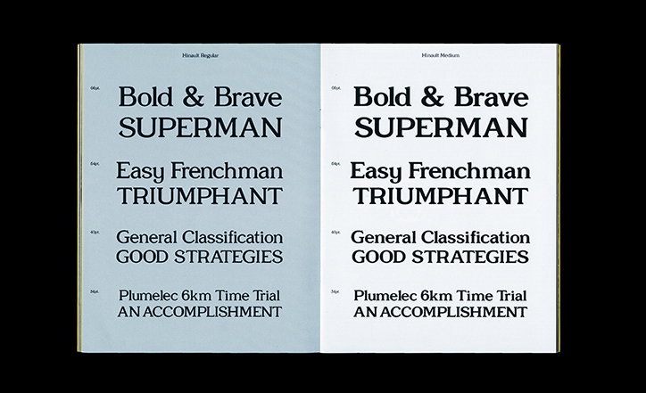
One example of this is Hinault, a typeface informed by the characteristics of five-time Tour de France winner Bernard Hinault. “As one of the most successful athletes of his time, he possessed an infamous arrogance that served as his trademark trait,” George tells us, “Self-assured and always well composed, one of the reasons for Bernard Hinault’s success is certain to be his assertive nature.”
While taking on these qualities, Hinault also mirrors the aesthetic world associated with 1980s cycle racing. “Simply designed, colourful cycling jerseys were type-centric, unlike more contemporary items in play today,” George adds, “The project’s purpose, in the end, was to portray the characteristics of Bernard Hinault while at the same time, maintaining the quirks of his backdrop of 1980s cycling design.” As a result, the project utilises nostalgia in an exploration of the cultural relevance and relationship typefaces have with the world surrounding them.
Whether creating work inspired by people, sports or, currently, a non-digitised phototype font by Gerhard Schwekendiek from Berthold Type Foundry in 1972, George’s typefaces are full of character. With an “instinctual and free” process, ultimately, his proclivity for the medium centres around details and technicalities. “It’s gratifying getting it right,” he concludes, “when a small, meticulous tweak enhances the overall aesthetic and readability of the typeface in its broader scale.”
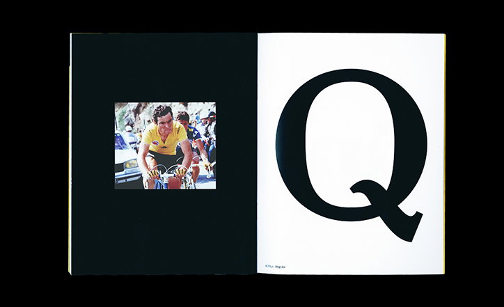
George Fletcher: Hinault
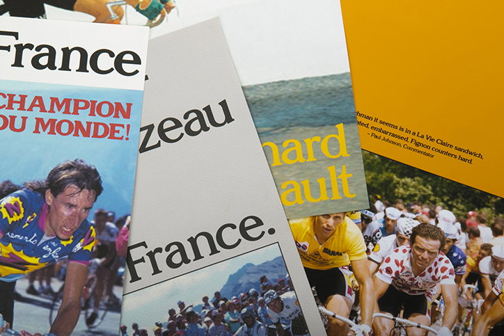
George Fletcher: Hinault
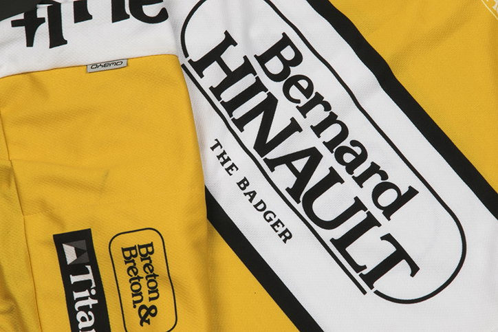
George Fletcher: Hinault
George Fletcher: Hinault
George Fletcher: Hinault
George Fletcher: Hinault
George Fletcher: Hinault
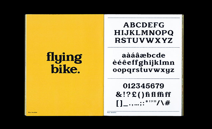
George Fletcher: Hinault
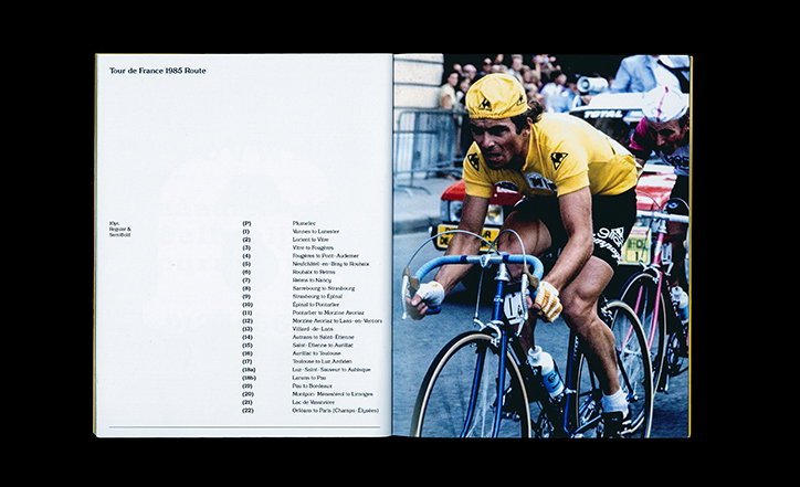
George Fletcher: Hinault
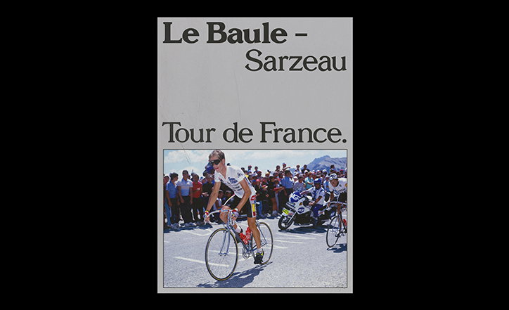
George Fletcher: Hinault
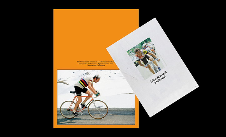
George Fletcher: Hinault
George Fletcher: Hinault
George Fletcher: Hinault
Share Article
Further Info
About the Author
—
Ruby is Senior Creative at It's Nice That, overseeing our visual output across platforms and projects. Before that, she was associate editor on the editorial team, after joining in September 2017 following graduation from Central Saint Martins.

