Launch Recite Me assistive technology
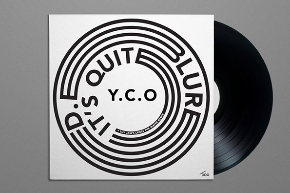
A black vinyl record partially slides out from a white square sleeve. The cover features a black circular graphic with concentric rings and the words “It’s Quit” and “Blur” curving around the edge, with “Y.C.O” in the centre.

Graphic Design: Alex Sullivan's prints are on the really good side of trendy

—
Date
30 July 2013

He’s a tad mysterious but Alex Sullivan’s bold graphic design suggests he’s a pretty fun man. Judging by the fact that most of his designs are for lo-fi films, underground music and record labels, we can almost guarantee that Alex is quite cool, which is pretty refreshing seeing as a lot of the time people who design stuff for labels and indie films can be a tad pretentious. None of that over here though; his pieces are a perfect blend of retro-inspired, well-informed graphic design that we loved the minute we saw it. His series for City Bass in particular is a very, very impressive.
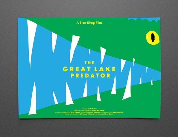
A graphic poster for a film titled “The Great Lake Predator”. A wide, open mouth with sharp white teeth is rendered in bold blue and green shapes, with a single yellow eye peering from the side. Small text at the top reads “A Sion Eirug Film”, with a list of credits along the bottom.
Above

Alex Sullivan: The Great Lake Predator poster
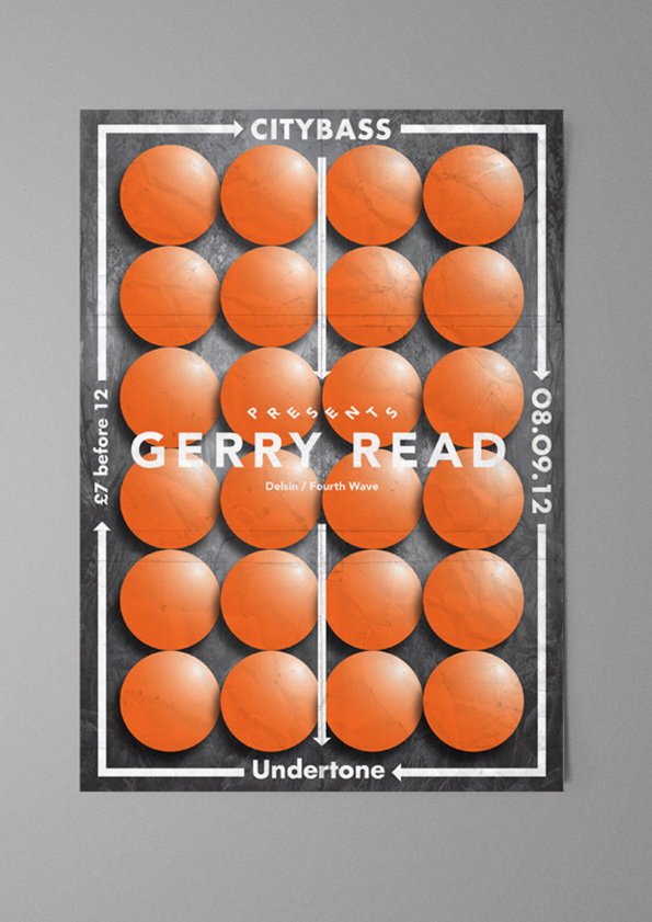
A poster for a music event features a grid of 20 orange spheres against a dark grey background. Bold white text in the centre reads “GERRY READ”, with “CITYBASS” at the top and “Undertone” at the bottom.
Above

Alex Sullivan: City Bass

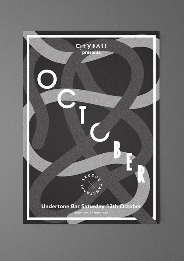
A monochromatic poster for a Citybass event features the word “October” spelled out across a series of interlocking, ribbon-like shapes. Text at the bottom reads “Undertone Bar Saturday 13th October”, with smaller details regarding the time and price below.
Above

Alex Sullivan: City Bass

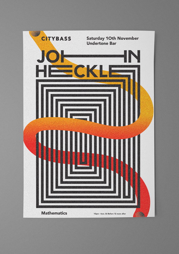
A graphic poster for a Citybass event featuring the name “John Heckle”. A series of black concentric rectangles create a tunnel effect, intersected by a thick, winding orange and red gradient shape. Text at the top reads “Saturday 10th November” and “Undertone Bar”. The word “Mathematics” appears at the bottom alongside event timings and pricing.
Above

Alex Sullivan: City Bass

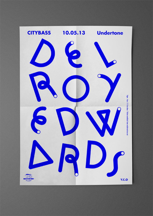
A typographic poster in blue and white features the name “Delroy Edwards” split across four lines in a bold, rounded font. The top of the page reads “Citybass 10.05.13 Undertone”.
Above

Alex Sullivan: City Bass

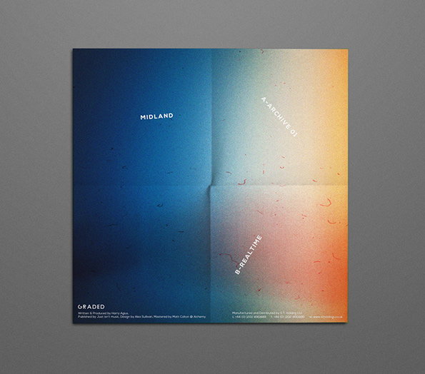
A square album cover featuring a soft gradient that shifts from deep blue on the left to orange and yellow on the right. White text is scattered across the design, including the words “MIDLAND”, “A-ARCHIVE 01” and “B-REALTIME”.
Above

Alex Sullivan: Graded Records, logo

Share Article

About the Author

Liv Siddall

—

Liv joined It’s Nice That as an intern in 2011 and worked across online, print and events, and was latterly Features Editor before leaving in May 2015.

It's Nice That Newsletters

Fancy a bit of It's Nice That in your inbox? Sign up to our newsletters and we'll keep you in the loop with everything good going on in the creative world.