



Launch Recite Me assistive technology
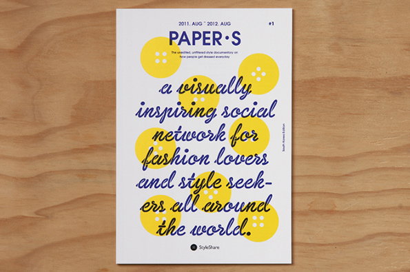
A magazine cover with the title “PAPER·S” in bold blue type. Large yellow circles are scattered behind a cursive blue headline that reads “a visually inspiring social network for fashion lovers and style seekers all around the world.”

Graphic Design: Ruddy beautiful graphic design from Jaemin Lee

—
Date
19 November 2013

How refreshing it is to see an entire portfolio of graphic design that is injected with a large dose of happiness. This pretty spectacular body of work from Jaemin Lee is that wild, beautiful combination of excellent illustration combined with traditional design knowledge – something that in the age of InDesign and minimalist, abstract work, is rather joyous to come across. Jaemin’s theatre posters, book covers and concert posters are so good you kind of want to own them, which is not something we often feel about about graphic design. Top marks.
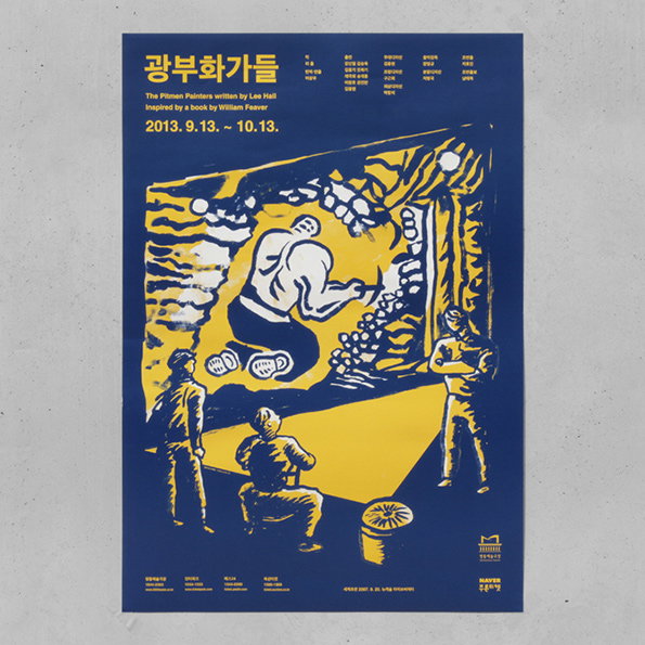
A blue and yellow poster for a production of “The Pitmen Painters”. A large, stylised figure is depicted within a frame, surrounded by smaller figures who look on. Text at the top includes the title in Korean and English, and the dates “2013. 9.13. ~ 10.13.”.
Above

Jaemin Lee: Poster for the theatre – Pitmen Painters
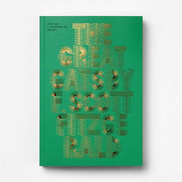
A green book cover featuring the title “The Great Gatsby” and author “F. Scott Fitzgerald” in gold. The text is rendered as a series of thin, radiating lines that create a shimmering, architectural effect.
Above

Jaemin Lee: Book cover for The Great Gatsby
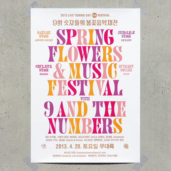
A typographic poster for the “Spring Flowers & Music Festival” featuring “9 and the Numbers”. The bold, serif lettering is rendered in shades of pink, orange and yellow.
Above

Jaemin Lee: Poster and banners for the concert – Spring Flowers & Music Festival by 9 and the Numbers
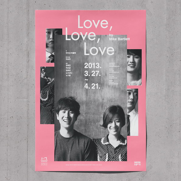
A pink poster for an exhibition by Mike Bartlett titled “Love, Love, Love”. Black and white portraits of people are arranged around the central text, which includes the dates “2013. 3.27. ~ 4.21.”.
Above

Jaemin Lee: Poster for the theater – Love, Love, Love
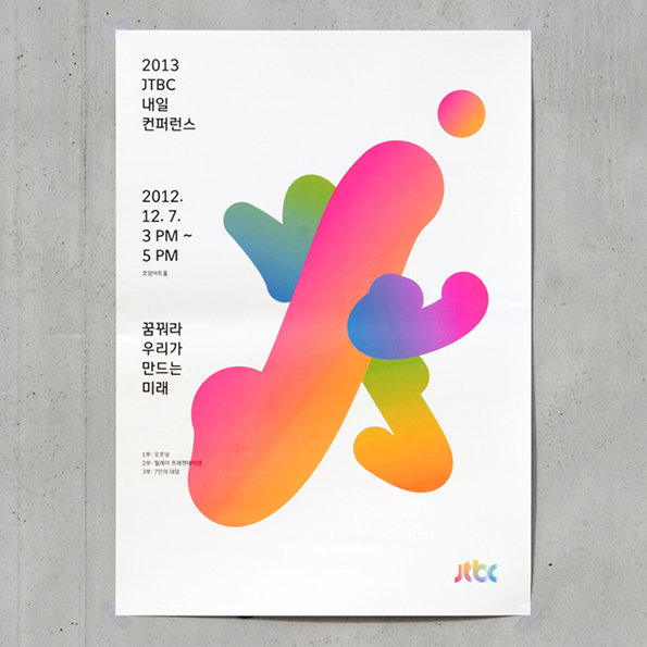
A poster featuring a large, abstract organic shape with a vibrant pink, orange and blue gradient. Korean text and the date “2012. 12. 7.” are aligned to the left, with the Jtbc logo in the bottom right corner.
Above

Jaemin Lee: Graphic design for the conference – 2013 JTBC Tomorrow
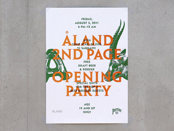
A typographic poster for an “Aland 2nd Page Opening Party” on 5 August 2011. Bold orange text is layered over a green illustration of a goat’s head.
Above

Jaemin Lee: Poster for ALAND – ‘2nd Page’ opening party
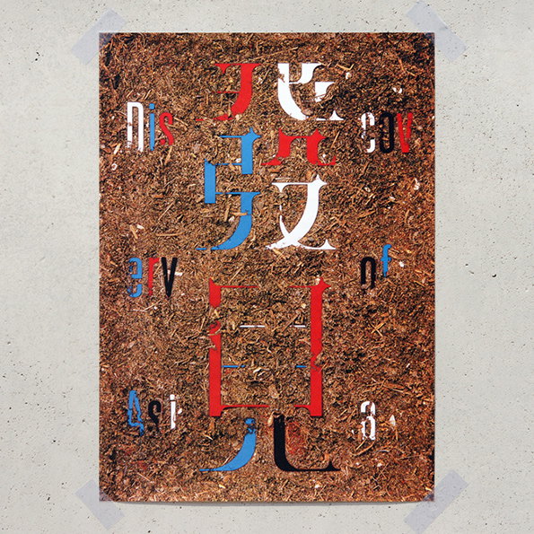
A poster with a textured brown background resembling woodchips or soil. Stylised, fragmented letters and characters in red, white and blue are layered across the centre.
Above

Jaemin Lee: Discovery Of Asia

Share Article

Further Info

About the Author

Liv Siddall

—

Liv joined It’s Nice That as an intern in 2011 and worked across online, print and events, and was latterly Features Editor before leaving in May 2015.


It's Nice That Newsletters

Fancy a bit of It's Nice That in your inbox? Sign up to our newsletters and we'll keep you in the loop with everything good going on in the creative world.