Launch Recite Me assistive technology
An open book displays a grid of diverse images across two pages. The layout includes a mix of photography, abstract illustrations and a black and white photo of a person in a draped garment.

Graphic Design: Design duo Kasper Florio are back with more monochrome majesty

—
Date
22 August 2013

Larissa Kasper and Rosario Florio are back with SO much good graphic design I don’t even know where to start. Something this Swiss duo drink, or eat, or practice out of hours must contribute to the magic they turn out in their work. Their look-book (if you can call it that, it’s more like a modern manual of good fashion and graphic design) for Christian Hersche’s Summer 2014 collection is astonishingly well put-together. My favourite, however, is Foto: Jim, Zürich which “shows the photographic work of Karlheinz Weinberger, who portrayed the homophile scene in Switzerland during the 1950s and 1980s.” Delightfully interesting and seriously beautiful to look at. What more could you ask for?
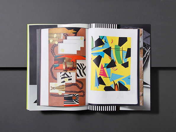
An open book displays two pages of abstract collage. The left page features a mix of neutral tones and red accents, while the right page shows bold, geometric shapes in yellow, blue and black.
Above

Kasper-Florio: Documentation journal for the Spring Summer 2014 collection of Christian Hersche.
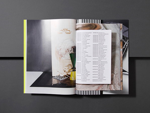
An open book shows a photograph of a textured, white sculptural object on the left page. The right page features two columns of German text and a partial image of a grey, draped fabric.
Above

Kasper-Florio: Documentation journal for the Spring Summer 2014 collection of Christian Hersche.
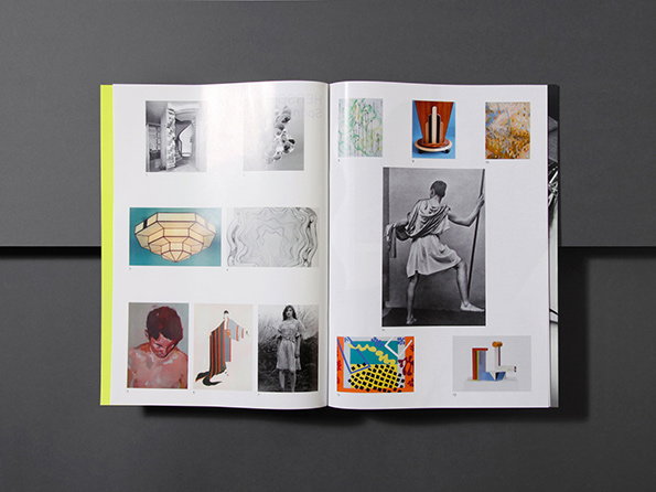
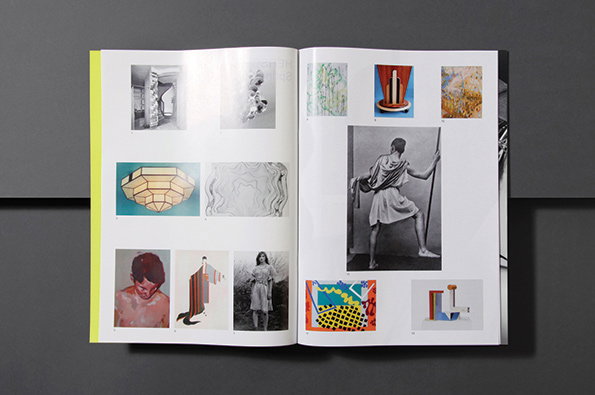
An open book displays a grid of various images across two pages. The layout includes a mix of photography, abstract shapes and a black and white image of a figure in a draped garment.
Above

Kasper-Florio: Documentation journal for the Spring Summer 2014 collection of Christian Hersche.
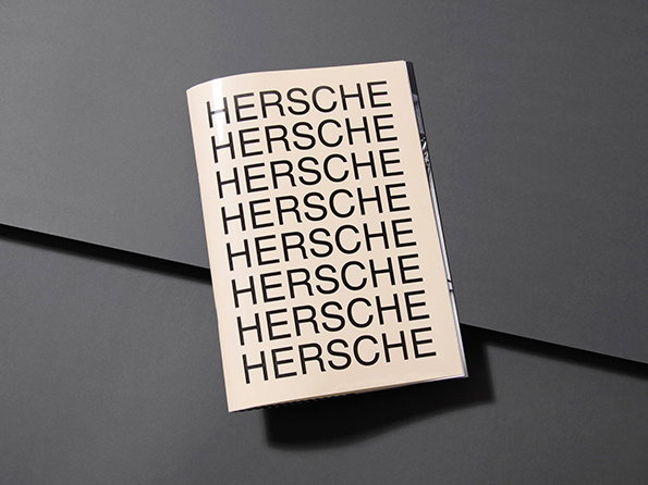
A small booklet rests on a dark grey surface. The cover features the word “HERSCHE” repeated eight times in a clean, black sans-serif typeface.
Above

Kasper-Florio: Documentation journal for the Spring Summer 2014 collection of Christian Hersche.
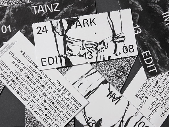
A collection of black and white printed tickets and flyers are scattered across a dark surface. One ticket features a stylised illustration of a person’s waist and hips with the words “PARK” and “EDIT” printed around them.
Above

Kasper-Florio: Flyer announcing the party series Tanz im Park.
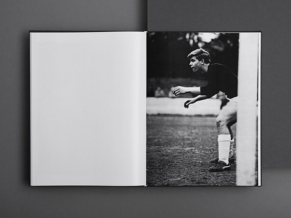
An open book shows a black and white photograph on the right page. A person in a dark T-shirt and white shorts stands on a grassy field, leaning forward in a focused stance.
Above

Kasper-Florio: Foto: Jim, Zürich

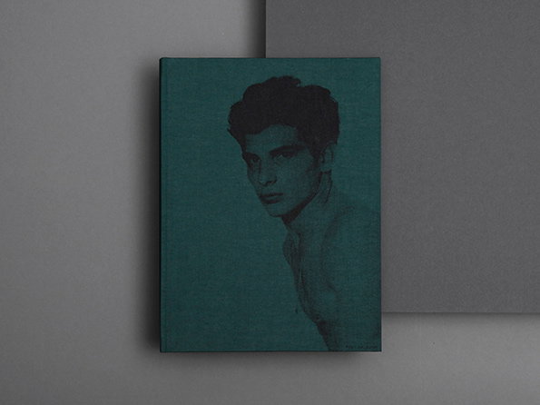
A square, teal-coloured book features a dark, moody portrait of a person looking towards the camera. The book is set against a minimalist grey background.
Above

Kasper-Florio: Foto: Jim, Zürich

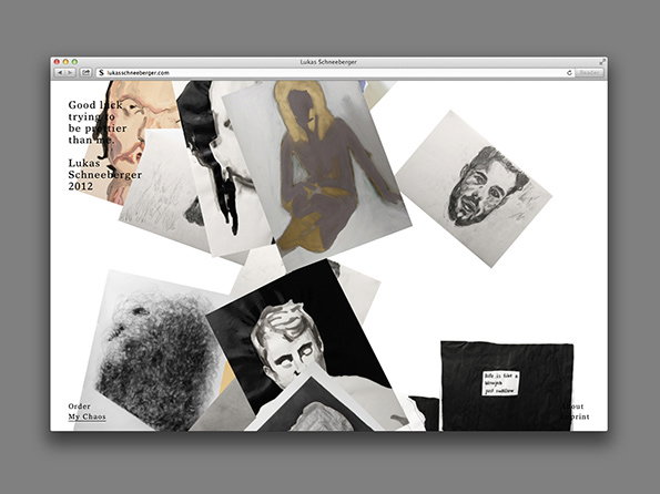
A website screenshot shows a scattered collage of charcoal and paint portraits on a white background. Text on the left reads “Good luck trying to be prettier than me” above the name “Lukas Schneeberger 2012”.
Above

Kasper-Florio: Webdesign for Lukas Schneeberger. In collaboration with Dominic Rechsteiner. Coding by Bänziger Hug
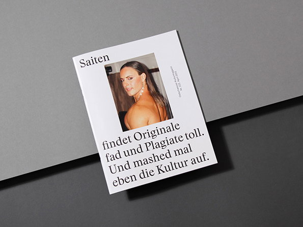
A white booklet rests on a grey surface. It features a portrait of a person and German text that reads “Saiten”, “findet Originale fad und Plagiate toll. Und mashed mal eben die Kultur auf.”
Above

Kasper-Florio: Saiten magazine

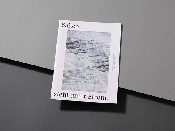
A white booklet lies on a grey surface, featuring a central photograph of churning white sea foam. The text reads “Saiten” at the top and “steht unter Strom.” at the bottom.
Above

Kasper-Florio: Saiten magazine

Share Article

About the Author

Liv Siddall

—

Liv joined It’s Nice That as an intern in 2011 and worked across online, print and events, and was latterly Features Editor before leaving in May 2015.

It's Nice That Newsletters

Fancy a bit of It's Nice That in your inbox? Sign up to our newsletters and we'll keep you in the loop with everything good going on in the creative world.