Launch Recite Me assistive technology
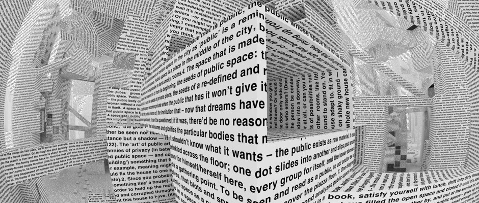
A 3D render of a surreal, architectural space constructed entirely from pages of printed text. The white paper folds and curves to create a distorted, cavernous room with a central void.

Major graphic design show set to open in New York featuring the best work of the millennium

—
Date
22 May 2012

If you wanted to find out about the state of the pig farming industry you could feasibly get a load of pig farmers together, interview them and write an article about their porcine concerns and aspirations. But in a visual media like graphic design, state-of-the-industry hand-wringing seems oddly out of kilter in print – don’t tell me, show me.

Graphic Design – Now in Production aims to do just that, looking at how things have changed since the turn of the millennium, as widely-available creative software democratises the methods if not the skills, and user generated content blurs traditional boundaries. Meanwhile the rise of the polygot who works across several disciplines has challenged the way designers are seen, and see themselves.

First shown at the Walker Art Center late last year, this week it opens in New York at the Smithsonian’s Cooper-Hewitt National Design Museum designed by heavyweight studio Project Projects.

According the organisers, the show, “explores the worlds of design-driven magazines, newspapers, books and posters; the expansion of branding programs for corporations, institutions and subcultures; the entrepreneurial spirit of designer-produced goods; the renaissance in digital typeface design; the storytelling potential of film and television titling sequences; and the transformation of raw data into compelling information narratives.”

The curatorial team sees leading museum experts joined by Jeremy Leslie of MagCulture and Ian Albison of Art of the Title bringing an eclectic mix of voices to the selection and organisation of the exhibits. Bill Moggrdidge, director of the museum said: "This ambitious exhibition looks at cutting edge ideas and breaking cultural revolutions in the world of graphic design. Focusing on design in the 21st century, this exhibition provides insight into the phenomena shaping culture today and transforming traditional conceptions of graphic design practice.”

The show runs May 26 until September 3.
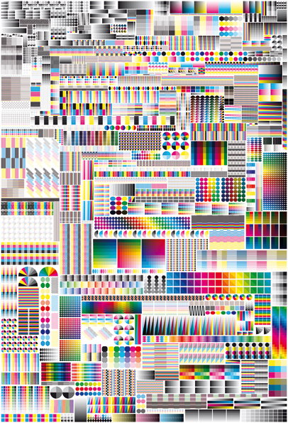
A complex grid of colourful geometric patterns, gradients and dots. The composition is a dense arrangement of small, varied modules in a wide spectrum of bright hues.
Above

Fanette Mellier: Specimen (2008)

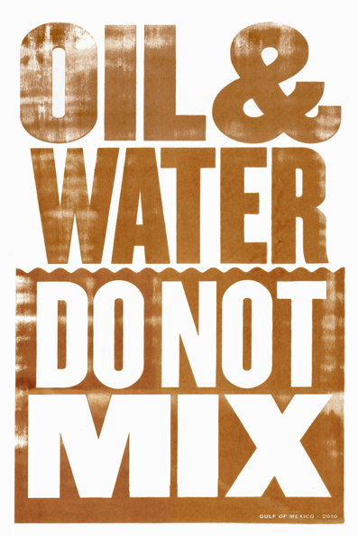
A typographic poster in brown and white reads “OIL & WATER DO NOT MIX”. Small text at the bottom right reads “GULF OF MEXICO – 2010”.
Above

Anthony Burrill: Oil & Water Do Not Mix (2010)
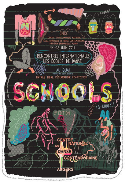
A surrealist poster on a black background featuring a collage of colourful, abstract figures and anatomical shapes. Bold text reads “Schools is cools!” and “Rencontres internationales des écoles de danse”, dated 14–18 June 2011.
Above

Antoine et Manuel: Comedie de Clermont Saison 2011-2012
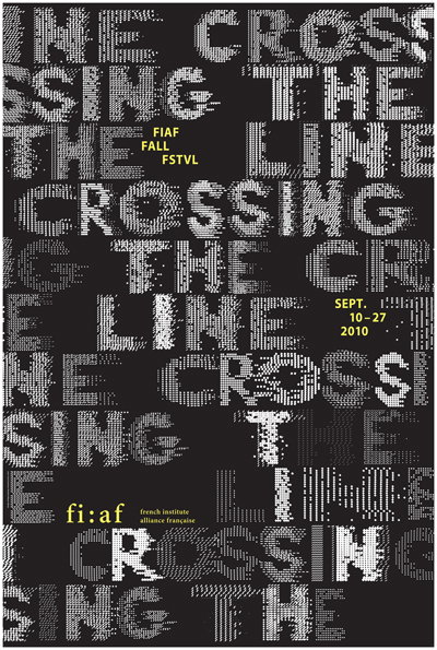
A typographic poster on a black background features the phrase “Crossing the line” repeated in a distorted, pixelated white font. Yellow text identifies the event as “FIAF Fall FSTVL” taking place from “Sept. 10–27 2010”.
Above

Phillippe Apeloig: Crossing teh Line FIAF Fall Festival 2010 (Courtesy Studio Apeloig)
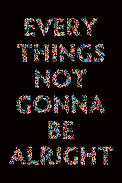
A typographic poster on a black background reads “EVERY THINGS NOT GONNA BE ALRIGHT”. The letters are formed from a dense, colourful mosaic of small, fragmented shapes.
Above

Christopher Clark: Web Typography for the Lonely: Cluster (2011)
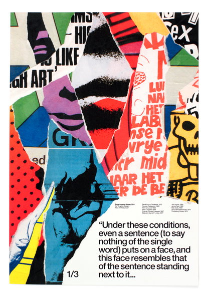
A collage of torn paper fragments in bold primary colours, featuring abstract shapes, textures and snippets of text. A block of text at the bottom reads, “Under these conditions, even a sentence (to say nothing of the single word) puts on a face, and this face resembles that of the sentence standing next to it...”.
Above

Experimental Jetset: Statement and Counter-Statement (2011)
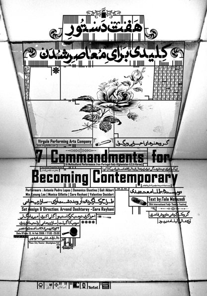
A black and white poster for a performance titled “7 Commandments for Becoming Contemporary”. The design features a central illustration of a rose and Persian calligraphy, set against a background of tiled walls.
Above

Farhad Fozouni,: 7 Commandments for Becoming Contemporary (2008)
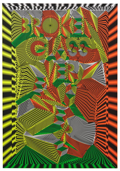
A complex 3D render of fragmented, geometric shapes in red, green, yellow and white. The distorted typography reads “BROKEN GLASS”.
Above

Michiel Schuurman: BROKEN GLASS EVERYWHERE (2010)
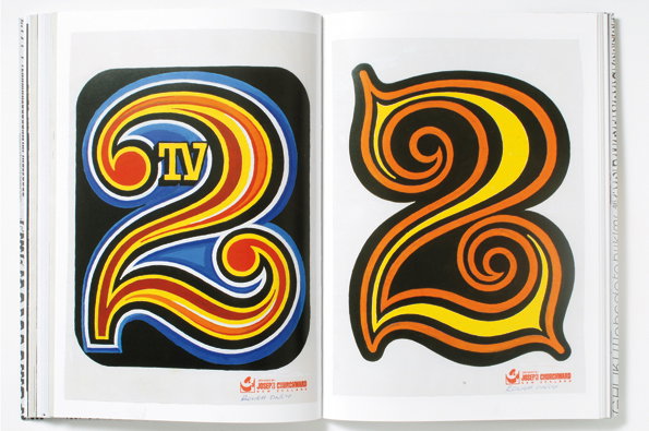
Two psychedelic illustrations of the number “2” are displayed side by side in an open book. The first is blue, yellow and red with the letters “TV” inside the top loop. The second is orange and yellow with swirling, concentric lines.
Above

David Bennewith: Churchward International Typefaces (2009) Photo by Franz Vos
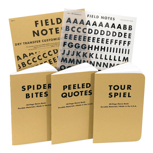
Three tan Field Notes memo books stand in a row, each with a different title: “SPIDER BITES”, “PEELED QUOTES” and “TOUR SPIEL”. Behind them is a matching notebook and a sheet of black typographic dry transfer letters.
Above

Aaron Draplin and Coudal Partners: Field Notes (dry transfer letter version) (2011)
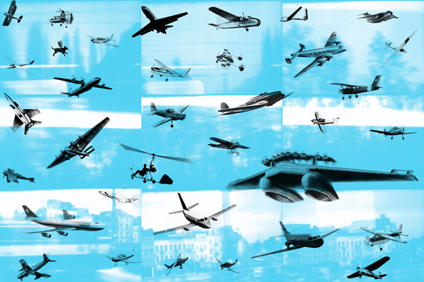
A collage of various aircraft and planes in flight against a bright blue background. The images are arranged in a grid-like pattern, showing a mix of vintage and modern aviation styles.
Above

cyan: Flieger (2010( (Courtesy Maharam Digital Products)
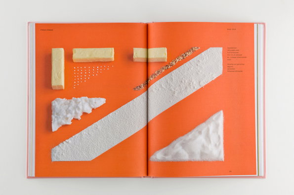
An open book with bright orange pages. Various white and cream textured materials, including blocks and shards, are arranged in a geometric composition across the spread.
Above

Forsman and Bodenfors, Evelina Bratell and Carl Kleiner: Homemade is Best (2010)
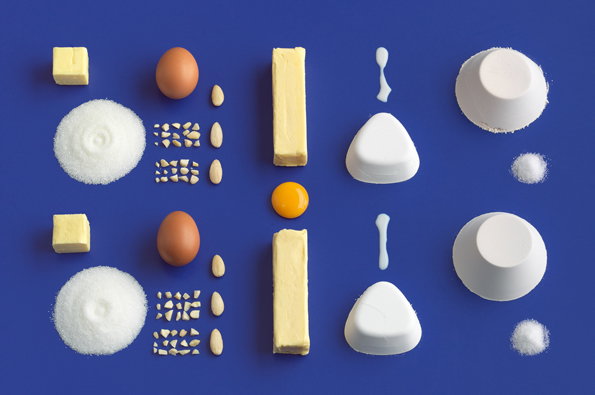
A symmetrical arrangement of baking ingredients laid out on a bright blue background. Butter, eggs, sugar, flour and almonds are organised into neat, mirrored rows.
Above

Forsman and Bodenfors, Evelina Bratell and Carl Kleiner: Homemade is Best (2010)
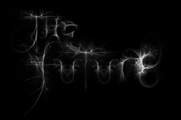
A 3D render of the words “The Future” written in glowing white, wispy lines against a black background. The letters are formed from intricate, fractal-like swirls and light trails.
Above

Sean Freeman and Craig Ward: The Future (2008)
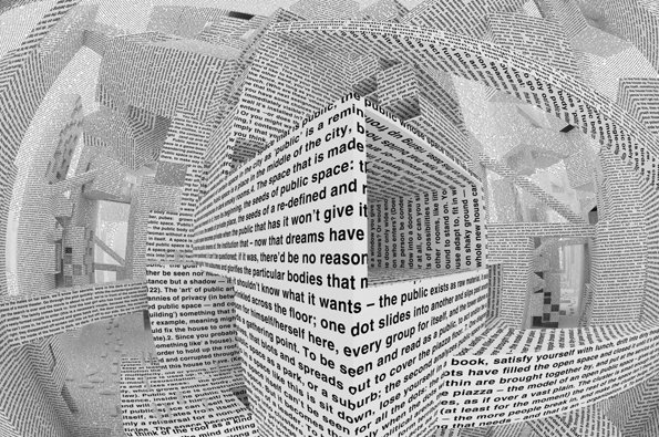
A 3D render of a surreal, architectural space constructed entirely from pages of printed text. The white paper folds and curves to create walls, ceilings and corridors that spiral into a distorted perspective.
Above

Acconci Studio: City of Words (2010) Courtesy Maharam Digital Projects
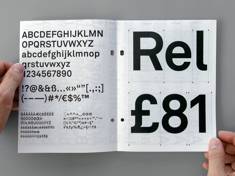
Two hands hold open a typeface specimen book. The left page shows a full character set of a bold sans-serif font, while the right page displays the letters “Rel” and the price “£81” in large scale.
Above

Laurenz Brunner: Akkurat 2005 Courtesy Lineto
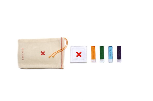
A small cream fabric drawstring bag sits beside a row of five fabric patches. The bag and the first square patch feature a red “X”, while the remaining four narrow patches are orange, green, blue and purple.
Above

Peter Buchanan-Smith: C.C.G.F. Badge Set Best Made Products, 2009
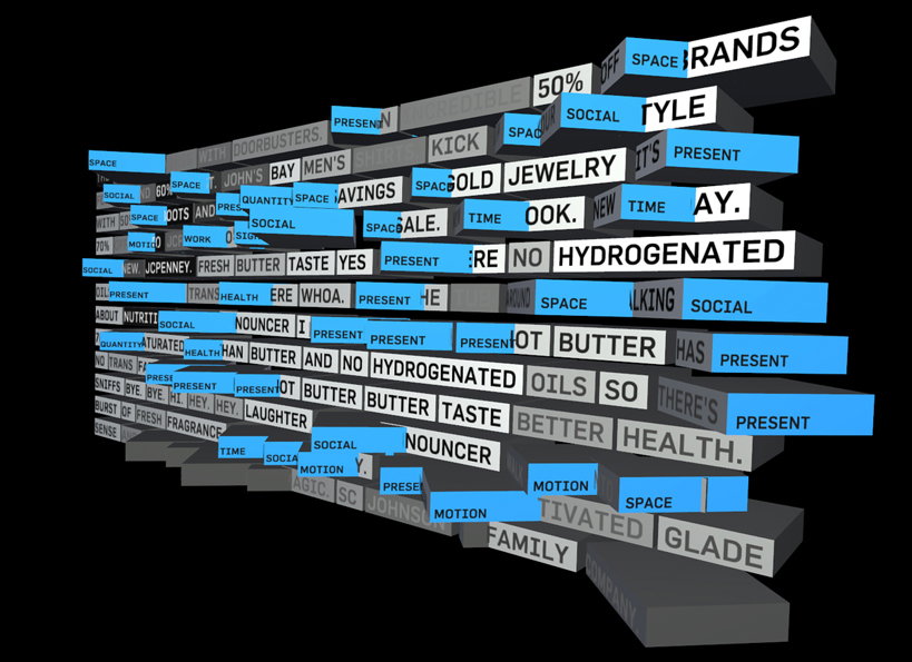
A 3D render of fragmented grey and blue blocks floating against a black background. The blocks are covered in white text, including phrases such as “GOLD JEWELRY”, “NO HYDROGENATED OILS” and “BETTER HEALTH”.
Above

Justin Manor, John Rothenberg and Eric Gunther: Set Top Box (2010) (Courtesy Sosolimited)
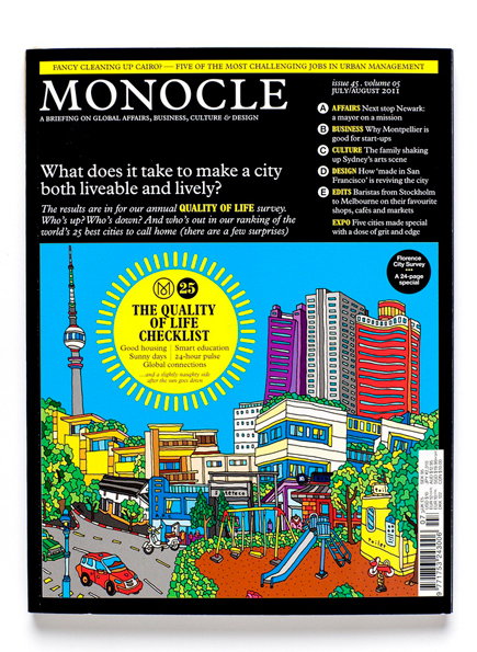
The cover of Monocle magazine, issue 45, from July/August 2011. A colourful illustration of a dense city skyline sits below the headline “What does it take to make a city both liveable and lively?”. A yellow circular badge reads “The Quality of Life Checklist”, listing factors such as “Good housing” and “Smart education”.
Above

Richard Spencer-Powell: Monocle, vol. 5, no. 45, July/August 2011
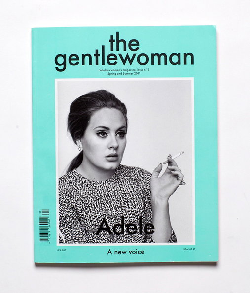
The cover of the magazine “the gentlewoman” in a bright mint green. Adele is pictured in a black and white portrait, holding a cigarette.
Above

Jop van Bennekom: The Gentlewoman, issue 3, Spring/Summer 2011
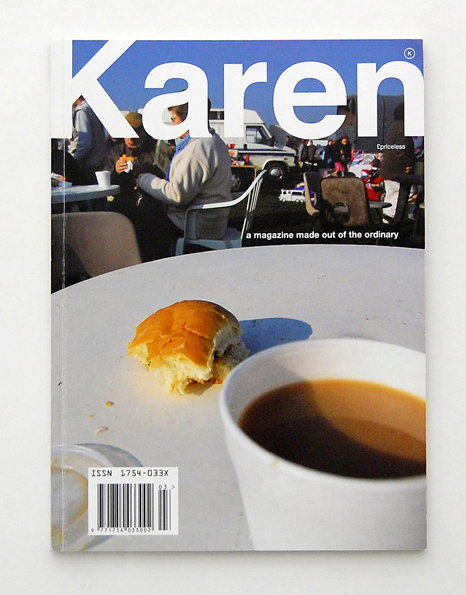
The cover of Karen magazine features a photo of a white table with a cup of coffee and a half-eaten bread roll. The title “Karen” is written in large white letters across the top, with the tagline “a magazine made out of the ordinary” below.
Above

Karen: Karen issue 3, 2007

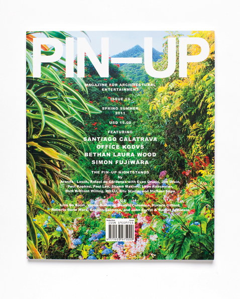
The cover of Pin-Up magazine features a lush, green garden with a mountain peak in the distance. Bold white text reads “PIN-UP” across the top, with a list of featured architects including “Santiago Calatrava” and “Bethan Laura Wood”.
Above

Felix Burrichter and Dylan Fracareta: Pin-Up issue 10, Spring/Summer 2011

Share Article

About the Author

Rob Alderson

—

Rob Alderson is a freelance writer, editor and strategist. He was previously editor-in-chief of It’s Nice That and WePresent, and editor of Design Week. He publishes the newsletter Undo, which tries to make sense of how AI is changing design work, the design process and the design industry.


It's Nice That Newsletters

Fancy a bit of It's Nice That in your inbox? Sign up to our newsletters and we'll keep you in the loop with everything good going on in the creative world.